Showing posts with label magazines. Show all posts

5.01.2012

Fun Characters from Pageant

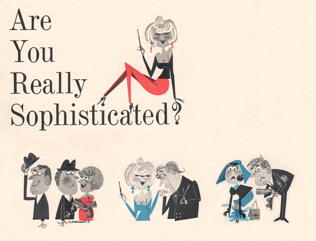
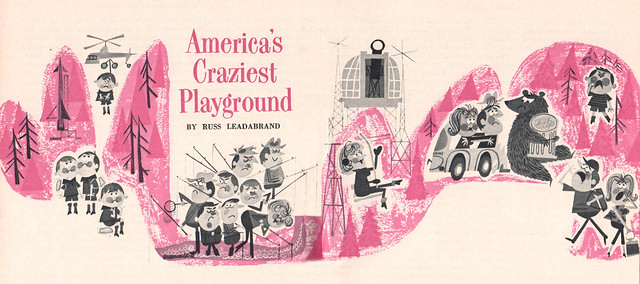
America's Craziest Playground Are You Really Sophisticated? Here are some fun characters by a mysterious "Greenwald R." They're from Pageant Magazine, a smaller, "digest" size magazine for the "gentleman." Bordering on the cheesecake from time to time, the magazine actually has an interesting connection to Mad Magazine. Well, I wish I knew more about "Greenwald R." I've seen similar work done by this artist, but never have been able to find anything more about him/her.

12.16.2010

You know, deck them halls and all that stuff?

CHRISTMAS! Can't wait for it!

The following ads were found in Collier's Magazine, December 24, 1954. This issue had part of the on-going saga of "The Body Snatchers" by Jack Finney. This story, of course, would eventually be published a year later as "Invasion of the Body Snatchers." So fitting for the Season, you think?

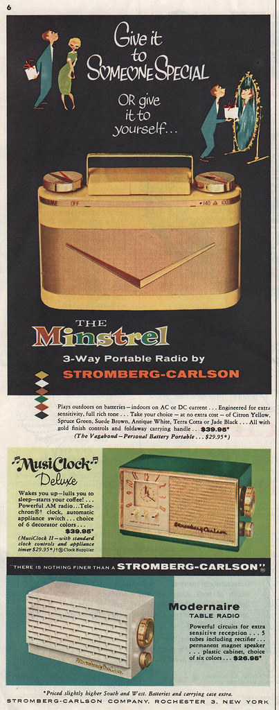
The Minstrel Radio ad
The Minstrel 3-Way Portable Radio ad with some fun characters at the top there.

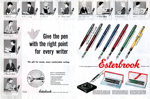
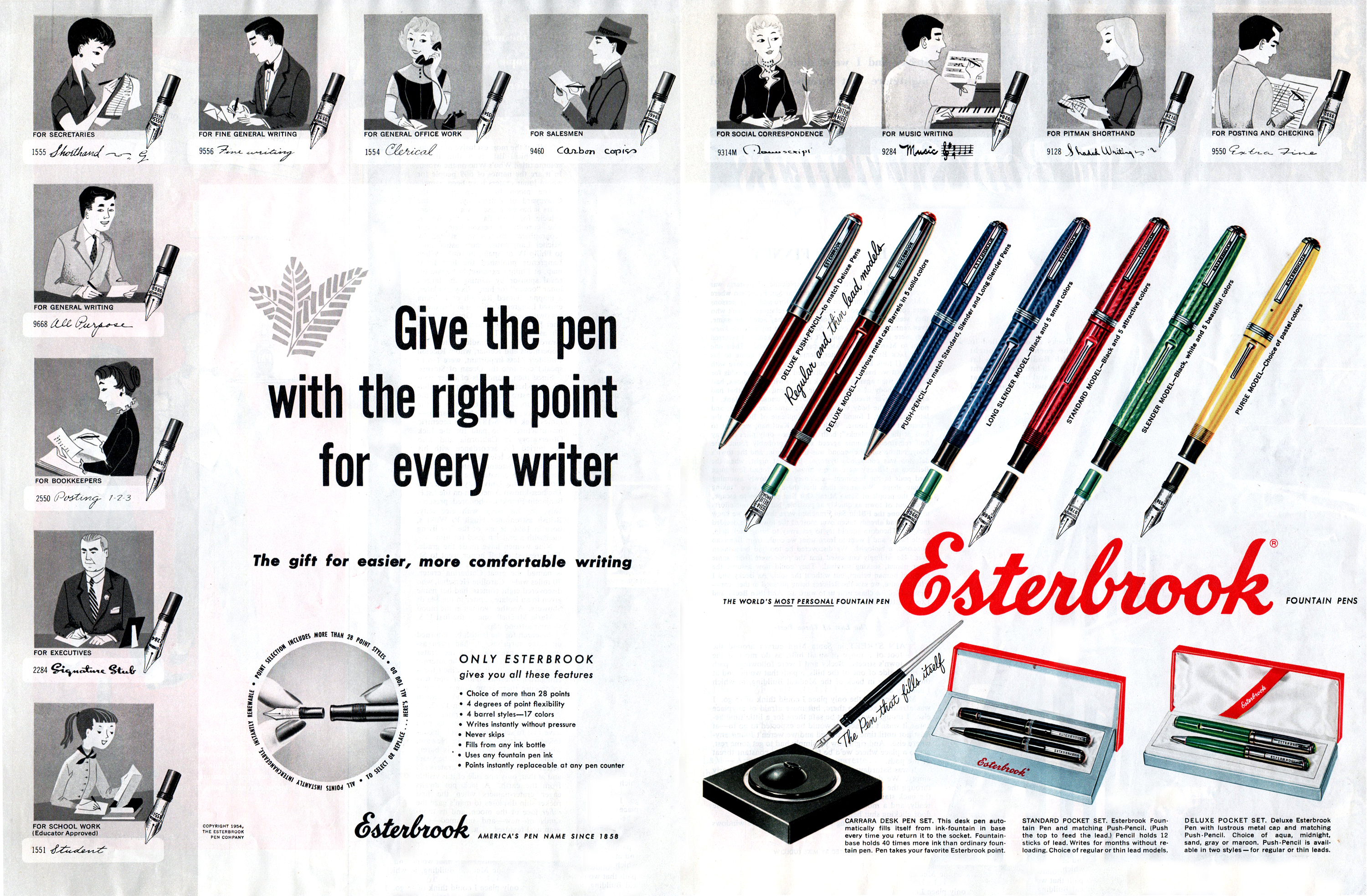
Esterbrook Pens ad
Esterbrook pens ad. I love the individual characters for each of the pens shown. Looks a lot like JP Miller, but I'm pretty sure it's not. No illustrator credit given. Notice all the females have clerical or secretarial jobs. Typical!

Here's a high-res version of it for you: Esterbrook Pens BIG. It was very difficult to get the right levels and tones here - the subtle grays in the illustrations were so fine and delicate, it was hard for me to find the right look without blowing the image out too much. Sorry.

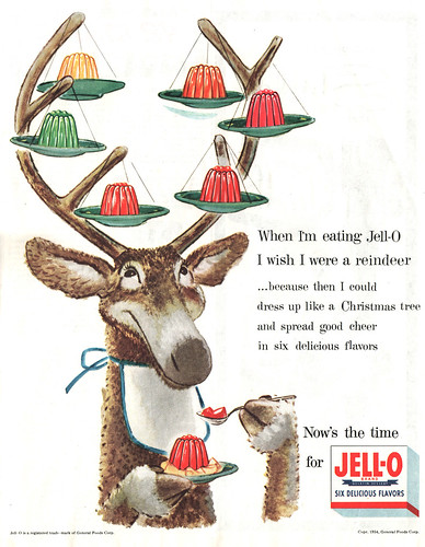
Jell-O ad
Fun Jell-O ad illustrated by the awesome Jack Welch.

This was part of a big campaign. You can check out more of the ads by clicking HERE.

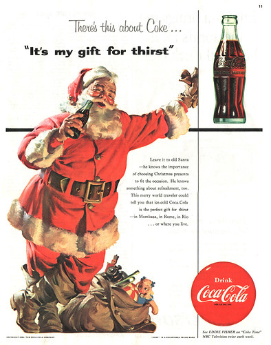
"It's my gift for thirst" Coke ad
Classic Santa Coke ad illustrated by Haddon Sundblom, of course. Not what I typically post here, but thought that it was a pretty cool ad to share. Plus, I love Christmas. And Coke. So there.

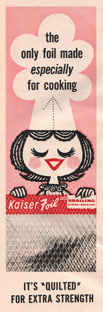
The following ad was not from Collier's but from Everywoman's Magazine, December 1957. The cutest little cook you'll find this Season using tin foil:

Kaiser Foil ad

Jettie, The Rich Reliefer
Not that Christmas-y, but still cool nonetheless, this illustration was done by Herschel Levit. Apparently he taught at Pratt at one point.

Hope you're enjoying the Season so far. I know I am. I've been listening to nothing but Christmas music all day long. Not tired of it one bit. Well, not yet, anyway.

12.01.2009

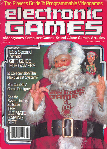
Electronic Games Mag: December 1982

Electronic Games magazine: Dec. 1982
To start off December, how's about a magazine from my childhood: Electronic Games, 1982. Yes, this is the actual magazine—I've kept it ever since. Awww, yeah. I was a gamer, circa 1982. Nothing but Atari, Activision, Colecovision, Intellivision, coin-ops, arcades, etc. for me, thankyouverymuch.

And for the record, I'd rather keep the term "retro" for anything older than 1980.

Also related: if you're ever in Portland, and you dig old arcade games from that early gaming era, you should stop by Ground Kontrol, at 511 NW Couch Street. It's a bar/establishment where you can play pretty much of all those classic arcade games. The original ones, of course. While working in Old Town during the summer, I would take a lunch break by going in to play a couple rounds of Tempest. Oh man, good memories playing that game. One of my favorites of all time. Didn't make it to the red levels, though. Next time.

11.05.2009

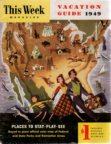
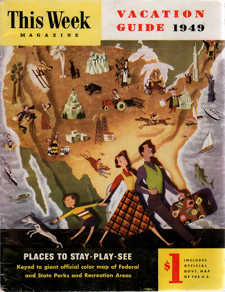
This Week Vacation Guide 1949

This Week Magazine Vacation Guide 1949
This Week Magazine: Vacation Guide, 1949. No mention of illustrator. Lowell Hess, perhaps?

This is a wonderful cover to a rather dull magazine. It's one of those informational publications, with no ads, a few photos, but mostly information like travel times from city to city, etc...- actually, it says that This Week is part of The Sunday Magazine, "issued jointly by 24 big city American newspapers." The "official govt. map of the U. S." was not found inside. Too bad. Would've been interesting to see that.

Things to consider: I love the way that the artist sets the family apart from the background by creating a light source directed on them. See the cast shadow? It's like they are up on a stage. Also, I love how there's a story being told with the dog interested in something off-camera left. Check out how each family member's pose moves from left to right as you go from dog, kid, mother, father: a nice triangle grouping. Genius! Also, I see a chevron pattern going down from the dog and back up through the kid's legs to mother's head, where the apex is. The mother is a triangle shape herself. Interesting stuff going on here. Incredible work.

Okay, I'll let you see it larger.

10.12.2009

Step-by-step: King of Putdowns

Hi guys. Thought I'd enlighten your day by sharing with you a sort of step-by-step process of how I created the illustration I did for Guide Magazine, The King of Putdowns (see previous post). Since I didn't take screengrabs while I was working, I can at least show you some of the layers by themselves, with a chance to view the images closer. I know that everyone has their own way of working, and by all means I'm not suggesting that any of you work exactly like me - this is just a hey, check it out! kind of thing. Hope you enjoy!

Roughs
Putdowns step-by-step: early sketch
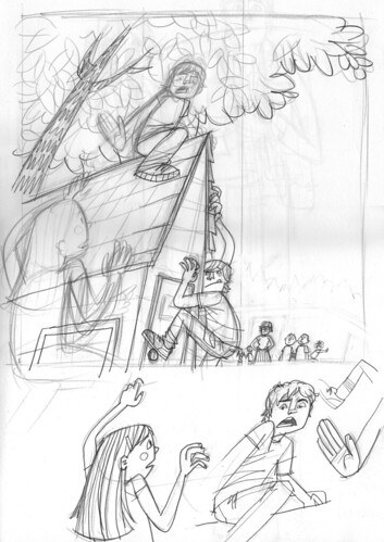
After reading the short story for Guide magazine, it was suggested that maybe we could use a low perspective, looking up at the scene. I went with this and created this first sketch in my larger sketchbook. I did a couple of extra drawings for the main character and his hand, along with the girl climbing up the playhouse. (It's a playhouse situated in the back of a school's playground, abutted up against the woods.)

Putdowns step-by-step: rough layout
This is the first rough I sent to Guide after I scanned in all the elements and put them together in Photoshop. I don't normally do the grey painting for the various background items (such as the tree and playhouse here), but I think I like it. It helped me keep an eye on how the tones and colors might work in the final version.

Final Pencils
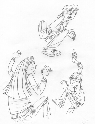
Putdowns step-by-step: final scan 1
Once I get the okay, I then print out the rough and create tighter pencils of each item by tracing over the rough. At this stage, I may change a couple of things as I'm going along - like the girl's expression, for instance. I also changed the pose of the main character, pushing it further, making him more in opposition of the girl climbing up. I also changed the other boy's pose - he looked strange hugging the playhouse in the rough version.

Putdowns step-by-step: final scan 2
Here are the final pencil scans of the playhouse, people in the background, and some leaves. I ended up not using any of the leaves over on the left, save those two that are not touching any other leaves. I then used those, along with the others on the right side of this scan, to create the leafy pattern for the final version. Lots of duplicates. Lots. On the bottom there, you'll see the teacher looking disapprovingly at the situation, along with two classmates. There are a few kids in the background as well. All these extras ended up getting nixed in the final version. I felt that it was taking away from all the action going on at the playhouse.

Color
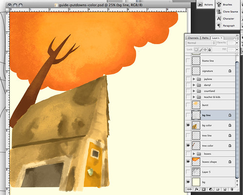
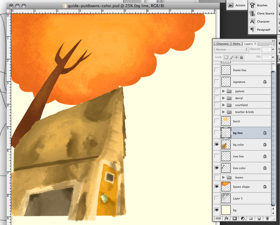
Putdowns step-by-step: background color
Closer look.

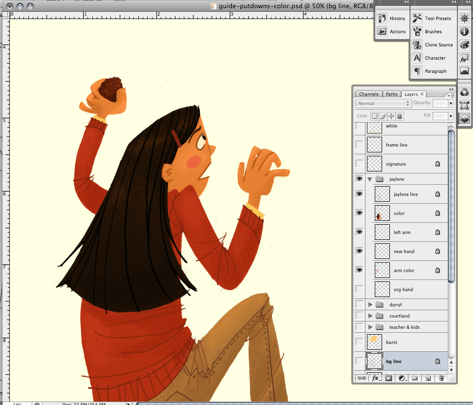
Again, sorry I don't have a step-by-step of my process on this piece, so I have a couple of the layers spotlighted for you. Here, you'll see the background color layer (as well as the tree color layers). As you can see in my layers on the right, I have two main layers for each item: line and color. Sometimes (not always) I'll put the pastelly-brushy effect on its own layer, separate from the color layer. That way, I can do alternate versions if necessary. But honestly, that requires time and usually I don't have much of that when I'm working.
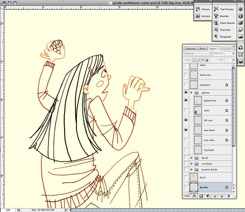
Putdowns step-by-step: girl line
I never merge the line layer with the color layer. Never! Even if the line will be the same color as the color layer underneath. I just never do it. I've learned my lesson throughout all the years I've done this. As you can see, I ended up adding a pine cone in the girl's hand (I drew and scanned this hand with pine cone separately) after re-reading the story and realizing that the girl ended up throwing a pine cone at the main character while she was climbing up the playhouse.
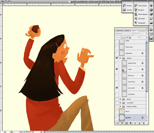
Putdowns step-by-step: girl color
It's rare when I see the layer like this. I always keep the line layer open so I can see the two layers together.

Putdowns step-by-step: girl final
Closer look.

And here are all the layers together. For the girl, since I had a different hand, I ended up separating the throwing arm from the body just in case I needed to shift it for a better composition.
Putdowns step-by-step: boy line
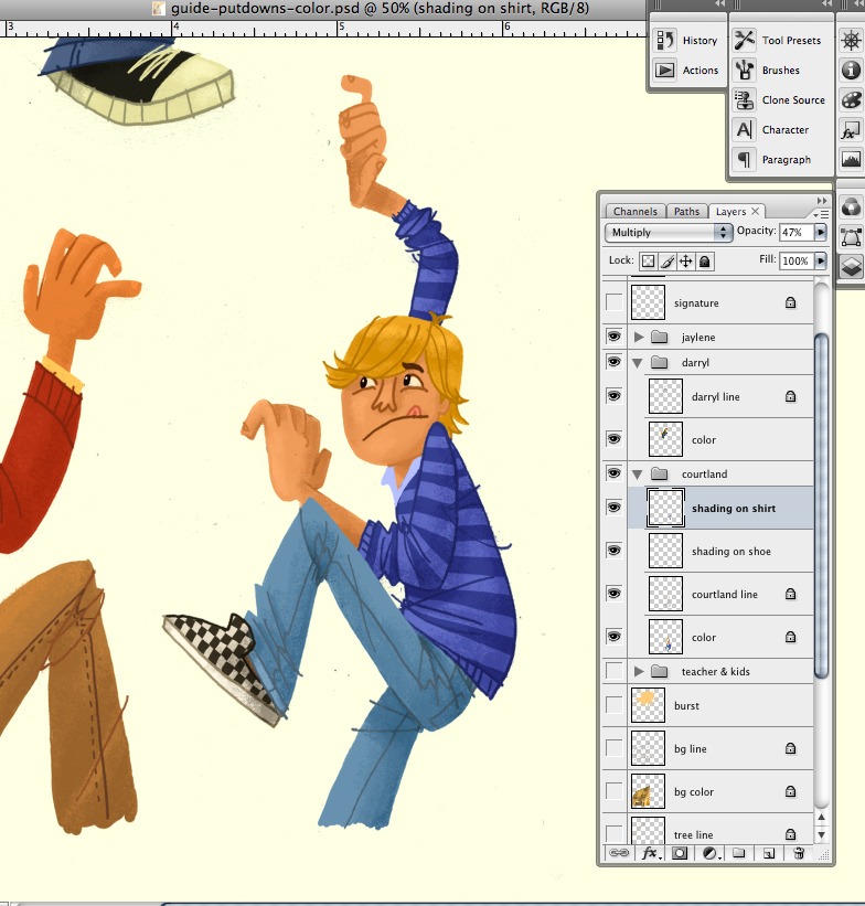
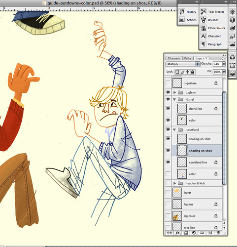
Courtland is this boy's name. His brushwork I did differently because he had a pattern on his shirt and shoes. Instead of trying to work out the brushy look on the color layer (where the patterns were), I did all the brushy shading on a separate layer, usually sandwiched between the line and color layers (here, the shading layers are on top). Well, as you can see, the shoes and shirt each had its own brushy shading layer (in case I needed to alter the opacity for each item, which I did). I do this only when the pattern underneath will be difficult to work with when it comes to the shading. Otherwise, I'd much rather work with the colors themselves instead of relying on a basic color for the shading. FYI: I never work with black or grey for the shading, unless the main color is grey itself. In order for the shadows and shades to be richer, fuller color, always work off of the original color.
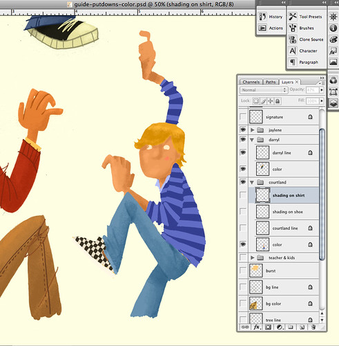
Putdowns step-by-step: boy color
For Courtland's color layer, I did all the brushy shading like I normally do on all the sections without patterns: the hair, skin and jeans.
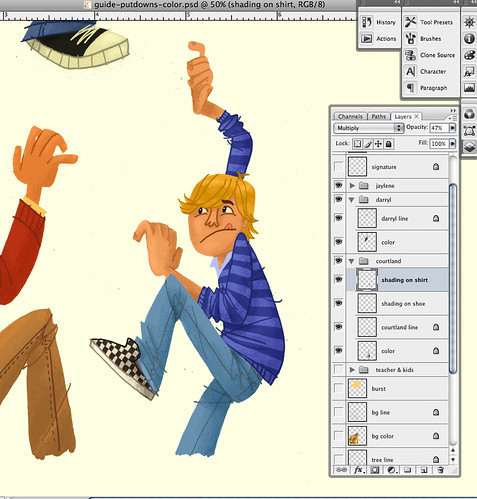
Putdowns step-by-step: boy final
Closer look.

And Voilá!! Courtland all colored and done. Here's the final again:

King of Putdowns
Closer look.

This process is a holdover from my days working in animation. I still use my animation disc and even use leftover animation stock paper when I work on the final pencils. Having pegbars and pegbar holes to better register the paper works perfectly for me. My entire children's book How To Train With a T.Rex and Win 8 Gold Medals was created using this method and it's worked pretty well for me so far. The concept of separating all the elements and then putting them all together like puzzle pieces is pretty much how we do animation, if you think about it. A sure fire way of making sure I don't get caught having to do extra work than necessary.

If you have any thoughts, questions, suggestions about this post, feel free to leave a comment below! I'd love to hear from you.

9.28.2009

King of Putdowns

King of Putdowns

Recent illustration I did for an upcoming issue of Guide Magazine. That boy at the top of the playhouse likes to put his classmates down with snarky remarks and insults. It prompts the girl to pick up a pine cone and toss it at him.

I'm very proud of this illustration. I was given ample time to work on it, allowing me to sketch and re-sketch the concept out, to get the best possible poses and overall composition. I was able to really take my time on the painting, too. It's nice to have a comfortable turnaround time. Many thanks to Brandon Reese. You're awesome, man.

11.30.2008

Better Homes & Garden Sept. 1958

Better Homes & Gardens - Sept. 1958

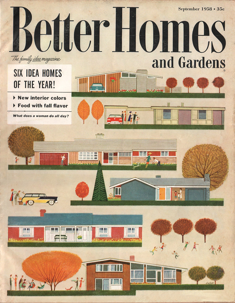
Oh man, what a scrumptious cover. And I don't usually use such descriptive words when describing a magazine cover. Vintage modern mid-century architecture goodness, care of the incomparable Jan Balet (here and here). Architecture, characters, color, design, etc. All of it coming together quite harmoniously.

You know you want to view it larger. Of course you do.

UPDATE: Leif Peng today (Dec. 1st) has posted some more of Balet's work, along with a letter he's received from the artist himself. Also, Jan sent Leif a photo of when he was 85 in 1998. He's 95 now! Checkit:

Jan Balet Sends a Christmas Gift.

11.27.2008

Happy Thanksgiving & a Mystery Solved

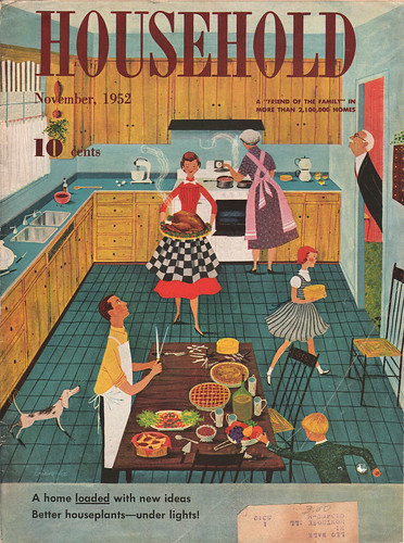
Household November, 1962

I've been waiting to put this one up for an entire year. I found it among my vintage magazine collection right after Thanksgiving last year and was kicking myself for not finding it in time. But that's okay. The reasoning? The illustrator is listed as Lorraine Fox. Why am I happy about this? Because a reader of my blog got in touch with me in August of this year and told me that they found out that it was Ms. Fox who did the wonderful illustrations for that Better Homes & Garden Decorating Book I mentioned on The Ward-O-Matic way back in 2005. The same illustrations that I used for inspiration for that Victory Vintage wall in Decatur. One big illustrator mystery finally solved!

Big thanks to Ashlee for her eagle eye.

Happy Thanksgiving to you all!

12.18.2007

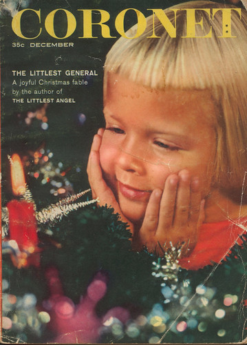
Coronet December 1957

Coronet December 1957

Welcome to Christmas 1957, Coronet Magazine-style. Coronet was a smaller in scale magazine, roughly half the size of your typical magazine found in newstands. The paper from this particular issue is brittle, giving the magazine a pulp-like feel. Very cheap. Hence, its ephemeral importance to me.

They weren't kidding with the bangs back then, were they? I've seen photos of my aunts with bangs as short as this -- that way, my Oma wouldn't have to cut them for long time. Didn't want to deal with all that.

There's some interesting illustrations going on in this issue, most of which I'll post at a later date; but the ads are what I thoroughly enjoyed the most. A few worth noting:

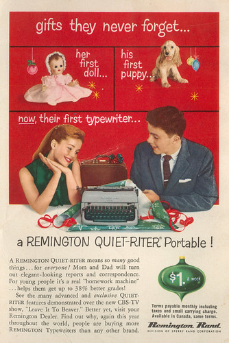
gifts they never forget...

I wonder if giving teens a typewriter for Christmas held the same significance as handing out toothbrushes for Halloween. Oh, they'll never forget this one, Santa. Thanks. Thanks a lot.

Betsy Wetsy

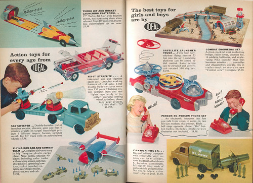
Click on image to view larger. This was the first page of a multiple-page advertising spread for Ideal Toys. Funny. She'll be singing a different tune when "wetsy" becomes actual urine.

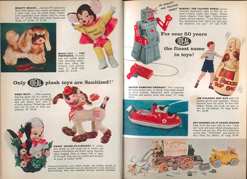
Toys!
Click to view larger. Love that Mighty Mouse doll! Is it me, or does the name "Robert" not sound very "robot-y" to you? I know that "Robbie the Robot" is a popular one, but that's okay. "Robert" sounds so....formal.

More toys!
Ooooo....the coolest two pages in this magazine. Love that see-through "Fix-it Starflite"! The fact that this has working head and taillights would've had me drooling all over this mag if I was a kid. I'm also eyeing that Satellite Launcher Truck. Very cool! Who wouldn't want a truck with a satellite launcher in the back?

-------------------------------------

Mmm'kay...after that garish presentation, something completely different. The wifey and I are mixing it up this year for Christmas. We've promised to give each other gifts found in thrift stores or flea markets. Uh, no....we're not cheap. (Well, maybe.) Actually, we got to thinking. Last year we got so carried away, it left us feeling...oh, I dunno, sort of empty: all that spending and consuming. It was crazy. Didn't sit well with us.

So, we've decided to find things that would require more thought and feeling, while at the same time offer a bit of a surprise. No lists, no "I've been eyeing this...", "I gotta have that...." Just to mix it up. Who knows, it'll probably blow up in our faces come Christmas Day, but at least we tried to stray away from the almighty, all-consuming Christmas-spending juggernaut. Admit it -- it's so easy to get carried away, isn't it?

Anyway, didn't mean to go off on a tangent there. Just thought I'd share some of my thoughts. We just want to try something different this year. And try to have fun.

Okay, enough of all that. More vintage Christmas-y stuff coming up!

10.24.2007

My Mom's 16 Magazine Collection

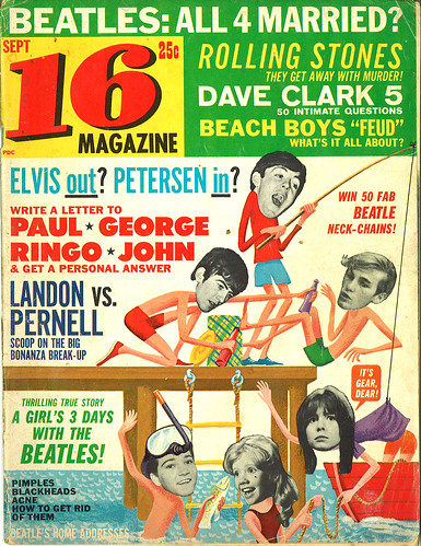
16 Magazine: Sept

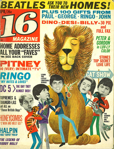
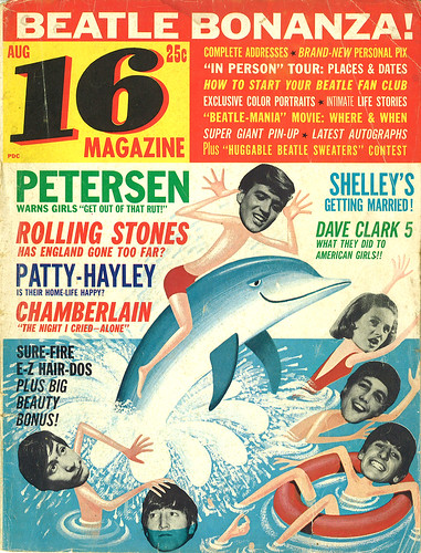
My Mom was a big fan of The Beatles, right at the height of their popularity, from 1964 to 1966. (Remember, she wrote this previously.) She had a big collection of teeny-bop magazines that featured all the big hot movie, tv and music hearthrobs at the time. She would only buy the ones that had anything to do with The Beatles, most importantly Paul. She was a big fan of Paul.

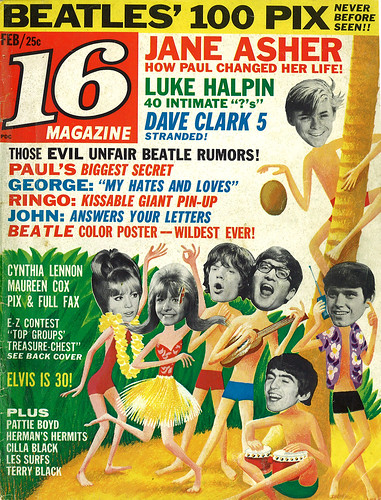
16 Magazine: Feb

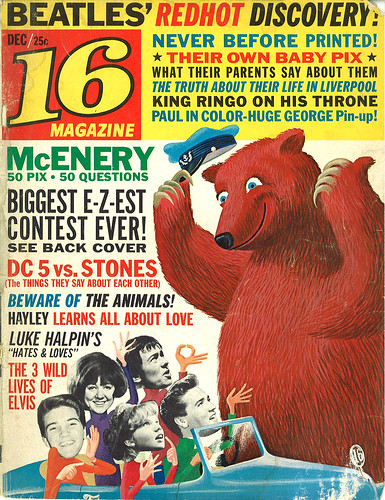
Growing up, I remember digging these 16 Magazines out of the closet and checking out all the covers, studying in detail all the fun and kooky cartoon activity going on. Big source of influence for me right here, folks. Loved how all the run-of-the-mill press photos were transformed into brand new scenarios by ingenious positioning and pasting. I really admired the artist who worked on these covers -- I could tell that they had to work with only what was available, and that inspired me.

16 Magazine: Dec

16 Magazine: July (2)

16 Magazine: Apr

16 Magazine: Aug (2)

16 Magazine: Aug

Check out the entire set HERE.

(Oh, and if you like more of this type of stuff, then The Retro Teen is your bag, baby.)

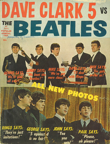
Mom had some other publications in her collection, mostly one-shot deals that were basically 'special issues' from 16 Magazine or Photoplay. Here's one specializing in the Great Debate of 1964: Who's better -- The Dave Clark 5 or The Beatles? Oh, the world must know!

Dave Clark 5 vs. The Beatles

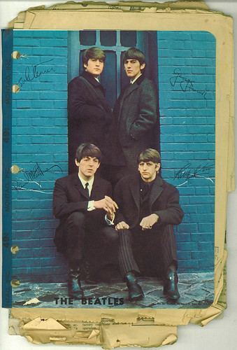
This next one is my favorite. It's my Mom's notebook that has been stuffed with newspaper clippings on the Fab Four. The band played one of their last live shows in Atlanta in 1965 and my Mom was there. There's lots of clippings about that event in here:
My Mom's Beatles notebook

Thanks, Mom, for being a teenager and being so passionate over four mop-tops from Britain. And thanks for keeping these fun & silly magazines around the house as a souvenir so that they may become a big influence on my creative upbringing. You never know what will influence young, budding artists.


2.26.2007

Whee!

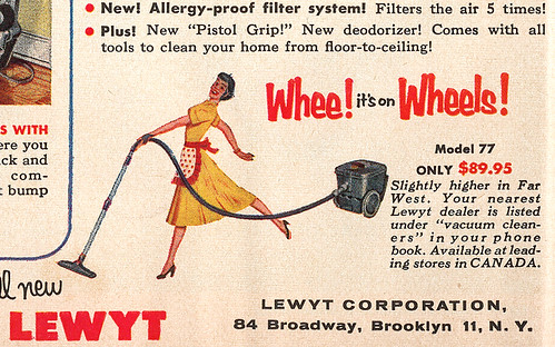
Whee!
This is how my life feels right now: full-on crazy, head spinning, multi-tasking frenetic energy and all on wheels. At least it feels like it's on wheels. Just switch out this domestic goddess's ear-to-ear smile with a look of fear and then you'll get a perfect example of how I feel right now. See, on top of all the sorting, filing, organizing, packing, moving, searching for a new home thousands of miles away, etc., we've had to find and buy a new car before the Big Move because our current one might loose its engine block halfway across the country, and.... I had to have a molar extracted today making me feel oh-so wonderful right this very minute. Gotta love perfect timing.

In the meantime, here's some neato scans of ads and illustrations found in that December 1954 issue of Better Homes & Gardens I posted about earlier. I've got priorities, people.

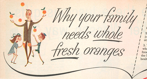
Not part, but whole
Nice illustration above. Yay for Daddies bringing home the....uh, oranges?

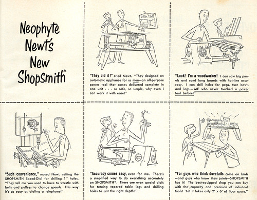
Neophyte Newt
Nice, simple clean lines here. Nice nice nice. Love the characters, too. Best viewed larger.

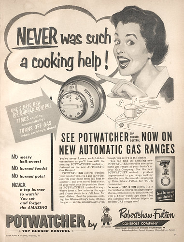
Potwatcher!
Classic housewife loving her appliance with a freakish-like glee. View larger, if you dare.

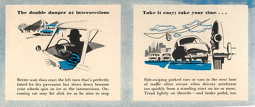
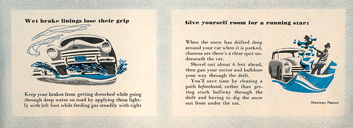
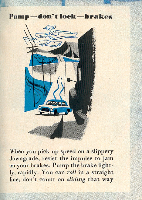
The following spot illustrations were for an article on winter driving. The artist signed it: "Pearson." They are very well executed with some nice stylization for the clouds and use of the blue spot color here and there. Definitely view them larger if you get the chance. Great stuff:

Winter Driving 1
View larger.

Winter Driving 2
View larger.

Winter Driving 3
View larger.

Winter Driving 4

Okay! Whee! There ya go! Excuse me while I dive back into my enormous pile of old notebooks, saved magazine clippings, and forgotten sketches.

12.18.2006

Better Homes & Gardens: Christmas Ideas 1956

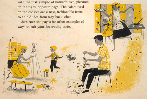
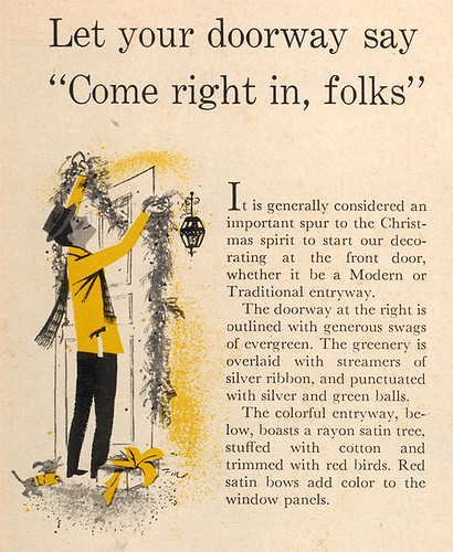
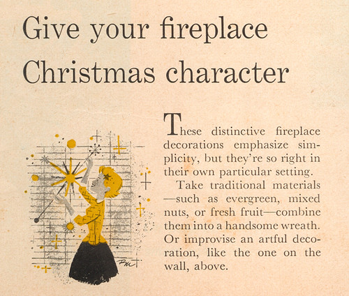
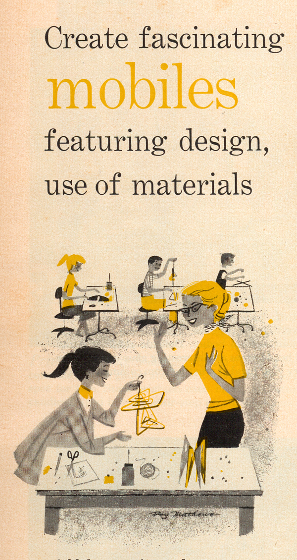
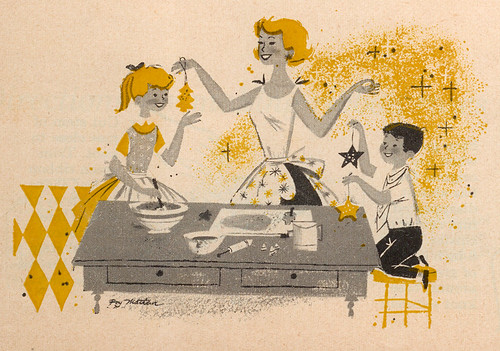
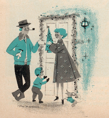
The following illustrations are found throughout the Better Homes & Gardens: Christmas Ideas 1956. It's basically a magazine, but only printed for the holidays, natch. For a pleasant change, the illustrator is actually given credit here: Roy Mathews, who was assigned several other BH&G projects during this time -- Barbeque Book and The Handyman's Book, for example. Who's Roy Mathews? That's a good question. I don't know. In fact, Google doesn't know either. I've done several searches for the guy and cannot find ANYTHING on him -- he's quite the enigma. I even pooled the resources of Leif Peng and he came up with nothing. Who was this guy? Where'd he come from? Schooling? Any other publications he illustrated? Is he still alive? My guess is that he was on the staff at Better Homes, since I haven't seen anything by him outside of the publication.
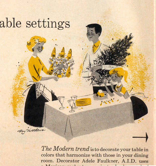
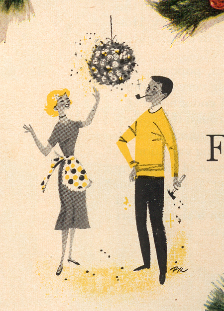
My hope is that by posting about Roy here, one of his family members or a colleague will respond (or even the man himself). I'm very curious about this artist who created some lively illustrations, expertly utilizing the limited two-color process in various magazines and books. There's a delicate touch given to his characters, mostly in the way that he depicted the faces -- just enough emotion to get across what he's trying to say in each scenario. Very straight-forward approach, but effective. And he added just the right amount of detail for each illustration, too.

Anyway, here are the fun illos for you all to enjoy. Merry Christmas! (Click on each image to view larger.)

Christmas Ideas: Traditional or Modern?
Christmas Ideas: Table settings
Christmas Ideas: Doorway
Christmas Ideas: Fireplace
Christmas Ideas: Ribbon Roses
Christmas Ideas: Mobiles
Christmas Ideas: Frosty charmers
Christmas Ideas: Front door