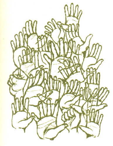
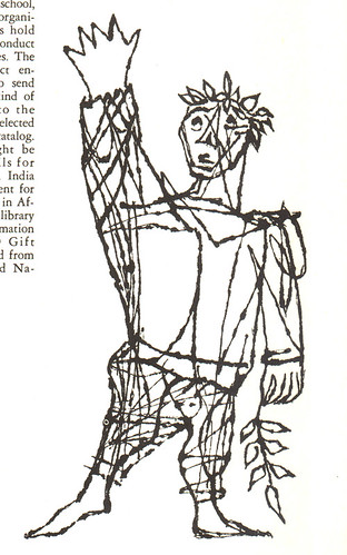
The Ottawa International Animation Festival is coming up next month and I will definitely be attending. The dates are September 20th - 24th. This will be my third year in a row and so far I haven't tired of it. FYI, the OIAF is the largest international animation festival this side of the globe. (Although Portland's brand spankin' new Platform Festival is gearing up to be a close second.) One new feature for the festival this year has been the introduction of their own podcast. It's been an interesting one so far, featuring several of the "Signal Films" (the short intro films before each and every screening), interview with animator John Straiton, as well as drawings of Norman McLaren. Click HERE for more information and how to subscribe.
OIAF recently announced their schedule (click HERE), and it looks to be a great festival. Some of the highlights:
Ol' pal Joel Trussell's War Photographer will be screened, as well as Michael Sporn's The Man Who Walked Between the Towers (award-winning film based off the book that won the 2004 Caldecott Medal—there's a short clip featured on his site). Also, in the student categories, I noticed some entries from the GOBELINS school in France. If you haven't seen what those students are capable of, then by all means check out their site. You will be amazed.
There's going to be a Bob Clampett Retrospective (always a fave of mine), and screenings of Bruno Bozzetto's short films as well as his famous film, ALLEGRO NON TROPPO, which, sadly, I've never seen. I know, I know, I'm an idiot. Also, there'll be a screening called Cultoons! Strange, Rare and Lost Cartoons! Sounds promising. And here's one for the John K. fans: John Kricfalusi Presents: Ren and Stimpy: The Lost Episodes. I've seen two of those episodes back in Ottawa two years ago and they were raunchy.
If you're thinking about going to Ottawa this year, then please get in touch with me! Would love to meet some readers. I'll be going this year under the auspices of Drawn!—speaking of which, I'll finally get to meet Drawn!'s creator, John! Now, I'll be able to find out if he's really a robot in human clothing. Truth will be told.
See ya there!
8.30.2006
8.28.2006
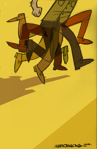
Illustration Friday: Run
My submission for Illustration Friday this week: run.
I'm going to forego the obvious and not make any Forrest Gump jokes here. Just not worth it.
It's kinda funny, because I had this sketch already drawn in my sketchbook last week. So what a nice surprise to see that the theme was "run." Was trying something simple with the colors on top of colors here. I used the "multiply" layer effect on some of the legs, but not all of them.
8.27.2006
more sketches for you
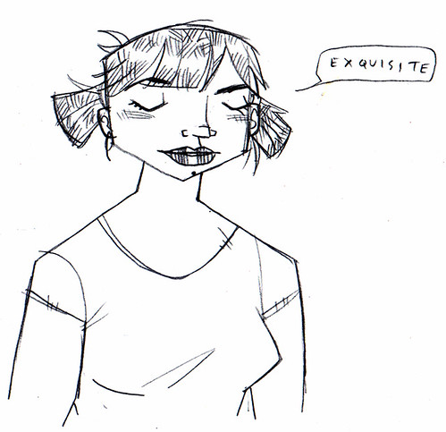
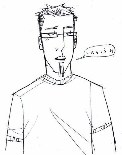
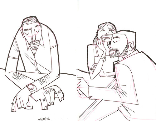
Told you I'd be back! With more! The first two drawings of Andrea and I were drawn on the same sheet of paper a long time ago. I forgot that I had them scanned and all ready to upload. Silly me! (Click on the images to go to each of their Flickr pages. From there, you can click on "All Sizes" to view them larger.)
Not sure what the words mean there. Just something off the top of the dome. No need to read into it.
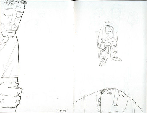
My current sketchbook is a cheap-o one from the art supply store that I started early last year. So cheap, in fact, that some of the pages are loose and free from the binding. I quickly dumped it when I bought my first Moleskine. After two Moleskines later, I've finally returned to the sketchbook, picking up almost a year later. You can see that this was done last July/August:
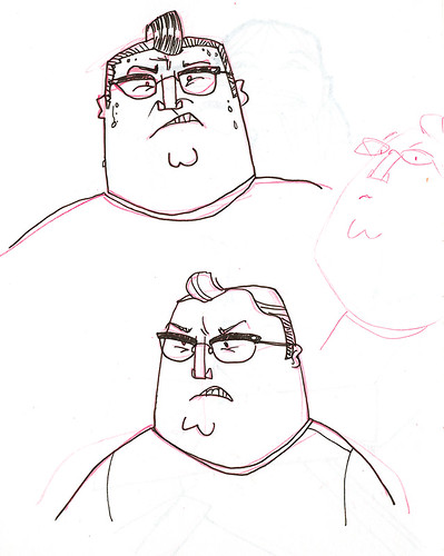
Sometimes I use real life as inspiration, starting with an initial thought, idea or shape, and then going with it. The guy below is loosely based on a co-worker at Primal. He's not big. I just drew this guy like that:
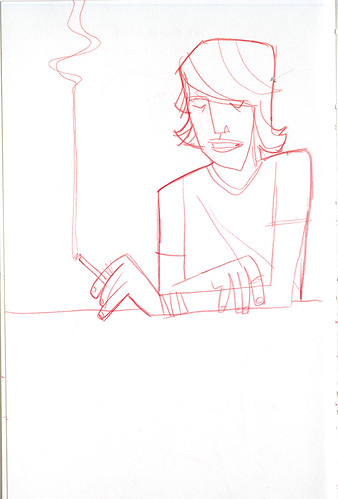
Smoking is cool. Well—not the cancer, the emphysema, the tar, the addiction, the nicotine, etc, that's associated with it. But a drawing of someone smoking makes it look so cool:
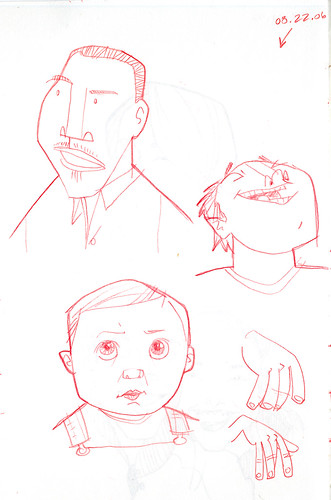
Some random guys and my boy Ezra. The drawing of Ezra here is based off of a photo I have of him on my desk at work. I see it every day. It's a classic Ezra face: furrowed eyebrows, looking all worried. How can I not draw him?
I have more. More! More! MORE! Will post them soon.
8.26.2006
sketchbook drawings
8.25.2006
I like gross stuff
Last Sunday, when I was writing up my review for SNAKES ON A PLANE, I thought I'd draw a goofy version of the famous shot of Samuel L. Jackson holding a dead snake in his hands, instead of using the photo. I've been wanting to create spot illustrations for some of my posts and thought that this would be the perfect opportunity for one. Using the original photo for reference, I began to create my color layer in Photoshop when Ava came up to me and wanted to sit in my lap to see what I was drawing.
I was a little worried about what she thought of the photo of this guy holding this huge snake, so I tried to downplay it as much as possible.
"Who's that, Daddy?"
"Oh, it's nothing. Just some actor holding a dead snake in his hand."
"Is that real?"
"Oh no, that's a fake one. It's all pretend."
"Oh," she replies. There's a slight pause before she asks the next question.
"What movie is that from?" Reluctantly, I respond, "Snakes on a Plane."
"Can I go see it?"
"Oh, no honey, it's a movie for adults like me. It's too scary and has gross stuff in it." I can almost hear the gears in her head turning and working hard as she thinks about her next reply.
"Well, I like gross stuff."
Typing out Ava's words here doesn't do that last line any justice. There was a certain way she said it, the inflection in her voice where she emphasized the "I like" that made it sound like that she was trying to convince me that she was okay with all this. That she wanted to be in on it. Similar in the way that you might say "Hey, I want to go-ooo!" if you found out some of your buddies were going out for the night. Hard to convey in writing, but still was a classic Ava moment for me.
Funny thing is, she does kinda like gross stuff. When she was 2, I used to take her with me to Criminal Records and hold her while I thumbed through the magazines and CD's. Sometimes (most of the time), my arms would get tired and I'd have to put her down. One time, I put her down and proceeded to look through some of the funky freshly-designed graffiti mags they had there on the magazine rack. Ava pretty much behaved herself, which was unusual at the time. When I was done with the magazine section, I grabbed Ava's arm so I could move onto the CD's in the back. Ava didn't move. I looked down and saw that she was eye-level with the current issue of Fangoria Magazine. Eeep! Luckily, the cover wasn't too gory for that particular issue, but still, it featured a creepy looking guy with pale, mottled skin (see image at right). I tried to pull her away, but Ava was fixated by this cover. She wouldn't budge. She wasn't scared of it, nor did she whimper or anything. She just stared at the creepy guy. Eye to eye.
I flipped the magazine over immediately and started to pick her up. But before I had a hold of her, Ava proceeded to turn the magazine back over. She was relentless. I finally pulled her away from the magazines, but couldn't help but think about how steadfast she was in looking at that cover. Who would've thought that a 2 year-old girl would dig a Fangoria magazine cover? Weird.
Back to the original story, Ava likes gross stuff. But I had to let her know that the gross stuff in SNAKES ON A PLANE was far more gross and scary than anything she's seen. She seemed a bit deflated, but then proceeded to critique my drawing of Samuel. "That doesn't look like him, daddy." "I know, I know, you're right." And she was right. It sucked. I scrapped the idea and just went with the photo. But I enjoyed the time she and I shared as she watched me attempt to draw some dude with a snake on a plane.
Now you see why we had kids in the first place: blog fodder. When in doubt, write about the kids! Always good for a laugh!
8.23.2006
Ava Thursday: Ava & Matt Collaboration
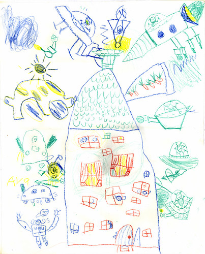
During the Christmas holidays of 2004, my sister came into town with her kids in tow, Naomi and Matt. Whenever they come and visit, it's a big family fest and all the kids get together and have a great time. Even though her kids are older than mine, the four get along very well. It's well known within the family that Matt is pretty much a Mini-Ward. My sister reminds me of this fact whenever her son showcases his finicky eating habits around the dinner table. (I wasn't known to eat everything on my plate, to say the least. Heaven knows I tried, though. I really did.) The Mini-Ward factor also pops up whenever Matt draws or creates something. I have to say that he does have a unique artistic quality about him—I can only hope that he keeps it up. He's quite talented.
For this particular visit, Ava and Matt (4 and 7 years old at the time) spread out on the floor and began to draw all these wild and fantastic scenarios filled with aliens and spaceships attacking houses. (Naomi, the eldest, spent some time drawing with them as well, but she moved on to something else after a while.) Ava was just following Matt's lead, but soon she started to create her own characters and aliens, which at the time was a first for her. In fact, this was a big moment for Ava and her artistic development because here, she was carefully watching her cousin in the way he drew all the characters and ships and the overall action. Before, her drawings were done very quickly and consisted of simple shapes and color. But after drawing with Matt during his visit, her drawings became much more developed and intricate. It was as if this event awakened the artist deep from within. It was fascinating to watch all this unfold right before my very eyes.
The drawing is big, almost 11" x 14". You can tell that Matt did most the action you see on the right side, with Ava doing her thing over on the left. Nice touch with the woman in the bottom left corner, screaming—see the talk balloon?
8.21.2006
New canvas
Moving day is coming. Soon. Labor Day weekend. We are SO not looking forward to it. But we have no choice. That's the way it has to be—no getting around it. Looking forward to moving into a home with more space, but hate that we have to go through a lot of crap to get to that point. We've been painting at the new place whenever we get the chance, and it's starting to look like our own, but I feel like it's just the tip of the iceberg. There is SO MUCH more to do. Ugh.
During crazy life events like this, I get so scatterbrained. I can't think straight. I can't focus at work and start cramming for a deadline like I crammed for tests and papers back in college. I hate that. I hate it because it puts a lot of stress on me. I tend to handle stress pretty well, but when it starts to eventually affect me, it gets me deep in the gut. Andrea and I are a pretty good team when it comes to dealing with these stressful moments, with each of us working off the other, letting the other one know that everything will be all right. And it will. I know it will, but still. Right now, reaching our goal seems to be the farthest light in the tunnel.
So yes, we are moving soon, and we'll have a whole new canvas to paint and decorate. It's nice to start over again, but boy, is it tiresome! We'll be sure to clue you in on what's going on. There may be a lag in activity here, but you never know. I can't seem to be able to shake this blog.
Ava's not looking forward to the new house. She says it has a bad smell (there's a fireplace that emits a faint burnt wood smell which I kinda like) and her new room is not like her room now. We reassure her that her new room will be just as nice and great as her current one, just give it a chance. Maybe she'll come around. I think once she sees the freshly painted walls (a nice blue "like the sky during the day," Ava tells us), she'll be on our side. Ezra just likes to run around the empty house screeching and hollering.
Hmm, I might have to try that when I'm up late night painting. Sounds like fun.
8.20.2006
Cheese On a Plane!
Yes, I admit it. I was terribly curious to check out the odd-internet-fascination-of-the-moment, SNAKES ON A PLANE. Having an appreciation of B-movie cheese, how could I NOT see the movie? I knew it was going to be bad. And it was—in a good way. I wouldn't have normally cared for a movie such as SNAKES but since it had Samuel L. Jackson in it—knowing full well that this was going to be an over-the-top action/thriller—heck yeah, I had to see it! And on opening weekend, no less. Oh, and for a midnight showing, too. I wasn't playing around.
It was a pretty good crowd, with some cheering after Samuel belted out his now-famous "Enough is enough! I have had it with these [MF] snakes on this [MF] plane!" It was somewhat forced in the film, if you ask me, but since it was shot later and added into the film after one of the many fan-based parody trailers and films had Samuel's character saying it (obviously a send-up of his on-screen persona in past films, particularly Quentin's), it was still hilarious to hear him say it.
The film to me was basically what we call in the broadcast/commercial industry a "doughnut," meaning, the parts in the beginning and end are vastly different from the middle. In commercials, it's the mundane section near the end, blathering about getting no interest until 2007, etc. Except in the case for SNAKES, the middle was the good part. The beginning story setting up the titular 2nd act was a dud, and the end was kind of a letdown. In fact, we never see what happens to the Bad Guy at the end. But to quibble over story details on a movie like this is like complaining about baby poop when you're a father—you know it's going to be bad, but you can't do anything about it. So why bother. You're just there for the ride.
And it was a fun ride. Do yourself a favor and check your brain at the door—it's not going to be needed during the hour and a half spent in the theater while you watch this movie. Goofy and gross, oddball antics coupled with oh-so-convenient fast-acting computer generated snakes hopped up on pheromones, this movie will satisfy the cheese factor lying dormant inside you. I know it's there, I can feel it. You've got your stereotypical characters present on the plane: the effeminate male flight attendent (funny running gag about him having a "girlfriend"), the rap star and his entourage, the two young boys who are winging it, sans parents for the first time, the newlyweds, the over-sexed youngsters, the mother with child. In fact, I was going to deem this film fodder for good if that baby bit the dust. At one point, one snake has the little one and mother in its sight, ready to strike, and I overhear one of the 20-something dudes sitting behind me say, "Do IT!" Sorry, can't be on the same level as that, my dear, jokester friend. Just wait until you have one of your own and see if you say the same thing. Anyways....
If you go see SNAKES, notice that the first two victims are guilty of the number 1 rule in horror films: no sex or drugs, or else you're a goner. So obvious, it's great. And that's why I liked this goofy film: it knows how obsurd and stoopid it is, but it doesn't care. The filmmakers know they aren't going for Oscars—they just want us to enjoy the ride. Well, I certainly did.
Oh, and one other odd thing...during the credits they play what has to be a first for me: an actual music video playing during the credit roll! It was an odd sight, but again, one that I couldn't take my eyes off of.
Funny Six Degrees of Separation for me regarding this film: I'm married to Andrea, who went to school in Cincinnati with Todd Louiso, who plays Dr. Stephen Price in SNAKES ON A PLANE. They were in the same class together. Crazy small world! For the record, Andrea has had no intention of ever seeing this movie. No interest at all. But that hasn't stopped us from using the title as a new phrase around the house—as in, "Don't go out there, honey, it's all 'snakes on a plane' out there."
8.18.2006
A little sunshine & Atlanta animation
Andrea and I had a real "date" the other night by actually going out to the movies to see Little Miss Sunshine. Great great great movie. As Andrea mentions on a recent post, it was a nice ray of sunshine during a summer filled with (for the most part) cinematic crap. There were some things that seemed off in the film (like the last act), but overall I loved it. Steve Carell takes a broad 180 degree turn from playing a comical 40 year-old virgin here and does a fantastic job as a suicidal gay professor. There were some wonderful subtle things in Sunshine that would've been overlooked (or not even put in at all) in a typical Hollywood film—but ah, this is not your typical Hollywood film. All the characters were well grounded and played perfectly by each of the actors. The humor was honest and quirky and slightly off-kilter, which Andrea and I so desperately needed. There's a great visual metaphor of the entire family having to get out of the wonky Volkswagen bus and push it just to get it started each time. Whatever arguments or differences are fought about inside the vechicle are forgotten when everyone is forced to band together to just keep going. No matter how dysfunctional, the family still has to come together at some point in order to move on. Great movie.
Ahh, a date. It was nice to get away and talk without being interrupted by whines or grunts or complaints or crying from the back seat or on the couch or from Ava's room or ANYWHERE for that matter. Andrea and I could just sit and talk to each other like normal adult human beings. Just talk. It was a welcome thing. Thanks, Nate.
The animation scene here in Atlanta is the feature of an article in today's Atlanta Journal-Constitution, in the business section. You can read the article here, but if they're asking you to register, try BugMeNot. The funny thing is, I tried getting the AJC to write an article about the local industry back in, oh, I think it was '97. I presented my idea to this one senior writer, telling him that there's a pretty cool group of guys who all know each other like family and we all work on cartoons, etc. I was promptly told that there's not much of a story there. Come back when there's something of interest. Well. I guess nine years is long enough to establish a story now. I was actually interviewed for this article, but ended up getting lumped into the broad description of "other animators," when they mention SCAD students.
The article is fairly decent and accurate, for the most part. Primal's own Doug Grimmett is mentioned (and quoted), as well as ASIFA-Atlanta president Joe Peery and Clay Croker offering their two cents. Pretty much what the article is about is Atlanta's growing animation scene and that most of it has grown significantly in the last ten years. This is true. You can give credit to Turner and Cartoon Network for most of the growth. If it weren't for Turner being in Atlanta, Doug would've never moved Primal Screen here in '96. But I like that the writer keeps Clay's comments about the saturation of the market:
"Atlanta's pool of young animation talent — much of it from SCAD or the former Atlanta College of Art — makes the city an attractive place for studios, Fry and other animators said.
It could also mean that the market is saturated, said C. Martin Croker, a veteran Atlanta animator.
Some people 'have an idea that there's an endless supply of workers needed for the animation scene, and that's just not the case,' he said. Salaries of dozens of Atlanta animators have fallen sharply in the past several years, Croker added."
I'm not going to add anything more to that. I've been out of the freelance pool for 10 years so I don't think I have enough authority to agree or dispute that—but I do know that the market has had its ups and downs. Actually, the same can be said for every industry.
I thought that this was a strange comment to make:
"Luckily for Grimmett and other animators, Flash software debuted in 1996. It enabled animation to be produced efficiently on computers. That changed the look of animation — it's much more varied than just Saturday morning cartoons or Disney flicks — as well as its production."
It makes it seem like Flash was Atlanta's saving grace once it debuted, but it wouldn't make a big impact here until Adult Swim in 2000-'01, when Harvey Birdman's producers decided to go with the vector-based program for their show. In fact, it was supposedly some "big-time secret" that they were going this route, but c'mon—we all knew what was going on! We may be the third largest U.S. city for broadcast production (so says Doug), but we still have that small town persona. You can't keep secrets from anyone.
But I digress. The article is a nice spotlight piece on an unusual career within the entertainment industry here in Atlanta. Most see Turner and CNN, etc., but I'm sure that many regular joes out there do not even know that there's some actual animation being produced here in town. Whether you like the shows or not doesn't matter: it's a thriving scene right now. Hopefully another article can be written about Atlanta's animation industry ten years from now and be able to say the same thing.
8.17.2006
Ava Thursday: Little Finger People
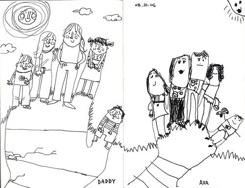
Click on the image to go to its Flickr page. To view larger, click here.
Ava wanted to draw in my sketchbook last week and proceeded to trace out her hand. The next thing I know she's created all these little people for the fingers. It was completely her idea, no parental involvement. She then handed the sketchbook over to me and told me to do the same with my own hand.
I had fun doing this! I might have to do this more often, when I get bored waiting for a render, or something. It was very invigorating trying to figure out how to draw the little characters for each finger.
For the record, Ava told me who to draw. On my hand, from left to right is: Ava's cousin Matt, his sister Naomi, my sister (and their mother) Amy, Ava, Ezra. Ezra ended up looking like some strange little stunted man, worried about being the thumb.
Ava's hand (L to R): Ava, Mommy, Daddy, best friend Stella, Ezra.
I really like these little characters. I'm thinking about getting Ava to help me out in coloring this when I get the chance. And when I do, I'll be sure to post it here. This was a fun little project and hope to do it again with Ava soon.
8.16.2006
Ain't got eyes
"You ain't got eyes to see this yet." --from "Brick Walls," by Qwel.
From Chicago comes this former graff writer-turned-rapper who has some of the deepest lyrics in the underground hip-hop scene today. Qwel's words are intelligent, touching, engaging and always on-point. His lyrics hit you deep in the gut, a full on one-two punch to the mid-section. Nothing like the rap crap that you hear out there on MTV or on the general pop chart, Qwel is raw, hard and incredible. I find his work inspiring, especially in this song, "Brick Walls," where we hear a conversation between him and (we're assuming) his dad as he tries to clue his dad in on his world of hip-hop and graffiti. Where else can you hear the names of Van Gogh and DONDI mentioned in the same line? Qwel has great insight into the art of music, the art of hip-hop and the art of graffiti.
Many times I feel that I don't have eyes to see what's in front of me just yet. But I want to. I tend to approach everything with seeming navïeté, eyes wide open and willing to take it all in. For things that I don't "get" right off the bat, I know that in a couple of weeks, months, years, I will. I try to go back and look at the work with new eyes. And 9 times out of 10 it works; I can wrap my brain around the work in new and strange ways. I feel that it's important for artists look at what's around them with new eyes, even if they don't got eyes to see it yet.
Links:
Galapagos4: music label Qwel's on.
Qwel on Amazon.
8.13.2006
Janet LaSalle's Better Living illustrations
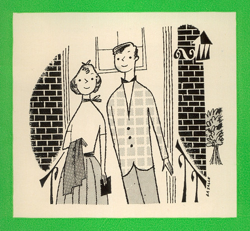
Cover to When Children Start Dating, illustrated by Janet LaSalle. 1951.
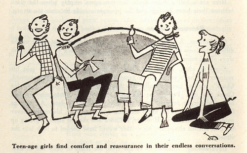
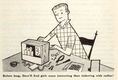
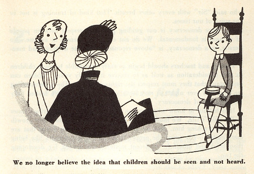
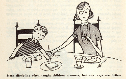
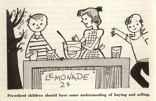
I found two booklets that were part of this "Better Living" series at a flea market several months ago. There were many other booklets in the series, but these two were the only ones worth buying because of the artwork. The name "Janet LaSalle" seemed familiar to me, and when I got back home I realized that I had two books that she had illustrated: Billy's Neighbors and Sound, both of which are featured by Eric in The Retro Kid (thus, I really haven't had the interest in scanning them—maybe later). What I find fascinating about these black & white illustrations is that the look and style are vastly different from the work found in those other books I just mentioned. Whether it may be that the color work was done later (1951, 1952 for the b&w compared with 1957,1962 for the color) and her style evolved, perhaps, I'm not sure—her work in "Billy" and "Sound" is bold and vibrant, with energetic poses and strong use of color. Her characters are looser, more free. Here, she's refined with delicate poses and precise composition. Both styles are excellent—it's a matter of apples & oranges in preference, if you ask me. All it tells me is that Janet had quite a range in styles, and she was highly skilled in whatever style she worked in.
More from When Children Start Dating:
Very angular and stylized linework, Janet's work here features some great thoughtful moments in teenage dating (and children minding their manners in the other booklet). I love her approach to rendering faces as there's just enough emotion through minimal detail. Sign of a great artist.
From Your Children's Manners, 1952:
There's plenty more that I scanned in (total of 19), and you can see the rest of it HERE.
8.11.2006
Growing Toward Peace book
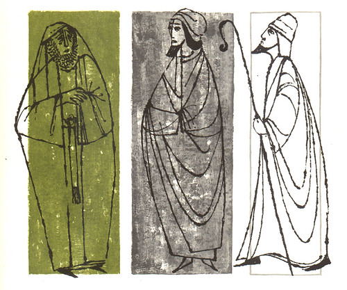
I found this book at a book market several years ago with the simple title, "Growing Toward Peace" in typical Roman letters. It's a book co-authored by Regina Tor and Eleanor Roosevelt for the United Nations and was published by Random House in 1960. Interesting book, talking mostly about all the various programs that the UN has to offer: UNICEF, UNESCO, FAO, WHO, etc. But the main reason I bought it was for the illustrations found throughout. And should I even have mention this?— there's no mention of who did them. (Although there's a slight possibility that it could be Ben Shahn.)
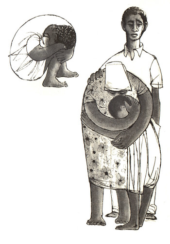
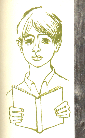
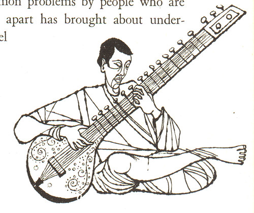
The illustration above was one of the strongest found in the book, of three prophets. (The subject was of peace throughout the ages.) The illustrator has a nice grasp of using simple line to convey emotion. There's a few spot illustrations that really get your attention and they're done in black and white. A second color of green is used sparingly throughout the book, but is quite effective. Here's some more from the book:
I'm not one to vocalize my political beliefs on this blog (there's plenty who do out there anyway), but I do hope and pray for peaceful times soon. Seeing death and destruction day in and day out on CNN and other various news outlets starts to wear you down.
For the insanely curious: the Wife has posted a set of photos from our recent vacation. Check it out here. It was good trip. Good time was had by all.
Oh well. Have a great weekend! I plan on posting some of my own work up soon.
8.09.2006
Ava Thursday: Father's Day crown
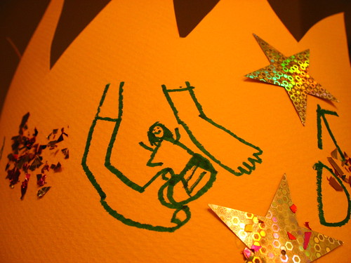
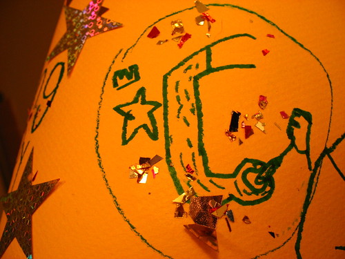
For Father's Day this year I received a fantastic gift: a crown worthy of a king made by a super sweet girl, my daughter Ava. I love this crown. She decorated it herself (Mommy presided) with confetti and shiny stars and wrote "King Dady" all on her own. She then drew everyone in the family drawing themselves all around the crown. I love it. I'm wearing it right now. (You think I'm kidding, but I'm not.)
This is Ava drawing herself by Ava.
And this is me, with my incredibly hairy arm, drawing myself. I do have hair on my arms, but man! I guess to a six year-old I'm Sasquatch.
Get yer linkage here
This is long overdue, I'm afraid. Here's some links for you guys to waste time and to keep you from working.
My pal Jared Chapman has moved his Little Crockpot blog to some fresh new digs. Be sure to update your linky links with the new address: My Little Crockpot. He moved all his posts over from the old one, although all the comments got lost in the shuffle. Too bad. I always enjoyed getting a kick out of reading his comments. Now he'll just have to come correct this go 'round. Represent, Jared.
I've been involved with a massive multi-author blog called Sugar Frosted Goodness, for some time now. It's composed of artists and illustrators and we simply post our work. That's it. We may include some how-to details, but it's mostly a chance to show everyone what we're working on currently. I've been bad and haven't posted anything recently, but I'll try. The great thing about this blog is that it gave me a chance to check out some great fellow artists that I never knew about before. One of them is Von Glitschka, aka Vonster. Definitely check out this guy's work. He takes vector-based artwork to the next level, if you ask me. Another artist on SFG is Josh Cochran. I LOVE his work. He does things with characters and figures that I completely "get," mostly in the linework and the stylized shapes and angles. Excuse me while I wipe away the drool off my keyboard.
Can I say that My House is Cuter Than Yours is probably one of the cutest blogs out there? Mary and I share the same interests in vintage cookbooks and housewife literature, but she takes it a step further by actually COOKING the items in said cookbooks. And she cooks them all in her nifty vintage (and some hand-made) aprons. (She's got a thing for 'em.) I'm comfortable enough with my masculinity to say cute, cute, cute. Another plus for me: Nightmare Before Christmas-themed apron! Enough said.
Flickr-ness:
Groups that are worth mentioning are ticky tacky's and Leif Peng's Mid-Century Illustrated, a group that goes hand-in-hand with my Retro Kid, featuring anything illustrated in the post-WWII years, up until about the mid-60's. It was a grand time for illustrators. See for yourself.
Another group that goes hand-in-hand with Retro Kid is Eye Candy. This group picks up where the Kid leaves off, featuring artwork and illustrations from children's books and the like from the 60's and 70's. I guess you could say that it's an official Retro Kid spin-off.
I mentioned Conelrad in a previous post, but it's worth noting that the man behind the site is on Flickr now.
If you want to check out some Googie (not Google) architecture, check out Googie. For some mid-century modern architecture, visit Mid-Century Modern Art & Design. And check out 1950's Interior Design to find out how to decorate the insides of those mid-century buildings.
If graffiti-covered train cars float your boat, don't miss Painted Trains. Seriously, there's a Flickr group out there for everyone. Blythe, anyone? What's the deal with that doll? I've never seen such devotion to a single doll entity (Barbie doesn't count).
There ya go. Go have fun.
8.08.2006
And we're back
It's been a bit hectic since we've returned from our vacation that I completely forgot to mention it here. The family is back and safe from our trip Sunday night, however, we are definitely missing the beach and pool. Would love to go into more details about our vacation, but I do have obligations here at work. Not to worry! We took tons of photos and plan to upload most of them soon. Between me and Andrea I'm sure you'll get your fill.
My Hands, illustrated by Aliki, 1962. Posted by Eric Sturdevant.
I've been meaning to post about this, since it concerns my Flickr group, The Retro Kid: several months ago I accidentally changed the status of the group from public to private. Only members could view the images—the only way to join was to get an invite from one of the members. You'd be sent to a broken link page if you clicked on a link to the group, and all the RSS feeds were distrupted. I never liked this because I've always felt that all of that wonderful artwork from that time should be seen by everyone, not just a select few. After much deliberation I decided to start up a new public Retro Kid, open to all. Please note the new url address, and please update all your links: Retro Kid. We are in the process of transferring all the images over into the new group, so please be patient. In the meantime, check out the new stuff that our loyal members have been posting recently. Excellent work that has been forgotten throughout the years, ready to be admired by a new generation.
One thing that I, along with some of the other members have noticed about the move to the new Kid is that it's been very cool to rediscover the illustrations and artwork all over again. Kinda get complacent when you have a big group like this, so it's been nice to be inspired a second, third, even forth time.
Maybe I'll move the Retro Kid every year to keep us all on our toes.
Nah. Don't think so.
8.04.2006
Vacation
Just hanging out with the family on a much-needed week-long vacation. This has been the best thing for us after working on that crazy attic and right before we make the big move to a new house. Yes, we did find a house! A lot of time and thought was put into it, but we think we've found the right place for us. The big kicker was that the house lay right on the border of Ava's school district, so Ava can go to the same great school that she entered last year. But more on all that later. Right now, I'm going to get burnt and go check out one of those cheesy beach stores—the ones where you enter by going through a big, toothy shark mouth. Nothing but the best for my kids.
Subscribe to:
Posts (Atom)