
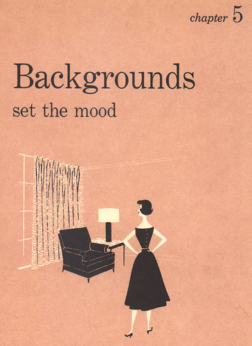
Check these illustrations out from the Better Homes & Gardens Decorating Book, 1956 edition. I got it off of eBay when a saw a co-worker's copy on her desk at work. She had an edition with a nicely illustrated cloth-bound cover, but the version I have has a simple turquoise cover. No biggie, as all I really wanted were the great series of illustrations found on all the chapter dividers. Wonderful yet simple stylized characters done in a two-color process, very typical of spot illustrations at that time. The sad thing is, however is that there is absolutely no credit given to the artist. I searched throughout the entire book but couldn't find anything. It's a shame, really.
UPDATE: Mystery solved!
One thing I find interesting, the photos of rooms throughout the book gives us a great insight into what was happening in home decorating at that time. Of course, all the rooms shown were more of an idealized version of the plain-jane reality that was probably true to the typical modern home of 1956, but it is still fascinating to see what trends were strong, what colors were in vogue, what furniture styles were big while thumbing through this book.
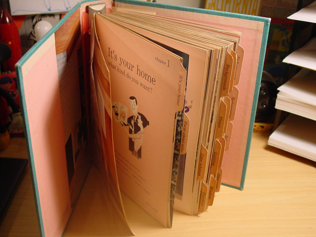 But it's all about the illustrations for me. The book is actually a five-ring bound notebook sectioned off into chapters, with sturdy paper dividers tabbed for easy access. It is on these dividers where these fun illustrations reside. The characters are simple, but effective in telling the story for each chapter topic, whether it be for choosing color schemes, glamorizing your floors, or lighting up your rooms with the right lamp. I would have to say that the images are deceptively simple because the more I look at them, I begin to see just how sophisticated the artist was in executing each scenario. The layout, the placement of the furniture, the poses of all the characters are done with finesse.
 I'm posting just a few of the illustrations here, but I have the entire set scanned and put together in a Flickr photoset. You can check them all out HERE.
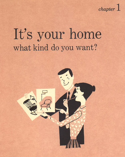
Notice here that the two choices of chairs the wife is holding up represent the two major decorating styles of choice that were at issue at the time: Conventional and Modern. (In this book, they describe the two styles as Colonial and Contemporary, but I've seen several variations on these themes, and they all pretty much mean the same thing.) A slight generalization here, I'm sure, because there were many, many other decorating styles that popped up around that time. But from what I've seen and read in many home decorating magazines and the like (including this particular book), a good many articles focused on talking, discussing and debating about these two opposing decorating patterns: which one was best for your home, the pros and cons of each, how to mix and match to make every family member happy, etc. It's a very fascinating thing to read and look back on.
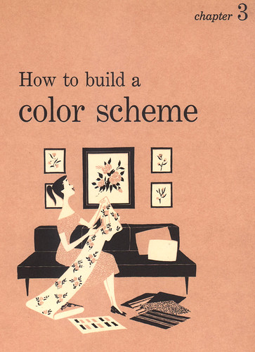
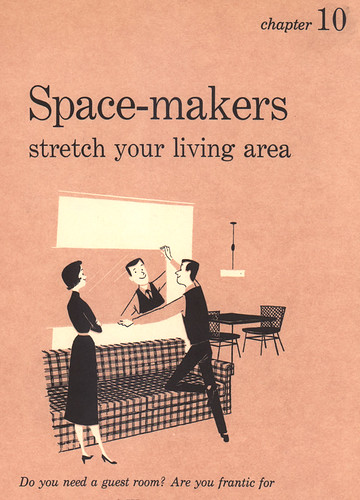
The above two pages showcase the artist's great sense of positive and negative space, giving off the impression that there's more to the illos than the limited use of two spot colors, white and black. By incorporating the background color of pink, a third color can be implemented. Looks easy, but it is very difficult to pull this off, believe me. There's this uncontrollable urge to draw everything out in black line and then fill in with white, because that comes natural to any artist. It's what we've been doing since we could pick up a crayon. There's more thinking that goes into illustrations like these, and in order to make it look so easy without any hitches -- well, that's the sign of a great artist.
Oh, and I have to say that the standing pose the woman hits in Chapter 10 is brilliant. There's a great sense of weight and proportion to her that is just perfect. The artist did a great job in conveying her standing with weight shifted over to the side, contrapostal, I believe.
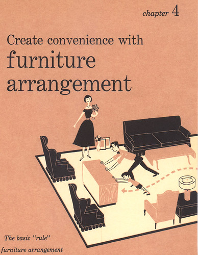
The artist was a great draftsman, too. Look at the layout and overall design of this room. Thre's some nice stuff going on in here. I especially love how the woman is definitely in charge here. Looks like she's really getting into it!
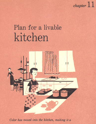
Yes, she's in the kitchen, but now with style.
Again, to see the rest of the images from this set, check them out HERE.
-------------
Like I've mentioned before, I'm currently painting a mural for Victory Vintage Home, in Decatur. I approached the owner, Lee, about perhaps enlivening up the back wall behind her store because she had this area that was simply perfect for a mural -- not too big, not too small. Plus, it's right next to a main road, with many cars passing by, most of which will be stopped because of the traffic light right there where the store is. Perfect opportunity for adding on to what the store is all about.
Instead of doing something original, I thought it would be a great idea to incorporate, or rather, reuse illustrations from the Decorating Book and duplicate them for the wall. Since Victory Vintage sells furniture and items from the 40's to the 70's, and most of what Lee sells is modern by design, these illustrations were perfect! When I showed her my proposal with the images photoshopped over photos of her back wall, Lee just about flipped.
It's been an interesting thing to duplicate large up on a wall what was originally meant to be viewed in a smaller scale like a book. The images so far transpire really well. Bold lines and color help. It's taking me a while to work on it -- finding time outside of work and family business is very rare and fleeting -- so BIG props to Lee for being so patient with me in all this. I'm having a blast with it so far -- that is, when I do manage to eek out the time to paint. If anyone in the area would like to check it out, stop by the store at 303 E. College Avenue, just across from Agnes Scott College.
Some details about the mural:
I picked out three images to use for the Victory wall, most of which will remain unchanged, but with a few alterations to fit for space. Here's what I chose:
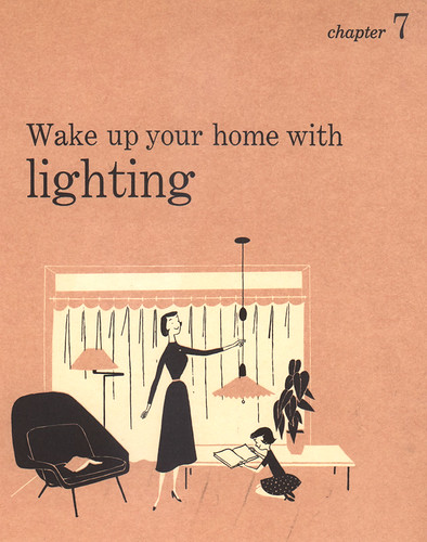
This scene will be virtually unchanged.
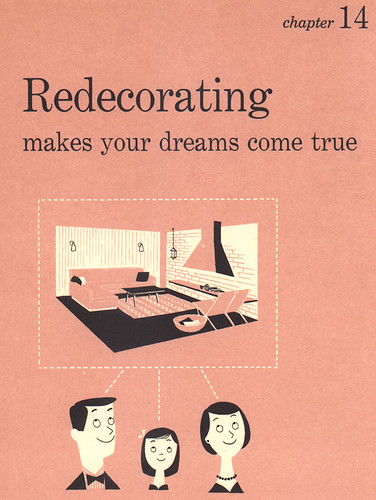
I love the floating heads of the family here, so they will be in the middle of the mural. Plus, I'll be painting "Redecorating: making your dreams come true" right above them.
This part will be at the far right of the wall, with the woman moved a bit to utilize the space better.
And here's part of the wall so far. I've since added on to much of it, but this'll give you an idea of how it's coming along:
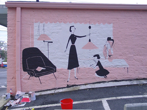
I added a nose to the mother there -- for some reason it looked better. I've finished the girl since this photo was taken.
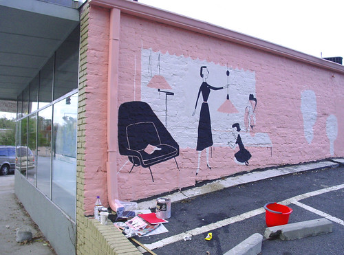
Another shot of the wall. You can see where I've painted the white for the family's heads in the distance there.
Try to stop by and check out the progress when you can! Offer me some hot coffee to warm my freezing bones -- it gets pretty cold and lonely in the back there.

A neat Mural!
ReplyDeleteAnd yes, indeed —you have chosen the best part of the year to paint outdoors :-)
I can't remember how I got to your page.
ReplyDeleteI just remember that I have to drop by at your blog once a day. All the retro pics are wonderful.
And today, I learn a lot with this decorating illustration.
I wish I could see the real wall painting:-)
Keep up the good work.
*gasp* that book! oh my! your mural- wow!! i can't wait to see it when you're done! ♥
ReplyDeleteI have that book too...saw it somewhere, had to have it! Isn't Ebay the greatest?
ReplyDeleteAs for the illustrations--heh, that's why I bought it too(as well as just being a fan of period design--check out some of the House Beautiful issues from the same period-wow); it's wonderful to see you celebrating the unknown artist and those murals? What a great idea(god, do I ever sound the slavish fan or what?)! I wonder who they were, and where they are if still alive...can you imagine how they'd feel to read your post? Or perhaps they'd consider it "just work" a la the feelings N.C. Wyeth had towards his commercial income? I wish we could find out. Drawn should cross-post this!
And btw your painting looks fab! : )
LOVE IT! Looks great Ward! what an awesome opportunity to compile the things that you love! I'm especially glad you kept the original color of the retro book.
ReplyDeleteGee Ward, this is such a SWELL mural! Wow - you are my hero! I don't know where I'd be without eBay (nor do I want to know where my bank account would be at either...). Thanks for showing!
ReplyDeleteThe mural looks great - perfect images to use for this store. I can't wait till I have an opportunity to drive by and take a look.
ReplyDeleteThanks for posting these amazing images from the magazine illustrations. I love the monochromatic tint and the sleek 50s character designs.
i'm flipping too!!! WOW! so so so very cool cool cool! the book, the illustrations, the amazing outcome of this mural! the words, "great job" are just not enough!
ReplyDeleteI drive by that mural everyday! It makes my short commute to work even more pleasant.
ReplyDeleteawwww! i wish i could send some hot cocoa through the monitor~*guh*~too messy!
ReplyDeletei love murals! the satisfaction that comes from the large scale is grat, and...have you noticed people walking/driving by have so many different reactions? have any passerbyers stopped to talk to you too? i found that stopped me from painting a lot ~ headphones and earmuffs can help :)
ok, going to check out flickr to add these pics as favs, i love the color scheme...awesomeness!
mGee whiz, those are swell illustrations - and that vintage store owner is lucky to have such a neato mural on her building.
ReplyDeleteExcellent mural and interesting to see your progress. Good luck with it and stay warm.
ReplyDeleteOddly enough, I've been reading your blog for a while and am happy you're the one working on Lee's store.
ReplyDeleteIt looks great!
- Chris (the drummer for one of Lee's bands)
I wanna live in a duotone pink house like that...with my own dreamy husband.
ReplyDelete...maybe we'll adopt a little girl like that, too. She'd come in handy for cleaning and dusting.
Thanks for giving me hope for my dream home!
And now, seriously, here's a compliment:
You are an incredible muralist. I miss my old apartment's grafitti.
I'm so proud of the work you are doing. each time I drive by it, I feel such a gush of pride. there's something so pleasing about the pink, the clean black and white of the characters... it's just so good, ward.
ReplyDeleteThanks for all the nice comments on the mural, guys! And Chris, that's really cool that you just happened to read my blog not knowing that it was me doing the mural. Weird cowinky-dink, huh?
ReplyDeleteJustin, your dream my soon come true one day, my friend. But just to let you know, Ava is currently busy cleaning and dusting our little abode. Sorry! And thanks for your compliments. Me all blushy.
Andrea, I knew you'd like it. Something for you to enjoy every day that you drive by it. With much love.
I was in Decatur over Christmas and stopped by to see the mural. Cool stuff. The store keeper told me she loves it. Good job, Ward!
ReplyDeleteI took a photo of it here:
http://www.flickr.com/photos/mrblank/83557300/in/photostream/
I love your mural! I have that binder book also. My fav divider is the 'Take advantage of dollarsavers'. Only my background is yellow not pink...
ReplyDeleteWhat a "neat" project!
ReplyDeleteThe mural looks great, nice work!
ReplyDeleteThe mural looks amazing. It's very well done, my congratulations go to the artist as they should really be proud of this work!
ReplyDeleteWell done, your mural looks amazing! I wish there was someone who would take the time to liven up my neighbourhood with something like this.
ReplyDeleteI love this mural, well done. It's obvious that a lot of thought and work has went in to it but i think it's safe to say it's paid off in the long run.
ReplyDeleteThat's gorgeous. I found a copy of this same book at an antique store a couple of weeks ago and had an idea I might scan it and ridicule it (a la It Came from the 1971 Sears Catalog or the Lileks Gallery of Regrettable Food), but I thought I'd better Google it first to make sure nobody else had the same great idea.
ReplyDeleteSpeaking as an amateur muralist, I think your decision to reproduce part of this hilarious book on your friend's wall is utterly brilliant. What an awesome project.
As a fan of period design, I go to bootfares every weekend on the hunt for old period books - you'd be amazed how many old books are available for pennies every weekend.
ReplyDeleteLike Jenny, I also trawl through ebay daily to try and pick up some bargains, although I have still to come accross the better homes and gardens decorating book, 1956 edition, but I have seven other books in the series from the 60s and 70s. Also thanks to Emily for her links in the comment above.
Fantastic mural! I've searched the net for this book and eBay has once again helped me out!
ReplyDeleteThank you!
Just a little note to say that I've ordered the book and it's on its way! I'll let you know when it arrives and how I get on.
ReplyDeleteDoes anybody know where we can see more real life examples from this book? I've searched on google but to no avail!
ReplyDeleteMy sister would really love this book and it would make her day if I got it for her birthday.
I've been unable to find the original 1956 edition of the book but thanks to google I've bought the 1968 edition, and after some research it appears that there aren't too many differences.
ReplyDeleteSo if you're interested in the 1968 edition you'll find it on ebay, here is a link for all of you who are interested -
http://cgi.ebay.co.uk/RETRO-DECORATING-BOOK-BETTER-HOMES-GARDENS-1968_W0QQitemZ190171987194QQihZ009QQcategoryZ69854QQcmdZViewItem
I hope this useful to you all.
This post really highlights the changes between the 50's and present day, yeh?
ReplyDeleteI think if this book was released now somebody might get shot haha.
Anyway, this is a great project. Have you done any more since?
WOW. I love this!
ReplyDelete