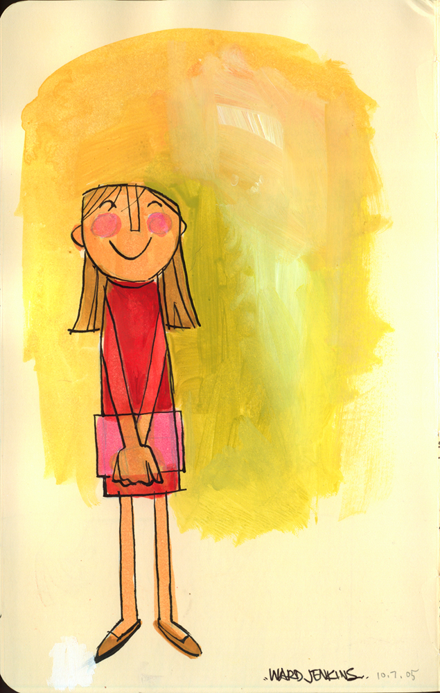
I love Halloween. I was one of those kids who really got into this fun holiday. I mean really got into it. One year, I made myself up as a skeleton-like zombie, with a paper maché eyeball hanging from my taped-shut right eye. I found some old clothes that I had grown out of and ripped open holes, tattered the edges and dabbled fake blood in all the appropriate spots. In order to give off the impression that I was a 'complete' skeleton, I even had my mom buy me some black tights and painted white bones that would show underneath the ripped holes in my jeans. I then walked around the neighborhood with a fake rubber hand (which I affectionately called "Hans") asking for candy. I was hard core, man. (Throughout the years, you would find Hans left in the freezer occasionally to give my mom and sister a little jolt in the morning. Just to keep them on their toes.)
I loved Famous Monsters magazine. I once got in trouble for reading the magazine during class. It was one of those classic confrontations in grade school where the teacher stopped the class and asked me to bring what I was reading up to her. I can't imagine what she thought when I handed her issue #158, with ALIEN on the cover. I'm surprised my mother wasn't called immediately.
Ah, but it was all in the name of good ol' fashioned fun. I loved all the horrific creatures and blood-soaked walls of the horror genre. There was so much originality and creativity put behind all those films -- I guess that's why I was so drawn to all of that. There was so much creative energy put into each film, and all just to scare the pants off of me. Even as a kid, I knew it was all fake. Those films and creatures all frightened me to death, but I loved it so. Isn't it funny how that works? Why is it that we are so drawn to what scares us?
So, yes, I love Halloween. It's all about having fun and the thrill of being someone (or someTHING) else. Good-natured heebie-geebies -- no satanism or demonic gooblety-gook, mind you. All about having a great time spooking and being spooked.
To put you all in the mood, I wrote a two-part commentary on one of my favorite animated films, THE NIGHTMARE BEFORE CHRISTMAS, late last year. I felt compelled to write about the film after watching it multiple times with Ava and realizing just how well it held up after 10 years. I kinda went overboard analyzing NIGHTMARE, but it was worth it. Click here for Part 1 and here for Part 2. Hope you enjoy.
Have a great Halloween!
10.31.2005
10.29.2005
Blog in the family
You are all well aware that my beautiful and talented wife has a blog, hula seventy. And I've mentioned a while back that my sister-in-law also has a blog, Lulu's World (she's married to Andrea's brother, Nate). Now, in my Things post, I spilled the beans that there were two other family members who blog:
My sister, Amy, is big Alias and Lost fan, thus she's spawned The Evil Puppet Masters, a Bad Robot newsblog. Bad Robot being JJ Abrams' production company. Yes, the same JJ Abrams who created Alias and Lost and who is currently directing MISSION IMPOSSIBLE 3. To prove just how much of a fan she really was of the shows, she decided to start up an official fansite for Bryan Burk, executive vice-president of Bad Robot, and executive producer for Lost. Yeah, I know all this sounds so geeky, but geekiness runs in the family, I'm afraid. Amy has become quite the devoted fan who happens to have connections. (Don't believe me? Just click here.) Amy tells me that there are many people out there who would love to be her friend. I'm sure that's no lie.
Lotus Geek is the perfectly titled blog started up by my cousin Rocky. The blog is devoted to anything remotely associated with Lotus Software, but Rocky somehow manages to include snippets of his hectic life in there to soften the blow. Like I mentioned earlier, he's written books on Lotus, like this one and this one. It doesn't surprise me that Rocky would be so completely immersed with computers. Back in high school, he was a member of the Computer Club, of which he tried to convince me to be a part of. I did try my best to get involved, but I wasn't digging all the code you had to put in just to make little square dots look like snow falling for a computerized snow scene. It was crazy. I was outta there.
So, uh... yeah, I wasn't kidding about the high geek factor in my family, was I? The cool thing about Amy and Rocky is they both know that they are geeks. They've come to terms with their geekiness, and now fully embrace it.
And I'm right there along with them.
10.27.2005
Ava Thursday: At the farm
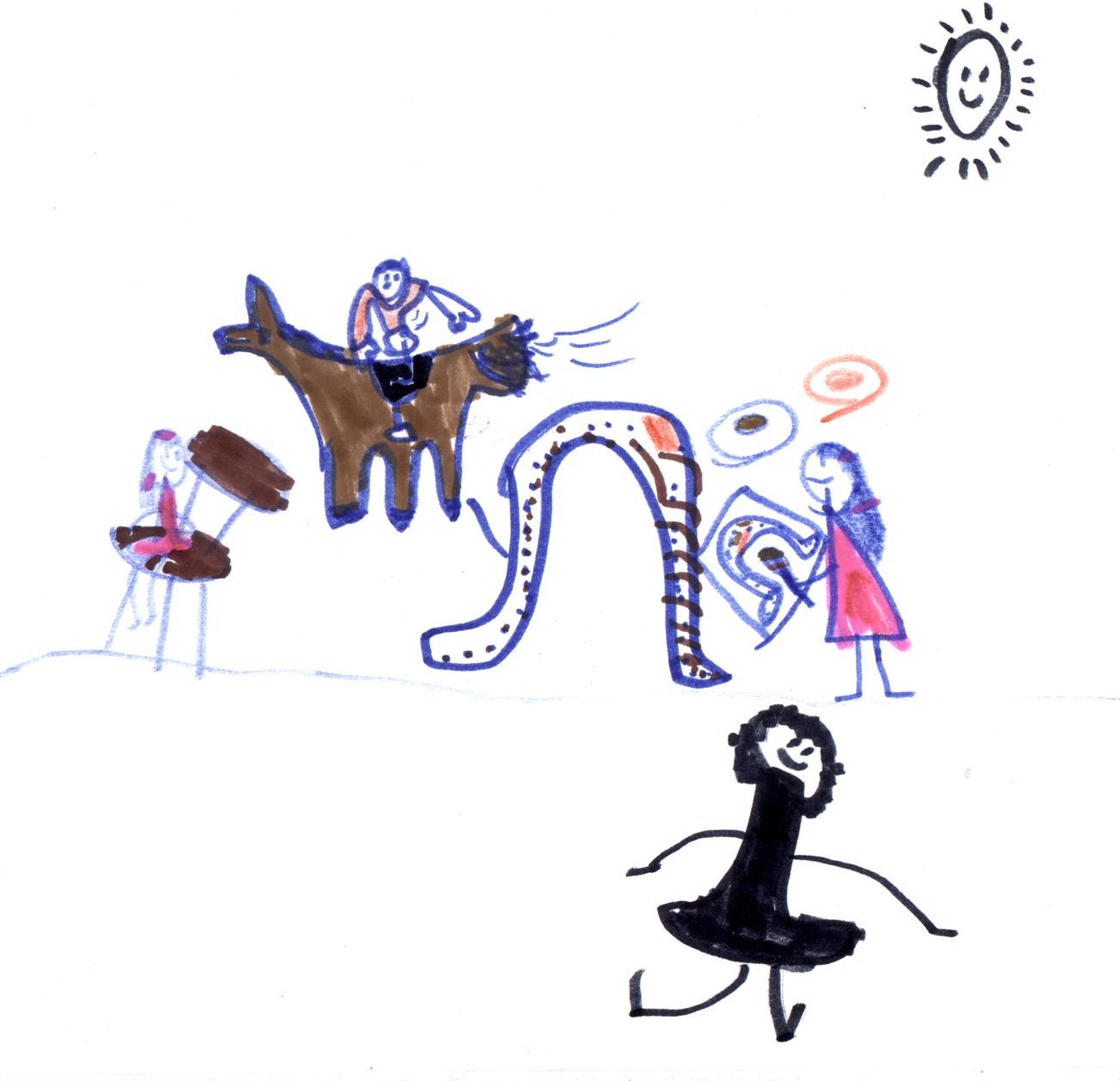
Ava drew this last Sunday while at the Buckhead Barn, this horse farm right in the middle of the suburbs of Atlanta. They have a polo club, too. We were there for this fall gathering for my mom's company, where they invite the whole family to come down to have loads of fun and eat loads of food.
There were horse rides, hayrides, games and all sorts of arts & crafts for the kiddos. Ava got to ride on a horse for the very first time (she'd ridden a pony a few years back), and she was so excited -- although you would've never known it, because of her quiet nature. She's funny like that.
So, in the drawing here, that's Ava painting a horseshoe (it was part of the arts & crafts), with Ezra riding a horse -- however, I can attest to the fact that he never got on one. I think. That's Ava's friend Stella, at the bottom of the page there. Not sure who that is over on the left in the chair. I'll have to check with the artist and get back to you on that.
A fun drawing that perfectly documents all the fun we had on that great autumn day!
(As always, you can click on the image to view it in my Flickr, whereupon you can click "All Sizes" to view it larger.)
10.24.2005
Things
There are many bloggers out there who do that 100 Things meme, where they list 100 things about them that the reader didn't know (and in some cases probably didn't want to know). I'm not going to go that far. Some people are very good at it, and can make it actually interesting to read. Me, on the other hand, not so sure. So, I'll approach this a little differently. I'm going to list a couple of things that may or may not interest you, may or may not bore you. If you'd like to know more about any of the items listed, let me know and I'll go into more detail on said item in a future post. (This is just to pass the time while I continue to work on my Ottawa installments. Procrastinating, is more like it.) Here goes:
1. I had no cavities until my mid-20's, even though I would eat sugar (and powdered sugar) by the spoonful when I was a kid.
2. I used to wear hard contact lenses when I was in sixth grade. Not fun to put in, believe me.
3. I have a younger sister. She and I are polar opposites when it comes to personalities and interests, but somehow we make it work. She blogs, too.
4. I've broken only one bone in my entire body: my collarbone. You know you can't set that bone correctly? Ever?
5. Andre 3000 once held Ezra up in his arms, while he was fussy in a bookstore.
6. I have a cousin who also blogs. He's written books on LotusScript, Lotus Notes, and Domino. He's a genius, I'm told.
7. I swear, if I had the chance, I would drink my weight in Coca-Cola. In one sitting.
8. I ran a marathon once. I didn't finish it. I was 14 at the time.
9. Throughout my 36 years here on earth, I've witnessed three births and one death. All family members.
10. While throwing papers at 4am, I was shot at by a man in a small truck with a .22 caliber pistol.
11. I love McDonald's Egg McMuffins. I like to wait to have my favorite fast food breakfast item on Friday morning, as if it's some sort of prize for making it to the end of the week, or something. "I'll have the No. 1 with a Coke. And a cinnamon roll."
12. I am the worst procrastinator and will get easily side-tracked, even if I'm right in the middle of sentence while talking wi
13. Back in the day, I still would order just vanilla at Baskin Robbin's 31 Flavors ice cream shop. Too many choices! Too much pressure!
14. I once was called "that little white dude" on air, by Charles Barkley.
15. In college, I drew a weekly comic strip titled, "Urban Diary," for the school paper. It lasted only about 8 strips.
16. My first real crush was Lori Boatright, grade 5. Because I knew that she would never give me the time of day, I drew a picture of us amongst an ocean and a beautiful sunset. I was so dorky.
17. I love the smell of cut grass. It reminds me of my childhood.
18. I never attended middle school. We went straight from elementary school (1st through 7th grade) to high school (8th through 12th). Talk about being dropped into the belly of the beast. Eighth grade was a very trying year for me, considering that I was your classic, grade-A GEEK. (And did you know that the 8th grade was considered "Sub-Freshman?" Upper-classmen loathed us and called us "subbies," in a derogatory way. But we loved that term and used it to our advantage. I don't know how, but we did.)
19. Because I was a big Prince fan, our whole family went to go see PURPLE RAIN when it came out the summer of '84. Yes, I know it was rated R. During that big love scene, if you happened to have looked over at me in the theater, you would've found me slowly sinking down, down, down into my seat out of embarrassment.
20. I've always felt years younger than I really am.
10.21.2005
Fun Vintage Commericals
By now, you should know that I'm a big fan of 50's illustration and animation design. Not only do I love children's book illustrations from that decade, but also love the artwork done in ads and commercials, especially the animated ones. A couple of years ago I was assigned to direct a spot for the Boomerang network, where we were recreating the look and feel of old commercials but with Hanna-Barbera characters put into them. We even were allowed to redesign the classic HB characters to fit the style, which is practically unheard of when it comes to network icons. I chose the 1950's, of course (with Quick Draw McGraw), and I went on a mad hunt for any and all animated commercials from that era. We had a tape at Primal with a great collection of vintage kids-related commercials, and for resource I sat down and grabbed as many frame grabs as I could from the tape. I couldn't stop, I tell ya. I got so into it, I literally had to pry myself away from the monitor at the end of the day.
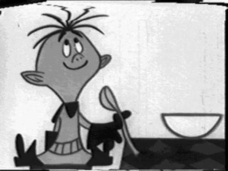
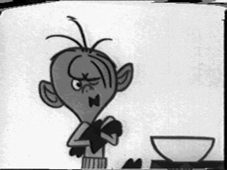
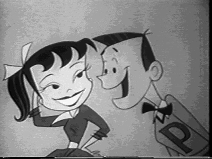
Out of my extensive research, there were a couple of spots I really enjoyed that had a fun look and great styling to them. I've put some of my favorite frame grabs from these spots into a new Flickr set titled, Fun Vintage Commercials. Here are a few highlights:
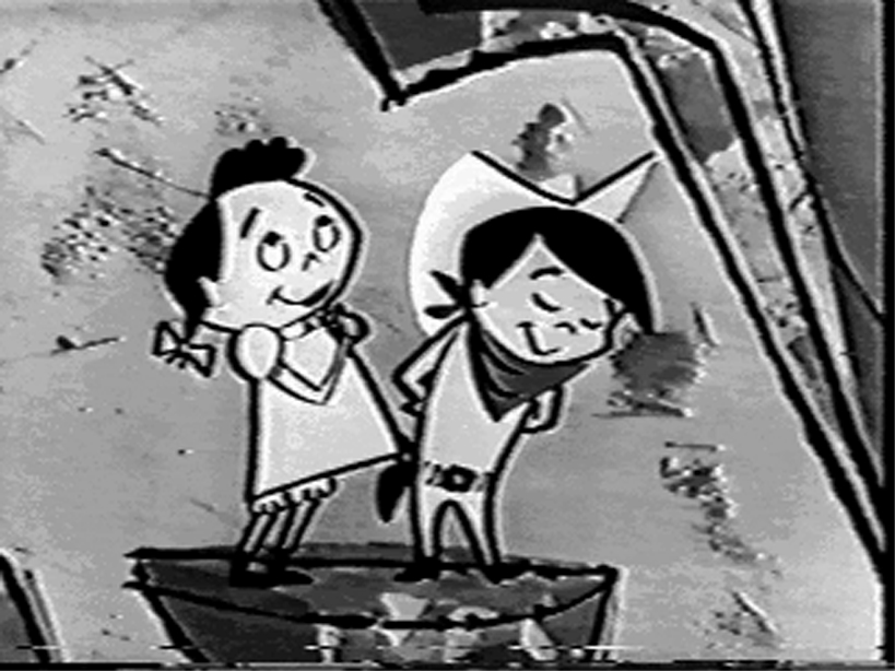
I Want My Maypo became one of the most popular commercials of that time, all thanks to the infamous tagline belted out by the "Maypo kid," shown here. It aired in 1956, with John & Faith Hubley doing the production, and Emery Hawkins, a former Warner Bros. animator, doing the animation (you can read more about Emery HERE). I love the design of the kid -- you can see why I chose him to be the icon for The Retro Kid, the Flickr group I started. Another bit of trivia, this spot is briefly seen in Brad Bird's THE IRON GIANT, when the Giant's hand is watching TV.
Pepsodent's The Yellow Went was one of the earliest TV spots that was aimed at marketing to a growing teenage market. The zippy animation and editing help this 60 second spot seem like it is only half that long. And guess what? The animation production was done by Tex Avery. Oh, and the jingle was pretty much a big deal too, with the "You'll wonder where the 'yellow' went, When you brush your teeth with Pepsodent!" running around in the heads of many in 1956, when it first aired. I have to say that Suzi, the girl in the spot, has one of the swingingest walks ever recorded on film. Check out the other frames I grabbed from the spot, and you'll see that teenage boys will do anything to get the attention of a cute girl.
I don't know the title to this spot, but The Cheerios Kid was introduced in 1953, along with his female pal, Sue, to promote the energetic possibilites of eating a bunch of little o's. This particular spot aired in 1955, with the character and background design done by TOOT designer, Tom Oreb. I love the way the mountains and how the waterfall were depicted, with everything very stylized and very angular. Fun animation, too.
Check out the set to see more images from these wonderful TV commercials. (And by the way, I plan on updating this set periodically, so be sure to check back often.)
10.20.2005
Ava Thursday: Mommy and Ezra
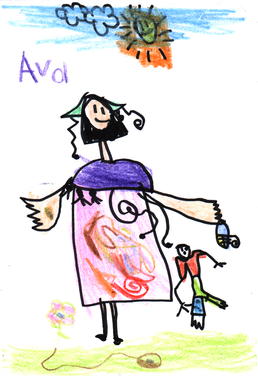
Ava's been on a drawing tear recently, and whenever this happens, new developments are sure to be evident in her work. She drew this the other day. It is of Mommy and Ezra, out for a walk on a nice, sunny day. Ava tells us that Mommy has a "pretty little hat with special things that hang off it." She's particularly proud of the colorful swirly pattern on the dress there. In Mommy's hand is a "rainbow seed that grows rainbow flowers," she tells us. Now, who wouldn't want a flower like that? On the ground is a seed with a flower sprouting out from it. (I thought it was one of the "rainbow flowers," but I was wrong.)
Not only are Ava's attention to details impeccable (the hat, the tassles on Mommy's poncho, the fun swirls in her dress), but I notice that she's trying something out with the arms and hands. When Ava usually draws hands, she draws them as simple three-fingered stick-like hands -- generally when she's drawing on a whim, not ready to tackle the difficult task of drawing out all the fingers, and such. But here, Ava focused more on the thickness of the arms, hands, and especially, the fingers. Notice that there are five fingers on each hand. This is something new in her artistic development, in my eyes. She's thinking about volume and density here.
But why would she slight Baby Ezra in the finger department over there on the right? My guess is that he's smaller, therefore the details of the fingers would've been very difficult to render. But I do enjoy all the details that's she's given him still: the way that his feet have a few toes, and especially his blue cast, complete with doodles (we all signed and drew on his cast before it was taken off).
A fun, cheerful drawing. Makes me happy.
10.19.2005
Drawn! on Attack of the Show
TiVo alert: Drawn!, that über-cool multi-author illustration/comics/animation/art blog-thing that I'm a contributor to will be mentioned on G4's Attack of the Show today, 7pm EST/4pm PST, with repeats at various times throughout the week. The blog's creator, John Martz (aka Robot Johnny) will be on the show to talk about Drawn's recent posts, the contributors, and various other geek-related stuff, I'm sure. Support!
10.18.2005
Poncho hair
I work close enough to home that I'm able to eat lunch with Andrea practically everyday. It's a much-needed break from the harsh deadlines and assistant interferring that ensues throughout the rest of my day.
Yesterday we had to swing by Ava's school because I had forgotten to put her milk money in her lunchbox. Andrea and I knew that they would allow Ava to get a milk anyway and to put it on her "tab", but it gave us an excuse to see Ava at school, see how she's doing and see her interact with her friends.
When we pulled up to the school, all the kids were outside for recess. Apparently, since the school is going through some renovations -- including the playground area -- recess right now is basically all the kids hanging out in front of the school, running around and chasing one another with no elaborate jungle gym to climb on, fall off of -- no big objects to play on or hide behind (a few trees, maybe). Just a big bunch of kids running around left to their own devices. The teachers are watching all this mayhem, of course, but it's quite a peculiar scene if you don't know the backstory.
We sat there briefly to watch the loud and wild scene. I tried to locate Ava but couldn't find her. "Where is our girl?" "I don't know... you don't see her?" "No."
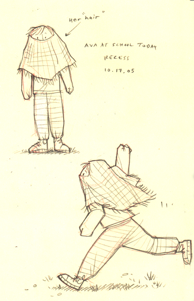
Just then, Andrea caught a glimpse of magenta flying through the little people. "There she is," Andrea said with a chuckle. I looked and saw a bright red shape moving about the crowd, arms stretched out wide, like an airplane. It was Ava and she had her magenta poncho covering her head, with only her bright little eyes peeking out through the hole. This was her "hair," she told Andrea. She had pulled her sleeves down to where she covered up her hands, which were firmly gripping the sleeves tight. This is what she looked like:
When Andrea walked up to her, Ava jumped up into her arms and gave mommy a big ol' hug, never taking the poncho off her head. When she had enough of mommy-love, she immediately got back down and instantly took off, tassled poncho hair madly blowing in the wind.
Ah, to be a kid again and not worry about social graces or being "normal." I was only a little concerned about Ava's social interaction with other kids before yesterday, but now I'm terrified.
Honestly, I do kinda like the idea of grabbing a poncho and putting it on my head all day at work. I really don't think anyone would notice.
10.14.2005
Moleskine fun
I've received my first Moleskine recently, and I'm a new convert. I love the thing. What is it about a nice compact little sketchbook that can take watercolor and goauche and acrylics without buckling the paper to no end? There's something about the convenience of the little 5x7 blackbook that actually makes me want to take it everywhere I go and record everything I see. Within my constrained little world that's a big thing. Oh, and you gotta love the nice elastic binding that keeps all the pages intact.
So here is an experiment -- just trying something out, with india ink and gouache, seeing what works or not. (Click on the image for a closer look.)
And with all things that have a following, there's a Moleskine blog called Moleskinerie, with the accompanying Moleskine Flickr group.
So here is an experiment -- just trying something out, with india ink and gouache, seeing what works or not. (Click on the image for a closer look.)
And with all things that have a following, there's a Moleskine blog called Moleskinerie, with the accompanying Moleskine Flickr group.
10.13.2005
Ava Thursday: She has a boo-boo
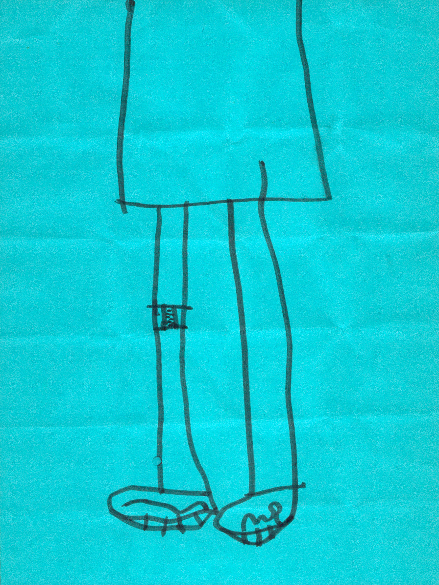
I am so digging this drawing. As with all of Ava's drawings, there's a story here, albeit a short one. When I asked her to tell me about this drawing, she said, "She has a boo-boo!" That's it.
I love the composition, where we see only the bottom half of the subject. No need to see the girl's face or arms -- just the main point of focus: the band-aid on her knee. And don't you just love the sneakers? I do too.
There's something in this drawing that really appeals to me. The way Ava drew the dress down from off the top of the page, and how the legs come straight down -- I dunno, there's just something about the execution of this that makes me realize just how proud I am of my daughter. Yes, I am the stereotypical Proud Father, but I think I have every right to proudly showcase my girl's artwork to as many people as I can. She is my girl. My one and only Ava, with whom I share a special bond. She is like no other, and I am so happy to have her in my life.
10.11.2005
Ottawa Animation Festival: Part 2
This is the second installment of my trip to the Ottawa International Animation Festival 2005. If you missed it, click here for Part 1.
The Ottawa International Animation Festival has something going on all the time. Some of the main screenings and workshops are scheduled every two hours throughout the day: 9am, 11am, 1pm, 3, 5, 7, and 9. Basically, there is maybe 30 minutes in between screenings to get to the next event, or maybe to grab a bite to eat. I emphasize the word MAYBE because more times than not I had no time at all to break for food.
By the time the Shorts Competition 5 ended on Thursday night, I realized that I hadn't eaten since early that morning. That was about 8am. I was getting real cranky and listless. Between the spots before my eyes, I was able to make out the fuzzy shape of a Pizza Pizza fast food establishment across from The ByTowne Cinema. I ate as quickly as I could and then headed back across the street to check out the next screening. (I got real lucky for my first night in Ottawa having practically all my screenings at the same place -- right next door to my hotel, no less! Sweet.)
Feature Competition: Empress Chung
Not worth it. I'm sorry, but this animated feature from Korea held such great promise with me -- I should've known by now that a pretty still frame does not a great movie make. The image I saw in the Festival guide is the one shown to the left there. Nice character styling and colors, right? Well, this character maybe, but the same cannot be said for the entire film. It started off great, with a nice intro, complete with warriors and a heart-wrenching sequence of a family in peril, but then the film went downhill from there. When odd sidekicks were introduced, like a turtle and a goose, I lost interest. Then the underwater sequence -- WHAT??? It got very fantastical and cutesy on us, completely ignoring the seriousness of the opening. Too bad. It could've been a good story.
I got to see this with Roque and his wife. Roque fell asleep. My thoughts exactly.
Afterwards, I had planned on going to the Gianluigi Toccafondo Retrospective, but decided to stay and watch the next Short Competition, which was starting up at the ByTowne. I swear, what a convenience this place was for me. Outside, while waiting for the screening to start, I ran into New York animators Pat Smith and Signe Baumane. Pat and Signe are part of the New York indie animation scene, an active and lively bunch of filmmakers who crank out short films on a continual basis. They rounded up several of these animators and artists together and produced a DVD compliation that ended up being one of my favorite finds from last year's Festival, Avoid Eye Contact. This year, they came back to Ottawa with a second volume, and you just know that I was excited to get my grubby hands on that one as well. There's some fun and wonderful stuff to be found on each volume, with work from Bill Plympton, George Griffin, John Dilworth, Mo Willems, Fran Krause, Pat, Signe and many others. I highly recommend these DVD's. You can order each volume HERE.
I met Pat last year at the Festival and we kept in touch with each other throughout the year. It was like we were old friends when we saw each other, complete with a we're-comfortable-with-our-sexuality-male-bonding-embrace. After our very special moment, Pat, Signe and I all made our way into the ByTowne for:
Short Competition 2
This was an interesting screening. A good group of shorts and films, with a solid amount of talent featured. Here are some highlights:
Lemony Snicket 'Littlest Elf' directed by Smith & Foulkes for Nexus Productions. What a fun intro to LEMONY SNICKETS: A SERIES OF UNFORTUNATE EVENTS! I had not seen the film, so watching this little bit of stop-motion-esque homage to Rankin/Bass 60's specials was very entertaining. My only qualm was that it was too short. In fact, when Jude Law's voice-over comes in at the end of the animated segment, there were some moans and groans of disappointment. The kicker? This was done entirely in CG, but you would never know it. They got those odd quirky-jerk camera pans and quaint limited motion that was so typical of the Rankin/Bass programs of that time. Very fun. To check out this retro film intro, you can view it in its entirety at Nexus's website. Once you enter the site, go to the Showreel section and then click on "The Littlest Elf." (You'll need Flash 6 plug-in to view the site.)
Ugh. I'm really surprised that the title sequence to The Life and Death of Peter Sellers was even entered into this competition. Ugly character design and horrible animation. I was not amused.
I really liked the next one. Ichthys, directed by Polish filmmaker Marek Skrobecki was a visually engaging stop-motion short film about a lone customer going to a remote restaurant to order a mysterious dish. The only problem is that he has to wait. And wait. And WAIT. Now, I have a problem with short films that go over 10 minutes -- something about that time limit starts to wear on my attention span, I guess. But I had no problem with this 16 minute film. There's some great puppet animation done on the waiter and the customer, and the sets are amazingly detailed. The film looks beautiful. Also, the editing and pacing of the film builds up to a very cool ending that can be looked on as a metaphor. There's some info about the film at Se-ma-for's website (the production company), but I could not see the short video clip that they had available to view. I don't know if it was my computer or the browser I was using, or what. Hopefully they'll work that out. It's worth checking out. Ichthys won the catagory for Independent Short Film: Narrative Short Work at Ottawa. Not too shabby.
The Ikea spot directed by Reuben Sutherland was very funny. Done in a style that is typical of how-to/assembly illustrations found when putting together your favorite Swedish designed living room set -- but in 3D -- the spot features a very hilarious and very gay spokesman, Stig, who prances around in his ideal IKEA world, shooting barbs at the clueless. To see the spot, go to Joyrider's site and then click on Reuben's name. While you're there, check out his video for Phoenix Foundation's single, "Hitchcock." It was also in competition at Ottawa and won in the Music Video Catagory. Very cool stuff Reuben's got there.
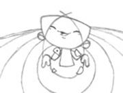
On occasion, the stereotypical self-absorbed student film pops up at film festivals and I always have to cringe. Nothing against the students who produce these types of films, but it's just been so overdone. What new thing could possibly be unearthed by a student for me, the viewer, to feel engaged by? Well, plenty, it seems. When you present your inner thoughts and explorations like Angela Steffen, then you've got me intrigued. Angela is a third-year student at Filmakademie Baden-Württerberg, and has a brilliant 5 minute black & white film titled Wie Ich Mich Traf (Meeting Me), that presents herself as a wonderfully stylized little girl who is trying to find out who or what she is. A newborn? A human? A bird? A worm? She animates herself as all these things. And can I just say how much I LOVED the character design in this film? Take note, students. This was a great little film filled with heart, fluid animation, and wonderful design -- a rare thing to see done well these days. Angela doesn't have a site, but there is a page about her film at Filmakademie's site, which you can see here.
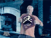
Before I talk about Rosto's film, Jona/Tomberry, I'll talk about Drew Carey's Green Screen Show 'Episode 104' first.
I love the concept of this show, the idea that you get actors doing improv in front of green screens so that animation will be composited in later -- it's a fun concept! I had not seen an episode of Drew Carey's Green Screen Show, but I had heard about it. And I must say I thoroughly enjoyed it. There were some sections where there was not much animation going on -- just basically a background that might change every once in awhile and maybe a prop added onto one of the actors' hands, depending on the situation. With these segments, I felt gyped. But the show gathers steam when the animation is full-blown, complete with characters who really interact with the live-action actors. Animation is the perfect medium for this concept because of the improvisational nature -- there could be 20 major story changes within one segment, and with animation, you can do anything. For instance, when two people from the audience try to come up with sound effects for one particular segment, the results are hilarious.
Pat Smith actually worked on an episode, so I asked him about the production of the show, like, how much freedom was given to the animators for their particular segment? He said that the producers gave them free range -- basically the artists and animators were doing "improv" as well. Little or no changes were made. A welcome change from all the usual client or executive nit-picking that comes from any animation produced for television these days. The show has a site and you can check it out HERE, complete with clips for viewing. (I had to use Firefox to be able to see the Quicktime movies -- plus, the clips are on a pop-up window when the site comes up. Just to let you all know, if you're curious enough to see them.)
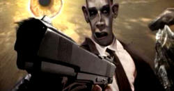
Okay. This next film presents me with a conundrum. I liked it. A lot. But I have reservations. Jona/Tomberry is quite a visual feast of surrealism and dreamlike imagery. Bizarre and haunting, loud and creative -- every frame of this film has so much going on, it's almost too hard to take it all in. (I guess repeated viewings is the way to do it.) But I actually enjoyed that aspect of it. It never ceases to amaze me when I see creative minds do their thang, full-tilt, with no limitations. And I have to give the director respect for implementing his artistic vision onto the screen. Director Rosto (that's right, like Cher -- only one word, please) apparently is something of a sensation in his homeland of Holland, making a one-word name for himself with videos, short films, and various media outlets. But I will not jump onto the Rosto-groupie bandwagon because I smell something foul.
Again, I will say that I really enjoyed this strangely intoxicating film -- it was an amazing piece of work. HOWEVER, before it was screened that evening, Rosto wanted to say a few words to the audience. At first I was thinking that maybe something was wrong with the print, that the audio got mixed-up, or something, but no -- Rosto stood up to say that it seems like everyone wants to try to understand, or "get" movies and films these days. But with this particular film, he wanted us all to "open up our minds and don't try to 'get it' (pointing to his head) but instead just try to 'get it' (pointing to his gut)." He pauses for effect...
"Just open up and don't be scared."
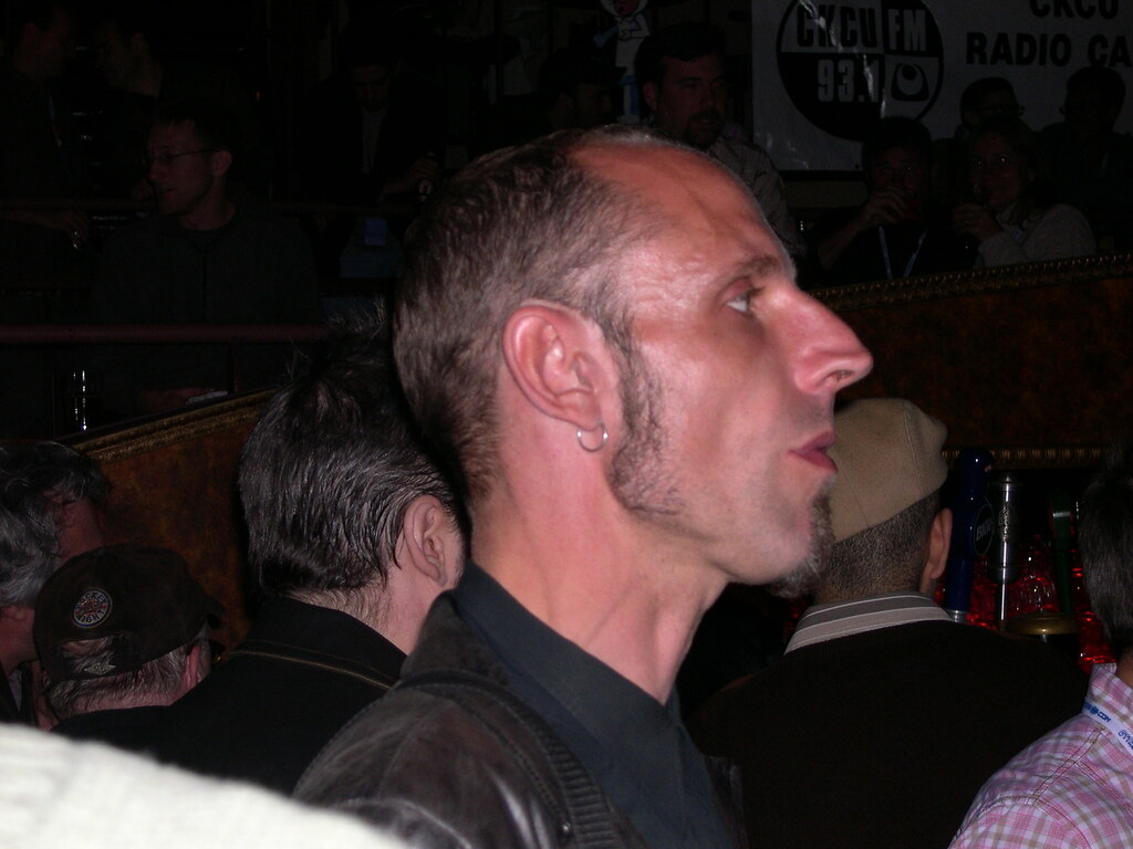
Now, why in the heck would a filmmaker say that? Why would any artist in their right mind go up and try and explain how to take their work in front of an audience? Rosto's actions made me shake my head in frustration, because he fell into that PRETENTIOUS ARTIST trap. It was really hard to take him seriously after his little speech. In fact, throughout the course of the festival I steered away from him for fear of being sucked into his glorious vortex of pretentiousness. It's too bad, because his work is definitely striking. (Photo of Rosto by Emru Townsend.)
After seeing the film, I still didn't really "get it," but I did enjoy it. Why can't that be enough for Rosto? Why not allow me, the viewer, to take in these visuals and make sense of it in my own manner, the way I'd perceive it? Please don't force me to "get it" your way. Give the viewer some credit -- don't try to hold my hand through the thing. Some filmmakers choose to be simple and obvious in their storytelling, others choose to go the abstract route. Either way, the viewer must be given the freedom to make up their own mind about what they see, whether or not they actually "get it." You know, there were several abstract films screened at the festival, and not one of the filmmakers walked up to the front of the theatre pleading to the audience, hoping that they'd try and "get" their film. I saw Rosto's actions as a sign of weakness, that he wasn't completely confident in his work.
Rosto must've had so many negative reactions to "Jona/Tomberry" or else he wouldn't have gone up in front of both audiences (oh yes, he did the same speech for the second screening of his film at the festival) to touch his gut with feeling.
So what is "Jona/Tomberry?" It's a wild mix of live-action and CG animation with grotesquely altered faces, freaky singing babies, gunplay taunting, and shattered mirrors -- LOTS of shattered mirrors -- if all this sounds like your altered cup of tea, then check out the film's site HERE. Oh yeah, Rosto is in the film, too.
That's the end of my diatribe. Sorry to go off on that, but I just had to do it.
I feel much better now.
After the screening, I scooted on over to the Chez Ani, a nightly hangout at The Arts Court, to have a drink and relax from the long long day. While there, I met up with the aforementioned Tom Neely, Emru Townsend, editor of the great online animation magazine fps magazine, and Amid Amidi of Cartoon Brew. (Pat Smith was there, too, but since he's such the popular guy, he ditched me.) All of us talked about animation and what the industry is up to nowdays. I can't tell you how refreshing it was to talk about animation in such an open environment, outside from the usual suspects that I cavort with in Atlanta. It was pretty interesting to see how much we could possibly talk about the industry, without running out of things to say. Apparently, we all have very strong opinions on what we like and dislike, and Emru will find something to say on just about anything. Just pick some obscure musical reference from the 80's and he'll go on a tear. It's quite a sight to see (or hear, actually). Amid and I met last year at the Festival, and we've emailed each other on a constant basis, so it was like seeing an old friend. We share a lot of similarites in art and design, as well as the love for jazz. He's just finishing up his book on animation design from the 50's, which will see the light of day next Spring. Judging from what he's said about the book, it'll be at the top of my must-haves, that's for sure.
Some pics from the evening:
A blurry Emru Townsend, a clear Tom Neely and me at the Chez Ani.
Emru and I contemplate a serious moment.
Tom, me, and Amid Amidi talk amongst ourselves at Chez Ani. I guess I missed the memo to wear a stylish hat, huh? (Photo by Emru.)
I didn't get back to the hotel until 1am that night. Boy, was I worn out. But it was so exhilarating to be back in Ottawa! It was so hard to go to sleep when my head was racing with all the visuals I had seen from the day. So much to see and experience -- and it was only my first day there! How could the other days compare?
Next up: The Animator's Picnic -- everyone's favorite part of the festival. Plus, more thoughtful insight on various short films and festival gatherings by your host, yours truly. I do this, so you don't have to.
Again, to see my photos from the trip, check out my Ottawa photoset on Flickr.
Self Portrait Tuesday 1
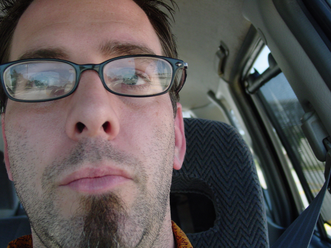
Well, before I finish up and post my second Ottawa installment, I've decided to dip my toe into the infamous Self Portrait Tuesday pool today. I had taken this shot about 3 weeks back, with the intent to submit it for SPT back then, but Ottawa planning got in the way.
Good grief, what a scary close-up. I guess it's appropriate for October, huh?
10.07.2005
Italia
My wife Andrea has a wonderful post on her blog about us going to Italy back in October of 1999. It was perhaps the best trip we have ever taken, hands down. Never had we felt so alive and so satisfied up until that point in our lives, six years ago. After experiencing a terrible miscarriage the year before, we vowed to save our pennies and take the trip that would rejuvenate us. Being artists with many art history classes between us, along with Andrea's family background, we decided that a tour of Italy would be the most sensible (and romantic) place to go. And it didn't disappoint. Upon returning from our trip, we soon found out that Andrea was pregnant, with Ava making her grand appearance the following July.
Allow us to be your guide through Venezia, Firenze, Toscana and Roma by visiting our ITALIA! photoset. Hope you enjoy.
10.06.2005
Ava Thursday: Ava adds her touch again
Click on image to see the faces up close. You'll need to scroll right -- it's 1500 pixels wide!
Remember when Ava came by my work and added her touch to one of the poses on a model sheet I had taped up on my desk? Well, during that same visit, my dear daughter had done the same to many more items around my office.
What you see here is a copy of page 445 in Frank Thomas & Ollie Johnston's bible to animation, Disney Animation: The Illusion of Life. It is a series of sketches showing how much emotion you can get just out of the eyes -- how they can squash and stretch with the same forces as real eyes, as well as showing how much expression you can get from opening or closing the lids ever so slightly. I photocopied this set and had it taped up at the top of my animation desk, right next to Frank's words. Something for inspiration.
Ava went in with a pencil and added mouths to each and every one of these sets of eyes. Not one mouth is the same. And she must've taken her time with it, as every mouth looks like they really belong to their respective eyes. I love this. It amazes me how much more emotion she was able to add. I love how she would make an "o"-shaped mouth for the eyes that are very wide and surprised. And how all the sad eyes have down-turned mouths -- but each one different.
She must've had fun doing this. I keep it taped up on my desk because she, like Frank & Ollie, are a constant source of inspiration for me.
10.03.2005
Justin
While we're taking a breather from my extensive coverage from the Ottawa Animation Festival, I thought I'd direct your attention to my dear friend Justin Winslow, who is leaving for the bright lights of the big city, New York, later on this month. He was hired at Primal Screen as a designer the same year as me. When I came onboard later, I was immeditately drawn to his fun, lovable characters and incredible linework. He and I hit it off right away -- talking about art, life, and everything in between. Since then, he's become a very close friend, probably the closest I have here in Atlanta. Although he lives the single life, partying and living life to the fullest on a daily basis (ha ha!), he always finds time to come by and check out the latest oddities in my cubicle, to check up on his favorite female friend -- my wife Andrea, or to see the latest creation Ava has bestowed upon me. And visiting Justin's cubicle was one of my favorite things to do each day. His workspace rivals mine in the sense that there is so much crazy goodness surrounding you that it's hard to take it all in at once. Needless to say, we spend more time in each other's workspaces than in any other at Primal. I will sorely miss my daily visit to Justin's.
He and I share the same sensibilities when it comes to drawing -- the way of creating and forming characters, the importance of design and composition, and the joy of color. Justin has a great sense of wonder about him and he even has a funny dark side, which I adore. Demented humor can go a long long way, I always say. There were many times I would find myself wandering the aisles of some dusty flea market and stumble upon a strange little nick-nack that I knew only Justin would love.
Justin has this amazing ability to draw these wonderfully complex compositions in ink, without sketching anything out. Just straight from his head, onto the paper. He'll create these masterpieces right in front of you, but never does his mastery ever go to his head. He's the most modest artist I've ever met, making you think that what he did was just some doodle. "Oh, it's nothing," he'll say. Yeah, right. His "nothings" are brilliant, and I've been trying to save as many of them as I can before he leaves!
Justin, here's to a new start, a new life. Whatever you do -- even it it is "nothing" -- I'm sure it'll be brilliant.
10.01.2005
Ottawa Animation Festival: Part 1
It's taken me several days to rest and recooperate from Ottawa, and now I feel that I might have some sort of handle on the entire festival. Mind you, I wasn't able to go to EVERYTHING, and I'm sure that if I did, I wouldn't be home, resting -- I'd be dead. Four full days of animation is enough to put the most avid fan of the art-form in the nuthouse. Good thing the festival offered other outlets to satisfy us instead of cramming down our throats screening after screening of short films, videos, and commercials. It was a nice balance of screenings, panels, workshops, and retrospectives.
It was a wild morning on Thursday, the 22nd. I would be missing the entire first day of the festival and half of the second, but since they held the competition screenings twice throughout the course of the fest, I figured out a schedule to be able to see them all. It took forever to get to the terminal and then eventually onto the small plane (we had to actually walk onto the tarmac, like a jet-setter from the 60's or something). I sat down in my aisle seat (why?) and began to read the complimentary USA Today. As the people were filing into the plane, a young (mid-20's) couple sat across the aisle from me. I began to play that game in my head where I try to figure out what this couple is like, why they were on this particular plane to Ottawa, what they do for a living, etc, mostly to amuse myself and to pass time. This was all done in a flash and immediately I was back to my paper. While reading and turning the pages, I noticed that the guy (who was in the aisle seat) was looking at me or my paper more uncomfortablly than normal. I figured that he must really be interested in the goings on in Hollywood, so I offered the Life section to him. He politely said no, and then asked very quietly, "Is... your name Ward?"
"Uh... yeah."
"I'm Roque, from Ghostbot." What the--?
Roque (pronounced "Rocky") and I had emailed each other about the possibility of meeting up and hanging out in Ottawa, but I'd never expect to see him on the exact same flight, directly across from me! See, several days before the festival, I had received a few emails from readers of my blog and of Drawn! mentioning that they would be there in Ottawa too. It was pretty cool to think that I'd finally get to meet some of my readers, which would be the oddest thing for me to fathom, as I still write this thing with nobody in mind. As far as I'm concerned, only words and images are posting comments to my posts, no real flesh and blood person behind them. To actually talk with someone who reads my words seemed completely foreign to me. But exciting at the same time. Arrangements were made to meet but nothing promised.
So what were the odds of Roque and I meeting on the same flight to Ottawa, before we even get there? It was crazy. After a few minutes of "Man!" and "Whoa!" and "I can't believe this! No one will believe us!" we eventually got to talking about the biz and what each of us do. There was hardly a break in the conversation, and before I knew it, we were up in the air, on our way to Ottawa. Roque's work has a great sense of design to it, and it seems to me that what he does comes from the heart. He puts all his effort into each project, and it shows. I was happy to know that Roque created one of my favorites of the early webtoons, Joe Paradise back in 2000. Very different design and composition compared to what was being offered back at that time. (His wife, Sonia even has a website.)
It was nice to have someone to talk to while flying as it made the trip seem incredibly shorter than it was. Once on the ground in Ottawa, we bid each other adieu and I got on a bus shuttle to my hotel. (I found out later on that Roque and Sonia had a heck of a time getting through customs. I guess they looked like the video trafficking type. I knew it!)
The way they set it up at the Ottawa Animation Festival is that every competition screening is screened twice throughout the course of the festival, just in case you miss one of the times available. I was scheduled to get in at 12 noon, but there was a Shorts Competition screening I wanted to see at 1. If I missed it, I wouldn't be able to see the second screening of it because of a schedule conflict. So I was hoping that the shuttle bus driver would move along quickly, because I had to get my Festival Pass first before going to any screening. No dice. The driver had to stop at several hotels before arriving at my hotel. And by the time I got around to getting my pass at the Arts Centre and then on to the screening, it was 1:45. I missed about half the show. The cool thing was that my hotel was literally right next door to The ByTowne Cinema, where the screening took place. At least I had that going for me. Or was it? When I went in to check in, my room wasn't ready. Fine by me. I really wanted to check out the rest of the screening anyway. Before I left for the trip, I knew that there was a slight chance that I'd miss some of that particular screening, so I made a point to view some of the shorts online -- that is, the ones that were available. I was in luck.
Shorts Competition 6
I was able to see the first short featured later on at the "Best of the Fest" screening shown at the end of the Festival. And it was indeed one of the best. City Paradise was directed by Gaëlle Denis for Passion Pictures about a Toyko student moving to London for the first time, and then finding a secret underground oasis. It had a great style to it, with live-action combined with CG backgrounds and various other techniques. The way they animated everyone's legs was a nice touch.
The Lost Reel ad for Esurance directed by Phil Robinson for Wild Brain was one of the shorts featured online. This is one in a series and you can check them out at the Ghostbot website HERE. They are brilliant. Flash animation done at its best, I must say. Even though there is some cut paper look to some of the action in these spots, it's pretty much done in a very fluid style, which is quite hard to come by in Flash. Excellent job, Ghostbot guys! (And is it possible to have a cartoon crush on the Esurance girl?)
I really liked The Detour spots for Canada's Teletoon, done by Guru Studio. You can check out the spots HERE. Some really nice character design in a stylized 3D environment. Great snappy timing, too.
The Newsroom "Learning to Fly" was a bit pretentious and too long for me. Half live-action, half animated, I was really disappointed by the lack of quality in the animation done by Cuppa Coffee Studios. There were some interesting points in the story, but it just seemed like fluff. Just a little too self-absorbed I must say.
One of shorts I really wanted to check out was one by Tom Neely, of i will destroy you. He had an entry in the Animation for the Internet catagory last year at the festival, Brother, Can You Spare a Job?, and so I was curious about seeing his newest video for The Muffs, Don't Pick On Me. I like his retro 30's rubberhose animation style, updating it for today's style in Flash. Tom picks up in the way that those old films have the characters bob up and down in repetitive cycles. Some very nice work.
After the screening, I happened to see Tom on the way out and I introduced myself. He was another reader who had contacted me before the Festival and so it was pretty cool to finally meet the guy. And he's quite a character, too, with his mostly-black wardrobe, Chuck Taylors on his feet, wide eyes and jet-black hair, topped off with his most prominent characteristic -- a straw porkpie hat. And can I say that the dude wears it well? Strangely well. We hit it off pretty well, sharing the same demented sense of humor and dry wit.
We chatted a bit before I went next door to check on my room: not ready. So we went to the 3pm screening that was showing next at the ByTowne:
Shorts Competition 5
This was a pretty good screening. Some great films featured here. Highlights include:
Tower BAWHER by Theodore Ushev was a great abstract experimental piece, described as "Deconstructivist Constructivism movements printed on film." Not a bad description. Now, I'm not a big fan of abstract animated films, but this one was pretty well done. Great look, style and design. The site for the film is HERE, but it's really for the company that produced it, and it's not currently available to view. But it does say on the site that it's coming soon. I highly recommend seeing it when it's up.
Omigosh, I absolutely LOVED the next film, The Mysterious Geographic Explorations of Jasper Morello directed by Anthony Lucas of 3D Films in Australia. Is it stop-motion? CG? It's a little bit of both and it looks entirely amazing. Harking back to the very first animated film, The Adventures of Prince Achmed (1926), Jasper is done in silhouette, like an elaborate shadow puppet play. At first I was thinking that it would be rather difficult to follow along because of it being in silhouette, but after about a couple of minutes I was completely into it, and forgot all about it. It helps that the story is pretty interesting, too.
Workin' Progress was a strange little film and was a terrible segueway from Jasper. Interesting retro style with mulitple workers working on a building, but I wasn't digging the animation.
Nexus Productions' Honda 'Grrr' was so strange at first but so vividly brilliant with all the gorgeous elements and idyllic setting, that when the message finally hit all of us in the audience, there was a rousing applause. Very, very cool spot. You can check it out by going to Nexus' site HERE and then scroll through the Showreel. It's one of the three Honda spots featured. Great spot.
I did not like Tick-Tack at all. Ugly character design and uglier animation. The gag at the end wasn't even that funny. Call me old fashioned, but it just wasn't a good joke. Ugh.
Another one of my favorites from the Fest is Andreas Hykade's video for Die Toten Hosen "Walkampf". Andreas did the poster and artwork for last year's Festival, and so it was very cool to see his simple linework and bizarre creatures in motion. Starting out in stark black and white, the simplicity of the video lulls you into thinking that this is all there is. But then, right when the chorus starts up, the video erupts in brilliant color. It's a great video. Andreas Hykade's site is HERE. You can actually see some work-in-progress for "Walkampf" at Studio Film Bilder's site HERE. Fascinating stuff.
Last for this screening is Don Hertzfeldt's The Meaning of Life. This is my second viewing of it and it's a bit easier to handle this time around (remember I reviewed this film earlier this year), but it's still not good. Pretentious with a capital P. I heard that he did not put any of the walkcycles on separate levels -- he animated everything all on one layer, which is time-consuming and tedious. First of all, WHY? Just because you can say you did it? It's not going to be noticed by anyone who watches the film, even with other animators. Why do this when he could've just animated a few walkcycles and duplicated them to fill the screen? It would've have the same effect, believe me. His point in not using computers is moot. It's not necessary and the significance in his hard work is getting lost by his heavy-handedness. Sorry Don, it was a valiant effort, but still falls short.
After the screening, I finally was able to check into my room. A quick break, and I was back at The ByTowne for ANOTHER screening! And guess what? I hadn't eaten anything since the morning. I was getting weak.
More on that later.
To see the Flickr photoset of my trip to Ottawa, click HERE.
To read the second installment of my review on the Ottawa Animation Festival, click HERE.
Subscribe to:
Posts (Atom)