12.25.2007

Merry Christmas to You

The First Noel

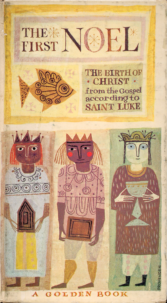
I posted this last Christmas, but it's worth it to post again: The First Noel, a small Golden Book illustrated by the brilliant husband-wife team of Alice and Martin Provensen, 1959.

You can view the book in its entirety HERE.

12.21.2007

'Tis Christmas

Funny how we never really use those contractions like "'tis" and "'twas" until the Holidays. Makes anything we write sound so warm and folksy, like we should be sitting by the fire with a laptop in our lap, hot chocolate by our side. But not me. I plan on using these archaic contractions as much as I can next year. Or, until someone strangles me.

The First Christmas Morning
Click on image to view larger.

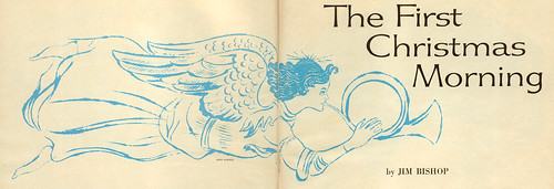
I was going through some of my old magazines, picking out the ones that were Christmas issues, and came across this illustration for a story in Woman's Day, December 1959. Taking a closer look, I found an artist mention: Andy Warhol.

Andy was a young illustrator trying to do his thing in New York in the 50's, doing some fashion illustration and advertising as well as the occasional album cover. His work mostly consisted of the "blotted-line" variety, and done very well, if you ask me. This is a nice one for the Christmas season. One of my favorite illustrated Blue Note album covers was done by Andy in 1958: Blue Lights, Vols. 1 & 2, by Kenny Burrell. I put an emphasis on "illustrated" because most of Blue Note's covers featured photos and graphics and I harbor a great amount of love for many of those types of covers as well.


Anyway, the Burrell cover was nice because of the posing and composition of the character juxtaposed with the simple sans serif type, the hallmark of Blue Note covers. Most of the design work was done by Reid Miles, featuring strong photography by Francis Wolff. There's a funny story about how Francis used to get so mad at Reid for cropping off the tops all the musicians' heads of Francis' shots.

You can see a great deal of these incredible covers in Blue Note: The Album Cover Art, by Graham Nash Marsh. I've owned this book since '93, and I still can't get enough of it. Highly recommended. UPDATE: My pal Alan from Chronicle Books informs us that this book is out of print, but there's another one available, titled, Blue Note: The Album Cover Art: The Ultimate Collection. Thanks for the heads up, Alan!

Things are ramping up around here for Christmas. Lots of stuff going on around the household, so expect a bit of a pause here on The Ward-O-Matic. I'll probably get around to posting something on Christmas Day, but until that time, have a great and safe Holiday.

12.18.2007

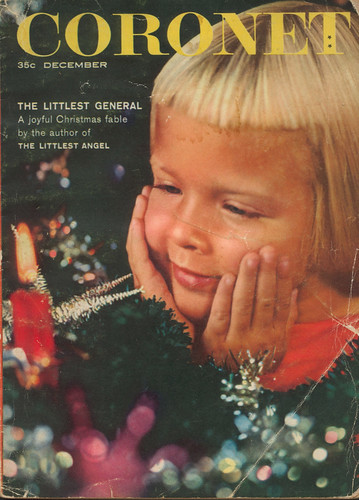
Coronet December 1957

Coronet December 1957

Welcome to Christmas 1957, Coronet Magazine-style. Coronet was a smaller in scale magazine, roughly half the size of your typical magazine found in newstands. The paper from this particular issue is brittle, giving the magazine a pulp-like feel. Very cheap. Hence, its ephemeral importance to me.

They weren't kidding with the bangs back then, were they? I've seen photos of my aunts with bangs as short as this -- that way, my Oma wouldn't have to cut them for long time. Didn't want to deal with all that.

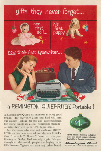
There's some interesting illustrations going on in this issue, most of which I'll post at a later date; but the ads are what I thoroughly enjoyed the most. A few worth noting:

gifts they never forget...

I wonder if giving teens a typewriter for Christmas held the same significance as handing out toothbrushes for Halloween. Oh, they'll never forget this one, Santa. Thanks. Thanks a lot.

Betsy Wetsy

Click on image to view larger. This was the first page of a multiple-page advertising spread for Ideal Toys. Funny. She'll be singing a different tune when "wetsy" becomes actual urine.

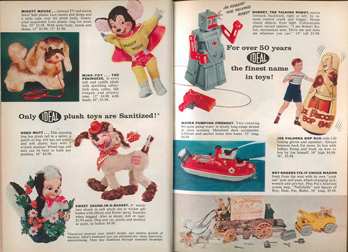
Toys!
Click to view larger. Love that Mighty Mouse doll! Is it me, or does the name "Robert" not sound very "robot-y" to you? I know that "Robbie the Robot" is a popular one, but that's okay. "Robert" sounds so....formal.

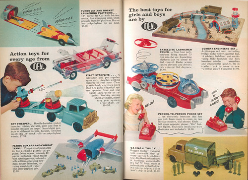
More toys!
Ooooo....the coolest two pages in this magazine. Love that see-through "Fix-it Starflite"! The fact that this has working head and taillights would've had me drooling all over this mag if I was a kid. I'm also eyeing that Satellite Launcher Truck. Very cool! Who wouldn't want a truck with a satellite launcher in the back?

-------------------------------------

Mmm'kay...after that garish presentation, something completely different. The wifey and I are mixing it up this year for Christmas. We've promised to give each other gifts found in thrift stores or flea markets. Uh, no....we're not cheap. (Well, maybe.) Actually, we got to thinking. Last year we got so carried away, it left us feeling...oh, I dunno, sort of empty: all that spending and consuming. It was crazy. Didn't sit well with us.

So, we've decided to find things that would require more thought and feeling, while at the same time offer a bit of a surprise. No lists, no "I've been eyeing this...", "I gotta have that...." Just to mix it up. Who knows, it'll probably blow up in our faces come Christmas Day, but at least we tried to stray away from the almighty, all-consuming Christmas-spending juggernaut. Admit it -- it's so easy to get carried away, isn't it?

Anyway, didn't mean to go off on a tangent there. Just thought I'd share some of my thoughts. We just want to try something different this year. And try to have fun.

Okay, enough of all that. More vintage Christmas-y stuff coming up!

12.16.2007

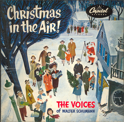
Christmas in the Air!

Christmas in the Air!

Christmas in the Air!, featuring The Voices of Walter Schumann. Cover by Wilson Smith. 1951. Thanks to the miracle of the internets, you can download this album here.

Yes, it is in the air. Can you feel it?

From the liner notes: "There have been many fine albums of Christmas music; but never one like Christmas in the Air! Here is an inspired musical production which captures all the traditional beauty and sacred spirit of Christmas, yet adds a fresh and original touch."

12.14.2007

'Twas the Day After Christmas

'Twas the Day After Christmas

Oh, I know it's not after Christmas, but I couldn't wait that long to post this.

Drew this for Tom at LAIKA. He makes a Christmas mix CD each year and asked me to illustrate it for this year. It took me a while to get the concept down, just the way I like it. It's still far from what I originally envisioned, but I like the end result anyway. Plus, I'm happy with the type at the top there. That was a load of fun. Maybe I'll post some of the sketches. There was a lot of trial and error.

I was a little worried about the ultra-pink/purple happening here, but I think it's okay. Not as harsh as I think. Or is it? Are my burned retinas affecting my creative decision making here? Are the violent violets melting my gray matter? The world will never know....

Check him out: Santa just sittin' back, relaxin', listening to some tunes while Rudolf curls up by the fire, the day after the Big Day. Santa likes midcentury modern. He's a modern kinda guy.

12.13.2007

New Apple Ad

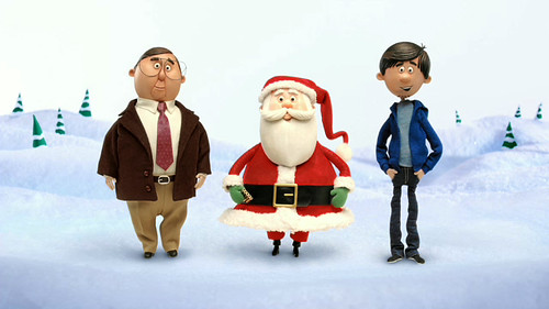
Santa Claus

Well, whaddya know. Check out who did the latest "Get a Mac" ad for Apple. Titled "Santa Claus", and directed by Drew Lightfoot. Characters designed by Shane Prigmore. Download the spot HERE.

Click on the image for spot stats. TBWA/Chiat/Day is the agency responsible for this campaign. Whether you love or loathe Apple (or this ad campaign in general), this spot is brilliant. My two cents.

12.10.2007

Christmastime is Booktime

Oh, dear Lord, there's no hiding the fact that I love books. I've tons of 'em, old and new, big and small, preferably filled with purdy pictures. Each year for my birthday and Christmas I always ask for books. Don't know why that is. Maybe it's that part of me that constantly craves information and needs to have visual stimulation in ye Olde World fashion by turning actual pages and feeling the smooth texture of paper. Maybe I just like presents. Who knows?

Since it's that time of the year again, and since I'm in a generously helpful mood, thought I'd pass along to you a list of some books that either I have and think that you might dig, or books I don't have but would look pretty nifty in my stocking currently hanging over the hearth. And perhaps yours, too. So...here we go:


BOOKS THAT AREN'T OUT YET BUT LOOK GOOD ON MY WISH LIST:

As usual, I've been collecting the "This is..." series by M. Sasek. The new ones coming out in January are:


This is Britain


This is Israel. Always digging me some Sasek.

There's no cover for this one yet, but this looks pretty good: Stepping into the Picture: Cartoon Designer Maurice Noble, by Robert J. Mckinnon. I just found out about this book, so I don't know too much about it. However, I love Noble's work (known mostly for his work at Warner Bros. but also did work at Disney), and so I'll be curious to check this book out when it's available in February of 2008.


BOOKS I DON'T HAVE BUT WANT:


Dream Worlds: Production Design for Animation, by Hans Bacher, a former art director for Disney. Now doing his own thing in the Philippines.


Cinderella, by Mary Blair. As much as I love Sasek's work, I equally love Blair's. I haven't taken a peek at this book yet, but I'm sure it's gorgeous. For more Blair-goodness, check out Art and Flair of Mary Blair, by John Canemaker.


Thomas Allen: Uncovered, featuring the cool photographs of Thomas Allen. Intro by graphic designer Chip Kidd. I've gotten to know Mr. Allen lately, all thanks to the glory of the internets. I love his work. Incredibly ingenious set-ups of cut-out characters from pulp book covers. He's meticulous at what he does and it shows.


Desene: Sketches & Scribbles, by fellow LAIKA-ian, Ovi Nedelcu. Umm...have you had the chance to see this guy's work? Incredible.


The Ancient Book of Myth and War, by Scott Morse, Lou Romano, Don Shank, and Nate Wragg. Pretty much a Dream Team, if you ask me. Pixar artists doing the Greek gods thing. Count me in!


Popping Through Pictures: Paintings from Amanda Visell, board book that looks twice as fun as the illustrations suggest. Amanda and her co-hort in visual crime, Michelle Valigura, make up The Girls Productions.


Art and Design GAMA-GO, by Greg Long, Chris Edmundson, and Tim Biskup. I've always liked the GAMA-GO line of products, so this would be a nice thing to have to check out their designs and concepts.


ON THE DESIGN-TIP:

I love design-y books, too. Especially the type and font variety. These two look veddy niiiice:


Hand Job: A Catalog of Type, by Michael Perry.


New Vintage Type: Classic Fonts for the Digital Age, by Steven Heller and Gail Anderson.


BOOKS I HAVE AND THINK YOU SHOULD TOO:

Yes, join me in owning these wonderful books. You won't be disappointed. "One of us....one of us...."


Three Trees make a Forest, by Ronnie Del Carmen, Tadahiro Uesugi, and Enrico Casarosa. Holy moley, what a great visual feast here. I can't get enough of these three guys. Together, they make up a strong visual collection. Lots of cute girls, if that'll sway you.


Timmy and Tammy's Train of Thought, written by Oliver Chin and illustrated by the amazing Heath McPherson. Amazing mostly for Heath's illustration talents, but also because he's from Alabama. I mean, do they actually teach art in that state? Ha ha...that's a bit of the Georgian in me. Alabama digs are always a favorite Georgia past-time. Seriously, this book is a fun, colorful look at all the different types of trains. The character designs are top-notch. Heath's style is so rich with flavor -- I think I'm going to be sick from all the sweetness. (That's a good thing.)


Fleet Street Scandal, by illustrators Chris Turham (another fellow LAIKA dude) and Kevin Dart. Together, they make up Fleet Street Scandal. Sweet drawings. More pretty ladies in this one, in a 60's pulp kind-of way. Oh, and monsters. And stunning colors. Take your pick -- this is a good one.


The Art of Ratatouille, by Karen Paik. Oh, yes. This is probably one of my favorites of the "Art of..." Pixar books. Added bonus: our man Harley Jessup is all over this book. More great work from the boys and girls of Pixar. Some day, I'll stop by for a visit.


BOOKS BY JERRY BECK THAT LOOK PROMISING:

Good ol' Jerry Beck has been busy lately, and these two books prove it:


The Art of Bee Movie, by Jerry Beck and Jerry Seinfeld. I took a quick glance in this one, and I'm incredibly impressed by what I saw. Sadly, most of what I saw did not make it onto the screen for Dreamworks Animation's latest. There's some really nice work in this book, I just hate that most of it will be overlooked. I don't have this book, but I wouldn't mind getting it. Some great work by even greater artists.


Hanna-Barbara Treasury. (Cover photo by Sherm Cohen.) Another one I don't own, but checked it out at the bookstore. A nice big tome on the art and graphics (toys and merch) of the Hanna-Barbara studios throughout the years. It's one of those conceptual books where you can open folders and envelopes to find various replicated items and what-not. A fun book, I'd rather see a book that has nothing but storyboards, model sheets, turnarounds, conceptual artwork, and original backgrounds -- but that's just the geeky animation nerd in me talking.

Okay! That's quite a list! Hope this offered some of you a chance to see what's out there for the fledgling animator/artist in your family. So, get off yer tuckus and start clickin'!

12.05.2007

O Tannenbaum and other Christmas-y things

Drummer Boy: detail

Ahh...Christmas. The Season's upon us. Don't you just love it? Oh, probably not. Most people don't warm up to the spending season, dashing in and out of stores and malls. You can count me as one of those people. But I do try to make the most out of it. For the first time in like ages, we were able to get our Christmas tree up within the first couple of days of December. We've always been tardy on the tree thing. Now, we're enjoying the wondrous scent of pine throughout the entire house. I swear it has a calming effect on us, soothing our holiday jitters.


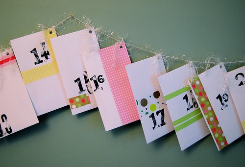
Andrea's put together a great advent calendar that's proven to become another much needed break from all the Christmas craziness. It's been fun finding out what's in store for us in each perfectly decorated envelope (Andrea's doing, of course). The other day, the kids made gumdrop trees and a wreath. Ava likes listening to Christmas music. (Well, she should, I've collected over 300 holiday-themed songs, enough to choke a moose.) Look at her go:


A couple of things:

I posted about this two years ago, when Nate first released it, so I would be remiss if I didn't mention it each year:

Just in Time for Christmas

I drew this for my bro-in-law, Nate. He's Dust, the DJ and producer for Mars ILL. He and fellow Deepspace5 alum, Listener, collaborated for this uniquely different hip-hop Christmas album in 2005. Curious? Make it a hip-hop Christmas and buy it HERE. (Scroll down a bit.)

Andrea and I love creating Christmas cards. However, time sometimes catches up on us and we end up pulling all-nighters in order to get them done. Occasionally, she'll do the cards for one year, and I'll do the next, and so on. In 2002, I did the cards. Here's what we sent out:

Christmas Card 2002

What's great was that Andrea added her own touch to the cards, making it a true collaboration. Notice that Ava has taken the reins. That was not unintentional. Ava was 2 1/2 at that time and had pretty much taken over our world. The concept was based off a vintage (probably 1940's) Christmas card that Andrea found at a flea market. It was one of those where the entire family was photographed in a sleigh in front of a staged winter scene and the family's name was etched into a ribbon graphic near the bottom of the frame. I always thought it was funny that we never saw any of the reindeer pulling the sleigh.

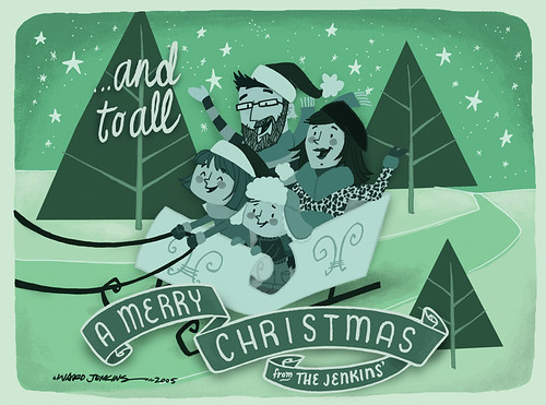
The next time I did the cards wasn't until 2005. I think I've posted it before, but here it 'tis again:

Merry Christmas from Us

The obvious inclusion being the EZ. I changed up the look for that year, changing the entire color scheme from red to green and giving everything a more stylized, "modern" look. Oh, and I had a beard. This year, I don't have the time to update this, but maybe I'll do the every three year thing and do one for next year. We'll see.

12.01.2007

One Foggy Morning

One foggy morning
Since moving to Portland, I've noticed the occurrence of fog being far greater here than in Atlanta. This offers up more photographic opportunities in the morning, and since we've purchased a Nikon D40 not too long ago, I can't afford to pass up these opportunities. Wednesday morning was such an occasion.

I found a ridge that overlooked a park that had a bank of fog rolling in, over the trees below. It was a beautiful moment.

fog and trees

fog and tree

An hour later, the fog really set in:
foggy bump

11.30.2007

Ava Thursday: My Birthday

All I wanted for my birthday this year was some art by my kids and a pair of retro Nikes. So, here's what I got:

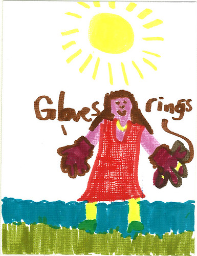
Ava Thursday: Birthday Card
This is the cover to the card Ava created. I love it, of course. That's Ava with big ol' gloves and rings on her fingers.

The card has a super-special added bonus: the markers are the scented kind, so Ava's dress smells of strawberries and the sea smells of...something blueberry-ish. I think.

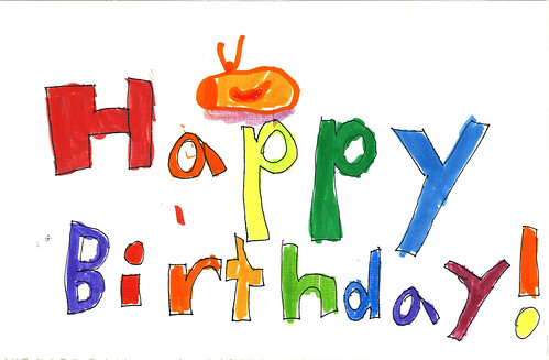
Ava Thursday: Birthday Card inside
This is the inside, when you open the card. Yup, all the colors here are scented and the card smells so yummy. That's a Nike Daybreak shoe up there on top. She drew this from memory. She had seen the shoe on Nike's site when Andrea was showing it to her before my birthday, and she had remembered all the details: the colors, the swoosh, etc.

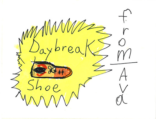
Ava Thursday: Daybreak Birthday
Found inside my birthday card was this little sheet of paper, drawn by my girl. Ahh, the fabulous Nike Daybreak, a classic Nike shoe from back in the day. I was an avid runner from '77 to about '84. My dad and I were Nike geeks. He had Daybreaks, I had a pair of Terra TC's. Among others. So, when I found out that Nike was making reproductions of some of their old shoes, it was only natural for me to hook myself up with a pair.

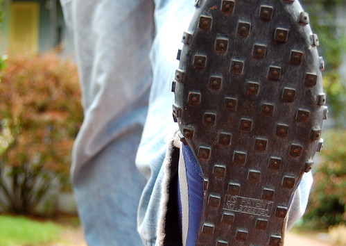
On Saturday, Ava accompanied me to the downtown Niketown and patiently sat through me putting on three different pairs of shoes. They had the Daybreaks, but not my size. Too small. But, man, the Waffle Racers looked sweet. And better yet, they were a perfect fit:

Birthday shoes

waffles
Would you like some waffles with your morning run?

Side note: You would think that since Uncle Phil owns Laika, that we LAIKAians would receive some nice Nike discounts, right?

Nope.

That's all I'm gonna say.


Big, big thanks to the wifey and kids for making my 39th a happy one. Love you guys.

11.26.2007

Symphony In Slang

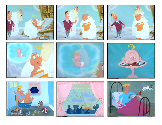
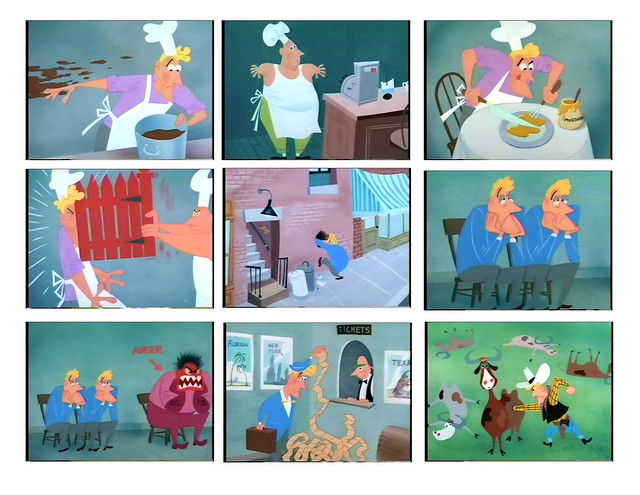
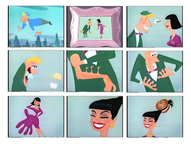
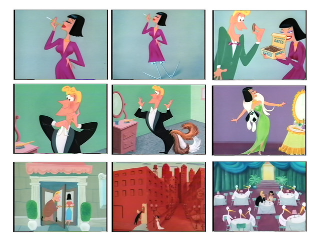
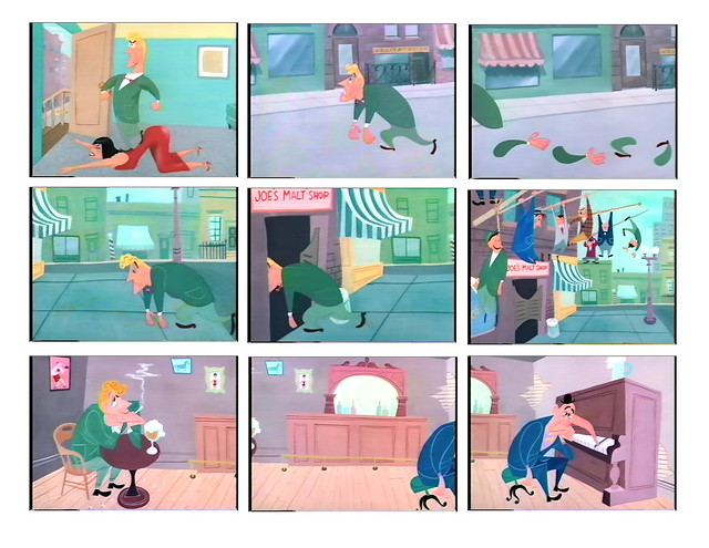
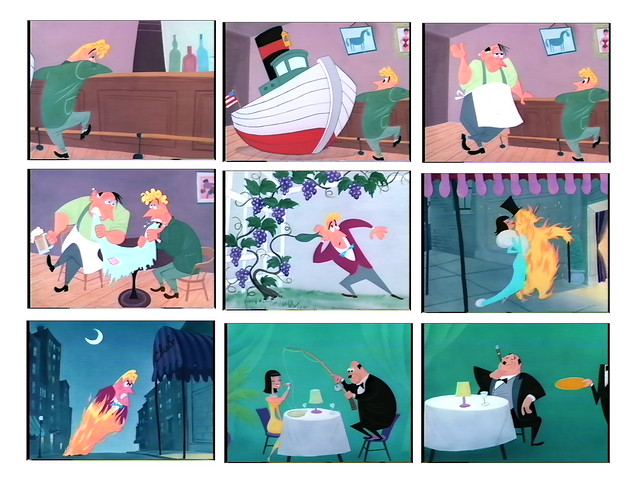
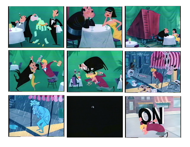
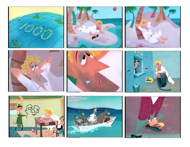
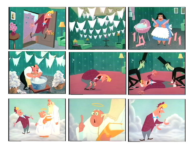
SYMPHONY IN SLANG (1951, dir. by Tex Avery) holds a special place in my heart. Back in the late 80's, when I finally realized that I wanted to be an animator, I bought some VHS tapes to analyze and study. One of them was Tex Avery's Screwball Classics, with Symphony In Slang included. I immediately fell in love with this cartoon. It was so different and opposite from the other fare that I had been watching at the time. A nice breath of fresh air. To me, the idea of visually recreating slang terms was so perfect for the cartoon realm -- most of the gags you would see in cartoons (especially in Avery's) were visual puns anyway. So it all made perfect sense to me.

Done as a one-shot, with all original characters who never appeared in any other MGM cartoon, Symphony is pretty much an anomaly in Avery's canon. What makes it even more so is the fact that Avery hired designer Tom Oreb to design all the characters and layout for the entire film. Just for this one cartoon. That's it. Why? Why did he hire an outside artist out of the blue, it seemed, to work on this one and only short for him? Oreb had been working at Disney pretty consistantly at the time, but left the company in the early-50's. To my knowledge, Oreb worked with Avery at MGM for this one cartoon and then went back to Disney where he designed characters for such projects as Toot, Whistle, Plunk & Boom, Sleeping Beauty and One Hundred and One Dalmations. I asked Amid Amidi about Oreb during this time:

"The only thing I'd say is that Oreb's history is very sketchy at this point. I believe he'd left Disney and was freelancing around. He designed a number of commercials for Ray Patin around 1952-1953, and I think he was in and out of Disney's at this time, if not completely gone. But it's not like Symphony was the only non-Disney project he did around 1950-1952. It's all a bit of a mystery at this point."


So Oreb didn't go off to do this one cartoon and then come back. He worked at some other studios as well. But what was the deal? What was Avery's intent for hiring Oreb for this one cartoon at MGM anyway? Well, here's my humble opinion on this matter:

Tom Oreb's style was unique, angular and highly stylized. It would be considered "modern" and contemporary at the time: cool, hip, new. On the other hand, most of Tex Avery's cartoons at the time were part of the MGM "house style", if you will -- Droopy, The Wolf, Red, all were products that came from the classic, rounded, traditional style of character design, along with semi-realistic painted backgrounds. These two opposing styles play an important part in Symphony, supporting the story on visual terms. When our main character (John) dies and approaches the Pearly Gates in the beginning of the cartoon, he's surrounded by lush backgrounds and well-rounded characters, such as St. Peter and Noah Webster. But he's not of this world. John's a hipster, a jazz kat. He's of the New Order, speaking in tongues with his hep-jive vocabulary. Our guy is definitely a fish out of water, designed in the flat-like stylized modern look by Oreb, while everything else is not. When we see John's life story visually played out in Webster's mind, his world is flat and angular, with bold colors. Webster is visualizing John's world in this new, modern style. John is the antithesis of the Old World. When John reaches Heaven, the two worlds collide. Just as the two opposing worlds clash, so too, does their visual styles. Hiring Oreb was clearly intentional on Avery's part, knowing that Avery probably wouldn't be able to pull off that "new look" on his own. I think it was a perfect decision; a match made in Heaven.

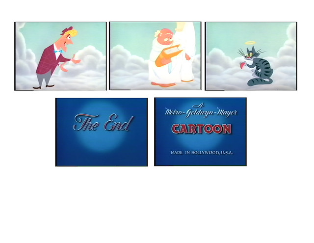
The story is simple: A young man, John, dies and is approached at the Pearly Gates by St. Peter who is baffled by his strange use of language: "What's cooking? How's tricks?" Obviously unaware of current slang, Peter asks Noel Webster what he can make of it. When Webster asks John to proceed with his life story, we witness Webster imagining every single slang term (along with other expressions and sayings) that this guy utters. From being "born with a silver spoon in my mouth", to "hanging out with the boys", to "going through a bunch of red tape" while trying to get out of jail, we witness these things literally. By the end of it, John has "died laughing", bringing us up to current. He then asks Webster, "So, what'dya think?" When Webster finds it hard to answer, John then asks, "What's the matter? Cat got your tongue?" Sure enough, the camera pans over to a little cat (with a halo, of course), holding a pink tongue in his paw. It's a simple concept, but brilliant through Avery's direction. With the use of limited animation, the movements are executed in a simple manner, basic and to the point. The concept is the main star here, with every gag being visually presented verbatim. The pacing is not as quick as Avery's usual fare, with the dialogue being very straight forward. As John says his line, the scene is presented thusly. No quick cuts, no complicated camera moves. Save for a few pan shots, and the occasional zoom out, the camera is mostly stationary.

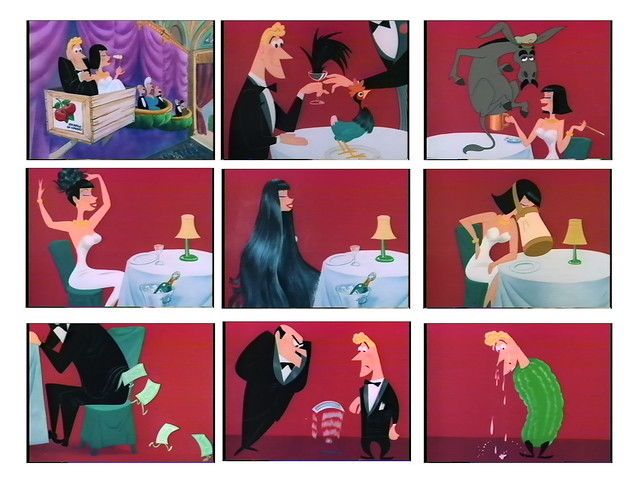
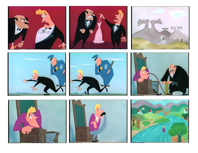
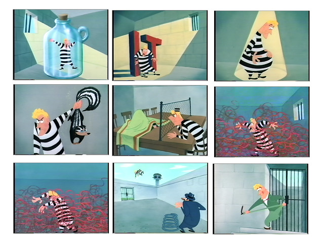
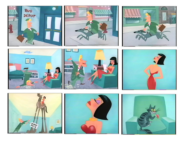
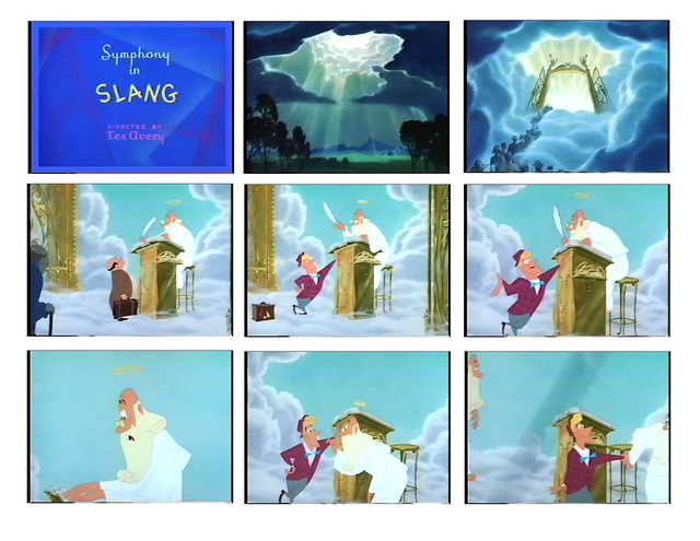
Below, I have put together the entire cartoon of Symphony In Slang through frame grabs of each and every scene. Some scenes have two or more frames, if there was a camera pull out, for example. I put all these frames together so I can see Symphony in its entirety, to see any patterns that may be evident, to see the choices being made for layout, composition, character posing, camera positions, and so on. It's fascinating to see it all laid out. There were much more scenes in this cartoon than in your typical cartoon of the time, because of the nature of the story. I think that I counted over a hundred and twenty frames (not including the multiple ones for the same scene). That's quite an undertaking for our man Oreb. But if you notice, every background is executed with style and panache, only in the way that Oreb could do it. It's also interesting to see just how much the animators kept to Oreb's original designs. That's unusual for that time. By the time the director gets the characters and adds his two cents and then passes them off to the animators who add their two cents, the overall designs most likely become watered down. But not here. This is pretty much Tommy's baby, through and through.

The stats on the film:

SYMPHONY IN SLANG
(Released June, 6th, 1951)
Direction: Tex Avery
Animation: Michael Lah, Grant Simmons, Walter Clinton
Layout and Design: Tom Oreb
Writer: Rich Hogan
Music: Scott Bradley
Producer: Fred Quimby
6 minutes, 43 seconds
Released by MGM

Here are the frames (click on each to view larger):
Symphony In Slang 1

Symphony In Slang 2

Symphony In Slang 3

Symphony In Slang 4

Symphony In Slang 5

Symphony In Slang 6

Symphony In Slang 7

Symphony In Slang 8

Symphony In Slang 9

Symphony In Slang 10

Symphony In Slang 11

Symphony In Slang 12

Symphony In Slang 13

Symphony In Slang 14

Symphony In Slang 15

UPDATE: I've since uploaded more images from this cartoon in the Flickr set: Symphony In Slang. Total number of images: 77.

These images taken from a VHS copy of the French laserdisc version of the cartoon. I have reason to believe that these colors are not correct. They're too contrast-y and the whites are too white (or, as we say in the biz, the "whites are too hot").

Until someone gets smart and releases a bunch of Tex Avery stuff on DVD (remastered, please -- and no DVNR either), the only way to view Symphony In Slang is to view it on YouTube (ugh...) or simply order it on VHS:


This is the first part of a series on Symphony In Slang here on The Ward-O-Matic. It's all part of research I'm collecting for a super secret side project I'm currently working on, paying homage to the great cartoons of the past. A short film that's being concocted down in the basement right now. More to come soon.