Well, would you look at that! A new look for this here blog. It's as if someone turned on the lights and opened up the curtains to let the sun shine in. Lots has happened since 2008, which was the last time I redesigned The Ward-O-Matic. I was working off a tweaked and re-tweaked Blogger template that I was sure wouldn't be a burden for me in the long run. But alas, Blogger introduced the "New Blogger" interface with a vast assortment of bells and whistles to design your own look for your blog. I refused to budge because I liked how my blog looked at the time. I mean, I didn't mind that the images I posted for each post were only 400 pixels wide. That is, until Andrea wanted to cook up a new look for her blog. She wanted big images and a simple, clean look. After many weeks of tinkering we finally got it looking like the way she had envisioned and I must say, I was impressed by how easy it was to change things around in the New Blogger interface. And I loved how Andrea's images filled the screen. Whenever I'd visit my own blog, I'd realize just how constricted and "small" everything was on it. So, here we are. A new banner (which I'll probably change again soon), white background, and simpler layout. After the switchover, I lost all the links and various what-nots over in the right column, but I'll put some things back in once I get the chance. In the meantime, enjoy the bigger, wider images here on The Ward-O-Matic. Perfect for all you image-hungry readers who'll want to share on your various Tumblrs and/or Pinterest boards.
Which, by the way, I have both:
The Ward-O-Matic Tumblr
My Pinterest
4.30.2012
4.16.2012
Old & New Project
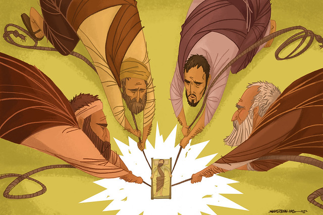
 "Dropped Through The Ceiling" - my submission for the very cool Old & New Project. Different interpretations of various passages from the Bible, from a wide variety of artists (Christian, agnostic, atheist, etc.), Old & New Project has set it up so that proceeds from the sales of the prints will go to the non-profit organization Blood: Water Mission.
 Old & New Project was conceived by designers Jim LePage and Troy Deshano. I'm honored to be a part of this fine project. Be sure to check out the other designs.
Subscribe to:
Posts (Atom)
