4.20.2006

While I'm away

Me the violinist
Please enjoy the soothing sounds of Jim Croce's "Time In a Bottle" brought to you by your host, via 1976.

4.17.2006

Spring Break

SO I'm torn right now. I want to post some artwork of mine, but I don't have anything scanned. I've been drawing in my Moleskine recently, but nothing's worth showing right now. I want to take some of these sketches and then do some Photoshop wonders to them, but I never have the time. I need to work on some side stuff, but again, the TIME. No time at all to do any of this.

ALSO I want to scan and post some great old illustrations, but I can't figure out just exactly what -- which book, which pamphlet, which illustration to show? I don't know. I have so much to show you all that I end up getting jittery over it and nothing gets scanned at all. Back to square one.

ALSO I need to work on some side stuff -- writing, believe it or not -- that might be a big deal for me some time down the road. But guess what? I have no time for it. Or, at least, I can't seem to organize my time -- just like my attic. My time mangagment skills are in the pits.

AND there are many follow-up posts that I've been meaning to get to, but I can never muster up the energy to work on them. Where's the third Polar Express post? The continuing Ottawa posts? My long-delayed post on graffiti? The drafts are there in my Blogger Dashboard, I just can't seem to... (again) find the time.

ALSO several deadlines are looming over my head at work right now and -- honestly? I find it quite difficult to fathom just how I've been able to do all of this in the first place.

I simply have too much that I want to do, need to do -- it renders me paralyzed.

THEREFORE

I am taking a little break from The Ward-O-Matic.

Time to focus on my family, on my work, on my sanity. Don't know how long it'll be until I return, but I when I do, I promise I'll be back in true form, with loads of great stuff to show and talk about.

Peace.

4.14.2006

The Key to Collecting


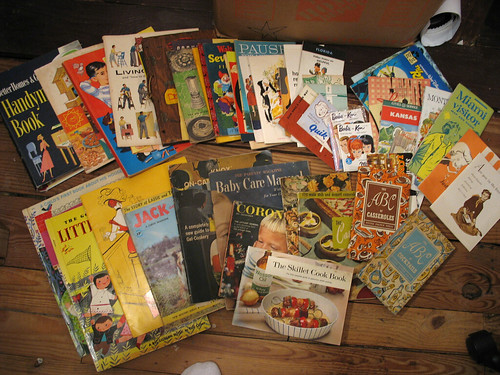
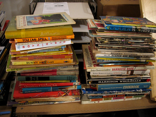
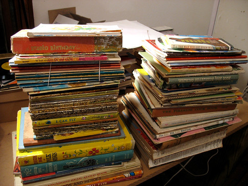
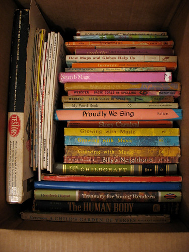
Man, I don't know why I'm posting these pics. I'm a glutton for punishment, I guess. Welp, here ya go. Just a taste of what I've accumulated throughout the years, ever since my 3 dollar purchase back in 2001. I started out just buying cookbooks, booklets, and pamphlets from the 40's through the 60's, but then I noticed similar tastes and styles with children's books, textbooks and various other ephemera, like maps and brochures, from the same era. What is it about paper? I swear I cannot pass a flea market booth without skimming for paper goods. And the fact that some of these things are cheap (anywhere from 2 to 10 dollars), makes it all the more fun for me.


Yes, eBay has played a major role in obtaining most of these items -- usually the books, of course. I try not to spend more than 20 to 25 bucks on a particular title, unless I know just how rare it may be. The good thing about most of these books is that the seller doesn't know what they have, and will be selling a hard-to-find book for $5. Lucky me.


You can see some of my Little Golden Book collection here. I have more at work and some just lying around in the attic. Like the rest of my collection.


I have not one organizing bone in my body, therefore I resort to boxes and plastic bins for all of my stuff. One day I'd like to be able to organize everything into separate catagories. Wouldn't that be nice? Anyone care to share your organizing secrets?

Having everything together in one place helps because I like to go up into the attic sometimes and just sit and browse through it all. Thumbing through pages and pages like a customer in a bookstore, I pore over all my purchases, often recollecting the times when I first bought them. Sometimes I might forget about a particular item, and then a rush will go through me, as if I'm looking at the book or pamplet for the very first time. There's nothing like rediscovering your collection -- at times it feels like finding a $20 bill in an old coat pocket, or something.

Of course there are the times I look at my huge collection and wonder, "Just what in the world am I going to do with all this stuff?" Am I really benefitting from having all these old books and papers up here in my possession -- a fire hazard, no less? But then I wake up from this fog when I pick up some booklet on Kotex products from 1955 and sit down and laugh at the cutesy female figure with spirals for eyes. I get lost in that world, I do. Not like I would've loved to live during that time, but I sometimes try to imagine what it would've been like to look at these illustrations and artwork when they were fresh and new. To have the knowledge that this was the way it was -- not "retro." To know that if I walked outside, I would see big metal cars with beautifully designed grills and tailfins, and gas station attendants to fill up your tank. Idealized world, I'm sure. Afterall, I'm only viewing it in retrospect from ads and articles, books and stationary, illustrations and drawings. Nothing is ever like it seems when it is viewed through the distorted glass of time. Just thumb through our magazines today and try to convince me that you identify with the people and products being shown. It's an illusion.

But I digress. What I was going to say is that when I do sit down and go through my collection, I get creatively charged. It's invigorating to see tons of great illustrations done with style. And somehow I try to imagine incorporating that same high level of panache into my own creations. It's more along the lines of paying respect to your elders, I guess. They raised the bar and you are just trying to do your best to reach it.

Often times, when I come back down from the attic after browsing for an hour or two, I'll plop down next to Andrea and sigh, "You know, when I go through all my stuff, it just makes me so happy."

And that is the key to collecting.


I'd like to see your collections, whether it be old stuff or new. You name it, I'd like to see it. What makes you happy?

4.13.2006

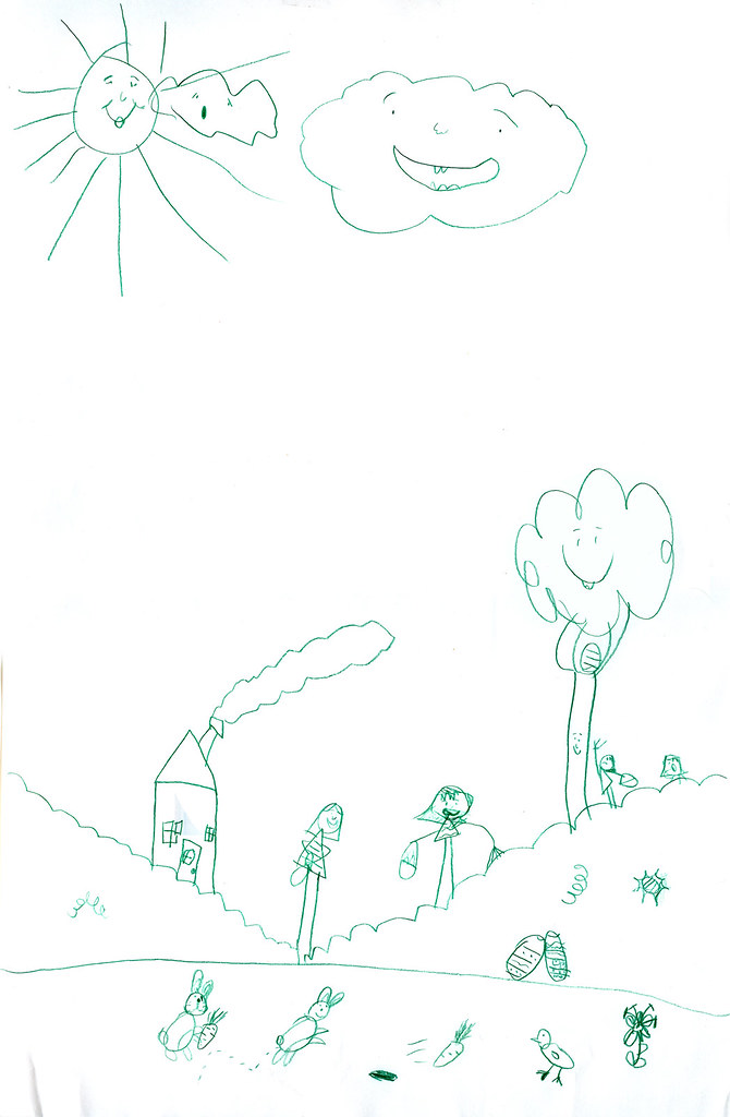
Ava Thursday: Easter Egg Hunt


(Please click to view larger.)

With Easter just around the corner, how about a nice Easter Egg Hunt drawn by your friendly-neighborhood Ava-girl? And to show you just how much Ava is into Easter, she drew this about two weeks ago. No lie. It's been taped up to the back of our front door ever since, a gentle reminder to the all-seeing, all-knowing Easter Bunny that chocolates and candies better be in full force come Easter Sunday. Actually, Ava's not that pushy when it comes to candy-driven events and holidays, but whenever I look up at the door, I can't help but get this sense of urgency, you know?

A couple of interesting things about this drawing: for one thing, it's big. Like 11x14 inches big. Don't ask me where she got such a large piece of paper because I didn't even know that we had such a thing lying around the house. Another thing, I love the way that she's drawn little motion dashes for one of the bunnies at the bottom of the page there to show that it's hopping. I don't recall ever drawing dashes like that for her before, so I'm curious as to where she got the idea. I also love all the smiley faces -- wouldn't you just love to hang out in a place where everything has a smiley face? In Easter Worlds like this one, everything must be happy and show it, of course.

One of my favorite parts to this drawing is the little girl reaching up to get the egg out of the tree. Subtle things like that bring a smile to my face every time.

Here's to a wonderful Easter to you and yours.

4.10.2006

3 dollars

California Wines: Chicken & Turkey

It all started with a $3 purchase at a frilly froo-froo antique market in Snellville, Georgia in late 2001. Found in a tiny booth, deep in the back of the store, and in a basket on the bottom shelf of some old cabinets were a series of small (roughly 3x6 inches) vintage pamphlets touting the use of California wines for cooking. My senses were piqued when I spotted the simple 50's-style graphics on the front of each pamphlet -- the bold use of primary colors sensibily combined with just the right amount of linework was so stinkin' appealing to me. As I opened up each booklet, there were about four to five simple spot illustrations found throughout, mostly there to add visual representation to the various recipes featured. I dunno what it was, but there was just something about the stylized items and characters in these pamphlets that opened up a whole new world for me. It was then that I decided that I needed to find more artwork like this.

California Wines: Fish

California Wines: Meats

California Wines: Wine & Drinks


And now, five years later, I've accumulated a great deal of artwork from the mid-century era, and I still can't get enough of it. Why? Why do I collect this stuff? Not to mention the overall appealling nature of the illustrations, but to me, the artwork exudes great design qualities that I don't normally see in today's illustrations. Maybe it's something about the deceptively simple use of lines and color, along with the brilliant execution that does it for me. Maybe it's the stylization of shapes and patterns, or the fact that these illustrations were done during a time of great opportunism and consumerism -- companies and advertisers were trying to reach as many people as possible and wanted lively artwork to do just that.


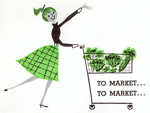
Two weeks ago, the Great Leif Peng asked me to contribute to his fantastic blog, Today's Inspiration. He started up a wonderfully new Flickr set called Ads w/ 50's Storybook Styles and decided to jump start the set by having a different person write a post about some of the artwork or artist featured in this set for each day of the week. After checking out some of the samples that he was thinking about posting, I chose to talk about the ads that were directed more towards the Housewife, mostly because the majority of my own collection consists of cookbooks, pamphlets, and various household-themed ephemera. Anyway, check out my post, Art for the Domestic Goddess. And be sure to check out the rest of the guest contributors for that week, too.


As most of you know, I collect and showcase these things on my blog because I love it. I love the artwork, that's it. Never do I collect things out of "coolness" or "hipness," nor do I post said stuff on my blog for the sake of rubbing it in your face. I post this stuff because I love the artwork and I want to share it with you all. Also, I post it because I think that there's something to be said for the quality of the work from that time. There was a certain style that emanated from the pages of magazines and cookbooks from that era that probably will never be emulated ever again. If there was some way that we, as artists, could learn from our illustrative past, then hopefully posting on blogs like Leif's and mine could be seen as inspiring.
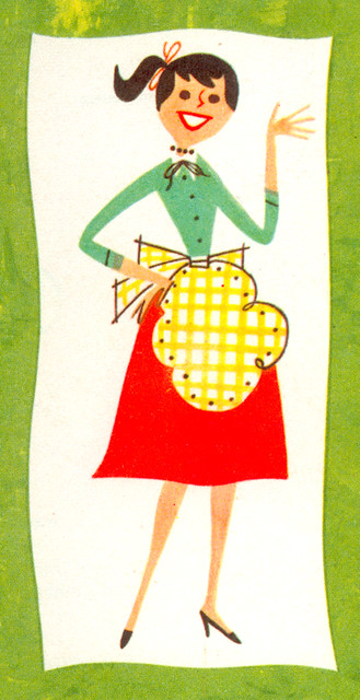
Knox Salad Book: Girl on back

4.06.2006

Spotlight: Big Wide Action Show (Part 2)

This is part 2 of a continuing series on the making of The Big Wide Action Show Open. Part 1 was on thumbnail storyboards. Part 2 is on character design. Part 3 is on layout, backgrounds and color. More to follow -- stay tuned.

And we're back. Sorry for the delay in continuing this series. There was so much artwork, so many drawings to go through that I found it difficult to decide on exactly what to upload. But enough gabbing -- I've got a good amount of work to show you, so let's continue.

In the first installment I showed you all how I go about visualizing a particular project by thumbnailing it out first. But even before I did this, I had to create and develop the characters first. It was a pretty interesting process I went through to design Big and Wide, the two main characters in The Big Wide Action Show open, so I'll try and be brief.

It's extremely rare to create and animate original characters when you're in the broadcast animation business. Most of what we do within this field is based on pre-existing characters, characters that have already been created and designed by networks such as Cartoon Network, Nickelodeon, PBS (PBS Kids), and others. I've had the great opportunity to animate some of my favorites from my childhood like Shaggy and Scooby, as well as Bugs Bunny and Daffy Duck. I kept pinching myself whenever I was working on those projects because I couldn't believe that I was getting to draw this character ALL DAY -- the same character that I got in trouble for drawing during class back in the day. It was very rewarding (to say the least). But there's really nothing to animating these characters -- they are already there with model sheets, lip synch positions, character poses all done and ready to animate. The legwork and sweating over character design has already been done for you, the animator. But what about when you have to create new and original characters? Ah... therein lies the rub. Read on:

The first all hi-def, all animation network, Animania, approached us back in 2004 and basically said, "We need you to create some original characters for us." Whenever a network says this sort of thing, it is tantamount to gold. I had to wipe the drool off my face when I was told that I would be the one to tackle this great project. And boy, did I tackle it. A little background info for you first:

Animania had a block of shows that were more geared toward action and sci-fi and wanted to have a couple of hosts to introduce and promote this block. But what to call it? This block of shows definitely needed a name and a concept to give it some identity, instead of just simply showing a bunch of shows. Animania's tagline for their network is: Animania: Big. Wide. Fun, so they decided to do a take off of their tagline, and thus, The Big Wide Action Show was born.

The clients wanted to do a send-up of all those superhero/action/sci-fi/monster genres -- poking fun at these genres, but at same time paying homage to them all. The open was going to be a big challenge for me -- tons of scenes with tons of action crammed into a very quick 20 second time frame, so the characters had to be bigger than life and memorable. The clients wanted two characters to act as "hosts:" Big, a superhero-type dude, and Wide, his sidekick. Originally, in earlier versions, Big and Wide were just regular joe-shmoes that just so happened to be a world-saving super-duo. Here was an earlier version (by the way, please click on all images for larger versions):
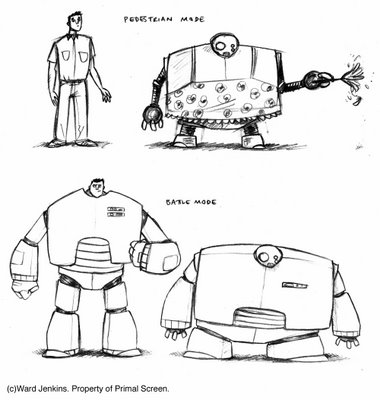

The joke here was that nobody knew that Wide was a robot and did odd jobs around the house. This was their "pedestrian mode." But when called to action, they would then put on their metal gear to get into "battle mode." It was pretty funny, but too much time was needed to establish who the characters were before they actually did any butt-kicking. This storyline was scrapped. For a while, both Big and Wide were supposed to be human -- Big being a superhero and Wide being this strangely wide man. I did a couple of drawings with this in mind:
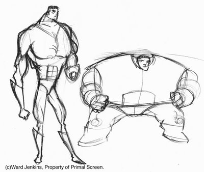

Geez, it's kinda embarrassing to show you all the above drawing because it was so early in the process. I was just getting started and I hadn't had the chance to really get all the proportions and musculature right. But below you can see that I pumped Big up more because, well, he didn't seem big enough. Still needed work.


I liked that Big had this smallish head on a huge, pumped up body. Kinda taking that superhero concept to the extreme, with a teeny-tiny head. Speaking of Big's head, I did some studies with him wearing these googles, similar to the character of Batou of Ghost In The Shell. I liked the mysterious look that the goggles gave him:


Still not satisfied, I did some more explorations with Big, even giving him a Japanese jitte-like baton:


I was not digging Wide as a human character. He looked odd, being this strange, squashed, hunched-over character. He just didn't look aesthetically pleasing to me. I mean, a character like Wide would prove difficult to animate anyway, but I wanted him to be likable, and a crouching, deformed man did not seem so likable to me. I suggested that maybe going back to Wide being a robot would be better for the character. That way, the squashed look won't look so odd for a robotic character, like he was designed to be this way, plus you got your sci-fi genre. Some early concepts of Wide as a robot:

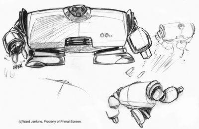


I was liking how Wide was progressing, but the clients wanted him to be more human-like in appearance. This would make Wide even more likable to the viewer and the clients were right in this bit of detail. Even though I was digging doing something "cool" by creating robots, Wide was looking mighty cold. No personality. But more on Wide later....

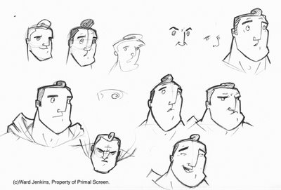
Going back to Big, the clients felt that we were getting "too serious" with the designs. So, I got rid of the goggles, and took a long, hard look at the stereotypical male superhero and all the send-ups and take-offs of that genre: Roger Ramjet, The Tick, Bob Parr of The Incredibles, and many others, to try and see if I could capture the spirit of the superhero that maybe the others had not picked up on. A hard task, but it was worth a shot. Getting into character, I felt that Big was a softy at heart, kinda ditzy, but was a sweetheart who would never hesitate to get that cat out of a tree for you. I began to develop a wide-eyed look for him, with that ever-present curly-cue lock on top of his head as a cutesy joke:

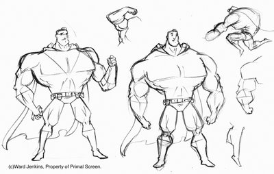
With his body, extreme was the main word. I wanted Big's muscles to be so grotesquely developed that there would be no way that he could move if he was a real person. To give off this effect, I drew his hands and feet incredibly small, making his muscles seem larger than they already were. He now has a tapered, dainty look to him:

With a couple of more tweaks, we finally got our guys. Below are the final modelsheets that I gave to my assistants to animate. As you can see, Wide went through more changes before we reached this final design, and I would have to say that I'm very happy with the final result. One thing that I was worried about was maintaining consistency between the two characters, and I believe that we achieved that.

Here is the size comparison for Big and Wide:


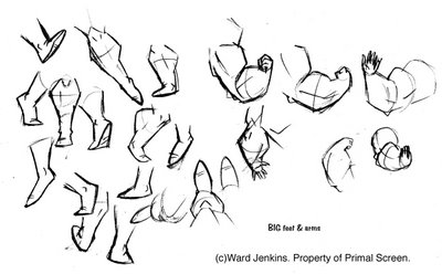
Various hands and feet for Big. His feet proved to be a strange thing to animate. Don't know why.


I love drawing a variety of faces for a particular character. It's fun to put yourself in the character's head and try and think what they will look like if they were sad or happy, excited or depressed, introspective or curious. It's a good exercise for animators to explore different emotions.
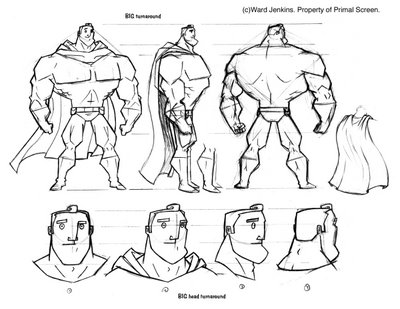

Here are Big's turnarounds, both body and head. Man, the CHIN. That was tough to figure out.


At first, I wasn't sure about the anthropomorphic eyes and face for Wide, but like I said earlier, I now see that it was necessary for the viewer to be open to him. My earlier versions made Wide too cold and lifeless. No connection was being made between viewer and character. But here, he's a very likable guy, offering that perfect comical sidekick quality that we so desperately needed. A good balance to Big's simple doofyness.


Wide was more difficult to animate, considering that he was wide and made of metal -- there was some squash & stretch going on, but not too much. Having a segmented armor thing going on made it a lot easier to pull off some of the squashing and stretching. The fun thing I added was that Wide's "hands" can convert into various tools and objects, like a blow torch. Or a plunger.

Overall, Big and Wide had to look like a true team, a believable superhero team that could save the world in all their goofy, quirky ways. I was very happy with the results, and I had a blast animating them. Even though Wide was a bit difficult to animate, I saw it as a great challenge and I enjoyed that aspect of the character.

Up next: Backgrounds and Color.

4.05.2006

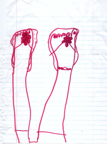
Ava Thursday: Sandals


Ava drew this while riding in the car on a recent trip. The sandals were bought for her just a couple of days before and she was so proud of them.

Nothing like a new pair of sandals on a beautiful spring day.

4.01.2006