3.30.2009

New B-Boy Prints! And a Giveaway!


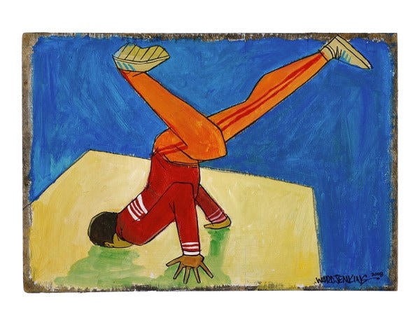
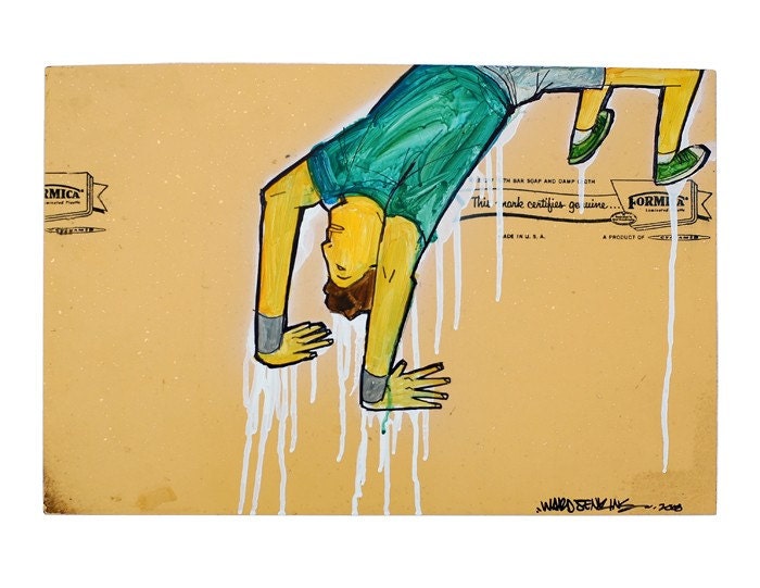
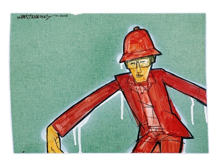
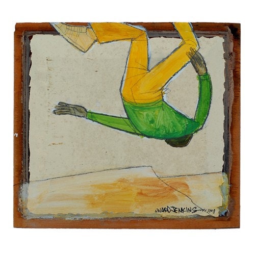
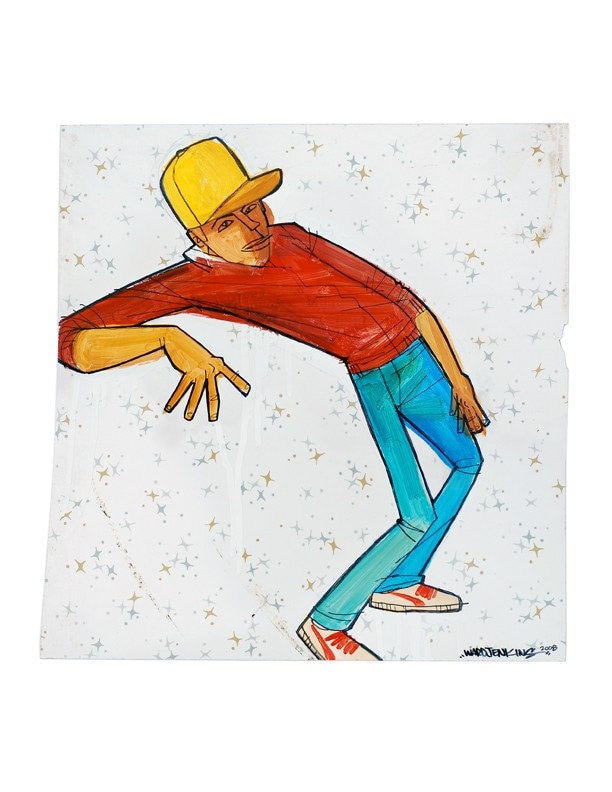
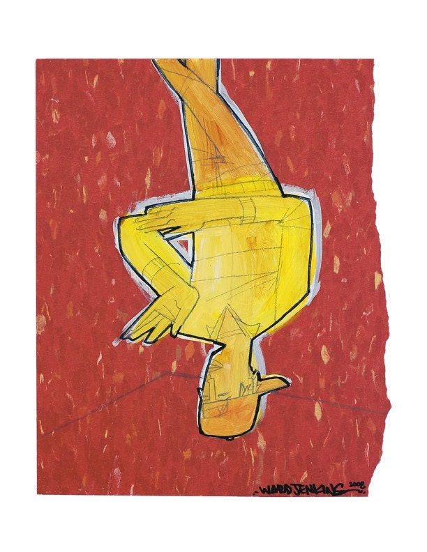
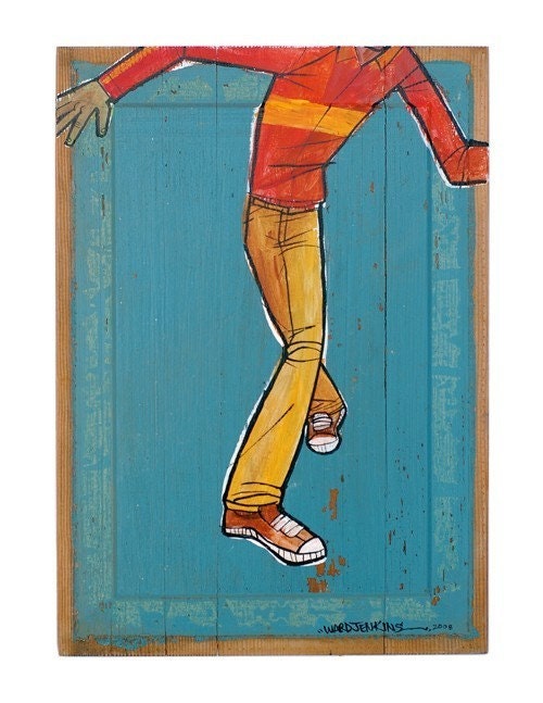
I'm happy to announce 7 new prints available in The Ward-O-Matic Shop on Etsy! And what's even better is the fact that all seven are from my b-boy series!


Yes! So here's the kicker: I want to celebrate this wonderous event by offering a giveaway to TWO lucky winners. To enter, leave a comment on this post by 11:59 midnight PST on Wednesday, April 1st. (This is serious - no joke!) I'll put all the numbers into my newsboy hat and have each of my kiddos pick out one number. The winners will be announced on Friday, April 3rd. Winners get a print of their choosing from my Etsy shop (with a few extra goodies).

Good luck!


B-Boy Series: Etsy
The Ward-O-Matic Shop

COMMENTS ARE NOW CLOSED. Thank you for participating in my very first Etsy Giveaway. I'm completely overwhelmed by the tremendous response! Don't forget to check back on Friday when I announce the two winners!


3.21.2009

Kidd's Toy Museum

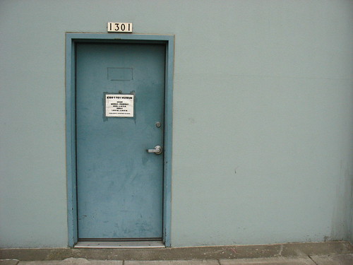
Entrance to Kidd's Toy Museum

Behind the bland blue door of a warehouse in SE Portland, is perhaps one of the largest private toy collections out there. I took the kids recently (in February) to check out hundreds of toys dating mostly from the 1860's to the 1930's. Although, I saw some stuff from later years, as well. The lady behind the messy desk there told me that there's even more to the collection, but is currently in various warehouses. They simply don't have the money or space to have the entire Kidd's toy collection available to the public. But what is available to view is quite impressive.

A fascinating place. And better yet, it's free!

Oh, and I have to say this: visiting the museum offered the opportunity for me to talk to Ava about racism. Hadn't planned on it, but hey, no time like the present.
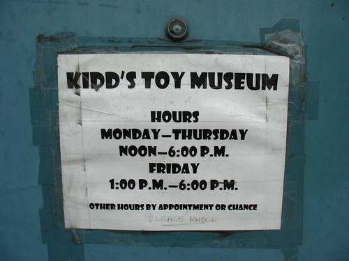
Other hours by appointment or chance
No frills: the museum's hours taped up on the door. Love the "by appointment or chance" line.
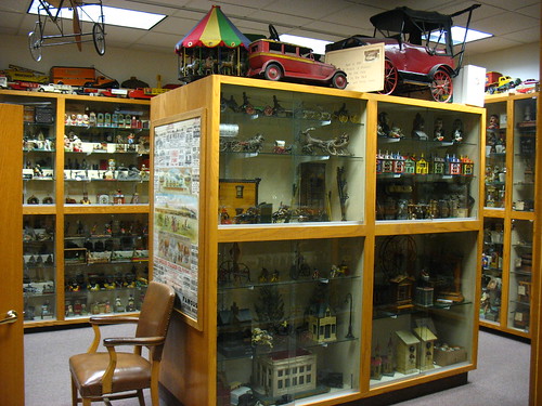
Everything's behind glass cases
Everything's behind glass cases, so it's safe for the little ones to check out the toys. Just don't bump into them, of course.
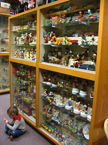
The Disney case
A half-awake Ezra sits next to a case filled with various Disney-related toys.
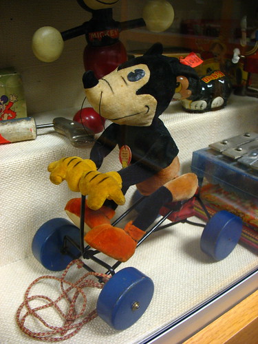
Mickey toy
A Mickey pull-toy from the 30's.

Three Mickeys
We Three Mickeys: Interesting to see the different ways Mickey was depicted back then.
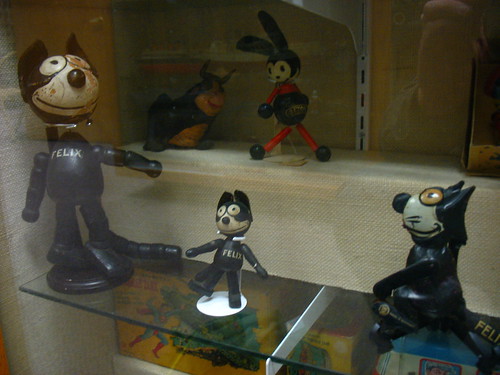
Felixes and Oswald
Felix is a great character that pre-dates Mickey. While taking this shot, I noticed the rabbit in the background: Oswald the Lucky Rabbit. Disney's first cartoon character.

Oswald the Lucky Rabbit
Oswald the Lucky Rabbit: Disney's first cartoon character, co-created by Walt and Ub Iwerks. I couldn't get any closer without blurry shots, but underneath Oswald's name, "Universal" is mentioned. That's Ferdinand The Bull from the Disney short film of the same name (1938).
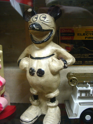
Uhhh....
Umm....not sure what to make of this. Kinda creeps me out. It's chalkware, that's for sure.
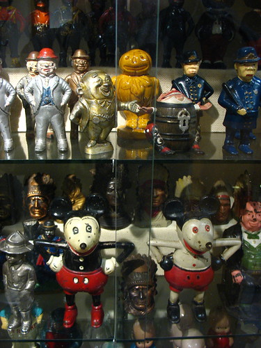
More banks
The place had tons of coin banks. TONS of 'em. Here's a few of the smaller ones.

Motorcyles
Toy motorcycles. Check out Popeye in the middle there.

Automobiles
My Dad owned one of those orange metal cab cars on the lower shelf there. I think he still has it at home. Came from his dad when he was a kid.
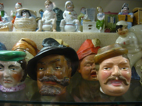
Porcelain, I think
Odd assortment of porcelain (I think) heads. Anyone know what these are for?

Various
Various oddities. Your guess is as good as mine.
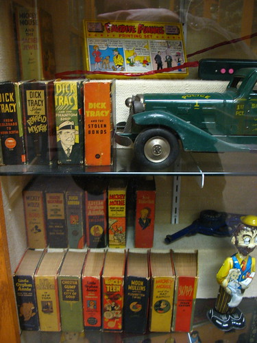
Old pulp comics
Old pulp comics. I remember my grandparents having one or two of these around for the kids.

Ezra trying out a coin bank
Ezra trying out a coin bank at the entry. Never could get the thing to work right. Ezra, of course, got mad.

A WORD TO THE WISE:

Since this is a historical collection of toys throughout the decades, mostly pre-1940's, there are several cases that have very un-PC depictions of African-Americans, mostly coin banks in blackface. These depictions are ugly to see, yet important not to forget. I've chosen not to show any photos of these items mainly because I don't feel that it's up to me to do so. I wasn't aware of the items when we visited the museum, but upon seeing the cases, I figured that I couldn't just hide them from Ava. (Ezra was asleep in my arms at the time.) I decided to sit down with her before we entered the room and talk to her about what she was about to see: about the past and how certain races of people were depicted back then. It was wrong then, as it is wrong now, but I told her that it's important to see these items and talk openly about who we are as a human race. I wanted her to see it for what it was: something ugly from our past and hopefully we've learned from it. To see blacks shown as lesser human beings on children's toys to having an African-American in charge of one of the most powerful countries on earth shows that we've definitely made some progress. But, I told her, it doesn't mean that others still won't make fun of and have hatred toward other races. And that is wrong.

Ava listened intently. "Why did they make them look like that? It looks ugly."

"I know," I sighed. "I guess that was their point back then."

So, if you want some racial education to go along with your children's entertainment one fine day in Portland, then Kidd's Toy Museum is for you.

Some more photos can be found in my Kidd's Toy Museum Flickr set.
3.18.2009

Ward Jenkins dot com

Ward Jenkins dot com

The site has been updated and now you can check out my illustration work, animated commercials, paintings, graffiti, and short films all under one roof FINALLY.

It's weird to see it all together in one place now, especially my two short films, figure drawing and noir. figure drawing has never been seen outside of a few screenings 10 years ago, so yeah, this is like airing out my dirty laundry.

I'll be sure to talk more about those two films here on the blog soon. I promise.

In the meantime, enjoy the site and tell me what you think.

3.12.2009

Relic

Relic

Ava trying out an old Smith-Corona typewriter. A couple of days before this, Ava asked me "what's a typewriter?" when the word was brought up in conversation. I actually had to describe the contraption, which sounds so alien if you think about it. She's played with one before, so I had to jog her memory a bit. "Oh, you know, Ava -- that thing where you put the paper in it, and it has all the letters like the computer, but different?" "Oh, yeah...."

Both she & Ezra love to play with these things. Ezra likes to smash all the keys down to watch the typebars get all entangled. Ava is very meticulous with each letter, pressing each key very firmly.

Oh, I have to say, this picture was taken over at our good friends Christina & Daniel's house.

3.10.2009

Illustration for Heal Emru

Heal Emru

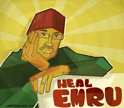
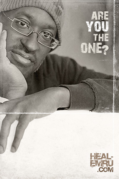
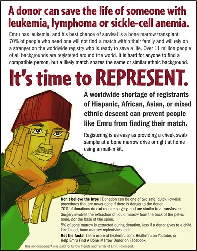
I did this illustration for HealEmru.com last year. It was the first bit of artwork I did after my letting go from Laika. Emru's sister Tamu asked me if I'd like to contribute a poster design for an upcoming hip-hop show. They were going to have a table set up there and needed some items (posters, buttons, etc.) with some nice designs. I, of course, said yes.

The illustration is based off of this publicity photo:


Tamu wanted something along the same lines, but if I wanted to do something completely different, that's fine with her. I thought that adding a different twist to something that they already have would keep it grounded. Here's how the illustration was used:


Originally, I drew only Emru and the area at the bottom for the type. Kept the artwork simple so Tamu could do whatever she wanted with it. I then went back later on and did my own version by creating the sunburst background and "Heal Emru" lettering.

I miss Emru. He passed away on 11 November, 2008. Tamu and Emru's family continue the tireless effort to garner attention for bone marrow donors. To learn more, go here. And then go tell everyone else.

3.09.2009

Objectified/Subjectified

I guess you could say that this is my entry for You Thought We Wouldn't Notice.


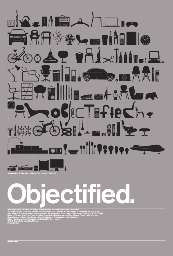
When I first saw this incredibly cool poster for the new documentary Objectified recently, I couldn't help but think that I'd seen this concept before: objects in black, with minimal detail silhouetted up against a basic solid background. And the type, too. So, where had I seen it before? I thought to myself. Maybe it was done by the same people? Maybe Build, the company who designed the poster, is known for this sort of thing? Maybe it's a common enough concept that it's not worth finding out? Nevertheless, I began the search in my extensive archives.

Ah, yes. here it is:

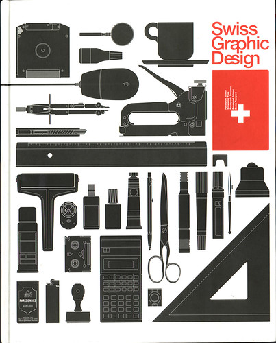
Swiss Graphic Design

The cover to Swiss Graphic Design, edited by Robert Klanten, Hendrik Hellige, and Michael Mischler, published in 2000. I don't own this book. I scanned the cover back in 2004 when I was working at Primal Screen. One of the designers there had the book on his desk and I was immediately intrigued by it.

I'm not crying foul here. I'm just presenting something that looks very similar to something else. I find it interesting that the objects themselves are rendered almost the exact same way: black with thin line details.

Here's a post on the film's blog about the logo that's shown in the middle of the poster:
Objectified logo explained.

It's there where you can get a closer look at the objects:


Click on image to view larger.

Coincidence? Or not?

I found this while writing this post: Chinese publication The Outlook Magazine rips Objectified logo. What goes around comes around, I guess.