3.31.2006
Photobooth Friday: Oma
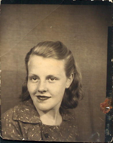
Oma passed away a week ago, so I felt it would be fitting to post a photobooth photo of her back when she was about 14 or 15 years old (around 1935 or '36). On the back it says "Merle Adams," which tells us that she was already married to her first husband.
Oma's front teeth were knocked out from a car accident when she was around 12. Even with partials put in, she'd always be self-concious about smiling. That's why we don't see her showing off her teeth here.
However, that would change years later.
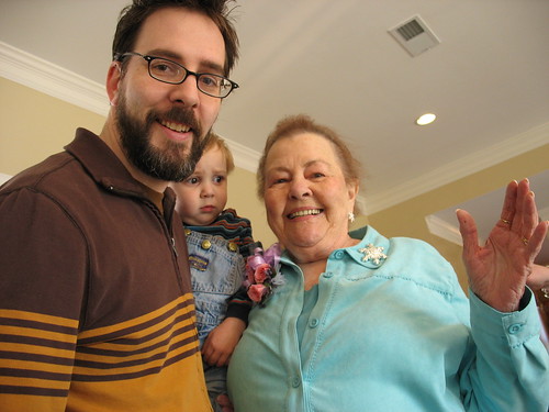
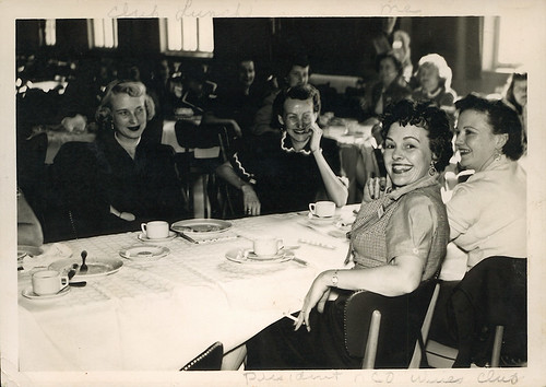
Oma was the president of the NCO Wives Club when Opa was stationed out in Kaiserslautern, Germany (circa 1954), and here we see the wives at a Club Luncheon. You can't miss Oma. Just look for the one with the bright, beaming smile. We're told that Oma was showing off her brand new teeth. As far as I see it, she was bound to get her money's worth out of them.
She still had that million dollar smile even at 85.
More Photobooth Friday goodness at hula seventy.
3.30.2006
Ava Thursday: Plussing Faces
Walt Disney coined the term plussing as a way of making an idea even better. By telling his workers to plus it, even when they think they nailed it, gave Disney that extra edge when it came to quality animation back in the day. Pixar is a staunch believer in plussing their work. And it shows.
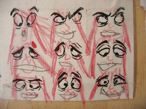
So, in the case of my dear Ava, back in October she had already added her touch to these eyes that I have taped up on my desk at work which were copied from the animation tome, The Illusion of Life. Just the other day I looked up and saw that she's since plussed them, adding noses, lips and hair.
I sense a future Pixar employee, folks.
3.29.2006
A Force
"My mother... was a force to be reckoned with."
With this bold opening line from my mother for Oma's eulogy Monday, there was a definite wave of all-too-knowing laughter from the grieving crowd. I swear I also heard a few "amens." A bold statement for a bold woman. Those who were close to Merle Bryant knew just how close my mother's words hit home. My grandmother was a bold, brash woman, who loved and lived life to the fullest. No apologies from this Southern Gothic woman born between the Wars. Oma grew up with the harrowing blanket of the Great Depression overhead and soon took care of her family when father fell sick and mother incapacitated. Taking care of two sisters and one brother at such an early age would force this belle to grow up quickly, tending to her family like only a mother could. Married at the tender age of 14, she became a 'true' mother a year later. This was during a time when marrying young was not frowned upon so much. Plus, it was the South.
After 2 more children and a divorce, Oma then met the man who would change her life. Again. After the divorce, Oma vowed never to marry again, but that all changed when she met Carl Bryant. Carl was smitten by her, even knowing that she was a divorceé with three kids. They got married a year later.
Oma was never one to stay still. Being married to an Army man meant traveling and living overseas. During this time, they had three daughters, the first one my mother, Carlene. The way I understand it, Carl and Merle were fantastic dancers. They danced like silk at any VFW soireés and parties. Oh how I wished I could've seen them dance when they were young.
"At the age of 40, Oma learned how to drive, had a child and went back to school to earn a nursing degree."
I wish I could lay claim to that line, but my mother penned it for Oma's obituary in the paper. I love that. In those few words, you have the essence of Oma. She was a force to be reckoned with -- a pain in the butt at times, but always there with a cold rag on your neck if you were sick from chemo treatments. She was always quick with a retort, and loved ribbing from her sons-in-law. A little too honest at times, but never without heart. She meant well, even if she had favorites.
When her beloved Carl died several years ago, it was obvious that she was a different woman. When I would see her, it looked as if she had been punched in the gut. She lost her will to live, it seemed. Even with a large family surrounding her, she was alone and sad.
She had nerves of steel, a voice that was loud and commanding like a foghorn, and a laugh that could light up downtown Atlanta. I giggled each time I would call her and she'd answer the phone, "M'yellow?" -- her thick Southern accent completely altering the usual "Hello?" greeting. Got me every time.
I can't wait to see her again, to go up to her and give her a big bear hug and kiss her on the cheek and ask to see her and Opa dance together again. Dance like silk again.
3.25.2006
My Oma
3.23.2006
Ava Thursday: Frustrated
"I can't draw anything," Ava sighs.
"Well, you don't have to draw anything if you don't want to," I reply.
"But I want to draw."
It was last Sunday night, and Ava and I were waiting in the car while Andrea was grocery shopping. It was late and Ezra was already fast asleep in the back seat. Ava loves to sit up in the front with me when Mommy is gone. She excitedly climbs over the seat and plops down with a pencil and some paper. But it was the end of a long busy day and Ava was tired. She wasn't feeling like her usual jovial self. After some thought, she resorted to the most basic of drawing exercises: she traced her left hand. Twice.
"OHH! I can't do it right! It's all messed up!" Ava shows me her drawings and while I see a great tracing job done by a 5 year-old, Ava thinks otherwise. "I can't draw anything," she sighs. Shoulders slumped and lips pouting.
It hurts me to see her like this, because I know just how frustrating it can be when you're tired and exhausted, but you still want to draw something. Drawing is Ava's primary creative outlet. It's hard for her sometimes though, because when she hits a wall with it, there's no release and she doesn't understand what that's all about. She just knows it doesn't feel good. And when I told her that she didn't have to draw anything if she didn't want to, she wasn't hearing it. Not drawing is not an option for Ava.
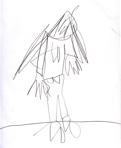
After our conversation, she fills a couple of pages with scribbles (with seeming reluctance) and then she draws this:
To me, this is a powerful image. I can almost feel her frustration, anger, irritation and dejection here. Notice the slumped position of the head, the disengaged pose, the sharp, scribbly features. There was no care taken in this drawing -- Ava drew this fairly quickly, almost on auto-pilot. If I did not know the story behind this particular drawing, I probably would've been worried for my girl, fearing that something was incredibly wrong with her. But I'm glad to have witnessed this creative output because if Ava ever produces drawings evoking this same intensity, I'll know that it's just something that she's going through. Just as every single artist has their ups and downs, so does my daughter.
As a parent, there's a part of me that wants to protect my child from anything rooted in negativity. But that's not entirely realistic, is it? And I would be depriving my daughter the full range of emotions that so defines our experience as human beings. It's one of the hardest things about being a parent.
The sweet and the sour: this is what makes great art.
3.21.2006
A Blast From my Past
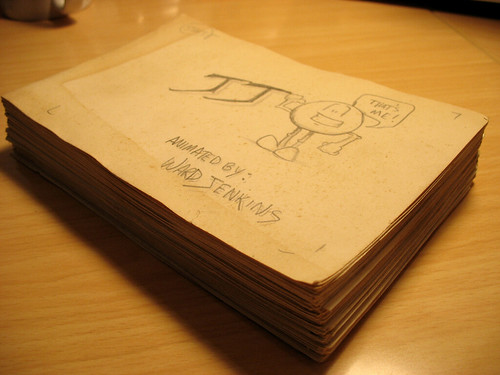
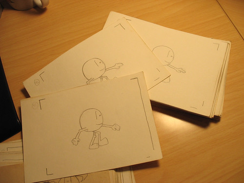
Remember my first piece of animation that I ever created? I mentioned it in this post. Well, guess what I found while going through some old boxes of mine at my Dad's the other day? Wow, the cover has yellowed quite a bit, but the rest of it looks to be in pretty good condition. It was done for this advanced studies class that I took in 9th grade, called IMPACT. Like I said before, I was a terrible student for this particular project because I could never work on it while at school, therefore it looked like I was slacking off. Plus, it didn't help when I shot the thing, I had to wait 2 weeks to get the film sent off to be developed and processed. My teacher was fuming by the time I got it back.
Titled, "JJ," the very, very short film tells the story of a little character being created by an artist's hand, who then starts to walk around (A walkcycle? What was I thinking?) and then have things happen to him, similar to DUCK AMUCK. I remember having fun working on it.
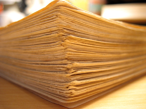
It consists of 146 drawings done on 4x6 inch postcards, all shot on the wall with an 8mm camera. After showing it to my teacher, she just about flipped when she first saw JJ walking. She ended up giving me a C for the class, instead of the originally intended F. About a year or two later, my aunt's dog somehow found it and ripped the film to shreds. I was devastated.
It's completely strange to come face to face with this strange artifact from my past -- all the way from 1983. I was 14 years-old when I created it. Man. That person was a totally different artist, a totally different me back then. I feel a bit guilty when I lay my eyes on this yellowing stack of drawings because I pretty much neglected animation right after this. It wouldn't be until 11 years later when I finally get back into it by taking some animation courses in college. I feel that I missed out on what could've been 11 years of studying and training to become a great animator.
Anyway, enough of the "should've, could've, would'ves" -- I'm an animator now, flippin' and animatin' and lovin' every minute of it, so no sense mulling over it, you know?
And yes -- I plan on scanning the entire thing so expect to see JJ walk again soon!
3.19.2006
Spotlight: Big Wide Action Show (Part 1)
This is part 1 of a 4-part series on the making of The Big Wide Action Show Open. Check the rest of the series: Part 2. Part 3.
Welcome to the first installment of Spotlight here on The Ward-O-Matic, a special series where I focus on a past job that I worked on and share with you all some of the processes that it took for me get the job done. I realize that I've pretty much neglected the work aspect on this blog, but hopefully this will right that wrong. It's kinda weird that I have not mentioned much of what I do at Primal, and quite frankly, I'm sure that most of you have absolutely no clue what I do. Actually, most at Primal are in the dark as well, so don't feel so left out. Anyway, with Spotlight, I plan to show how each job has been a learning experience for me, and I'd like to share some of this knowledge with my readers. You'll get a little insight to how I approach each job as well as check out my thought processes and methods. One thing I must say is that even though I've been animating for 10 years and have been at Primal for the past five, in no way am I saying that my methods are the best. Every director (I've observed) has a vastly different approach to animation -- from broadcast to feature to TV production -- and so there are many, MANY different ways to skin a cat. All I'm doing is letting you in on some of my methods, no matter how quirky they may be. Either you may get something out of this or have extreme sympathy for my assistants (in that case, please email me and let me know where I'm going wrong).
About a year and a half ago, I had the great opportunity of creating original characters for this all hi-def animation network called Animania (part of the VOOM HD network). They needed an open for this block of mostly action shows (primarily aimed at the boys, obviously) called The Big Wide Action Show. Since Primal Screen has done a good amount of show opens (see: Harvey Birdman: Attorney at Law), as well as created the entire identity packaging for Animania, it seemed like a perfect fit.
THE BIG WIDE ACTION SHOW OPEN:
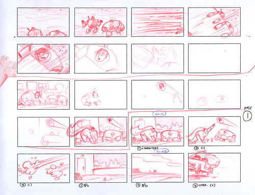
The story for the open was conjured up by a writer hired by Animania and thusly, it was up to me to visualize it. I was given a one-paragraph treatment of the story and once I got the characters designed and locked down (another whole post coming up), I started to work on the storyboards (or 'boards). But I didn't start with full 'boards just yet. I started with thumbnails.
Thumbnail sketches, or "thumbnails," are an early part of the animation process. Basically, it's a brainstorming session to see just what the spot (in this case, the open) will look like. Done in a smaller scale (and quickly), it gives me a chance to focus on the placement of the characters and action as a whole. Working small allows me to see the entire frame sans extraneous detail. Once I get the thumbs looking right, I then take the images that I like here, scan them, and put them together in After Effects to create an animatic, or "moving storyboard," to check for timing and pacing. I also resort to thumbnails when planning out my keys when animating. Most animators know about this very important part of the process.
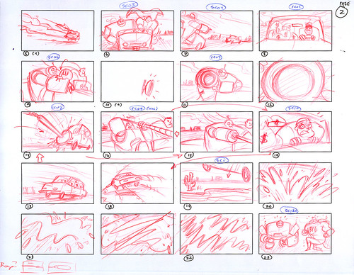
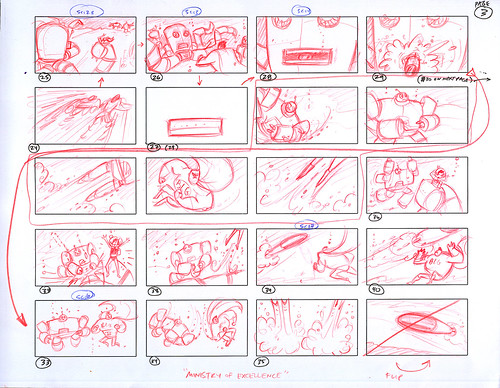
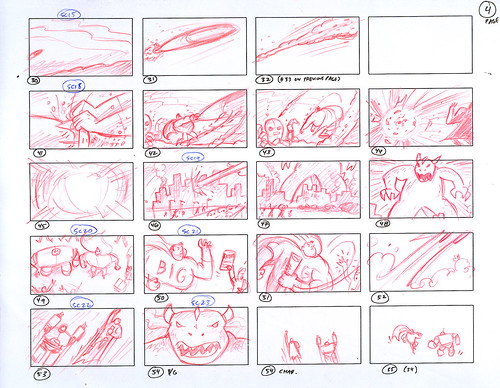
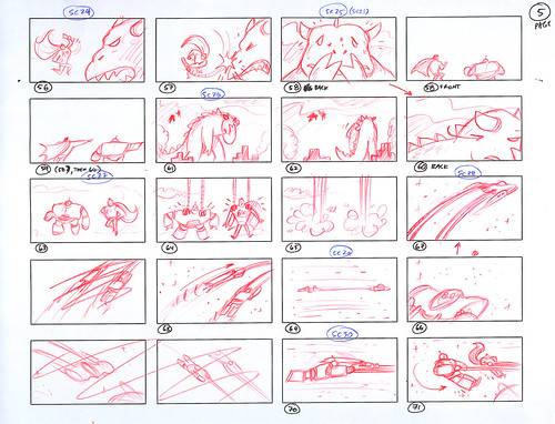
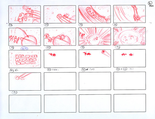
The basic premise of this story is that our superhero BIG and his robot sidekick WIDE (Animania's tagline is "Big Wide Fun") are called to action to save the world -- multiple times within 30 seconds. It's done tongue-in-cheek, with obvious nods to superhero and action clichés. Remember, we're living in the Age of Irony. There was A LOT of action to be planned out from that initial one-paragraph treatment for just 30 seconds, but the clients wanted it all. My first challenge was to get it all in there and make it understandable for the viewer. Not an easy task. What you'll see in the following thumbnails are my gut drawings, drawn quickly, and drawn with the viewer in mind. The action skips around, but if you follow the numbers, you'll (hopefully) understand what's going on. Be sure to click on each page for a closer look:
After a couple of false starts (we went through several versions of the treatment before the clients liked this one), you can see that I didn't get it started until halfway down the page. The joke here is that it would seem kinda funny if a superhero and a robot are tending to their garden when they get the signal.
Sorry it switches around here, but if you can follow the story, BIG and WIDE nab a runaway burglar in their trusty, rusty bucket of bolts.
Inexplicably, we are now underwater with our two heros battling it out with an underwater nemesis. We changed the robotic octopus to a manta ray-like submarine because having to animate eight metal tentacles would prove to be insane. Also, we got rid of the damsel-in-distress for timing purposes.
After blowing up the underwater bad guy (boys like things that blow up real good), the scene switches to a city under siege by a Godzilla-like monster. The scenario pretty much remains the same here, save for the fact that the monster went through some changes before animation.
Of course, the joke here is that BIG smacks the monster on the nose like a naughty puppy and the monster leaves, dejected. I really liked working on this scene. Once that creature is gone, our two heros are suddenly wisked away by aliens in a spaceship. Hey -- they covered all bases here with action, superheros, monsters, AND sci-fi.
More explosions. Gotta love that. There was this running gag at the end where BIG and WIDE see their signal in the sky again, causing them to take off and save the world again, but we nixed that. No time left.
Next installment I'll talk about how I created the characters of BIG and WIDE. Stay tuned....
Check out how I created our two main characters, Big and Wide, in Part 2: Character Design.
3.16.2006
Ava Thursday: Tiny Book
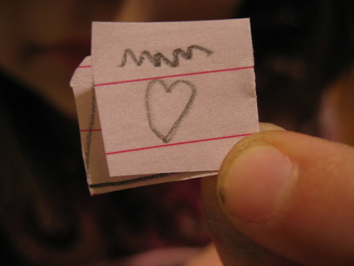
"It's a book about love," Ava tells me.
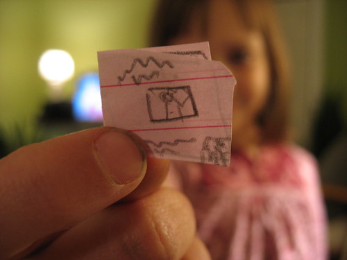
This is the cover to this teeny, tiny book that Ava drew and cut out yesterday. It really should be the back, because of the way the book opens, but no, it's the cover, Ava insists.
"So what does the inside of the book say?" I ask her.
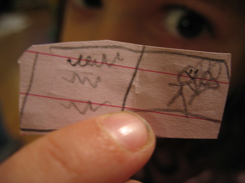
"I don't know." And for some reason I'm not surprised. I do know that that's a person holding a bouquet of balloons.
This is the back of the book. She tells me that this is where it says who wrote it. In this case, it says "Ava" and "Ezra."
Boy, that girl needs a manicure.
3.15.2006
Make Better Movies
That's the golden advice theatre owners are telling Hollywood at ShoWest: make better moves. Boy, I'm so glad that somebody finally wised up and told those crazy Hollywood studios what they needed to hear, because, gosh, I'm sure that they've never been told that at all! To "make better movies" is such a crazy idea that it... just might work!
Seriously, I had to laugh at this article because really -- isn't that what movie companies are trying to do anyway? Granted, they are not succeeding, of course, but don't you think that they already feel the audiences breathing down their necks and clamoring for better entertainment? To make better movies is not a simple patch job, though. To entertain people and have them come back for more is a crap shoot. Studios have been trying to figure out the fickle-minded movie-going public for decades now and they STILL haven't gotten it right. Even with all their idiotic focus groups and test screenings (if you knew all the great movies of the past that had horrible test screenings, your head would spin), the People will remain an enigma.
No matter how hard you try to replicate a blockbuster film, the People will not go and see it unless it is a good film. What makes a good film? There's your problem. No one knows. Good movies will remain an enigma as well.
What some of the theater chain owners are suggesting to get butts back into their cozy high-back chairs seem to be a band-aid solution to a broken arm problem. Some of these suggestions may work -- making it conveinent to buy tickets over cell phones can prove to be profitable, as well as giving incentives to repeat customers. But there are a few things I'd like to see change in order for me to fully enjoy my time at the movie theater:
1. Take away the pre-show entertainment. The "20" and all that glorified TV and movie promotional crap shown before the trailers is so annoying and so loud that it makes me want to come in late or not at all. One of the reasons for going to a movie is to be with friends or a loved one, but how can you have a decent conversation with them while BEHIND THE SCENES OF THE LATEST OC EPISODE ARE DROWNING OUT ANY CHANCE OF HUMAN INTERACTION? It's inane and frustrating, to say the least. That time you have when you get in your seat before the previews used to be a fun time, to chat and cuddle, to joke and make fun of people coming in, etc. That's lost now.
2. Cut down the amount of trailers shown before each movie down to 3 or 4. The next time you see a 2 1/2 hour film, the last thing you need for you and your bladder are 10 previews of movies that probably do not go with the tone of the movie that you paid for. Show restraint, theaters! (And I know it's all about theaters promising to show so-in-so's trailer before so-in-so's movie (ie: money), but theaters can have a backbone in all this.)
3. The cell phone thing will always be a problem. Nothing you can do will change the fact that we People are dumb and will still talk while a movie is playing. But I do have to say that they're doing okay with the fake movie previews reminding us to turn off our cellies. Not sure if it's working, but it's a start.
4. I know that theater chains make money off of concessions, but PLEASE -- $4 for a coke? That's JUST CRAZY. And when they offer special combo deals, it'd be great if they were true "deals." I'd rather save more than just a quarter, thankyouverymuch.
I worked at a movie theater for 3 years before I got into the animation biz, so some of this hits close to home for me. I did it all, from sweeping popcorn kernels off the floor to serving hot dogs, pretzels, buckets of popcorn and coke to threading 14 films at once to counting the mulah at the end of the day. It was a pretty wild time I had from '93 til '96 -- a time that I will never forget. I learned so much about myself as well as about others throughout this period, which provided an invaluable resource of characters and inspiration for me.
Plus it was free movies. Couldn't beat that.
3.13.2006
Sony don't got game
The following post was originally written for the most part last December, but for one reason or another I was never able to finish it. Until now. The controversy may be little out-dated, but not the message.
The first time I saw these black and white characters across town I knew that they weren't legit. I smelled a rat. For one thing, they didn't look like they were done quickly, but rather done with extreme execution and time involved. No late-night bombing sessions here, no way. (For the uninitiated, "bombing" is graffiti and any street art activity done illegally and quicky -- so don't feak out.) These characters to me were done in a style that evoked 100% poseurism. No true graffiti writer would concoct such inane and insepid cartoon kids like these. Oh sure, there are many graffiti characters painted in styles similar to these, and many of them are just as idiotic, but there was something about these particular characters that somehow 'got' to me. And I couldn't put my grubby, painted-speckled finger on it.
The more I saw the more ruffling of feathers. It started to get under my skin, and since I had no idea who or what was doing such tripe, it only escalated the irritation.
Taking a closer inspection, I noticed that the items that the kids were holding and playing were unusually detailed. All the buttons on the hand-held devices were in their perfect and proper places. Almost TOO perfect, if you ask me. And that was it: subversive advertising done on walls made to look like legitimate street art. The culprit? SONY. To become "legit," SONY came up with the big idea to turn to what some writers and artists feel is the last bastion of free artistic expression: the street.
Not gonna fly with the crews, if you ask me.
Image from Secondary Screening.
And I'm right. Once WIRED wrote about the ad campaign back in December (Sony Draws Ire With PSP Graffiti), the brilliant graffiti/street art blog, Wooster Collective was flooded with emails and photos decrying this action. A great debate immediately erupted: Should a major company like SONY use graffiti as a means for reaching out to their youth-minded audience? And worse yet, should they make it look like it's illegal, in order to maintain some sort of legitimacy?
Wooster Collective reaction posts (warning: some big-boy language being used, so don't say I didn't warn you):
Reactions to the Ads
More Reactions
Sony Campaign May Be a Watershed Moment
There is plenty more on the site, all of which makes for fascinating reading (that is, if you have the time), but there is a good summing-it-all-up post: Fact Checkin'. Definitely read that one.
What I find even more fascinating is the reactions by writers and artists showing their disapproval through visible means:
Defaced Sony Ads
More Defaced Ads
Graffiti writers can be a bit touchy when someone -- in this case, a big media conglomerate -- tries to pull the wool over their eyes. Expect retaliation.
Of course, someone from the other side had to add his two cents:
Sony PSP Artist Speaks Out
SONY thought that they had something going on here. A sure thing. Instead, it just created a big mess of everything: from desperately trying to reach an audience to the walls themselves. Nobody won. To see a massive entertainment company rape an art-form that is so prideful in its history and communal bonds, it frustrates me. But I'm looking at this from the eyes of a writer, so of course I'll be sensitive to all this. I'm sure that others out there could care less that graffiti is being violated -- because basically that's what graffiti does anyway, right? Descecration of public property and an assault to the well-being of society, right? An "urban blight," right?
Hmmm. Well, apparently SONY didn't think so. And now we all have to pay.
Tell me, what's worse -- graffiti tagging or corporate tagging?
3.12.2006
Our only Snow Day
It doesn't snow much here in Atlanta, maybe once a year. Twice if we're nice. This winter was pretty lame, with the one and only "snow day" for us back in the early morning of February 13th. It was gone in about two hours once the sun got to it. Oh well. I took a couple of shots of Ava playing in the "snow." It was only about 1/2 inch. Yipee. At least Ava was having fun.
Anticipation.
Crazy kid. I didn't think that she would actually touch the wood beam with her tongue. But she told me that she wanted to see what snow tasted like. Cotton candy, right?
It doesn't take much to make this girl happy.
Here, Ava is coming up to me and saying "SNOW HANDS!" in a silly voice.
Now, on to SPRING! Bring it on!
3.10.2006
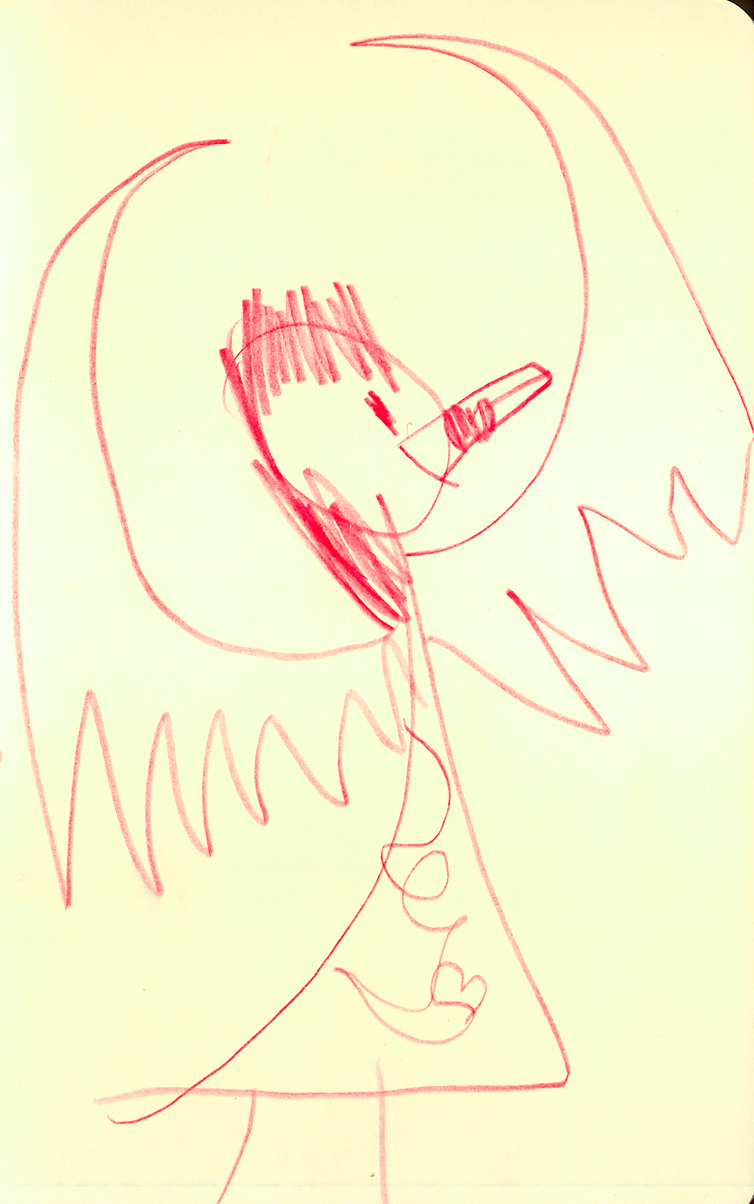
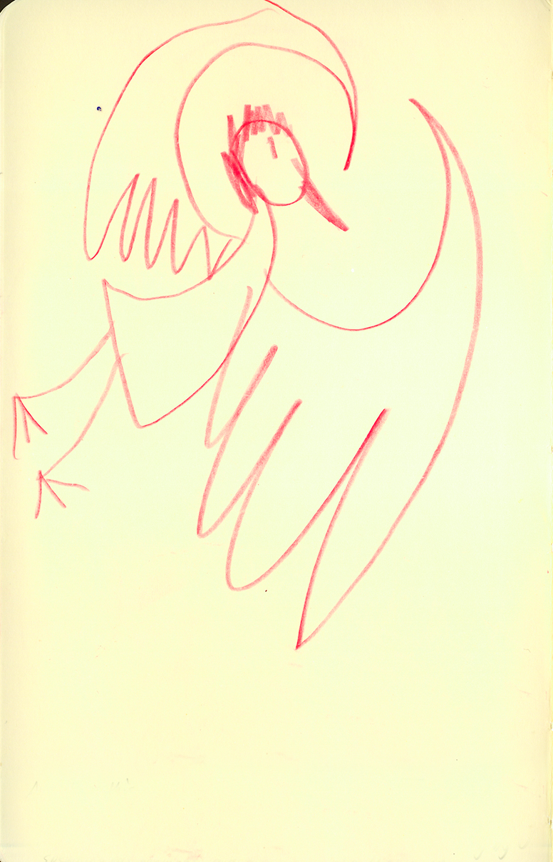
Ava Thursday: Fairy Princess
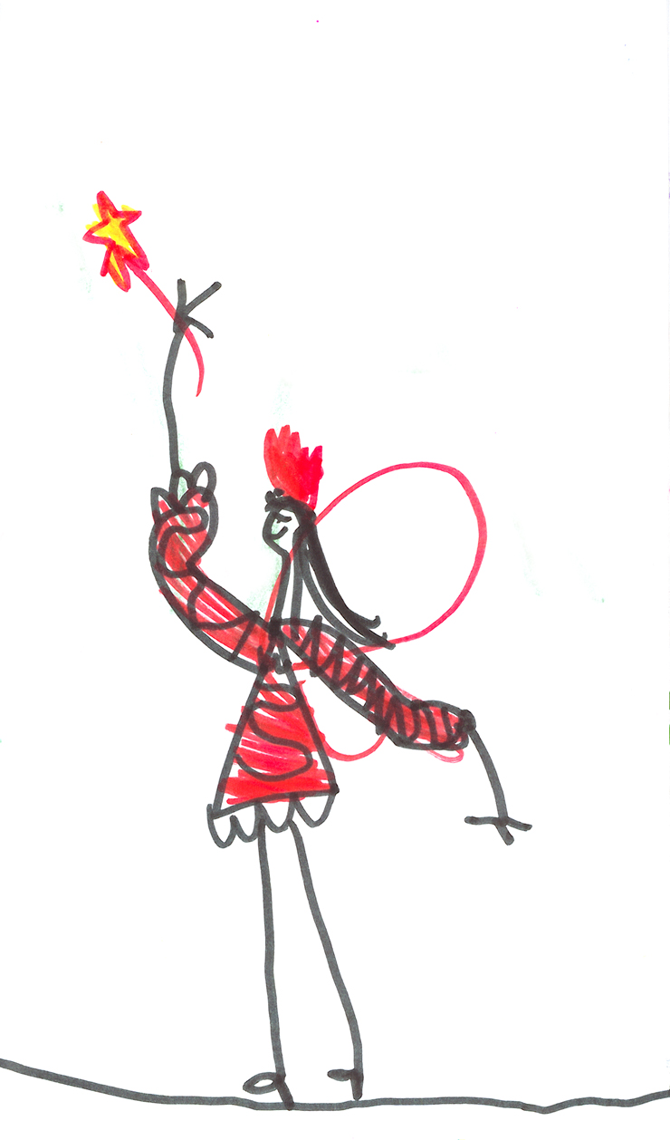
Ava is so girlie-girlie through and through. She loves loves loves pink and red parties, playing with her Polly Pockets and Barbies, setting up elaborate tea parties for her "guests," and she especially loves fairies, princesses, and fairy princesses.
A beautiful red fairy princess at your service, courtesy of your friendly neighborhood Ava Jenkins.
3.08.2006
Figure Drawing Tales
When you go through the art program at a college, one of the rites of passage is taking figure drawing classes. If you're not familiar with the set up, it's basically this: a group of artists gather in a circle and draw a human subject. The subject is more often than not nude. Occasionally a prop will be added to further aid the artist and/or model in enhancing the poses, like a chair, a broom, or a hat. Similar in the way an actor uses a prop to enhance their performance. This sort of thing is rare, so mostly the model is sans prop.
The whole scenario is quite bizarre if you think about it: A couple of people looking at and drawing a completely naked person. If you were to walk by the room and were totally oblivious to where you were, you would definitely do a double-take because of the fact that you don't normally see a naked person just struttin' their stuff right out in the open. Along with a bunch of onlookers surrounding said naked person.
Throughout the years of taking figure drawing classes there's bound to be some interesting situations as well as interesting subjects from time to time. I have a couple I'd like to share with you all:
My first figure drawing class was at Dekalb College (now Perimeter College) in Atlanta back in 1987. Being a community college, they did not have it in the budget to pay for full-on nude models so we were forced to look at the human body in leotards and Speedos. No lie. It was a strange sight. The first model I ever had to draw was, weirdly enough, someone who I knew from high school. She was one of the "stoner" kids who hung out the smoking section behind the school (yes, they had places like that back then). Apparently she needed some extra cash and modeling (semi-nude) in art classes was just the ticket for her. So, it was an odd feeling to sit right in front of her while she disrobed and displayed her figure for all of us fledgling artists to see. And did I mention it was her first time, too? It showed. During the first couple of long poses I noticed that she was so nervous that she began to quiver and shake. The poor girl. Trying to look calm in a relaxed pose, all the while her slightly-overweight body jiggling. I almost wanted to grab her robe, throw it on her and wisk her away from all of us naughty peeping-toms and tell her everything will be alright.
Another interesting model at Dekalb was this older man with a very very obvious toupee. He was almost hitting 65, but had an orange tan and a barrel chest if you ever saw one. Yes, all this and glorious Speedos to boot. The entire time he would talk and try to hit on all the women, making for many awkward moments while we drew. We all agreed that he thought that he was God's Gift to Women.
Later on in my career I took some "continuing education" classes -- basically classes for older folk who felt the urge to take that one class on pottery that they missed out on when they were young. To further my career in the animation field, I needed to take some figure drawing classes to help me with my gestures and figure studies. There were no instuctors, making it cheaper and therefore, easier for me to take. Even though there were no instructors, we did manage to maintain some sort of respectable dignity in these classes -- we were, afterall, "older" students. But the models soon would take advantage of the situation and become more relaxed with their posing. This would be the first time I would be drawing nude models, so the initial 'unveiling' always shocked me -- it's such a strange thing to witness, you know? I found myself always looking down, or looking out the window whenever the model disrobed, out of respect. I know, strange, since we were about to view the model naked full-on for 2 hours, but whatever. It was almost involuntary for me.
The way it was set up was this: quick 1 to 5 minute poses at first, then on to 15, 20 and/or 30 minute poses later on. The second half was the big test for the models, and they knew it. I could sense their seething frustration whenever the timer was wound to 20 minutes and they had to find a decent pose that would be sorta interesting for us to draw that long, as well as be relaxing enough for them, without some body part falling asleep on them.
This one lanky girl, no matter how hard she tried, would always start yawning during these long poses. Not just simple, cute yawns, but a big, long, full-gaping-wide-mouth yawns. And many of them. I literally had to stop my drawing to wait for her to go about her business. It was very annoying. And then she would fall asleep during some of these poses -- mouth open wide for all to draw.
There was this one female model who was different. She was quiet, and kept to herself (some of the models would at least make small talk during breaks). I didn't notice at first when she disrobed (I was looking somewhere else, remember?), but it wasn't until I was drawing during the quick gesture poses that she... well, she had no hair "downstairs." On purpose. And she had her belly button pierced. I remember thinking to myself, "Oh. Well... this is different."
But it didn't stop there. See, the connection between artist and model is a strange one. When you start to draw a nude figure, you are no longer looking at a person with no clothes on anymore. You are looking at your 'subject.' They become an object to you. There are no sexual thoughts going on in your brain, just your inner artist trying to get the gesture, the pose, the subject just right. Good models know and understand this connection and will work with us and help us attain our goals. Some are very aware of their poses and will ask if that particular pose works for everyone, but some could care less. They come across as mindless drones, posing like they are working in a factory. No fun for everyone involved. Anyway (got off track there), this one particular model was okay. She wasn't bored or anything, but her poses were VERY different than what we were used to. And I noticed it right away. All her poses were very suggestive and almost Penthouse-worthy. I kid you not. It was very odd to draw her with her patootie up in the air, legs spread out. For those who take figure drawing classes, you know that this is not typical. This crossed the line from artistic subject to porn-mag subject. I eventually stopped drawing her and began to sketch this old man to my left who had a front row seat to all this porn-glory. It was pretty funny for me to think about what was going through his head. I also imagined the scenario later on that evening at home: having to explain to his wife why he had such naughty drawings in his sketchbook.
One model came in to the studio and I literally had no clue if it was a he or she, until they took off their robe. It was a female, but she looked like a little boy. She made for an interesting subject, that's for sure.
So, there ya go. Some curious tales from the art set. I was wondering if any of you guys had some intriguing tales to share? Would love to hear them.
3.06.2006
I know an Oscar winner!
Hey -- I know an Oscar winner!
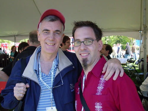
Big CONGRATS to John Canemaker for winning the Oscar for Animated Short Film! I was hoping his captivating and emotional THE MOON AND THE SON would win because of the years it took for him to finally get it made, as well the personal journey he took to get this subject out in the open. It's a brave film. This is a well-deserved win. I met John in Ottawa and had the best time talking with him, rambling on about various subjects such as blogs, books, and his film. I was a little nervous about meeting him because of the massive backlog of animation history and knowledge stored up in his head, not to mention the multitudes of books he's written on the subject. I was so worried that I was going to slip up on some bit of info and then he'd correct me with a resounding "No, you're wrong silly animator boy," but no -- he was gracious, honest, open and so easy to talk to. So, my sincerest wishes to John and his family on winning this Oscar. You deserve it!
You know, I've been in contact with Canemaker several times since Ottawa, and I'm working on trying to get him down here to Atlanta to do a lecture/workshop about his career, his film, his books. It would be a joint venture with ASIFA-Atlanta and Image Film & Video -- we're hoping that John will be available later on this year. *Crossing fingers.*
-----------------------
And speaking of ASIFA-Atlanta and Image, don't forget that we have the first ever Animation Film Slam, 7:30 tonight at The Earl in East Atlanta, off of Flat Shoals Road. I promise that we won't be too harsh on the filmmakers. I'll be one of the judges (along with Turner's Joe Peery and fellow Primate Jeff Fastner), and we plan on offering constructive criticism for anyone who asks for it. We promise it'll be a fun evening. Come on down!
3.04.2006
Once Upon a Wintertime
I'm a collector of Little Golden Books, but I must go on record to say that I am a very selective collector. I only collect LGBs that feature a certain look and style to them, or feature certain illustrators that I love. For instance, I have several books illustrated by JP Miller and Aurelius Battaglia, to name a few. I like Richard Scarry, but only his early work. See, I'm selective. It's weird, I know. But that's okay because collecting is a weird and peculiar thing. And collectors can be weird and peculiar people. For me, since I'm interested in the artwork, I will usually find a particular artist that strikes my fancy and then do an exhaustive search for any and all titles illustrated by that artist. But it doesn't stop there. Oh no. I then have to find that one artist's contemporaries and then search for any and all titles done by those artists, and so on and so on. A never-ending cycle you could say. Throughout the years, to further add to the geekiness level, I've picked up on the lingo and the lexicon of the Little Golden Books world, as well as know which titles I will never own because of rarity and/or availability. Some titles have become "white whales" that have constantly eluded me, whether it be through last-second lost bids on eBay, or through over-zealous owners who feel they have gold in their possession (most of the time, they do not).
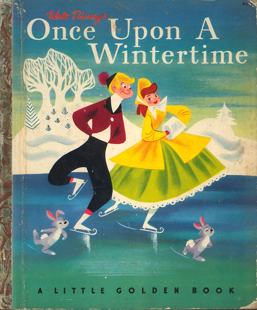
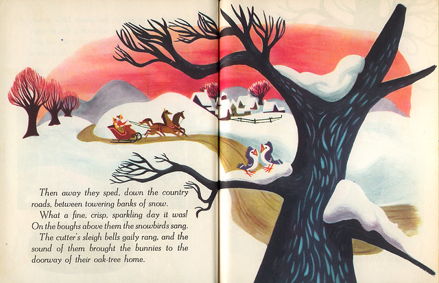
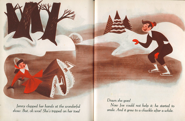
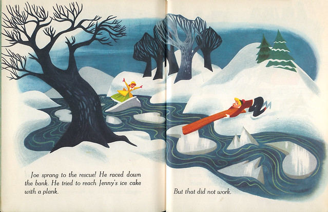
So I was very surprised one day when I was going through a Little Golden Book price guide in the bookstore and found a strange entry: Once Upon a Wintertime, an incredibly well-drawn and designed LGB based off of the animated short segment in Disney's 1948 feature MELODY TIME. What surprises me with this book (and the key to my tip-off) is the fact that the unsung hero of animation design, Tom Oreb, is credited here as adapting the story from the animated short. This would be the only account I know of Oreb doing an illustrated book. If you recall from my posts on TOOT, WHISTLE, PLUNK & BOOM and MELODY, Tom Oreb did character design at Disney for a few years before moving on to work on other projects (like commercials, for instance). Largely forgotten throughout the years, Oreb left his mark on Ward Kimball and the many artists who were lucky enough to work alongside him.
What is very curious to me in this book is that the characters look similar to Freddie Moore style characters -- Moore was working at the studio at the time, but is not listed on the credits. Also, the background stylings in the short look to me to be designed by Mary Blair -- or, at least they are greatly influenced by Blair. (Blair is given credit on MELODY TIME as "Color and Styling," so she probably did do them. For more info on the film's credits, go HERE.) So it's interesting to see Oreb conform to Moore-like characters and Blair-ish stylings. I'm thinking that Oreb might've been a bit frustrated to hold back, but overall, the book is very well illustrated and the colors are brilliant -- nice yellows and blues going on here.
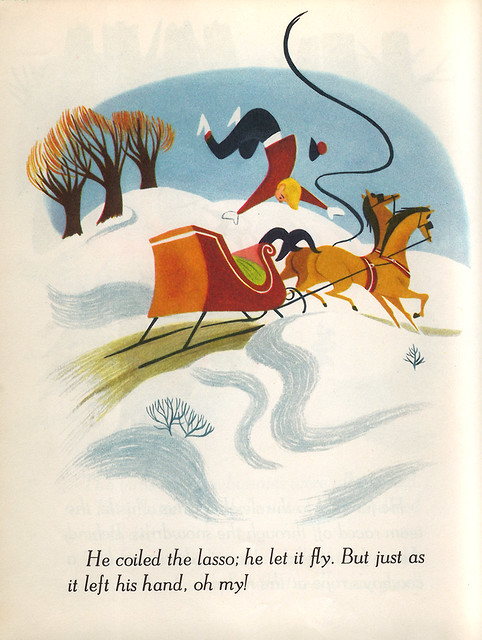
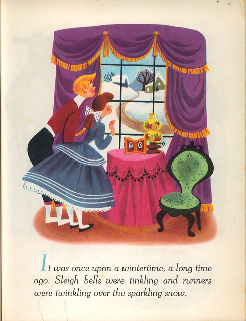
Here are a couple of pages out of the book -- be sure to check out more in this Flickr photoset. Also, make sure you check out the larger versions of the two-page spreads -- there's so much detail going on, it'd be a shame to miss it all.
So! Bring on the illustrations:
What's unique here is that the book puts words to a story that is otherwise a word-less animated short. There's a song that's sung throughout it all, but the lyrics do not reflect the action going on.
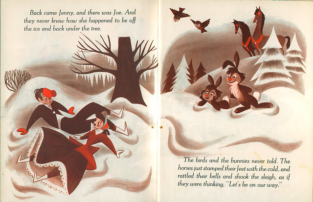
In some early Little Golden Book editions (as well as many other books of the time) there would be pages that were printed in monochromatic tones, obviously an attempt to save on ink and printing costs. In this particular book, it's about half and half.
This is my favorite layout. So much going on with the dynamics here -- the trees, the river, the ice in the river, the drama being played out with Joe trying to save Jenny, the colors -- all of it comes together magnificently.
You can tell that someone with an animation background did the two images above. I love the one with Joe flying through the air. Also, the rope and lasso have a nice fluidity to it.
Overall, this book is a stand out from the usual Little Golden Book fare that was printed at that time. I really wished that Tom Oreb did more children books because he had a great knack for layout and character design. It's a shame that he did not pursue this line of work outside of his animation career. He could've forged new ground with his eye for design and color.
Again, go here for more images from this book. And if you dig this sort of thing, be sure to check out more mid-century children's book illustrations in The Retro Kid.
So I was very surprised one day when I was going through a Little Golden Book price guide in the bookstore and found a strange entry: Once Upon a Wintertime, an incredibly well-drawn and designed LGB based off of the animated short segment in Disney's 1948 feature MELODY TIME. What surprises me with this book (and the key to my tip-off) is the fact that the unsung hero of animation design, Tom Oreb, is credited here as adapting the story from the animated short. This would be the only account I know of Oreb doing an illustrated book. If you recall from my posts on TOOT, WHISTLE, PLUNK & BOOM and MELODY, Tom Oreb did character design at Disney for a few years before moving on to work on other projects (like commercials, for instance). Largely forgotten throughout the years, Oreb left his mark on Ward Kimball and the many artists who were lucky enough to work alongside him.
What is very curious to me in this book is that the characters look similar to Freddie Moore style characters -- Moore was working at the studio at the time, but is not listed on the credits. Also, the background stylings in the short look to me to be designed by Mary Blair -- or, at least they are greatly influenced by Blair. (Blair is given credit on MELODY TIME as "Color and Styling," so she probably did do them. For more info on the film's credits, go HERE.) So it's interesting to see Oreb conform to Moore-like characters and Blair-ish stylings. I'm thinking that Oreb might've been a bit frustrated to hold back, but overall, the book is very well illustrated and the colors are brilliant -- nice yellows and blues going on here.
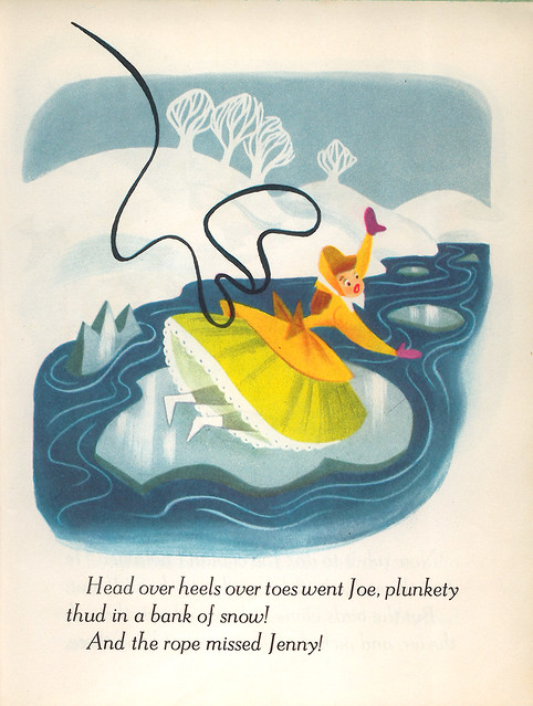
Here are a couple of pages out of the book -- be sure to check out more in this Flickr photoset. Also, make sure you check out the larger versions of the two-page spreads -- there's so much detail going on, it'd be a shame to miss it all.
So! Bring on the illustrations:
What's unique here is that the book puts words to a story that is otherwise a word-less animated short. There's a song that's sung throughout it all, but the lyrics do not reflect the action going on.
In some early Little Golden Book editions (as well as many other books of the time) there would be pages that were printed in monochromatic tones, obviously an attempt to save on ink and printing costs. In this particular book, it's about half and half.
This is my favorite layout. So much going on with the dynamics here -- the trees, the river, the ice in the river, the drama being played out with Joe trying to save Jenny, the colors -- all of it comes together magnificently.
You can tell that someone with an animation background did the two images above. I love the one with Joe flying through the air. Also, the rope and lasso have a nice fluidity to it.
Overall, this book is a stand out from the usual Little Golden Book fare that was printed at that time. I really wished that Tom Oreb did more children books because he had a great knack for layout and character design. It's a shame that he did not pursue this line of work outside of his animation career. He could've forged new ground with his eye for design and color.
Again, go here for more images from this book. And if you dig this sort of thing, be sure to check out more mid-century children's book illustrations in The Retro Kid.
3.03.2006
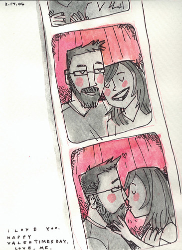
Photobooth Friday: Valentine's Day Card
Since I know Andrea so well, I thought I'd give her something on Valentine's Day that combined two of some her favorite loves: photobooths and Valentines' Day. This is the inside of the card that I gave her.
Just a tad on the lovey-dovey side, isn't it? *Insert collective "Awwww!" here.*
More Photobooth Friday fun to be found at hula seventy.
3.01.2006
Ava Thursday: I'm Learning To Fly
I wish that we can fly. Wouldn't that be something? To experience the feeling of the wind whipping across your face with nothing underneath you -- just you, the clouds and the sky, completely weightless. Birds have it pretty good, don't they? We mere humans will never truly experience this phenomenom without some assistance, I guess. Ava has on many occasions wished out loud to be able to fly. She wants to fly so badly that I've found her jumping up and down with eyes closed, grunting and grimacing like there's something wrong. "What's the matter, Ava?" I would then ask her. "I want to FLY!" Ava says this with such a determination and longing and a genuine belief that this act can actually be possible.
And that is why I love this little story that Ava drew in my Moleskine back in January. There is so much to this series of three drawings, so much heart and depth and personal yearning that it almost hurts for me to see them. To know just how much Ava wants to fly -- and then to see her draw this and tell me about it -- it's almost too much for me.
The story is called "I'm Learning To Fly." It is a story of a bird who can't fly but is dreaming that she can when she sees a flock of birds flying overhead.
Here, our little bird has decided to open up her wings to try and take flight...
...and then she flies!
Ava has yet to fly in a plane, but I'm thinking that when that moment comes, she'll be so exhilarated she won't know what to do with herself. I would do anything to witness that moment.
This post has been featured on the always interesting Moleskinerie blog! Thanks, Armand. Ava will be so happy.
And that is why I love this little story that Ava drew in my Moleskine back in January. There is so much to this series of three drawings, so much heart and depth and personal yearning that it almost hurts for me to see them. To know just how much Ava wants to fly -- and then to see her draw this and tell me about it -- it's almost too much for me.
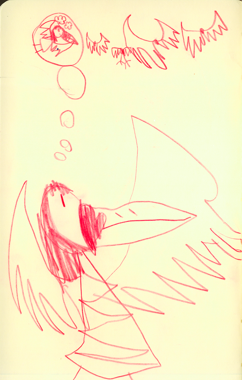
The story is called "I'm Learning To Fly." It is a story of a bird who can't fly but is dreaming that she can when she sees a flock of birds flying overhead.
Here, our little bird has decided to open up her wings to try and take flight...
...and then she flies!
Ava has yet to fly in a plane, but I'm thinking that when that moment comes, she'll be so exhilarated she won't know what to do with herself. I would do anything to witness that moment.
This post has been featured on the always interesting Moleskinerie blog! Thanks, Armand. Ava will be so happy.
Subscribe to:
Posts (Atom)