
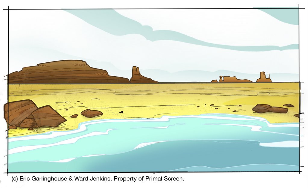
Scene 1 final color.
Very sorry for the long interlude between Spotlight entries. No sense getting into explanations, so let's get into it, shall we?
After the character designs and final storyboards were signed off by the client, my next step in creating the Big Wide Action Show open was to create an animatic of the entire open. An animatic is basically a very early rough version of the piece, using the storyboard images as placesholders before we start work on actual animation -- basically a "moving storyboard." The animatic is very important at this stage because as a director, I need to know how the spot flows from scene to scene -- do the timing and pacing feel right? What scenes are working or not? Can we read what's happening? It's also important at this stage to find out the frame count for each scene so I know just how much animation is needed.
I put the animatic together in After Effects and typically I start by laying the rough audio down first as the "groundwork" and then I edit the storyboard images in order based on the audio track. Since there are no speaking parts in the Big Wide Action open, there was no need for me to worry about audio at this stage. I just started to put this puzzle together knowing that I have 30 seconds to tell my story and then Steve Mank, our sound guy, will work his magic afterwards.
After the animatic is finalized and the piece is flowing like it should, I then move on to layout. Layout is essentially creating the environments and setting for each scene -- the backgrounds, if you will. Similar to what a set designer does on a movie shoot, when I create my layouts, I'm trying my best to give a sense of place for my characters to reside in. That means I must know the path(s) of action for each and every character for each and every shot, and I must know if everything is clear and readable. Remember, animation is about communication. I need to make sure that every shot is concise and that the viewer has no problem figuring out what's going on -- especially for this particular job. For the Big Wide Action Show open there was about 30 shots -- quite a handful for a 30 second open. That means most of the shots would be on screen for at least a second or less -- I had to think BIG and BOLD. Good thing this was for Hi-Def TV -- the wider aspect ratio for the screen gave me more breathing room for most of my shots on this open. Conceptually, I went with broad camera moves and extremes -- from extreme close-ups, extreme zoom-ins to extreme zoom-outs, all to convey the frenetic outrageousness of the storyline. Since this was all about action in an exaggerated (and comical) sense, I really wanted to push it further than what our viewers were used to seeing.
Once I sketch out each of the scene layouts, I pass them onto an inker to ink the backgrounds and then I start to paint them in Photoshop. Since I had so much on my plate for this particular job, we called in a freelancer to help me out with the backgrounds. First of all, I have to say that I'm not one to pass things off to others so easily. I'm a firm believer in the addage "If you want something done right, you have do it yourself." But this is not a smart way of thinking when you're working in the animation biz. Animation is a collaborative effort. Not one person can do everything in this industry (unless if you're working on your own project, but even then you still rely on some help) -- it's just not feasible. Knowing that I was going to be stretched to the limit with all the amount of work that needed to be done, I relented and went ahead and passed off the backgrounds to another artist. Not just any artist, but someone who understood and really got my style and would understand my vision. I was a bit nervous, but man! -- what a stroke of luck when we found Eric Garlinghouse. Recently I decided to interview Eric for this post, so you can get an idea of what goes on when we hand a guy like Eric a job like this, and how he approached the job:
Ward: So, who are you and what do you do?
Eric: I am Eric Garlinghouse, now the Senior Graphic Designer at Radical Axis, in Atlanta, Georgia. [Ed. note: Eric was a freelancer at the time of the Big Wide Action job.] Recently I've been working on commercials for Chuck E' Cheese and Cheetos [both are currently airing on Cartoon Network]. I've also been working on stuff for "Freakshow", which is on after Southpark on Comedy Central [first aired October 4th]. I've also been working on a graphic rebranding of Radical Axis including Demo Reel, Company DVD, and print materials. I've been working in motion design for about 4 years and have done freelance work for print.
Motion design is actually my second career. I taught music for about 10 years at schools such as Wesleyan, Starr's Mill H.S., Macintosh H.S. , and Georgia Tech.
W: What is your background—schooling, for instance—is it animation? design? shadow puppets?
E: I spent most of my post-high school years studying, performing and teaching music (percussion mainly). I constantly illustrated and tried to amalgamate the two disciplines into my compositions; both aurally and visually. I soon decided I would rather utilize my skills in motion graphics than become a band director so I went to school for graphic design. I graduated from Georgia State University where I spent almost a year as an intern then freelancer at Primal Screen. I currently work at Radical Axis as a motion designer/compositor and occasionally get to paint backgrounds.
W: What sort of direction (if any) did I give you for the Big Wide Action Show open?
E: You have always been an inspiration to me and I was overjoyed to be asked to paint the backgrounds for the Big Wide Action Show. You and I discussed how the backgrounds should look and we both were imagining things slightly different. The backgrounds were roughed out by you but I imagined heavy textures that complimented the lines that are so descriptive of your style. A bit later, we were watching a clip from Disney's, then recent, HOME ON THE RANGE and fell in love with the background textures and decided to use that movie as a reference. We were also inspired by TRIPLETS OF BELLEVILLE (aren't we all), and I seem to recall someone bringing up THE CARE BEARS MOVIE...hmmm maybe not.
W: No comment on the CARE BEARS MOVIE bit. But you're right, I forgot that we based a lot of our backgrounds on HOME ON THE RANGE. They had some great stylized shapes and textures in the backgrounds for that film. I felt that you did a great job incorporating that look but making it completely your own.
E: Thanks, I always try to draw inspiration from things I see and absorb the idea instead of making a direct copy. I think the whole spot turned out vibrant and fresh.
W: I agree. I was very happy with what you came up with. It was like you took my background drawings and added that extra "umph" that they needed. What approach to the overall look and style of the backgrounds did you take?
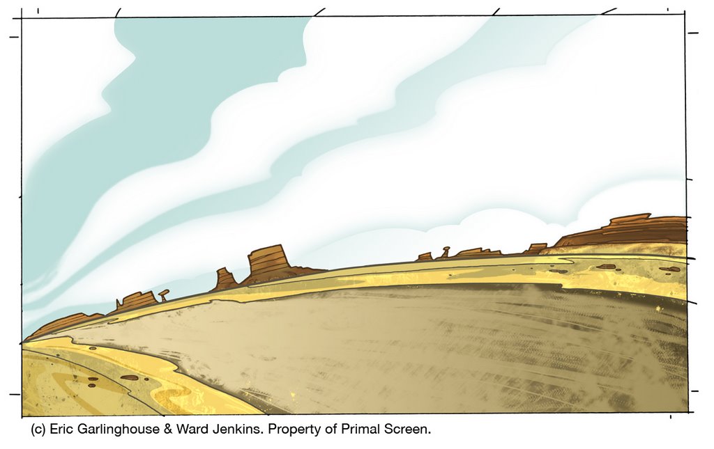
E: Armed with inspiration from you and about 500 photoshop brushes (some created specifically for this project) I started out painting the desert scenes. The first scene I painted was the scene where the road vanishes to the right and Big & Wide drive off after the villain with the money bags.
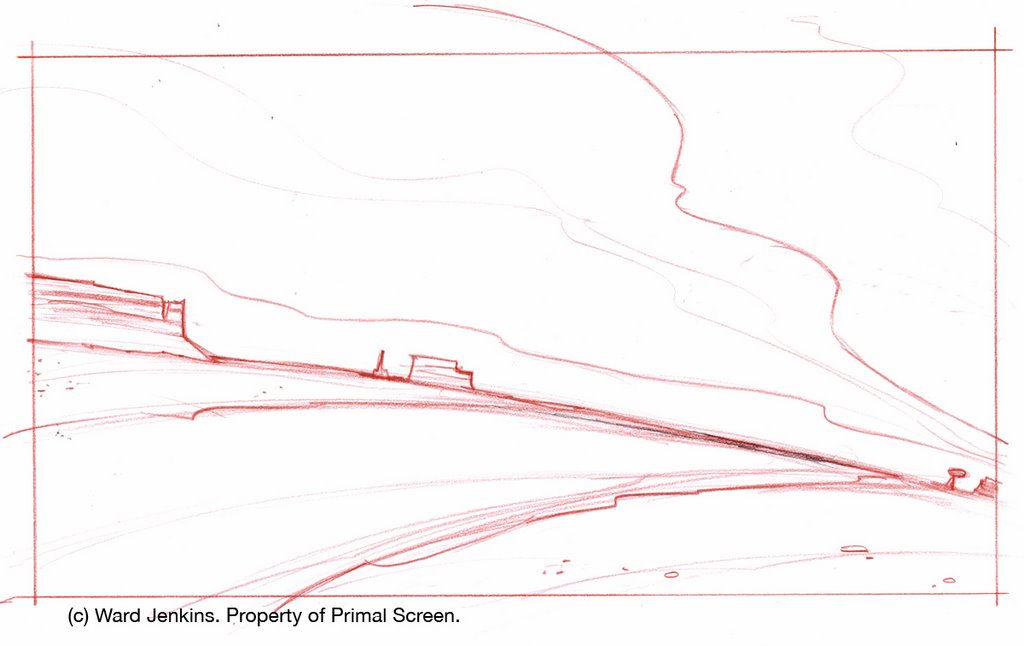
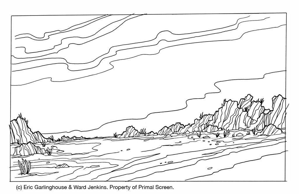
Scene 2 layout.
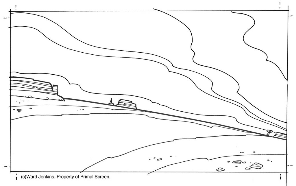
Scene 2 line.

Scene 2 final color.
I started out by creating some extra swaths of sand along the edges as if it had been blown into that fashion by passing cars. Then I added multiple layers of color to create one unified color scheme. A very painterly approach. The final result of the clouds was a happy accident. Using feathered masks on lines drawn with a pen tool, I applied varying blending modes and gradients to create the soft, distant stratus type cloud.
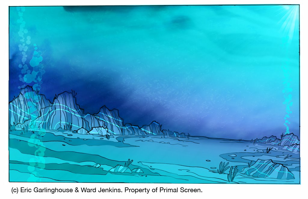
The underwater scene is probably my favorite. I remember showing some of these to you and you said that the appearance was "refreshingly different" from what you had first imagined. I felt that the underwater scenes needed a sense of mysticism and other-worldliness. These scenes were incredibly thick with layers and blending modes to get the right blend of color. I even worked some of the textures in Painter 8 to get a natural feel to the application of color. I made some really cool bubbles in painter, but they weren't used in compositing. This is the only scene where i used actual photography, as well. It is pulled way back in saturation and color, but it helped give reality to the surface of the water. You can kind of notice it in the shot where Big is about to catch the torpedo.
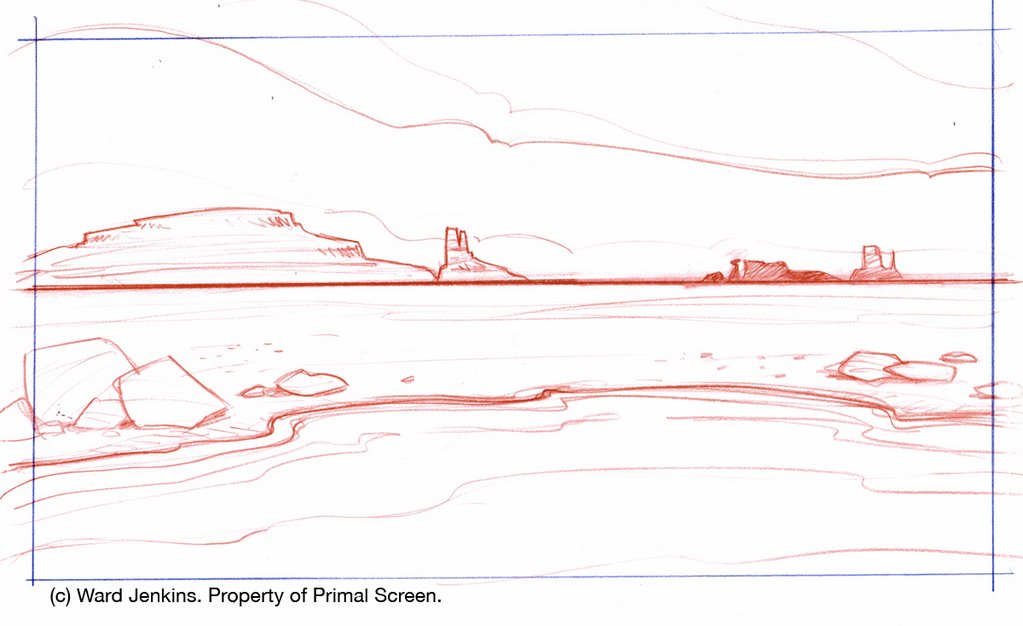
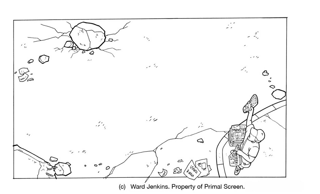
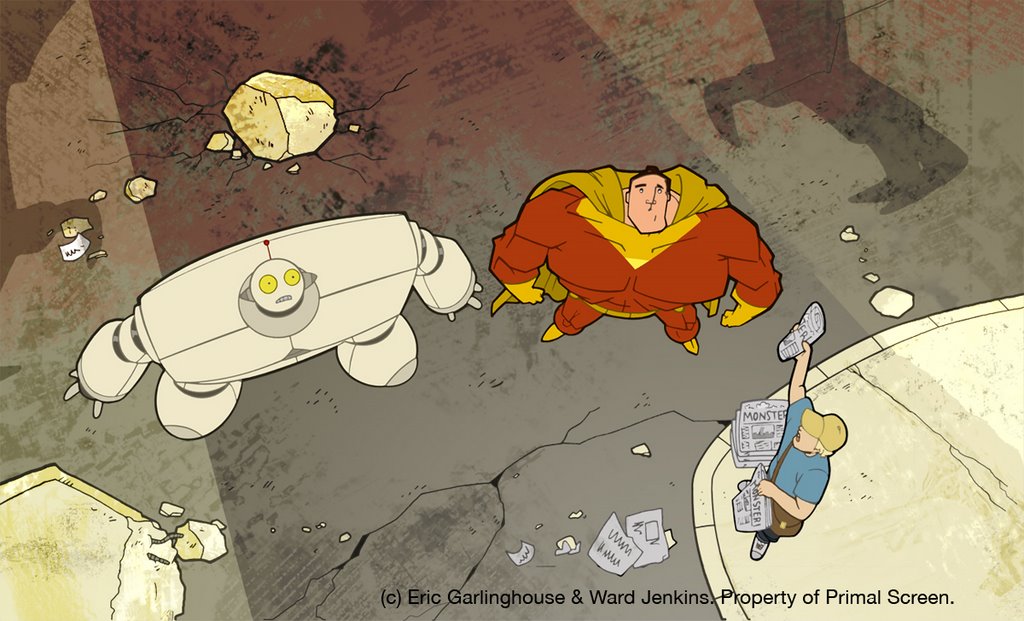
Scene 13 layout.
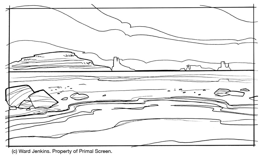
Scene 13 line.

Scene 13 final color.
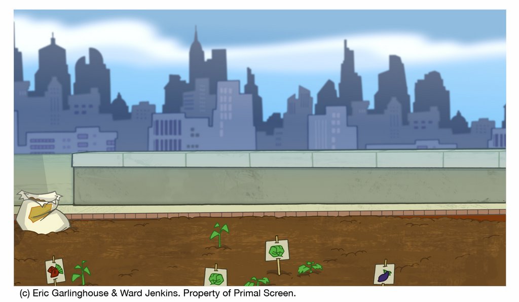
In the city scene the colors were meant to be dark and apocalyptic. I thought this was a humorous approach given the ease of which Big & Wide remove the threat upon the city. There are a couple of funny stories about this scene. A quintessential Ward-ism is precariously placed if you look on the billboard over the top of the lowest set of buildings on the left. There you will see an homage to none other than his wife, of course. Also, in the scene where Big & Wide are looking up at the monster and the paperboy is on the corner, there is a slight zoom out from their faces. This was the last background to be painted and the zoom out wasn't working properly because there was not enough of the drawing to zoom out that far. So I went back in to add some extra linework along the edges, just continuing the rocks, sidewalk and textures. Somehow the compositor got a hold of an older version of the background and the scene went to layback with some of the textures clearly not running all the way to the edges. So we ended up with only a block of textures just inside the viewable area. I went out of town and wasn't there for layback, so i believe that that was the version that was sent to the client. Oops.
W: You know, I never noticed that. I'll have to go back and check it. And "Ward-ism?" I like it. I'll have to copyright that. So, last question: Did the characters' look, color, and design have an effect on you when you created the backgrounds?
E: Big & Wide are designed very well and I had to stick with colors that complimented them and not fight with their appearance on screen. I did change some colors after seeing the rough composite of the desert scene. I also darkened up some of the city scene as to lessen the similarity between the sky and Big's uniform.
W: Well, Eric, you did an excellent job with the backgrounds. It was so nice not to have to worry about that part of the job, and if you know me, that's a big big deal, considering that i tend to get my grubby fingers in all aspects of a particular job. Thanks for all your hard work, Eric. Fantastic stuff.
E: Back at ya Ward! It is an honor to work with you any project. It was a smooth ride and I it really turned out beautiful...um, can I un-pause THE CARE BEARS MOVIE now? Grumpy Bear is about to go belly-up freebasing rainbows again...
W: Again, no comment on CARE BEARS. Some things are better left unsaid.
It was relaxing to know that I could hand off my background drawings to Eric and know that he would create some beautiful work for this piece. I was extremely happy with everything that he did. Big thanks to Eric for taking the time to do the interview (sorry for the lengthy delay in getting it up) and also for his incredible work on the Big Wide Action open. Much appreciated, man. (FYI, I'll post the frames featuring what Eric called "quintessential Ward-isms" for the next post.)
Here are some other examples of the backgrounds and layouts we created for The Big Wide Action Show open, with pencils by me and final painted versions by Eric:
Scene 10 final color.
Scene 11 layout.
Scene 11 line.
Scene 11 final color.
Scene 12b layout.
Scene 12b final color.
Scene 20 layout.
Scene 20 line.
Scene 20 final color -- Eric's version (here you can see where Eric expanded the background).
Here's the final color for our two boys, Big and Wide:
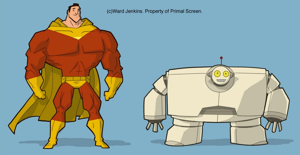
It was hard to figure out a color scheme that would be typical of superheros but one that hasn't already been done. THE INCREDIBLES wasn't out yet when we were working on this, but there was the teaser trailer available online and I tried my best to not get too close to that. We had to think about a multitude of things since our characters were going to be placed over a vast variety of settings -- there were going to be scenes in broad daylight, underwater and in space, so we had to find a color scheme for Big that would look great in all these settings. For Wide we just wanted something simple since he was a robot, but we didn't want your typical metal grey -- so I choose to go with an off-white with some varied tones of that original color. I think it worked really well.
Up next (and last installment for this series -- finally!): Animation. Also, I'll have a nice quality Quicktime version of the open available to download. Stay tuned!
LINKS:
Article on AWN of a book about layout artists: Animation Layout: Support Material
Don Bluth's description of layout: Don Bluth's Animation Academy: Layout.
Nice article on Skillset about layout artists: Layout Artist.
Ahhh wow!!! What a great post, Ward!! I love the backgrounds you and Eric worked on together, and the interview with him, and your explanation of the process and Big & Wide!
ReplyDeleteYay! :)
Great post. It has always amazed me how challenging a 30 second commercial really is. 30 seconds to tell a story and have such a great visual impact is no easy task!
ReplyDeleteInteresting breakdown for a process that led to a VERY cool result!
ReplyDeleteThe Care Bears movie, huh?
I didn't know you guys collaborated on the backgrounds, but it makes sense. It seems impossible to do everything yourself, when you're dealing with such detailed animation.
I finished a "very limited" animated piece recently for a friend's film, and BOY...it was tough doing the whole thing on my own. Because of that, I had to severely limit my ambitions due to time and a lack of extra hands! But it was still a fun exercise. I sure wish I could've stolen you away to help me, because then it would have been MORE professional!
Love these write-ups about your work, Ward. So fascinating. The backgrounds are awesome. I love the 'Monument Valley' feel you've got on some of them and the colors and lighting on the underwater scenes. Can't wait to see some of it in motion!
ReplyDeleteAWESOME post!
ReplyDeleteHaha I just saw the trailer. You guys made it look easy, nice job.
ReplyDeleteOne thing I quite liked was the sets alternated between warm and cool palettes. Nice effect!
Awesome job putting the 3 part series together, Ward! It was a lot of fun to go back and re-live one of my favorite projects. Thanks!
ReplyDeleteWow these are great man! Thanks for showing!
ReplyDelete