
And now, five years later, I've accumulated a great deal of artwork from the mid-century era, and I still can't get enough of it. Why? Why do I collect this stuff? Not to mention the overall appealling nature of the illustrations, but to me, the artwork exudes great design qualities that I don't normally see in today's illustrations. Maybe it's something about the deceptively simple use of lines and color, along with the brilliant execution that does it for me. Maybe it's the stylization of shapes and patterns, or the fact that these illustrations were done during a time of great opportunism and consumerism -- companies and advertisers were trying to reach as many people as possible and wanted lively artwork to do just that.
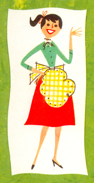
Two weeks ago, the Great Leif Peng asked me to contribute to his fantastic blog, Today's Inspiration. He started up a wonderfully new Flickr set called Ads w/ 50's Storybook Styles and decided to jump start the set by having a different person write a post about some of the artwork or artist featured in this set for each day of the week. After checking out some of the samples that he was thinking about posting, I chose to talk about the ads that were directed more towards the Housewife, mostly because the majority of my own collection consists of cookbooks, pamphlets, and various household-themed ephemera. Anyway, check out my post, Art for the Domestic Goddess. And be sure to check out the rest of the guest contributors for that week, too.
As most of you know, I collect and showcase these things on my blog because I love it. I love the artwork, that's it. Never do I collect things out of "coolness" or "hipness," nor do I post said stuff on my blog for the sake of rubbing it in your face. I post this stuff because I love the artwork and I want to share it with you all. Also, I post it because I think that there's something to be said for the quality of the work from that time. There was a certain style that emanated from the pages of magazines and cookbooks from that era that probably will never be emulated ever again. If there was some way that we, as artists, could learn from our illustrative past, then hopefully posting on blogs like Leif's and mine could be seen as inspiring.
It's brilliant stuff. Keep collecting. Keep sharing. Thank you.
ReplyDeleteThis past year I have found a passion for this style of work. It has inspired and influenced my recent explorations. Thank you for for appreciating a wonderful aesthetic.
ReplyDeleteI'm so there, riding this aesthetic wave with you, Ward. I've always LOVED this niche of illustration work, and luckily, it's come into vogue recently with movies like Monsters Inc, The Incredibles, etc. Don't you think? I agree that what makes it so special is the blend of design simplicity with illustrative flair. Thank you for always having some cool, new example of this stuff on hand, and sharing.
ReplyDeleteAlso, thanks for being a good friend in need yesterday.
thats the last straw Jenkins!
ReplyDeleteYou've rubbed my face in your collection of
vintage pamphlets for the last time!
:-)
d
nice images
"The Great Leif Peng"... I like the sound of that! Mind you I prefer"Leif Peng - Soooper Geeenius!" ;-)
ReplyDeleteA great post Ward - and I'd be remiss not to say your passion for this area of 50's illustration wasn't the inspiration for my efforts. Thanx buddy!
I'd also want to add that whenever I see the work of those half-a-century-ago innovators I think of how many current artists owe a huge debt of gratitude to those artists for inspiring their own styles.
I know they've profoundly influenced my own work!
I never get the sense that you are trying to front or earn cool points with your ephemera posts, Ward, although they do make me drool sometimes! My personal obsession started with my acquisition of a box of 1950s cocktail napkins with little illustrations and pithy sayings and limericks that I found at a garage sale four years ago. I just like the angular economy of line and bold colors of the 1950s illustration aesthetic so much. Now, it's a bonafide sickness.
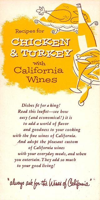
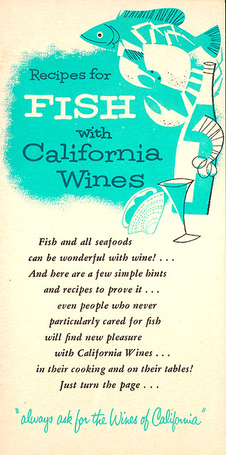
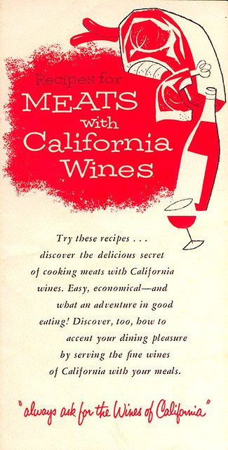
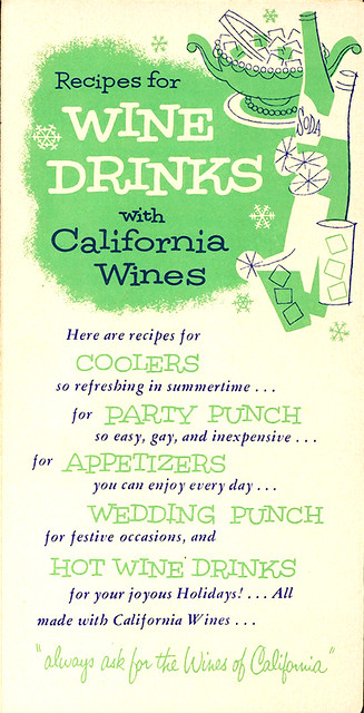
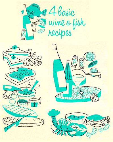
ReplyDeleteI just love how these artists did so much creativity with just two colors -- like on your recipe booklet scans. I also noticed that in looking at my Cool Vintage Illustration flickr set. Neat stuff, keep it comin'!
ReplyDeleteI blame cigarettes, jazz, and HighBalls for such moon rocket deconstruction of design. You realize it all leads to Bob Ross and Lynda Barry!(?)
ReplyDeletePamphlets like these are often over-looked by collectors, but I agree, they sometimes have the best design and illustrations of any ephemera. There are a lot of mid-century examples available and they are generally very affordable. Great post. Keep collecting.
ReplyDelete