Showing posts with label Spotlight. Show all posts

11.10.2006

Spotlight: Big Wide Action Show (Part 3)

This is Part 3 of a continuing series on the making of The Big Wide Action Show Open. Part 1 was on thumbnail storyboards. Part 2 was about character design. Today, I discuss layout, backgrounds and color, featuring an interview with the background artist for the project, Eric Garlinghouse. (Click on each image to view larger.)


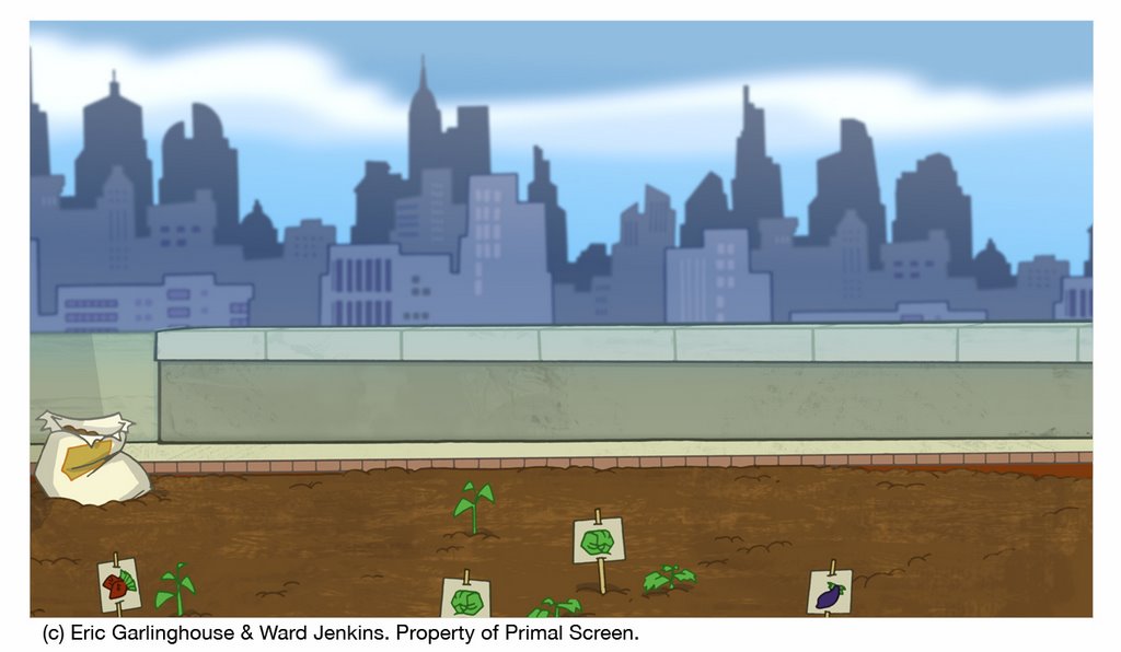
Scene 1 final color.

Very sorry for the long interlude between Spotlight entries. No sense getting into explanations, so let's get into it, shall we?

After the character designs and final storyboards were signed off by the client, my next step in creating the Big Wide Action Show open was to create an animatic of the entire open. An animatic is basically a very early rough version of the piece, using the storyboard images as placesholders before we start work on actual animation -- basically a "moving storyboard." The animatic is very important at this stage because as a director, I need to know how the spot flows from scene to scene -- do the timing and pacing feel right? What scenes are working or not? Can we read what's happening? It's also important at this stage to find out the frame count for each scene so I know just how much animation is needed.

I put the animatic together in After Effects and typically I start by laying the rough audio down first as the "groundwork" and then I edit the storyboard images in order based on the audio track. Since there are no speaking parts in the Big Wide Action open, there was no need for me to worry about audio at this stage. I just started to put this puzzle together knowing that I have 30 seconds to tell my story and then Steve Mank, our sound guy, will work his magic afterwards.

After the animatic is finalized and the piece is flowing like it should, I then move on to layout. Layout is essentially creating the environments and setting for each scene -- the backgrounds, if you will. Similar to what a set designer does on a movie shoot, when I create my layouts, I'm trying my best to give a sense of place for my characters to reside in. That means I must know the path(s) of action for each and every character for each and every shot, and I must know if everything is clear and readable. Remember, animation is about communication. I need to make sure that every shot is concise and that the viewer has no problem figuring out what's going on -- especially for this particular job. For the Big Wide Action Show open there was about 30 shots -- quite a handful for a 30 second open. That means most of the shots would be on screen for at least a second or less -- I had to think BIG and BOLD. Good thing this was for Hi-Def TV -- the wider aspect ratio for the screen gave me more breathing room for most of my shots on this open. Conceptually, I went with broad camera moves and extremes -- from extreme close-ups, extreme zoom-ins to extreme zoom-outs, all to convey the frenetic outrageousness of the storyline. Since this was all about action in an exaggerated (and comical) sense, I really wanted to push it further than what our viewers were used to seeing.

Once I sketch out each of the scene layouts, I pass them onto an inker to ink the backgrounds and then I start to paint them in Photoshop. Since I had so much on my plate for this particular job, we called in a freelancer to help me out with the backgrounds. First of all, I have to say that I'm not one to pass things off to others so easily. I'm a firm believer in the addage "If you want something done right, you have do it yourself." But this is not a smart way of thinking when you're working in the animation biz. Animation is a collaborative effort. Not one person can do everything in this industry (unless if you're working on your own project, but even then you still rely on some help) -- it's just not feasible. Knowing that I was going to be stretched to the limit with all the amount of work that needed to be done, I relented and went ahead and passed off the backgrounds to another artist. Not just any artist, but someone who understood and really got my style and would understand my vision. I was a bit nervous, but man! -- what a stroke of luck when we found Eric Garlinghouse. Recently I decided to interview Eric for this post, so you can get an idea of what goes on when we hand a guy like Eric a job like this, and how he approached the job:

------------------------


Ward: So, who are you and what do you do?

Eric: I am Eric Garlinghouse, now the Senior Graphic Designer at Radical Axis, in Atlanta, Georgia. [Ed. note: Eric was a freelancer at the time of the Big Wide Action job.] Recently I've been working on commercials for Chuck E' Cheese and Cheetos [both are currently airing on Cartoon Network]. I've also been working on stuff for "Freakshow", which is on after Southpark on Comedy Central [first aired October 4th]. I've also been working on a graphic rebranding of Radical Axis including Demo Reel, Company DVD, and print materials. I've been working in motion design for about 4 years and have done freelance work for print.

Motion design is actually my second career. I taught music for about 10 years at schools such as Wesleyan, Starr's Mill H.S., Macintosh H.S. , and Georgia Tech.

W: What is your background—schooling, for instance—is it animation? design? shadow puppets?

E: I spent most of my post-high school years studying, performing and teaching music (percussion mainly). I constantly illustrated and tried to amalgamate the two disciplines into my compositions; both aurally and visually. I soon decided I would rather utilize my skills in motion graphics than become a band director so I went to school for graphic design. I graduated from Georgia State University where I spent almost a year as an intern then freelancer at Primal Screen. I currently work at Radical Axis as a motion designer/compositor and occasionally get to paint backgrounds.

W: What sort of direction (if any) did I give you for the Big Wide Action Show open?

E: You have always been an inspiration to me and I was overjoyed to be asked to paint the backgrounds for the Big Wide Action Show. You and I discussed how the backgrounds should look and we both were imagining things slightly different. The backgrounds were roughed out by you but I imagined heavy textures that complimented the lines that are so descriptive of your style. A bit later, we were watching a clip from Disney's, then recent, HOME ON THE RANGE and fell in love with the background textures and decided to use that movie as a reference. We were also inspired by TRIPLETS OF BELLEVILLE (aren't we all), and I seem to recall someone bringing up THE CARE BEARS MOVIE...hmmm maybe not.

W: No comment on the CARE BEARS MOVIE bit. But you're right, I forgot that we based a lot of our backgrounds on HOME ON THE RANGE. They had some great stylized shapes and textures in the backgrounds for that film. I felt that you did a great job incorporating that look but making it completely your own.

E: Thanks, I always try to draw inspiration from things I see and absorb the idea instead of making a direct copy. I think the whole spot turned out vibrant and fresh.

W: I agree. I was very happy with what you came up with. It was like you took my background drawings and added that extra "umph" that they needed. What approach to the overall look and style of the backgrounds did you take?

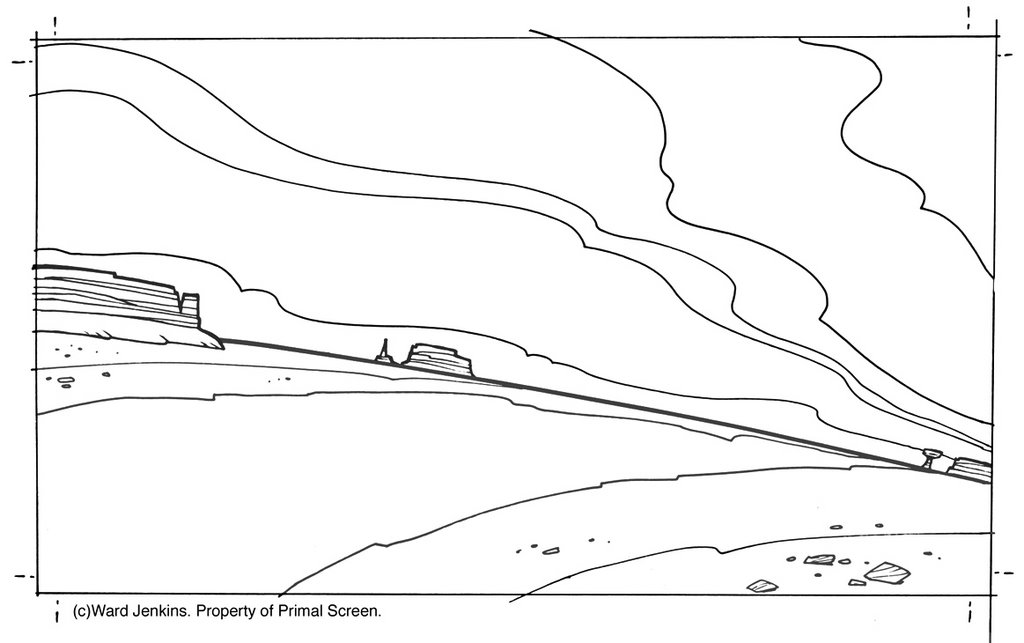
E: Armed with inspiration from you and about 500 photoshop brushes (some created specifically for this project) I started out painting the desert scenes. The first scene I painted was the scene where the road vanishes to the right and Big & Wide drive off after the villain with the money bags.
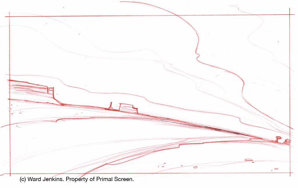

Scene 2 layout.

Scene 2 line.


Scene 2 final color.

I started out by creating some extra swaths of sand along the edges as if it had been blown into that fashion by passing cars. Then I added multiple layers of color to create one unified color scheme. A very painterly approach. The final result of the clouds was a happy accident. Using feathered masks on lines drawn with a pen tool, I applied varying blending modes and gradients to create the soft, distant stratus type cloud.

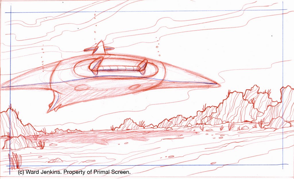
The underwater scene is probably my favorite. I remember showing some of these to you and you said that the appearance was "refreshingly different" from what you had first imagined. I felt that the underwater scenes needed a sense of mysticism and other-worldliness. These scenes were incredibly thick with layers and blending modes to get the right blend of color. I even worked some of the textures in Painter 8 to get a natural feel to the application of color. I made some really cool bubbles in painter, but they weren't used in compositing. This is the only scene where i used actual photography, as well. It is pulled way back in saturation and color, but it helped give reality to the surface of the water. You can kind of notice it in the shot where Big is about to catch the torpedo.

Scene 13 layout.

Scene 13 line.


Scene 13 final color.

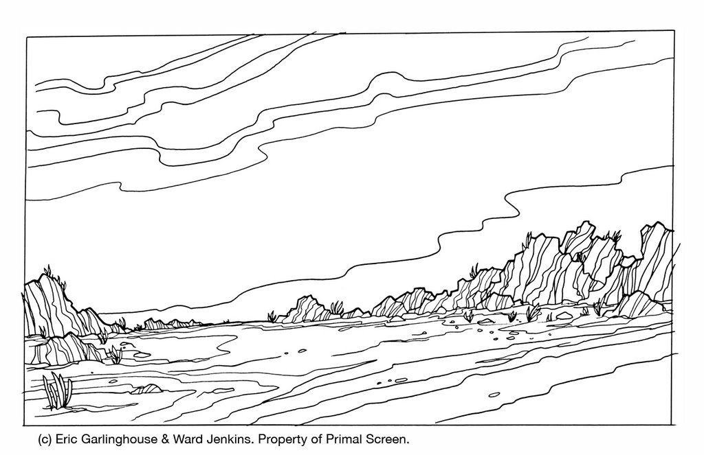
In the city scene the colors were meant to be dark and apocalyptic. I thought this was a humorous approach given the ease of which Big & Wide remove the threat upon the city. There are a couple of funny stories about this scene. A quintessential Ward-ism is precariously placed if you look on the billboard over the top of the lowest set of buildings on the left. There you will see an homage to none other than his wife, of course. Also, in the scene where Big & Wide are looking up at the monster and the paperboy is on the corner, there is a slight zoom out from their faces. This was the last background to be painted and the zoom out wasn't working properly because there was not enough of the drawing to zoom out that far. So I went back in to add some extra linework along the edges, just continuing the rocks, sidewalk and textures. Somehow the compositor got a hold of an older version of the background and the scene went to layback with some of the textures clearly not running all the way to the edges. So we ended up with only a block of textures just inside the viewable area. I went out of town and wasn't there for layback, so i believe that that was the version that was sent to the client. Oops.

W: You know, I never noticed that. I'll have to go back and check it. And "Ward-ism?" I like it. I'll have to copyright that. So, last question: Did the characters' look, color, and design have an effect on you when you created the backgrounds?

E: Big & Wide are designed very well and I had to stick with colors that complimented them and not fight with their appearance on screen. I did change some colors after seeing the rough composite of the desert scene. I also darkened up some of the city scene as to lessen the similarity between the sky and Big's uniform.

W: Well, Eric, you did an excellent job with the backgrounds. It was so nice not to have to worry about that part of the job, and if you know me, that's a big big deal, considering that i tend to get my grubby fingers in all aspects of a particular job. Thanks for all your hard work, Eric. Fantastic stuff.

E: Back at ya Ward! It is an honor to work with you any project. It was a smooth ride and I it really turned out beautiful...um, can I un-pause THE CARE BEARS MOVIE now? Grumpy Bear is about to go belly-up freebasing rainbows again...

W: Again, no comment on CARE BEARS. Some things are better left unsaid.

------------------------


It was relaxing to know that I could hand off my background drawings to Eric and know that he would create some beautiful work for this piece. I was extremely happy with everything that he did. Big thanks to Eric for taking the time to do the interview (sorry for the lengthy delay in getting it up) and also for his incredible work on the Big Wide Action open. Much appreciated, man. (FYI, I'll post the frames featuring what Eric called "quintessential Ward-isms" for the next post.)

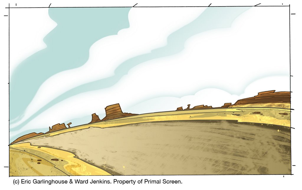
Here are some other examples of the backgrounds and layouts we created for The Big Wide Action Show open, with pencils by me and final painted versions by Eric:

Scene 10 final color.
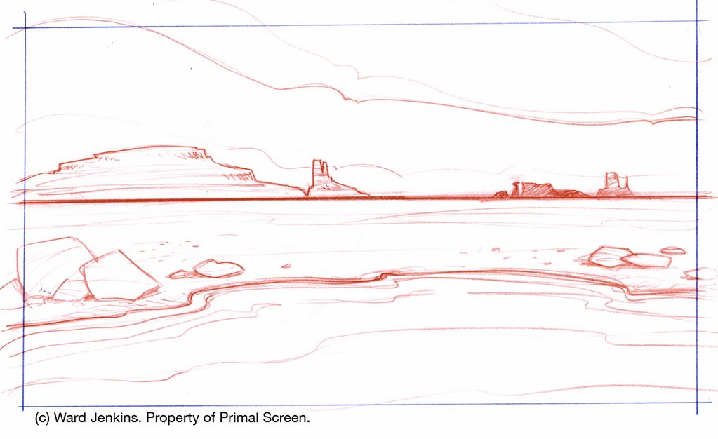

Scene 11 layout.
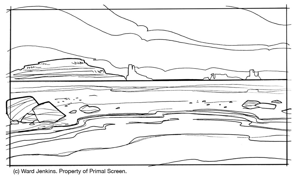

Scene 11 line.
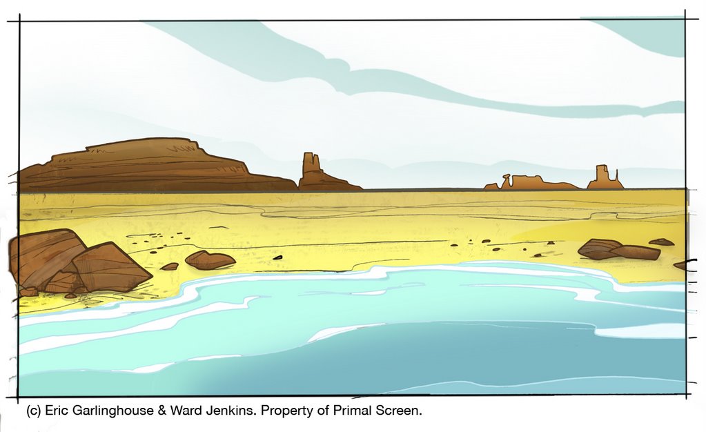

Scene 11 final color.
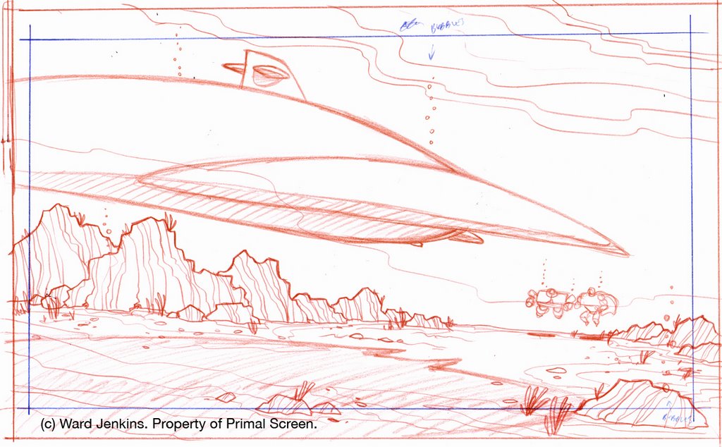

Scene 12b layout.
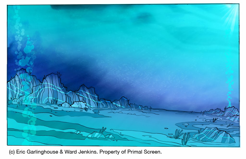

Scene 12b final color.
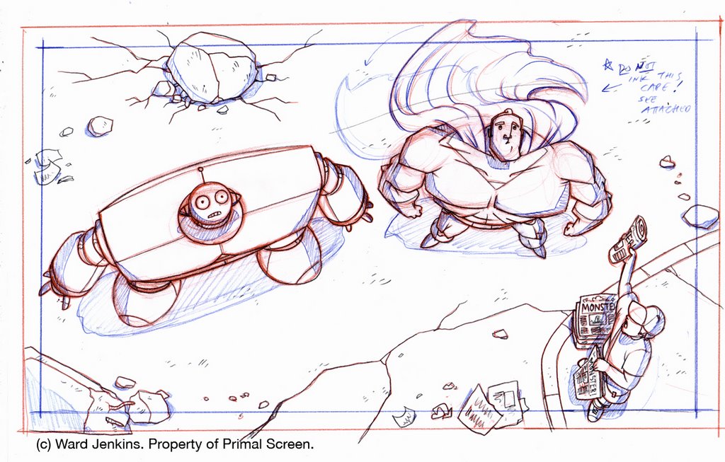

Scene 20 layout.
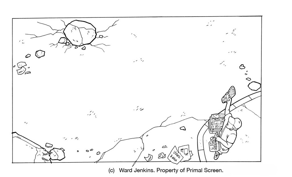

Scene 20 line.
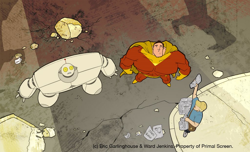

Scene 20 final color -- Eric's version (here you can see where Eric expanded the background).


Here's the final color for our two boys, Big and Wide:
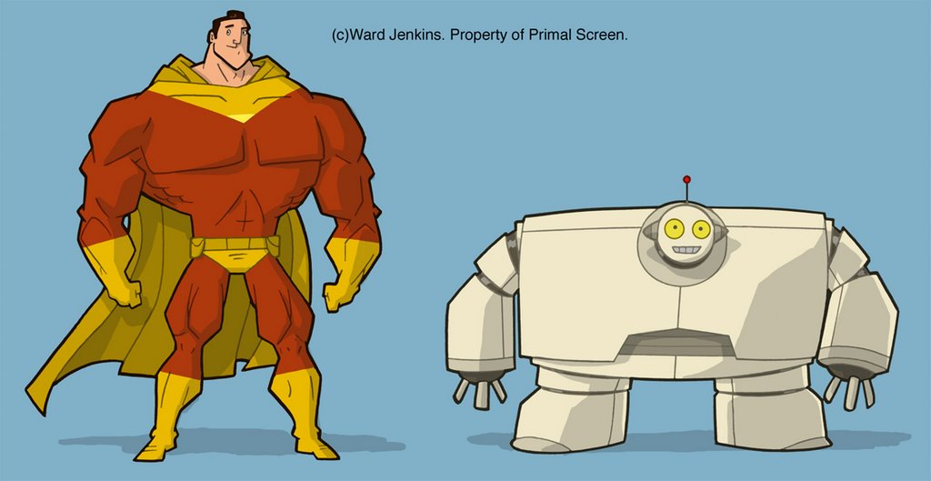
It was hard to figure out a color scheme that would be typical of superheros but one that hasn't already been done. THE INCREDIBLES wasn't out yet when we were working on this, but there was the teaser trailer available online and I tried my best to not get too close to that. We had to think about a multitude of things since our characters were going to be placed over a vast variety of settings -- there were going to be scenes in broad daylight, underwater and in space, so we had to find a color scheme for Big that would look great in all these settings. For Wide we just wanted something simple since he was a robot, but we didn't want your typical metal grey -- so I choose to go with an off-white with some varied tones of that original color. I think it worked really well.

Up next (and last installment for this series -- finally!): Animation. Also, I'll have a nice quality Quicktime version of the open available to download. Stay tuned!

LINKS:
Article on AWN of a book about layout artists: Animation Layout: Support Material
Don Bluth's description of layout: Don Bluth's Animation Academy: Layout.
Nice article on Skillset about layout artists: Layout Artist.

4.06.2006

Spotlight: Big Wide Action Show (Part 2)

This is part 2 of a continuing series on the making of The Big Wide Action Show Open. Part 1 was on thumbnail storyboards. Part 2 is on character design. Part 3 is on layout, backgrounds and color. More to follow -- stay tuned.

And we're back. Sorry for the delay in continuing this series. There was so much artwork, so many drawings to go through that I found it difficult to decide on exactly what to upload. But enough gabbing -- I've got a good amount of work to show you, so let's continue.

In the first installment I showed you all how I go about visualizing a particular project by thumbnailing it out first. But even before I did this, I had to create and develop the characters first. It was a pretty interesting process I went through to design Big and Wide, the two main characters in The Big Wide Action Show open, so I'll try and be brief.

It's extremely rare to create and animate original characters when you're in the broadcast animation business. Most of what we do within this field is based on pre-existing characters, characters that have already been created and designed by networks such as Cartoon Network, Nickelodeon, PBS (PBS Kids), and others. I've had the great opportunity to animate some of my favorites from my childhood like Shaggy and Scooby, as well as Bugs Bunny and Daffy Duck. I kept pinching myself whenever I was working on those projects because I couldn't believe that I was getting to draw this character ALL DAY -- the same character that I got in trouble for drawing during class back in the day. It was very rewarding (to say the least). But there's really nothing to animating these characters -- they are already there with model sheets, lip synch positions, character poses all done and ready to animate. The legwork and sweating over character design has already been done for you, the animator. But what about when you have to create new and original characters? Ah... therein lies the rub. Read on:

The first all hi-def, all animation network, Animania, approached us back in 2004 and basically said, "We need you to create some original characters for us." Whenever a network says this sort of thing, it is tantamount to gold. I had to wipe the drool off my face when I was told that I would be the one to tackle this great project. And boy, did I tackle it. A little background info for you first:

Animania had a block of shows that were more geared toward action and sci-fi and wanted to have a couple of hosts to introduce and promote this block. But what to call it? This block of shows definitely needed a name and a concept to give it some identity, instead of just simply showing a bunch of shows. Animania's tagline for their network is: Animania: Big. Wide. Fun, so they decided to do a take off of their tagline, and thus, The Big Wide Action Show was born.

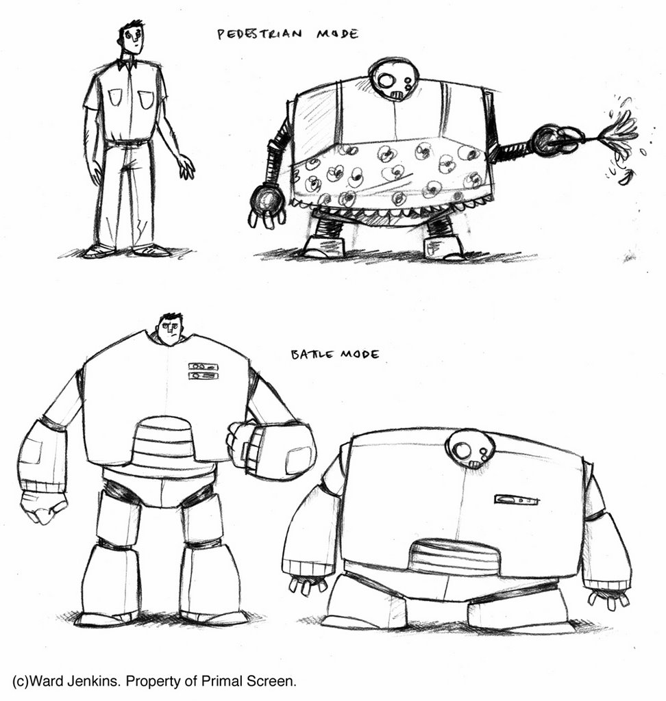
The clients wanted to do a send-up of all those superhero/action/sci-fi/monster genres -- poking fun at these genres, but at same time paying homage to them all. The open was going to be a big challenge for me -- tons of scenes with tons of action crammed into a very quick 20 second time frame, so the characters had to be bigger than life and memorable. The clients wanted two characters to act as "hosts:" Big, a superhero-type dude, and Wide, his sidekick. Originally, in earlier versions, Big and Wide were just regular joe-shmoes that just so happened to be a world-saving super-duo. Here was an earlier version (by the way, please click on all images for larger versions):


The joke here was that nobody knew that Wide was a robot and did odd jobs around the house. This was their "pedestrian mode." But when called to action, they would then put on their metal gear to get into "battle mode." It was pretty funny, but too much time was needed to establish who the characters were before they actually did any butt-kicking. This storyline was scrapped. For a while, both Big and Wide were supposed to be human -- Big being a superhero and Wide being this strangely wide man. I did a couple of drawings with this in mind:


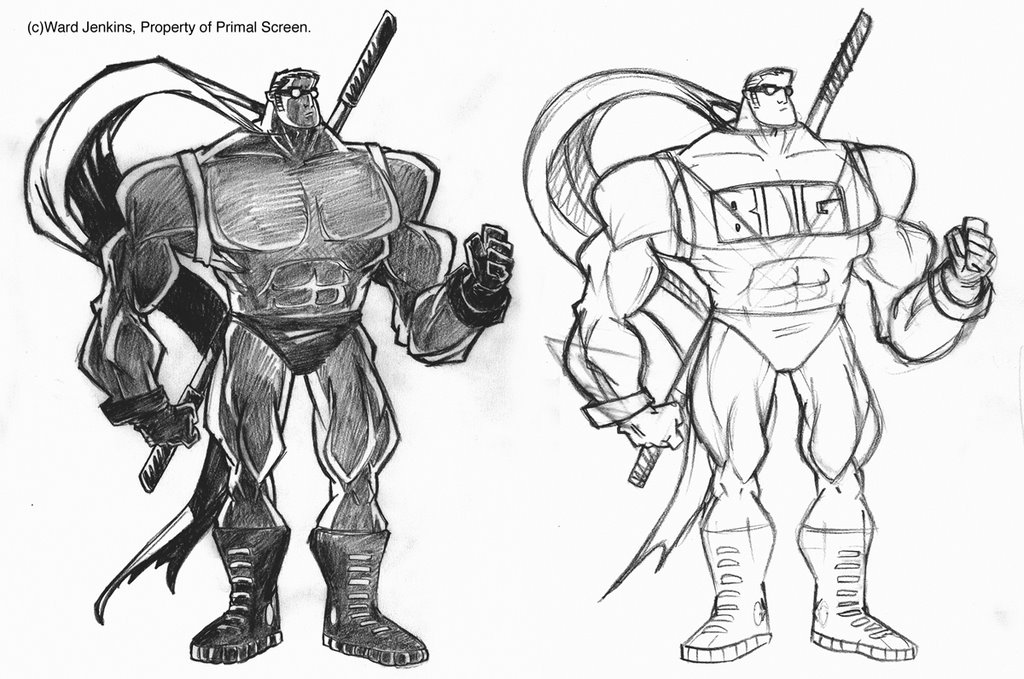
Geez, it's kinda embarrassing to show you all the above drawing because it was so early in the process. I was just getting started and I hadn't had the chance to really get all the proportions and musculature right. But below you can see that I pumped Big up more because, well, he didn't seem big enough. Still needed work.


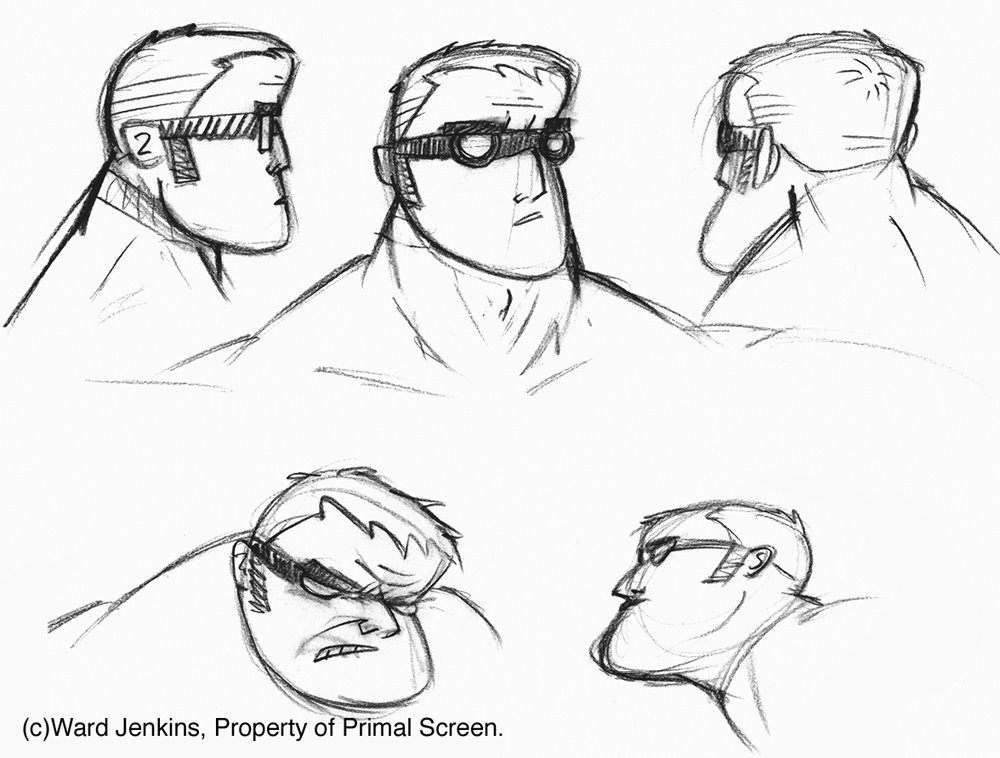
I liked that Big had this smallish head on a huge, pumped up body. Kinda taking that superhero concept to the extreme, with a teeny-tiny head. Speaking of Big's head, I did some studies with him wearing these googles, similar to the character of Batou of Ghost In The Shell. I liked the mysterious look that the goggles gave him:


Still not satisfied, I did some more explorations with Big, even giving him a Japanese jitte-like baton:


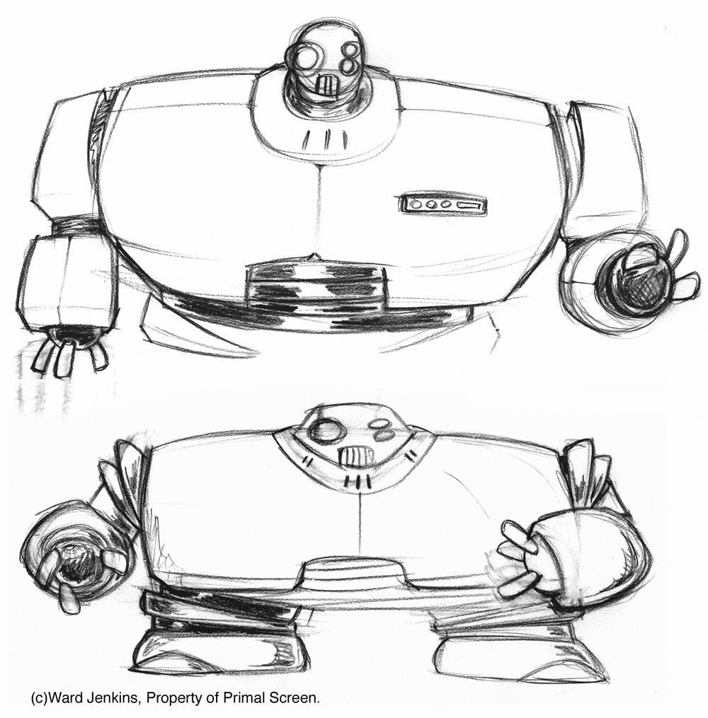
I was not digging Wide as a human character. He looked odd, being this strange, squashed, hunched-over character. He just didn't look aesthetically pleasing to me. I mean, a character like Wide would prove difficult to animate anyway, but I wanted him to be likable, and a crouching, deformed man did not seem so likable to me. I suggested that maybe going back to Wide being a robot would be better for the character. That way, the squashed look won't look so odd for a robotic character, like he was designed to be this way, plus you got your sci-fi genre. Some early concepts of Wide as a robot:


I was liking how Wide was progressing, but the clients wanted him to be more human-like in appearance. This would make Wide even more likable to the viewer and the clients were right in this bit of detail. Even though I was digging doing something "cool" by creating robots, Wide was looking mighty cold. No personality. But more on Wide later....

Going back to Big, the clients felt that we were getting "too serious" with the designs. So, I got rid of the goggles, and took a long, hard look at the stereotypical male superhero and all the send-ups and take-offs of that genre: Roger Ramjet, The Tick, Bob Parr of The Incredibles, and many others, to try and see if I could capture the spirit of the superhero that maybe the others had not picked up on. A hard task, but it was worth a shot. Getting into character, I felt that Big was a softy at heart, kinda ditzy, but was a sweetheart who would never hesitate to get that cat out of a tree for you. I began to develop a wide-eyed look for him, with that ever-present curly-cue lock on top of his head as a cutesy joke:


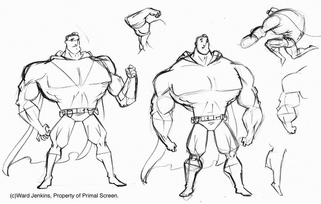
With his body, extreme was the main word. I wanted Big's muscles to be so grotesquely developed that there would be no way that he could move if he was a real person. To give off this effect, I drew his hands and feet incredibly small, making his muscles seem larger than they already were. He now has a tapered, dainty look to him:


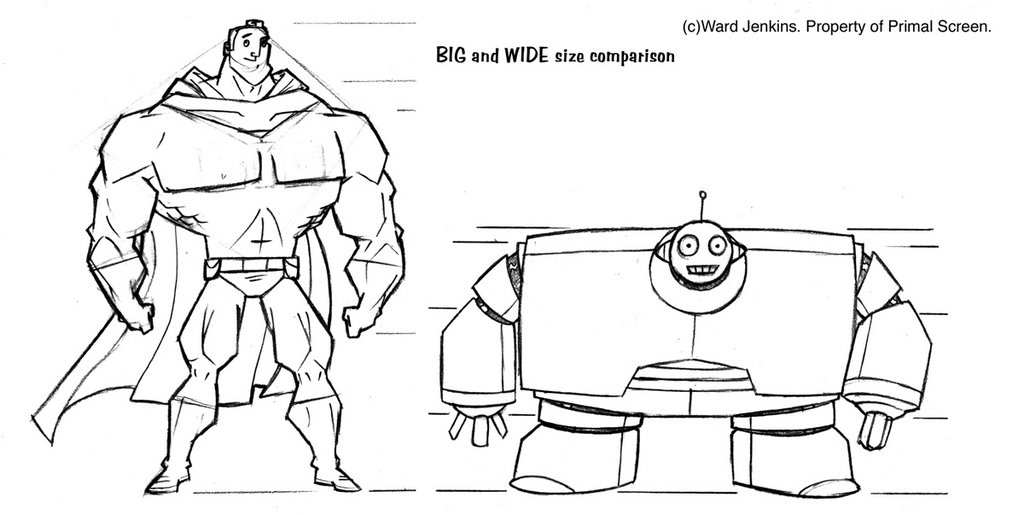
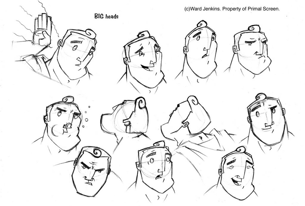
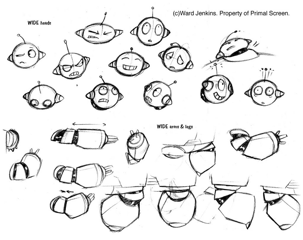
With a couple of more tweaks, we finally got our guys. Below are the final modelsheets that I gave to my assistants to animate. As you can see, Wide went through more changes before we reached this final design, and I would have to say that I'm very happy with the final result. One thing that I was worried about was maintaining consistency between the two characters, and I believe that we achieved that.

Here is the size comparison for Big and Wide:


Various hands and feet for Big. His feet proved to be a strange thing to animate. Don't know why.


I love drawing a variety of faces for a particular character. It's fun to put yourself in the character's head and try and think what they will look like if they were sad or happy, excited or depressed, introspective or curious. It's a good exercise for animators to explore different emotions.


Here are Big's turnarounds, both body and head. Man, the CHIN. That was tough to figure out.


At first, I wasn't sure about the anthropomorphic eyes and face for Wide, but like I said earlier, I now see that it was necessary for the viewer to be open to him. My earlier versions made Wide too cold and lifeless. No connection was being made between viewer and character. But here, he's a very likable guy, offering that perfect comical sidekick quality that we so desperately needed. A good balance to Big's simple doofyness.


Wide was more difficult to animate, considering that he was wide and made of metal -- there was some squash & stretch going on, but not too much. Having a segmented armor thing going on made it a lot easier to pull off some of the squashing and stretching. The fun thing I added was that Wide's "hands" can convert into various tools and objects, like a blow torch. Or a plunger.

Overall, Big and Wide had to look like a true team, a believable superhero team that could save the world in all their goofy, quirky ways. I was very happy with the results, and I had a blast animating them. Even though Wide was a bit difficult to animate, I saw it as a great challenge and I enjoyed that aspect of the character.

Up next: Backgrounds and Color.

3.19.2006

Spotlight: Big Wide Action Show (Part 1)

This is part 1 of a 4-part series on the making of The Big Wide Action Show Open. Check the rest of the series: Part 2. Part 3.

Welcome to the first installment of Spotlight here on The Ward-O-Matic, a special series where I focus on a past job that I worked on and share with you all some of the processes that it took for me get the job done. I realize that I've pretty much neglected the work aspect on this blog, but hopefully this will right that wrong. It's kinda weird that I have not mentioned much of what I do at Primal, and quite frankly, I'm sure that most of you have absolutely no clue what I do. Actually, most at Primal are in the dark as well, so don't feel so left out. Anyway, with Spotlight, I plan to show how each job has been a learning experience for me, and I'd like to share some of this knowledge with my readers. You'll get a little insight to how I approach each job as well as check out my thought processes and methods. One thing I must say is that even though I've been animating for 10 years and have been at Primal for the past five, in no way am I saying that my methods are the best. Every director (I've observed) has a vastly different approach to animation -- from broadcast to feature to TV production -- and so there are many, MANY different ways to skin a cat. All I'm doing is letting you in on some of my methods, no matter how quirky they may be. Either you may get something out of this or have extreme sympathy for my assistants (in that case, please email me and let me know where I'm going wrong).

About a year and a half ago, I had the great opportunity of creating original characters for this all hi-def animation network called Animania (part of the VOOM HD network). They needed an open for this block of mostly action shows (primarily aimed at the boys, obviously) called The Big Wide Action Show. Since Primal Screen has done a good amount of show opens (see: Harvey Birdman: Attorney at Law), as well as created the entire identity packaging for Animania, it seemed like a perfect fit.

THE BIG WIDE ACTION SHOW OPEN:

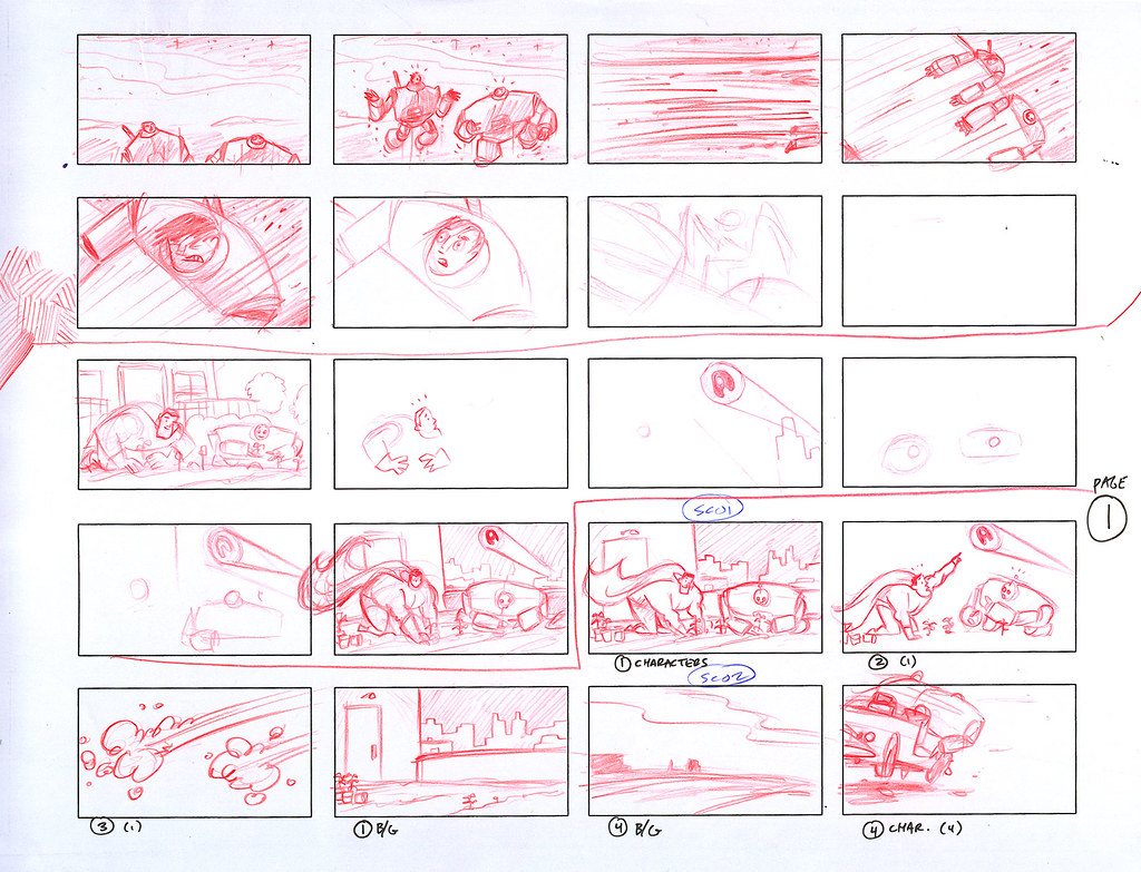
The story for the open was conjured up by a writer hired by Animania and thusly, it was up to me to visualize it. I was given a one-paragraph treatment of the story and once I got the characters designed and locked down (another whole post coming up), I started to work on the storyboards (or 'boards). But I didn't start with full 'boards just yet. I started with thumbnails.

Thumbnail sketches, or "thumbnails," are an early part of the animation process. Basically, it's a brainstorming session to see just what the spot (in this case, the open) will look like. Done in a smaller scale (and quickly), it gives me a chance to focus on the placement of the characters and action as a whole. Working small allows me to see the entire frame sans extraneous detail. Once I get the thumbs looking right, I then take the images that I like here, scan them, and put them together in After Effects to create an animatic, or "moving storyboard," to check for timing and pacing. I also resort to thumbnails when planning out my keys when animating. Most animators know about this very important part of the process.

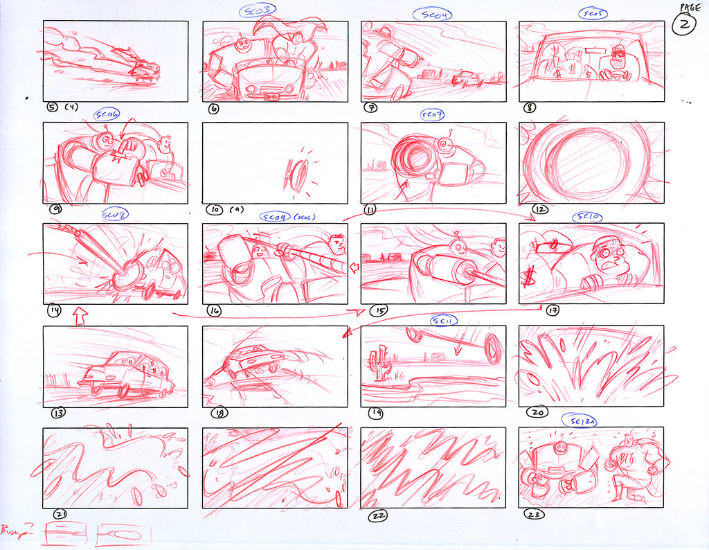
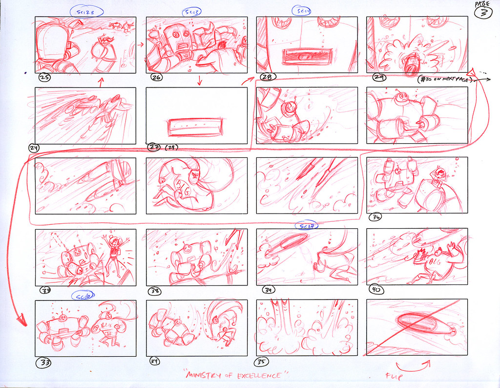
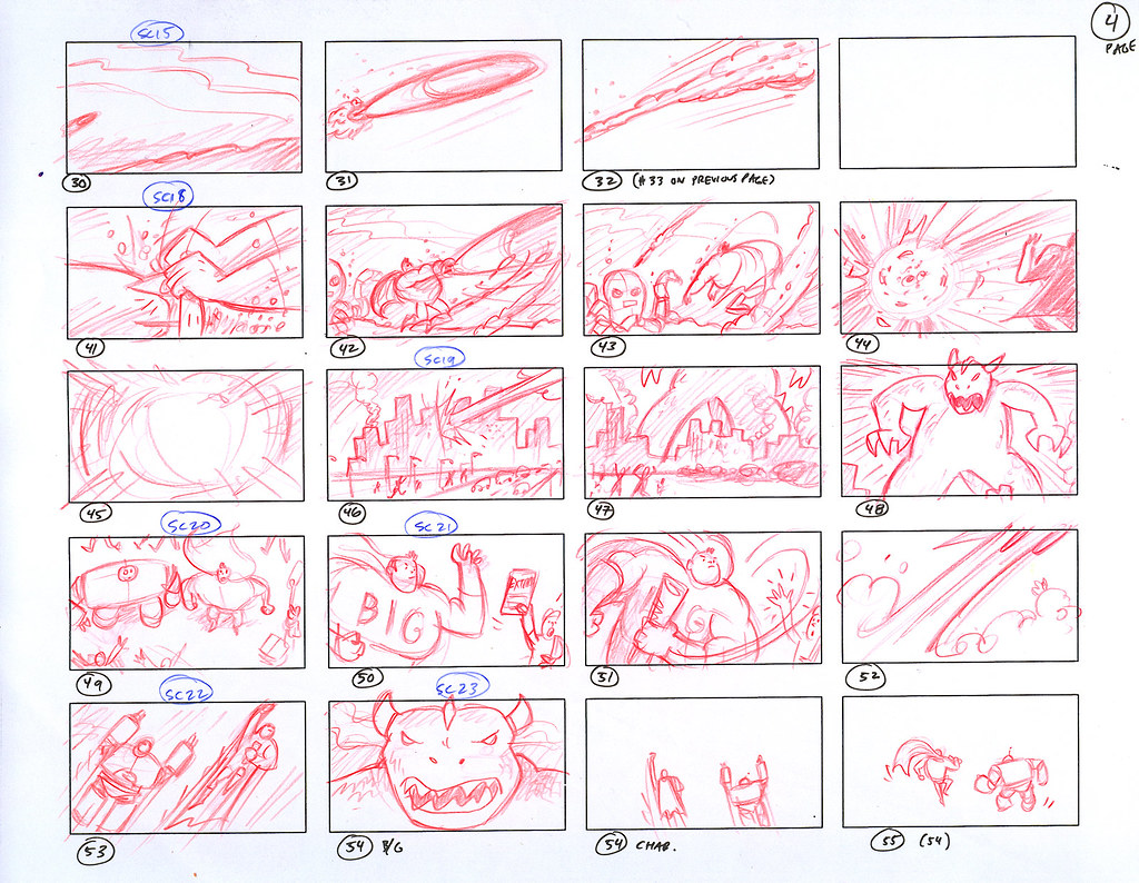
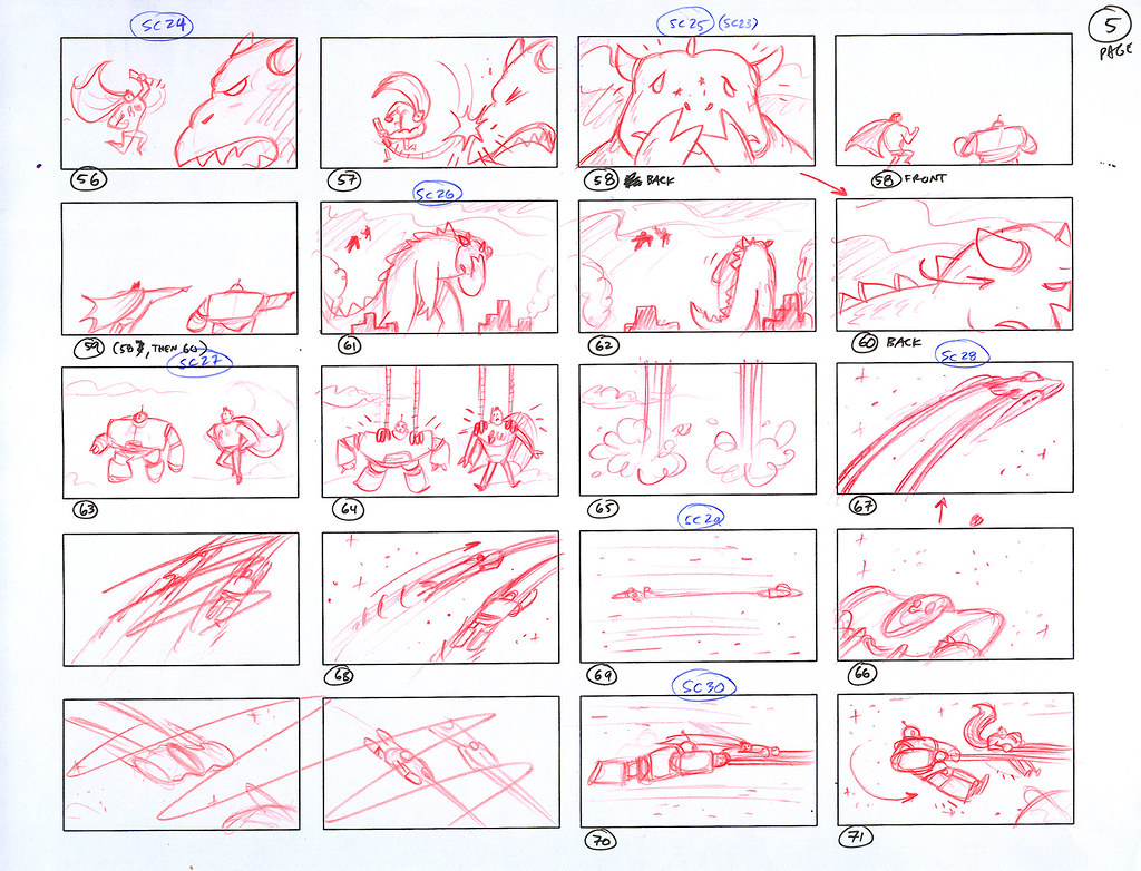
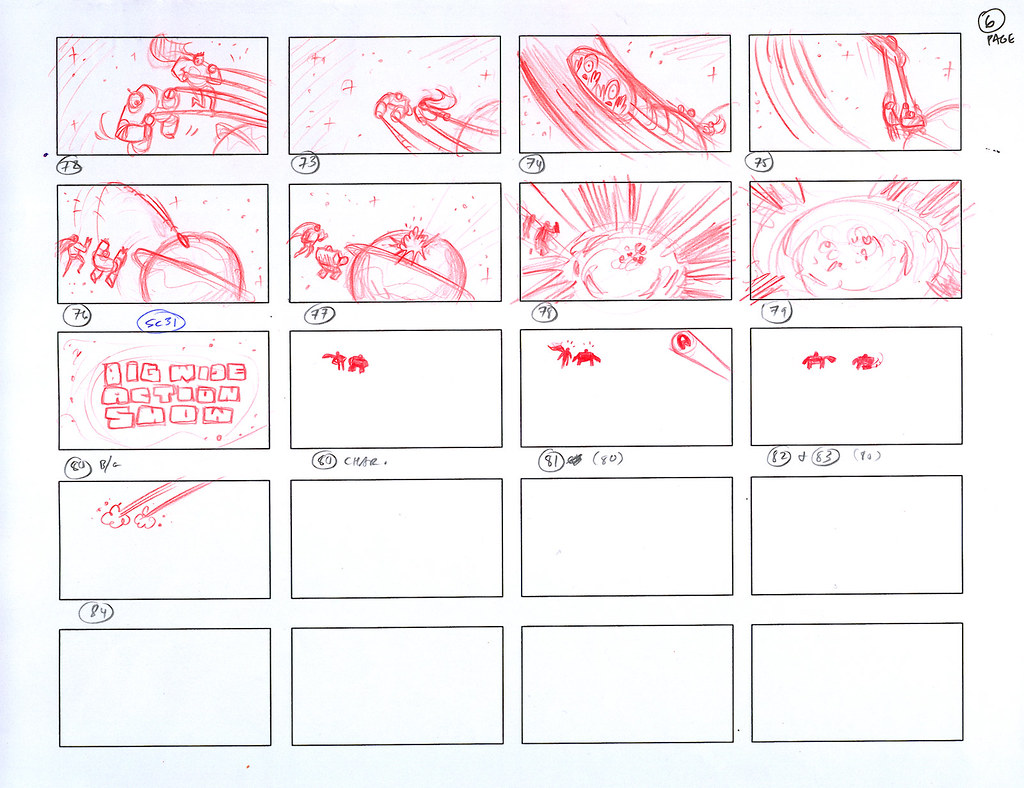
The basic premise of this story is that our superhero BIG and his robot sidekick WIDE (Animania's tagline is "Big Wide Fun") are called to action to save the world -- multiple times within 30 seconds. It's done tongue-in-cheek, with obvious nods to superhero and action clichés. Remember, we're living in the Age of Irony. There was A LOT of action to be planned out from that initial one-paragraph treatment for just 30 seconds, but the clients wanted it all. My first challenge was to get it all in there and make it understandable for the viewer. Not an easy task. What you'll see in the following thumbnails are my gut drawings, drawn quickly, and drawn with the viewer in mind. The action skips around, but if you follow the numbers, you'll (hopefully) understand what's going on. Be sure to click on each page for a closer look:


After a couple of false starts (we went through several versions of the treatment before the clients liked this one), you can see that I didn't get it started until halfway down the page. The joke here is that it would seem kinda funny if a superhero and a robot are tending to their garden when they get the signal.


Sorry it switches around here, but if you can follow the story, BIG and WIDE nab a runaway burglar in their trusty, rusty bucket of bolts.


Inexplicably, we are now underwater with our two heros battling it out with an underwater nemesis. We changed the robotic octopus to a manta ray-like submarine because having to animate eight metal tentacles would prove to be insane. Also, we got rid of the damsel-in-distress for timing purposes.


After blowing up the underwater bad guy (boys like things that blow up real good), the scene switches to a city under siege by a Godzilla-like monster. The scenario pretty much remains the same here, save for the fact that the monster went through some changes before animation.


Of course, the joke here is that BIG smacks the monster on the nose like a naughty puppy and the monster leaves, dejected. I really liked working on this scene. Once that creature is gone, our two heros are suddenly wisked away by aliens in a spaceship. Hey -- they covered all bases here with action, superheros, monsters, AND sci-fi.


More explosions. Gotta love that. There was this running gag at the end where BIG and WIDE see their signal in the sky again, causing them to take off and save the world again, but we nixed that. No time left.


Next installment I'll talk about how I created the characters of BIG and WIDE. Stay tuned....

Check out how I created our two main characters, Big and Wide, in Part 2: Character Design.