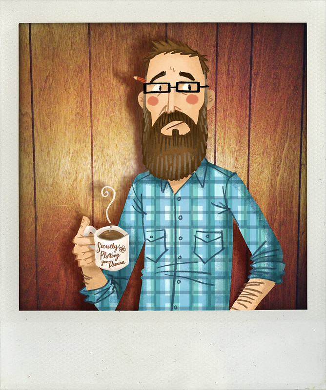
5.25.2022

Hello. It's me. Again.

Hello, it's me again. I am still here - I promise. It's been another long break in between posts here on this blog. I've been finding myself here more often lately, looking up old posts, reading memories, finding old photos and scans and reminiscing over old artwork by the kids - all from what seems like an eternity ago - and it got me thinking I should do an update, a spring cleaning of sorts. There are a lot of posts with broken and/or corrupt images (because I was using an out-dated image hosting server - this was before Blogger offered hosting images) and I'd love to revive these broken posts, fix them by updating the images and making everything whole again. 

I do miss the glory days of blogging where we would share our thoughts and interests and photos of our lives and share our latest drawing (or our kids' drawings) and have a nice back-n-forth with people commenting, sharing their own stories, connecting and reconnecting. The connecting is vastly different now. But here, this is where it all began: a lowly blog, with a few words accompanied by a photo or drawing or two. I'd like to do this again. I'm actually enjoying typing this out right now and seeing my words appear as I think them out - like I did SO many times before. 

So, hello - again. It's me. Hope to reconnect with you again here. I've missed you.

11.02.2018

Here's a random post outta nowhere for you guys - all 10 of you who still follow this ol' blog of mine. Enjoy!

7.24.2017

O HAI

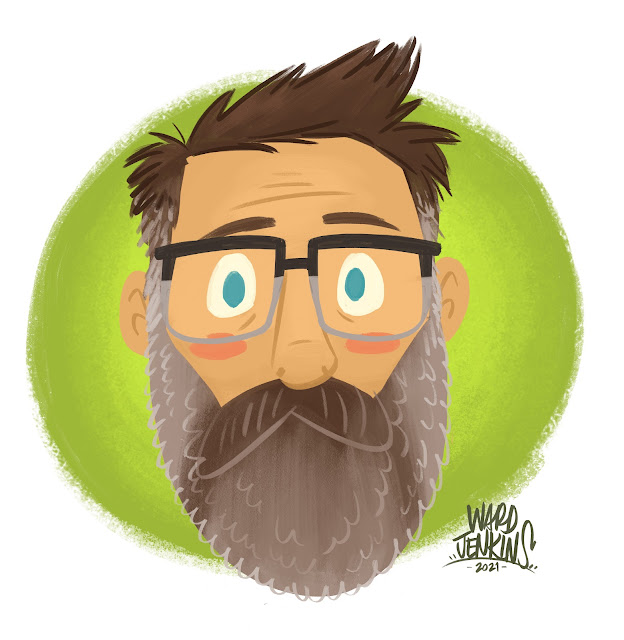
Oh hey! I'm still here. Just not as often as I'd like to be. Anyway, here's a drawing of me.

10.25.2014

New Website

Ladies and gentlemen, my revamped, redesigned and renewed website: www.wardjenkins.com. ENJOY!

5.18.2014

This year...

This is me.

I am not going to compare myself to others as much. Or at all. I am embracing the struggle, accepting the mistakes I've made and pushing through. I am learning. I am trying. I am not going to let it get to me. Everything. It is going to be okay. I know it will. I am going to finish that one project I've been working on for some time now. I will not put it aside and forget it. I will keep it up front and center. Because I know that that's my spark. I know that it will keep me whole. I know that I can call it my own. I am going to draw when I don't want to. I am going to draw when I'm tired. I am going to draw when I need to. Because I am losing my identity when I don't. I am going to draw more and erase even more than that. I am going to organize my thoughts and ideas. For once. And I am going to listen to my wife. Because she knows me best. Even when I think she doesn't, she does. Always. And I am going to give in to the uncertainty of this year. Because I know I can't control it. I am not going to forget things and I am not going to give up. I am going to remember and I am going to keep going. I am not letting my weaknesses take root. I am not letting my insecurities envelope me. I am not listening to my doubt. I am not letting my negativity control me. I am not letting it win. I am not losing this year. I am not. I am not. I am going to win. I am. I am.

7.22.2013

Etsy Shop Update!

Etsy Shop Update!

Yes, it's finally happened: an actual update to my Ward-O-Matic Etsy Shop with NEW prints! Amazing! Here are the three prints that are now available (top to bottom, L to R): Vinyl Kid, SX-70 Camera Boy, SX-70 Camera Girl.

Prints shown above are the 5" x 7" size. All three are available in 8.5" x 11" as well. Yay!

Here, let me hold them for all of you to see (again, these are the 5 x 7" size):

Etsy Update: Vinyl Kid print

Etsy Update: SX-70 Camera Kids

The link: The Ward-O-Matic Shop

2.16.2013

Elly in Ink & Gouache

It's always nice to break out the ink and gouache. Trying some things out with my Calico Elly character. Although the calico pattern is a little difficult to convey in paint. But hey, it's always worth playing around here:

Elly fun

Elly fun 2

And who wouldn't want an extra appendage for eating chips out of the bag while reading? I mean, c'mon.

2.04.2013

Promo Postcard for 2013

New year, new promo postcard. Here's the back of the card, complete with all the important information that you'd need to ever get a hold of me:

Promo Postcard 2013
Jennifer Laughran of Andrea Brown Literary Agency is my agent and she's been great. She's sitting by the phone, waiting for your call - er, well, she's sitting by her computer, waiting for your email. Yes, that's it. She's ready for anything.

The elephant is a character I've named Calico Elly. You might've seen her before. I've got a story idea for her I've been working on - a picture book idea that would involve Elly and some classmates. Looking forward to seeing where the story process takes me on that one.

Anyway, the front to the postcard is actually detail of a spread from San Francisco, Baby! - the Lombard Street one:

Promo Postcard front
Fun!

1.03.2013

Ending the year on a good note

Happy 2013! Here's the last illustration job I did for 2012: a piece for The Phoenix (again!) of Portlandia's Carrie Brownstein.

Since I was out of town for the holidays and I didn't have my trusty light table (well, my animation disc), I had to improvise:

When in doubt: improvise

Here's the rough sketch I sent the client:

Carrie Brownstein: rough

And now, the final. Portlanders will catch the bridges references (extra points for those who know which bridges these are) and the green heart Oregon logo on the coffee mug:

Carrie Brownstein: final

So, yeah - a good way to end the year! The people of The Phoenix are awesome.

Coming up: some good news! More details later.

Again, if you like what you see here and want to share it (Tumblr, Pinterest, blogs, Twitter, etc.) please, please, PLEASE give credit to who did this! Many thanks.

12.25.2012

Merry Christmas

The First Noel
The First Noel illustrated by Alice & Martin Provensen. 1959. This is my staple Christmas post - I absolutely love the illustrations in this book and will share this with you, my readers annually because they are so worth sharing. Enjoy.

Merry Christmas to you and yours, people.

With much love, peace & happiness,
Ward Jenkins aka Ward-O-Matic.


The First Noel: title page

The First Noel: 1-2

The First Noel: pp. 5-6

The First Noel: pp. 7-8

The First Noel: pp. 11-12

The First Noel: pp. 13-14

The First Noel: pp. 17-18

The First Noel: pp. 21-22

And finally, the back cover:

The First Noel: back cover

12.24.2012

Merry Christmas Eve

The Condenser 1957

A wonderful gift from a good friend of mine, Brad Ross-McCloud aka The King of Jingaling. Thanks, Brad! You know me so well.

A great illustration by "Faulkner," from 1957.

12.20.2012

Phoenix Illustrations

I've always wanted to do editorial illustrations for magazines and newspapers and I've done some here and there, but never of any celebrities or important people in the news. Until recently. The Phoenix in Boston asked me to do a few illustrations of people to accompany interviews, and boy, was I thrilled.

The first was of documentary filmmaker and author Errol Morris, who was interviewed for the November 9th, 2012 issue. Here's the rough sketch first:

Errol Morris - rough
I drew this with my Cintiq in Photoshop - I have a pencil brush I use for the black lines, and a chalk brush for the brushy, pastel-y effect for the grays. I decided to abandon the ribbon encircling Errol with all the interviewers and cameramen because I thought it seemed cliché.

As I was working on the various different shades of gray on his face, I liked the effect that gave me, so I decided to take it further in the color stage:

Errol Morris
My concept with the multi-hued color treatment here was that I liked the idea of how Errol approaches his subjects - viewing them through a multi-faceted lens, so to speak. Trying to look at any and all aspects of a particular event that might've affected a subject, like the Jeffery MacDonald case from 1972 - of which he's written a book about the case and why he was being interviewed by the Phoenix in the first place.

The next illustration I did was of political statistician Nate Silver for the November 5th, 2012 issue. (I actually drew the Errol Morris one first, but the interview was held until after this one was published.) Below is the rough sketch, again drawn in Photoshop on my Cintiq:

Nate Silver - rough
For both illustrations, I had already drawn several pencil sketches in my sketchbook leading up to the digital sketching, as a way of trying to get the subject right. For Nate, I felt that I got his appearance right away. Errol was a bit more difficult to capture. (I'm not a caricaturist by heart - but I do my best.)

Nate Silver final
I really had fun drawing this one of Nate. I went with the obvious red/blue for the two opposing political parties - splitting Nate right down the middle, so as not to give any preference for him (since he's just stating facts & figures on his blog and not offering any opinions). Notice that his left is blue, his right is red. AND, notice that in the background, the left side is blue, the right is red. Worked out perfectly, I think! Nate's blog on the NYTimes site is called FiveThirtyEight Blog, hence the number "538" in the illustration.

Been really enjoying working on these illustrations, even with a quick turnaround. I'm happy to say that I'm currently working on a third piece for the Phoenix - of an actress/musician who's in one of my favorite current TV shows. Very much looking forward to working on that one!

12.07.2012

SCBWI Bulletin Cover

Bulletin in person

You probably have heard me talk about SCBWI here from time to time. It's the Society of Children's Book Writers and Illustrators, and they are dedicated in helping people who are writers and illustrators to better hone their craft with the hope of getting published. I've attended several of the conferences they've put out, including one national and several local chapters. This past May I was honored to be a part of the faculty for our local chapter's annual gathering, SCBWI-Oregon's Spring Conference. One of the highlights during the 2-day event was sitting next to Lin Oliver during the faculty panel. I mean, really? C'mon, the Lin Oliver? Executive Director of SCBWI? Sitting next to me? It was a bizarre moment.

At one point, Lin leaned over to me and said how much she loved my work. She'd been looking at my postcards and portfolio and liked what she saw. She then asked if I'd be willing to illustrate a future Bulletin cover. After picking up my jaw from my lap, I said "uh, HECK YEAH!" No, actually I think I was a bit more subtle, but I was definitely floored and flabbergasted that she'd consider me as a future cover artist for them. I told her yes, it would be quite an honor.

So, fast-forward several months and I'm doing sketches for the cover. I had an idea that stemmed from talking with Andrea about what to illustrate. See, each issue has a kite for its theme - the SCBWI logo features a kite, therefore every issue has had a kite featured either prominently or not so prominent on the cover. I wanted to do something vastly different, and not go any typical route, like flying kites up on a hill or something. After brainstorming with me for several minutes, Andrea at one point said, "Well, what about doing a mural?" That's it. Something clicked in my head and I started sketching right away. Out of that session, I ended up with two main roughs that I sent to SCBWI for approval:

SCBWIBulletin-rough1
SCBWIBulletin-rough2

So, the idea would be that the mural would serve as a beacon of warmth and light in the midst of a blustery, wintery, snowy day, right in the throes of winter. Much like graffiti does in the middle of blighted areas: pops of color blooming like poppy blossoms in a stark, vast field. I was excited about this idea and was extra excited to work out a little visual play with the boy spray painting the kite's string, making it look like he was actually pulling the kite.

The version that was chosen was the top one - the lower point of view made it easier to see the large mural, as the other version felt less intimate. I thought that the impact of this colorful mural was getting lost. My SCBWI contact felt so, too.

So, here's the final for you to check out, in all its brilliantly loud glory:
SCBWI Bulletin Nov/Dec 2012

(By the way, please be sure to give credit if you decide to share with your peoples - many thanks!)

The Christmas season is upon us and I'm slowly but surely getting into the spirit of things here. Hope this gives you a little jolt of happiness, just in time for the weekend. Enjoy!

10.20.2012

When M. Sasek meets NBA

NRDC NBA Adds Up PSA - Ward Jenkins/Paul Golden from FFAKE Animation on Vimeo.

It's been a while since I'd directed anything lately, so it was a welcome pleasure for Paul Golden of Ffake to contact me about co-directing this fun public service announcement for the NBA and NRDC. That's National Basketball Association (of course) and the National Resources Defense Council - they're all about going green and recycling, etc. The PSA was a simple walk through of all the ways that the NBA has been working with the NRDC to make sure the league is going green - mostly through the basketball arenas and facilities.

Paul wanted to emulate the look and feel of M. Sasek and his "This Is..." children's book series, and I - of course, couldn't say no to that. It was quite a fun adventure working on this spot. Below are some of the first sketches I did of the NBA player and the NRDC scientist guy: Sketches 1 Sketches 2 Sketches 3

After some more sketches, finally got it down to a decent look for the scientist - more of a goofy guy who's a little behind the times with his basketball outfit: characters 3 NBA/NRDC characters in color

Of course, we ended up having to change the gender of the scientist, which is perfectly fine with me. Just meant there was more work to do, while the deadline never changed.

Here are some of the rough, penciled layouts:
rough layout sc02a rough layout sc02b rough layout sc03a & b rough layout sc05 rough layout sc06

And now, here are the final backgrounds with final color treatments for the characters (they were all eventually reworked and animated in Flash).

Scene 01:
sc01

Scene 02: This scene required the most work. I referred to a lot of Sasek's books that had lots of downtown buildings to get the look right. Here's the regular version of the arena scene:
sc02 main
And here's the same shot, but with a cutaway of the arena:
sc02 open

Scene 03:
sc03

Scene 04 with the characters:
NBA/NRDC sc04

And here's Scene 04 background only:
NBA/NRDC sc04 background

Scene 05 with characters:
NBA/NRDC sc05

And here's Scene 05 background only:
NBA/NRDC sc05 background

Scene 06:
NBA/NRDC sc06

Scene 08, wherein we have to put all the appropriate logos at the end tag:
NBA/NRDC sc08


I know that I've shared a lot of images here, but you can see all these as well as a few more in this Flickr set: NBA/NRDC PSA.

Enjoy!