As promised, I thought I'd show you guys a little "how-to" on the thought processes for my recent
Illustration Friday piece,
Black & White. You can add this to your Special Edition Ward-O-Matic files, I guess. Since I did not record my progress when I initially worked on this piece, I tried to replicate the steps here the best I could.
First, the concept. I immediately thought of a film noir scene when I first read of the week's theme,
black & white, and so, being that I had recently wrote about Frank Miller's
Sin City, I wanted to get real dark and gritty. I wanted to go to both extremes with the tone, from bright whites to jet blacks, from bright lights to sunken shadows. So, what a better setting to convey this type of scene, than in a bar? I sketched this guy out with my red Col-Erase pencil on animation paper on the second try, and then scanned him in at 150 dpi (300 dpi is normal for print and such, but since I knew this would be on the web, I figured there's no need for him to take up too much space in my computer), and tweaked levels to darken the subtle lines. I need as much of the pencil lines as possible before my next stage.
(Most of these images are clickable for larger views.)
Next, I want to get rid of all the whites, so I can have freedom in painting and coloring. Where I work,
Primal Screen, we have all these Photoshop actions for various cel-oriented jobs, and one of them is a "delete whites" action. I went in and tweaked the action so it would better suit my needs and came up with this: before I do anything, I make a copy of the background layer (the layer your current image is on), and then select the top layer and go under Select=Load Selection... If all goes well, I usually can just click "OK" and all the white is selected in that top layer. I then press "delete," and hopefully all the white in that layer is gone, including half-tone whites. See, getting rid of the half-tone whites is very important as that ugly halo effect will not be present if I just selected the white areas with the wand tool.
UPDATE: I found out that in order for the Select=Load Selection to work properly, the image must still be in "Greyscale" mode. Once you delete the whites, you can then convert the image to RGB or CMYK mode, whichever you prefer.
After deleting the bottom background layer, I add a new layer and place it under my image. I then click on the transparency lock for the top layer, which I now call my line layer. This will allow me to color only the line itself, and nothing else. Nice. Okay, so originally, my idea was to have a big diagonal black shadow run across the entire image, with only half of our friendless barfly visable. But as I am working on it, I realize that I'll lose some of the impact of the light coming in from the door. Anyway, I select my
bottom layer and go ahead and fill in the area on the right in black, and fill in the rest with white. This bottom layer is now my color layer.

Next, I select the top line layer and then grab my trusty pastel brush over in the brush tool menu. It's about two-thirds down. I use the eyedropper to select the white for my brush and then start to color in the line that's now in the black area, to white. After this, I start to have some fun. Back on my bottom color layer, I go back and forth between black and white and start to work with the pastel brush to get a good idea of shading and lighting. How much am I willing to go with the shadows? Should I make the entire room black? Should I have a harsh light emit from the one window in the door? How harsh should this light be? All these questions go through my mind, plus more.

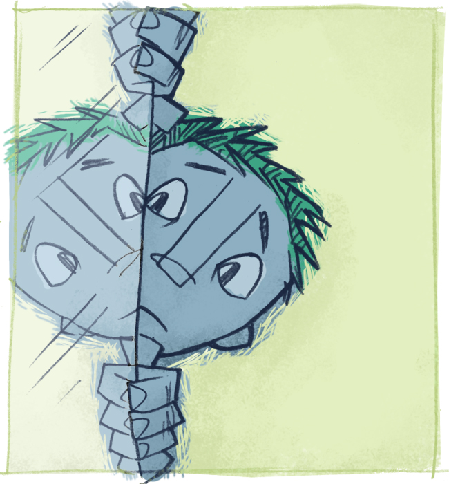
As I was working on this piece, I started to realize that the more lines I hid, the stronger the image got. If you'll notice in the final image, the guy's head in shadow has only a few highlights of lines to denote his hair and ear. I figured that the audience will know that his head continues back there, so why should I have to show all the lines? To do this, I did NOT erase the linework, but instead colored it black. That way, if I changed my mind later on, I still had the artwork intact. And by the way, I did not use the airbrush brush at all, only the pastel brush to do all my coloring -- background color and line color. I try my best to stay away from the default airbrush they give you in Photoshop as it tends to look too "computer-y" (except in a few situations where it's called for). It's too perfect. Here, I wanted a human element involved, to make it look like someone got their fingers all smeared with charcoal or pastels.

As I work, I start to get a feel for the setting, the overall ambience of the place, and try to get that feeling across through my brushstrokes. At first, I want to show all the smoke in pure white, but once I darken part of it on the right side, it somehow feels better to me. It looks "right," somehow, and I leave it be. Sometimes initial ideas don't always work out the way you imagined it in your head. (Remember that big idea I had earllier, with that diagonal shadow splitting the image in half?)
So, alas, we have here the final image, after much tweaking and noodling. Of course, the more I look at this, the more things I want to change. Why is that always the case?