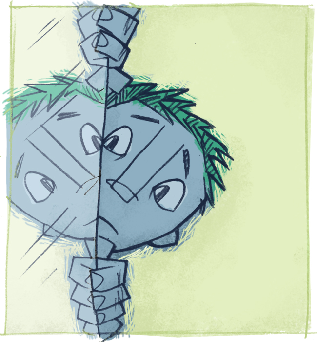
Here's my submission for this week's Illustration Friday, with the theme being reflection. No backstory to this one, just some guy looking around a mirror. Trying something different with the color. I tend to use a lot of greens, and it's so hard for me to get out of that. I still happened to get some green in his hair, still. Oh well!

Just terrific! I've had such fun nosing around your blog - seeing all your fun stuff - and your daughter's artwork is priceless! You have a warmth that really comes across in your work and writing. I'm looking forward to joining The Retro Kid. I found some great Golden Children's Magazines from the 60's that I've been scanning - they're just chock-full of great illustrations! Here's some from my blog if you're interested: http://justbeenme.blogspot.com/2005/07/golden-magazine-illustrations-part-1.html
ReplyDeleteLove your picture this week! Kudos!
Looks good, Ward!I like the unsure look on his face.
ReplyDeletewonderful!
ReplyDeleteReally really nice.
ReplyDeletevery nice.. funny too.. :)
ReplyDeleteMr. Jenkins, the patterning around the kid looks scratchboard-esque. And I'm wondering what the ratio of hand-done-ness and digital enhancery is with this dealie. It's a fun bit, tho'. Good jorb.
ReplyDeleteWow, I just made up a lot of words.
Thanks all, for your nice comments! And bee'nme, thanks for nosing around -- I encourage that! And that one scan you posted looked very interesting. Definitely join the Retro Kid and include it! We'd love to have ya
ReplyDeleteJeope, about the scratchboard effect, I tried a different brush, one that allowed more of a brushy stroke to it, and then went back and used an eraser with the same brush, but smaller, to trim it. Very lightly, though. So, I would say bout 50/50, maybe?
Very bueno.
ReplyDeleteVery nice! And I like the green hair.
ReplyDeletewell, very nice illustration Mr Jenkins, I'm coming to your blog quite a lot, very interesting stuff and beautiful art of course! I never left a comment so thought it was about time as I just started my blog 2 weeks ago and I realize that people feedback is very important.
ReplyDeleteAnyway, great blog!
Yes, I love your work, Stef! Thanks for visiting. It's been very inspiring for me to see so many artists sharing their work via blogs. There's so much great work out there. I love it!
ReplyDeleteGreat illustration - I like the subtle shade of the reflection.
ReplyDeleteBeing on a high today awaiting the new Terry Gilliam movie, I can't help but look at this illustration and be reminded of a shot in 'Brazil' where Sam seems to wrestle w/ his reflection, framed in a similar way to this picture.
he's smiling!
ReplyDeleteawesome sketch there man. this weeks is a good topic, cant wait to see what everyone comes up with. take it easy.
ReplyDeleteThis is awesome!
ReplyDeleteHey, there! I just came across that reflection illustration of yours on google images and I'd really love to use it on my blog. I mean... it looks perfect to me! It really does. The image itself is beyond great! But there's also the fact that even your colors match my blog... I mean, that's gotta mean something, right? Do I sound desperate? Well, I really would LOVE to use it... Please?
ReplyDelete:D
Thanks!
Just making an adjustment on my info... the site I left on my earlier comment is actually followed by /journal
ReplyDeleteHope to hear from you! :D