
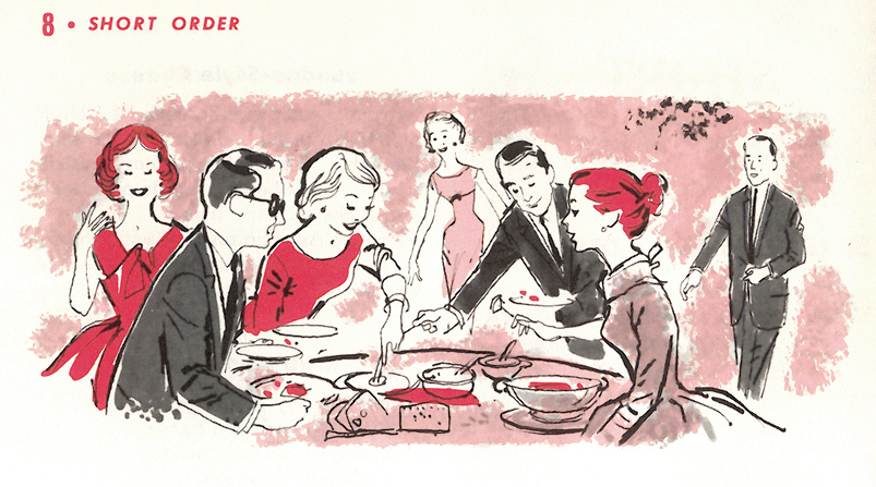
Several years ago I wrote about Lou Peters and his propensity to be diverse in various illustrative styles. (Still no new information on exactly what this mystery person was all about. Anyone?) While it's obvious I'm in awe of such talent - to be able to go from style to style without making it look difficult is quite a feat for any artist - this had me thinking, "Is it worth it to be a versatile artist? Was it beneficial for Lou Peters? Would it be beneficial for me?"
I've often wondered about this throughout my career as both an illustrator and animator. While in animation (especially of the hand-drawn variety) it usually works to one's advantage if they were an artistic chameleon, aping the look and style of every character and show that they've been assigned to work on. Throughout my time as director in broadcast animation, I often told my assistants this: Forget your own style; you have to be a chameleon. Sounds harsh, but it's a harsh reality in this industry. If they didn't completely conform to how a particular show was being drawn, they would be politely assigned to another project (which wasn't too often, I'm happy to say). Time is money,right? If an artist wasn't drawing the characters correctly, it was a waste a time - therefore, a waste of money.
This constant aping of various cartoon styles served to be both a blessing and a curse for me. I throughly enjoyed being assigned a new project, diving into all the research that went into it, watching shows frame-by-frame to see exactly how the characters moved and acted, grabbing screengrab after screengrab of faces, walkcycles, and characters. With my thirst for knowledge, the pre-production stage of each project was my favorite part. However, there were issues with how much time I devoted to research on the onset - did I really need 40 frames of Astro licking George Jetson's face? (In hindsight -yes, but that's just between you and me.) Could it be that too much information is, well, too much?
I digress. Back to the issue at hand. For an illustrator, the question of being diverse is different. It might look on the onset that being a versatile artist would be beneficial to an independent illustrator as well - to be able to address a look and style that fits each job offer that comes their way should work to their advantage, right? If a client is looking for illustrations that imitate Soviet propaganda posters, or mirror Roy Lichtenstein's pop art characters (which, in of itself is ripped from comic books, of course), or perhaps copy the pen and ink feel of Maurice Sendak's Where The Wild Things Are, then who's to say it would be wrong for an artist to not turn these projects down? Especially during this day and age of an unsure economy? But would the artist be compromising his own vision? Most freelance illustrators are in the business because they have a "voice", with their own unique look and style and use it to their advantage. In order to stand out, you have to be unequivocally forging ahead with your own distinctive style.
Or do you?
Let's take a look at the fantastic work of Mel Crawford. He's done plenty of children's books during the 50's, 60's, all the way through the 70's and 80's. (He's still alive and painting, by the way!) I've mentioned Mel before. Here's the cover to his take on Uncle Wiggily from 1953:
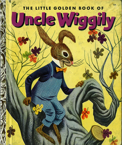

Bright, lively work, Mel captures the fun and energy of the story and brings this vitality through on each spread of this book. The colors are bold and the characters are posed wonderfully. Plus, I love the textures that he shows for the surroundings, such as the trees, grass, the house. All around, a brilliant book.
Now, let's look at another Little Golden Book he illustrated, Tommy's Camping Adventure, from 1962:

I had this book when I was a kid. When I saw it in the fleamarket, I bought it right away. A wave of nostalgia washed over me while turning the pages of this book. I remember it fondly.
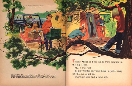
Notice how Mel framed Tommy with the use of the tree and branches, and silhouettes the boy by the much lighter yellows and light greens behind him.
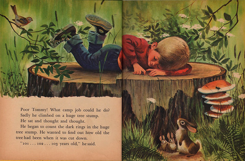
I remember looking so intently at this spread when I was a kid - the details, oh! the details! I could almost feel the ridges of the rings on the tree stump here. So wonderful. Take a closer look.

With the use of an extreme diagonal, Mel allows our eyes to go from the family down to Tommy, and finally, to what he's looking at: a little wood rat.


Again, the diagonal. Love that huge tree on the left there. Also, notice how Mel uses the tree on the extreme right to help guide our eyes to Tommy, so we don't go off the page.
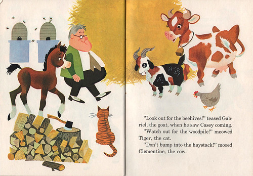
Now, let's take a look at Casey The Clumsy Colt, also illustrated by Mel Crawford (from 1965):

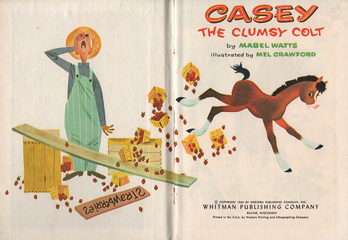
What's interesting to me is the fact that Mel uses white in almost every single spread of this little book from Whitman Publishing. Whitman made small, easy-to-afford books for children, similar to Little Golden Books. They weren't known for their quality, however. Most Whitman books I own are in terrible shape because of weak binding and eager little fingers wanting to tear them apart throughout the decades.
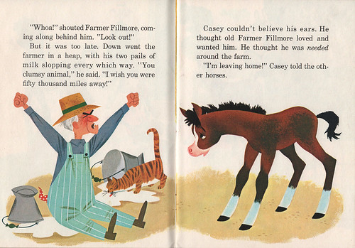
Even on a busy spread, the details that Mel put in are simplified here - there's not too much to take away from the story, or the overall aesthetic.
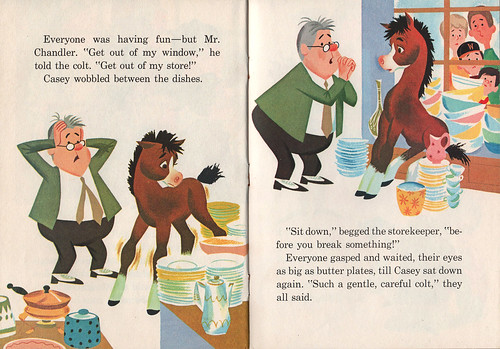
Mel's characters are perfectly designed - simple, yet give off enough personality in each pose.
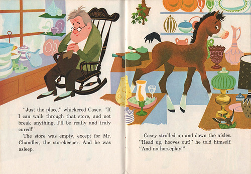
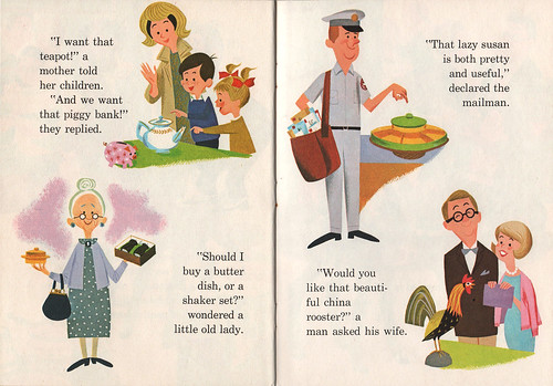
Even when there's more information painted in the background, white is evident.
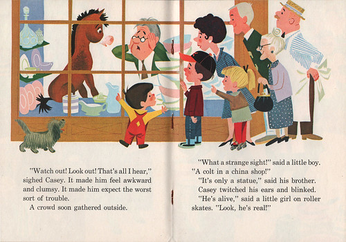
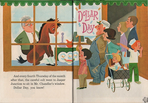
The man definitely has a grasp on details and knowing how to pare back on what's necessary to show in order to get the story across. I've been looking at Tommy's Camping Adventure and Casey side-by-side and it's so fascinating to observe what Mel shows, and more importantly, doesn't show. What's clearly evident in all three books I've shown here is the fact that Mel Crawford is simply a great artist. He's able to take on any form of illustration technique and apply his talent and skills to the story at hand. Each book has its own "voice", which is very important for the reader. When I open each of these books, I'm transported to their respective worlds, and am able to be fully immersed in the story, without any doubts.
(Oh, by the way, check out some more Mel Crawford in my Mel Crawford Flickrset.)
With this in mind, I was curious about what others thought about being versatile in this industry. I put this question out to my Twitter followers, to see what they thought:
Do you think it helps or hinder your career to be diverse in styles as an artist?
I received some interesting answers:
@eimhin The canned answer is "Hurts", as we're always told to pare down to an identifiable style. ADs can't decide if we fit, otherwise...However, I think it ought to be seen as an asset. You just need to market each style differently, and not to same people. (from Even Jensen)
@matt_gavenda from my experience. you'll be asked at some point in your working years to do multiple things. only can help, i think. (from Matt Gavenda)
@hipphop If you are diverse in style, no, diverse within your style, yes. I have learned it gets looked at as inconsistent. (from Ryan Hipp)
@mary_longshore It is my opinion that it helps to have as many styles as possible. Versatility is important for success as an artist. (from Mary Longshore)
@AJB_Design A distinct style identifies an artist, but maybe limits their jobs. A generalist might be more versatile, but less memorable. (from Andrew Brozyna)
@arthurmount I'm for diversifying. While it may dilute the impact of having one style, it broadens your reach and creates new audiences. (from Arthur Mount)
@curtisdickie I believe it is good 2 be internally diverse-but u need to create an outward focused style 2 create your brand as an artist. (from Curtis Dickie)
@ohmgee personally, i have several styles. to hire, i want consistency. know what to expect. but sick of 1-trick pony graf artists. (from Martin Gee)
@suceda you should be able to work in different styles that are right for you, I wouldn't want to limit myself to just one media. I don't think I have ONE consistent style, I think & draw a certain way, but the actual execution of piece depends on subject. (from Santiago Uceda)
Illustrator Zack Rock then asked: "How do people with multiple styles represent themselves professionally? Different promos, sure. But different sites?" I replied: "I would think that artists w/different styles showcase them on their sites: as separate sections." At least, that's what I would probably do. I've seen others do this—if they have two or more distinct styles, they'll have different portfolios on their site, showcasing them separately.
Finally, I get this tweet from designer and typographer Mark Simonson:
@marksimonson 25 years ago, Mary Grandpré asked me that. I thought she should diversify. She didn't follow my advice.
If you didn't already know, Mary Grandpré is most known for the illustrations for the covers of the entire Harry Potter series.
What do you think? Does it help or hinder an artist to be versatile? I'm curious as to what you have to say.
-------------
LINKS:
Mel Crawford's official site
Mel Crawford's official blog
My Mel Crawford Flickrset
Mel Crawford featured on The Retro Kid
Mel Crawford on Golden Gems blog