4.22.2008

Primal Screen DVD Show Reel


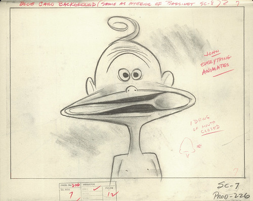
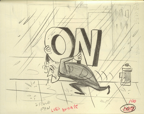
I designed and animated these characters for the company I used to work for, Primal Screen, in 2006. It was for Primal's DVD Show Reel. I loved working on these guys. Loads of fun. I animated them in pencil and paper and then had the drawings scanned into Photoshop, composited together in After Effects, and then exported QT movies into Flash. There, animator Joe Kubesheski traced over my rough pencil animation to create the final look of the characters and their movements. He did some tweaking here and there, as well. Both he and Jeremy Seymour worked on Flash animation. Overall design and concept by Rick Newcomb (he was also the art director). Sound design by Stephen Mank. He's the man.

I originally uploaded this on YouTube, but DANG. This looks much, much better. I'm impressed. I know that a lot of people are down on Flickr for adding videos, but hey, I'm okay with it if they can keep the quality of the videos looking like this. Very nice.

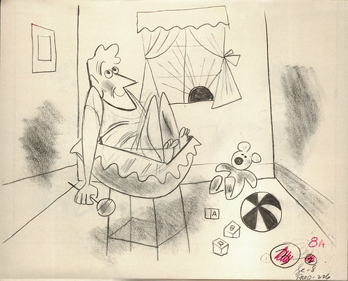
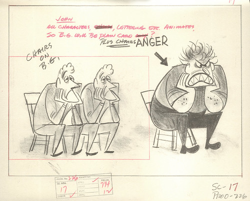
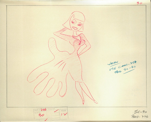
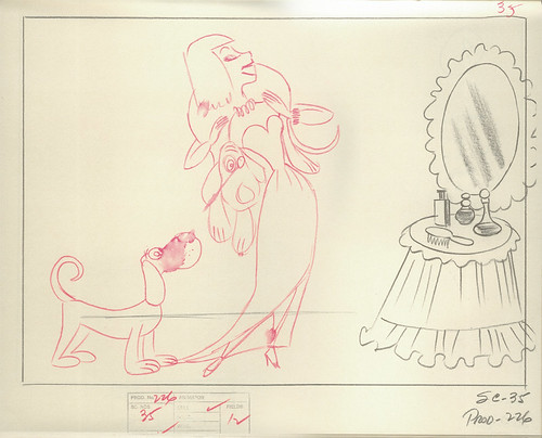
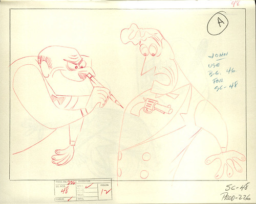
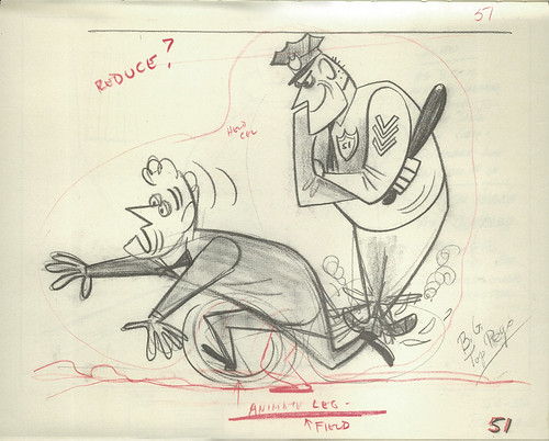
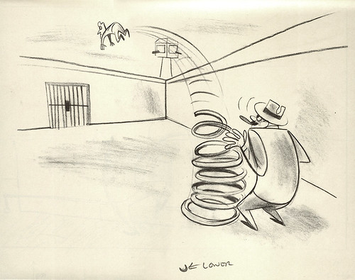
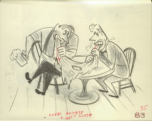
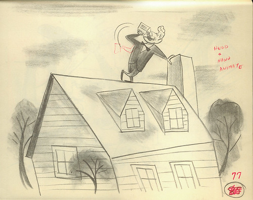
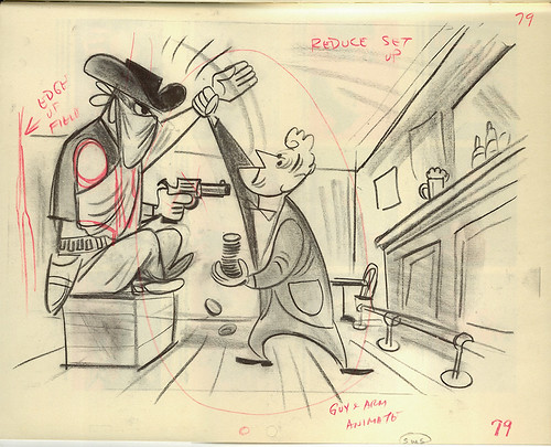
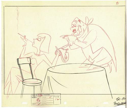
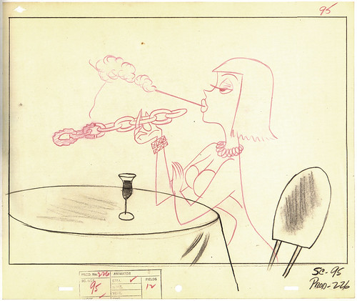
Here are some screen grabs:


The concept called for four different types of characters, with each having their own way of transitioning to a separate menu. The transisitions had to be original and take the viewer completely by surprise. I had a great time brainstorming, trying to come up with some fun ideas for these guys. For the blue guy on the far right, I thought it would be funny if when you select him, you somehow disengage his hovering ability. That's why he falls right away and reluctantly gets up.


Here's the inside menu for the blue guy, designed and animated by Rick. In fact, Rick did all the internal menus for all the characters. Wonderful work. Below is the menu for the dual-faced orange guy. He was originally designed by an intern, but I went in and re-designed him so he'd better fit with the look of the other guys.


This is my favorite transition:


Poor guy. I think we dubbed him "Cuddles." There's so much pathos going on with this green one. When you see him walk up to the main menu, he's walking very intently, like he's a man on a mission. Like someone wronged him and he's fixin' to go all Bronson on 'em. But his demeanor totally changes once he plops down and starts to caress his tail. That tail -- what a strange relationship Cuddles has with his appendage. Do you find it interesting that the same thing that provides security and comfort for him also takes his head off? So, it's a false sense of security, I guess. Go figure. Kinda demented, but cute. He's my kids' favorite, of course.

During repeat viewings, be sure to check out how each of the characters exit the scene when a particular section is selected.

Cuddles' menu:


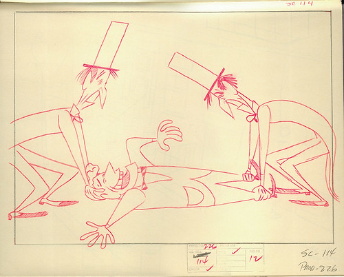
This is the menu for the dude on the left. I love his transition, too. It was a stroke of luck for me to have his nose become some sort of alternate arm, making it easier for the guy to pry himself apart. Playing around with some visual trickery there.


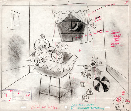
For the easter egg part of the DVD, when you select the Primal Screen logo up at the top, you're taken to a whole different world (dimension?), featuring one final character. Here's the menu for that guy.

Once I posted it up on my YouTube last week, Aaron of the excellent all-Flash blog, Cold Hard Flash, immediately posted about it, scooping me on my own content! Oh well, it's nice to be noticed, anyway. Thanks for the mention, Aaron!

This project has been winning design awards left and right, including The Art Directors Club (this link features more details about the project), The Create Awards, and BDA/Promax (where it won a Gold).

It was also featured in last year's How Design Annual, voted "Outstanding Motion Design" in the April '07 issue. Designer Jeff Andrews was kind enough to scan the page from the magazine and post it on his blog. However, I'd love a copy of this magazine for myself. Anyone got an extra copy? I'll pay ya for it. The cover can be seen on the left there. Many thanks!

One last thing: If you go to Primal's website, there's a splash screen featuring other characters designed by me that were featured throughout the show reel. They just weren't on the main menu.

4.16.2008

Pulp Covers

Occasionally, when I'm browsing for some neato vintage finds, I'll come across a pulp paperback novel with a great cover. Below you'll find a few worth noting. For an added bonus, these novels have some great synopses written up, either on the back cover or right when you open the front cover:

The Girl in 304

The Girl in 304, by Harold R. Daniels. Cover art by Walter Brooks. 1956.

On the back cover:

Standing in front of her mirror in Room 304, slipping on her yellow dress for the Sunday evening's work, Lucy Carter wearily hoped the bright color would be the bait she needed for a successful night.

Sometimes, though, it could hook the worst sort of fish...like Lt. Cox, whom she'd refused to pay off....

Still, these were the risks of her trade. But when Sheriff Ed Masters found her the next day in the weeds of the Georgia swamland, the risks were over for Lucy Carter...and just beginning for the man who had ended them.


The Man Who Got Even With God

The Man Who Got Even With God, by Reverend M. Raymond, O.C.S.O. (Originally written in 1941, this printing: 1963.) No credit for cover art.

On the back cover:

"I'll get even. I always do," said John Green Hanning, the violent-tempered schoolboy. He was stating the principle that would govern his life. His teachers knew him as the boy with a chip on his shoulder. As a young man he "got even" with his father in a violent, evil way. He became a cowboy who refused to become friends with anyone. He was an outsider, all the way.

But there came a change–a complete transformation of character. The man who couldn't get along with anybody became a Trappist lay brother and got along with everybody.

Brother Joachim, who was John Hanning, sounds like a character out of fiction, yet his story is as real as the world he left and the world he entered. Father Raymond, a Trappist monk at the same monastery, tells the story of this ex-cowboy–a life as fascinating, as moving, as any fiction.


(The cover art wraps around to the back. I might have to scan the whole thing and upload it later.)

In a Deadly Vein

In a Deadly Vein, by Brett Halliday. Cover art by Bob McGinnis. (Originally titled "Murder Wears a Mummer's Mask", written in 1943, this printing: 1962.)

From the inside cover:

I'm on vacation when I meet this gorgeous trick with a head of golden hair that's worth half of Fort Knox. Her old man has found a mine worth the other half. Putting them together, she stacks up as a lucky girl.

Then she disappears. With her looks, and her old man's loot, I figure she's a diamond-studded candidate for the morgue.

That makes her my dish. After all, murder and blondes are my business.


Man, I totally want to read this now.


More about old paperbacks:

Pop Sensation: blog.
Pulp Fiction: Flickr group.
Vintage Paperbacks: site with tons of images.


4.15.2008

RIP: Ollie Johnston

The big news in the animation industry is the sad passing of the last of Disney's Nine Old Men, the great Ollie Johnston.

My heart goes out to his immediate family and friends during this time of mourning. It's never easy when a loved one passes on -- and for someone who was 95, there's so much history there. Ollie's life was full, vibrant, and touched millions of people on this earth. Not many can said of this achievement. I have so much gratitude for this man. He'll certainly be missed.

May you rest in peace, Ollie.

-----------------------------


I wrote about meeting Ollie and his co-hort in animated crime, Frank Thomas, back in 2005: Meeting Giants.

More on Ollie's life and career can be found here:

Cartoon Brew: Ollie Johnston 1912-2008

Animation historian John Canemaker sent in a wonderful tribute to Ollie on Cartoon Brew: Canemaker on Ollie Johnston.

Cartoonist and caricaturist Pete Emslie has a great remembrance of Ollie on his blog: The Cartoon Cave: Ollie Johnston.

Ollie's work is extensive. Here's a quick lowdown of what he's accomplished:

His Disney feature work.
His Disney shorts work.

Ollie on Wikipedia.
Frank & Ollie: Frank & Ollie's official site.

4.11.2008

Symphony In Slang Layouts

This is the second post for my continuing series on Tex Avery's SYMPHONY IN SLANG (1951). In the first post, I featured frames from every single shot of the cartoon. This time around, it's layouts. For some unusual reason, a great deal of Slang layouts have survived throughout the years. I wonder if a majority of them were saved by one person and then a couple were later passed around to others here and there. Whatever the reason, I'm glad they've survived. I didn't have to go too far to find all these images you see below.

There are three very good sources for Symphony In Slang layouts:

1. Tex Avery, by Patrick Brion. This is the most extensive resource not to mention the most expensive. Luckily, I was able to borrow a copy from my good friend Dave, aka. Dr. Strangetoons. (Thanks, Dave!) What's remarkable about this book is that all of the layouts are actual size and are all printed on nice toothy, thick paper and not the thinner, glossier kind the rest of the book is printed up on. Makes it look like they grabbed the original layout drawings and bound it just for you in this book. Probably why it's been out of print for over 20 years. That and it's entirely in French. Strictly for hardcore animation book completists (you know who you are).

2. Tex Avery: The MGM Years, 1942-1955, by John Canemaker. This came out in the mid-90's and features some great artwork, ranging from original animation sketches & layouts to original production cels. One interesting thing is that this book also features some "recreated" cels -- paintings that look and feel like the real thing but have been recreated from original production drawings. There were a couple of decent Slang layouts I scanned from this book.

3. Tex Avery: Les Dessins, by Patrick Brion. Not as hard to come by (and certainly not as expensive) as Brion's other book, "Les Dessins" is a soft cover book that features animation drawings and layouts only. No color, save for a second color of red for whenever there were some director notes scribbled in red. Again, everything printed in this book looks to be life-sized and not reduced. There's even a couple of multiple fold-outs of background pan layouts that are very impressive when you unfold them. Most of the Slang material in this book were of, surprisingly enough, scenes cut from the final film. (More on that later.)


A note about these layouts: What's exciting for me when I scroll through these images is the fact that the rough layouts were most likely drawn by Tom Oreb himself. You can just tell in the quirky way that the characters were drawn and how Oreb utilized the pencil to create shading and blending effects. There's a certain looseness, yet direct quality in his designs here -- very simple and effective. When I study these layouts, I'm noticing how each character is staged, and how the action is going to play out. For this cartoon, camera movement was pretty much kept to a minimum, allowing us, the viewer, to take in each gag as it's presented. Again, simple and effective.

You'll notice that there'll be other layouts that are cleaned up, with red pencil used to signify character movements. No telling who did these drawings. An assistant, most likely, but there's a slight chance it could've been Oreb, tracing over his own rough layout drawings. Slight changes are sometimes made from the rough to the clean version, based off of any director's notes. Not sure just how much could've been changed for this cartoon, but at least it looks to me that a good amount of the scenes featured here were identical to the final version.

Onto the LAYOUTS:

From "Tex Avery", by Patrick Brion:

Slang layout 01

The "John" mentioned here on some of the scribbled notes was probably background painter John D. Johnson, who worked with Tex Avery during his MGM years. You can see some more of his work here. He did the "Red Hot Riding Hood" backgrounds in the first part of the post.

Slang layout 02b

Slang layout 03b

Slang layout 04

Slang layout 06a

Slang layout 07
This is my favorite gag in the film.

Slang layout 08

Slang layout 12

Slang layout 14

Slang layout 16b

Slang layout 19


From "Tex Avery: The MGM Years", by John Canemaker:

Slang layout 02a

Slang layout 06b

Slang layout 13a

There were many more slang terms that were not used in the final film. Whether it was because of timing or just not good enough gags, there's no way of telling. Either way, it's fascinating to see just how many of the layouts for these cut scenes survived.

Take this scene, for instance:
Slang layout 22a
I'm thinking that the line would've been "The judge gave me life!" Compare this rough layout to the cleaned-up version below:

Slang layout 22b
You can see changes made to the judge, probably to get the best possible pose in this shot. That's my guess, at least.

Here's some more cut gags/scenes:

Slang layout 21
"Fate brought us together..." I can see why this wasn't used. Everyone has their own interpretation of "fate" (isn't it usually depicted as a female?), so maybe this was cut because of it not working out. Maybe. Anyway, I like "...and then our eyes met," much better.

Slang layout 23
"Drinks were on the house!" Item worth noting: this gag was used in another Tex Avery cartoon: "The Shooting of Dan McGoo." Checkit at 3:30 into the cartoon.

Slang layout 24
"Played with the One Arm Bandit," I'm assuming. Corny gag.

Slang layout 25
"She had him eating out of her hand." It probably worked better story-wise for the guy to have the upper hand, don't you think? This gag gives Mary control, and not the other way around.

Slang layout 26
"She was a chain-smoker." Ha -- I like this one. Too bad it was cut. These last two were from "Les Dessins", by Patrick Brion.

There are plenty more layouts (along with many other images) from this wonderful cartoon on my Symphony In Slang Flickrset. Hope you enjoy.

Oh, and in case you're wondering, this is all part of research I'm collecting for a super secret side project I'm currently working on, paying homage to the great cartoons of the past. A short film that's being concocted down in the basement right now.

Up next: Backgrounds!

4.10.2008

Ava Thursday: Pap Paw's Birthday Card

My Dad and his wife came to visit us for the first time this past February. We had a blast. During the course of their visit, Dad celebrated his 67th birthday. What would be the perfect gift for a man his age? Well, I wrangled the kids up to make some birthday cards for him, of course! Naturally.

This is what Ava came up with:
Ava Thursday: Pap Paw's Birthday Card
The front.

Ava Thursday: Pap Paw's Birthday Card
The inside.

Ava Thursday: Pap Paw's Birthday Card
On the back, Ava added a little logo down in the lower right-hand corner, "Daddy Cards." I had made a card with that logo on it a while back and she really liked it. So this is her version. Love little details like that.

Oh, and here's Ezra's card:

Ezra gets in on it
I think it says his name over and over.

Ezra's card
He was real proud of it.

Ava then got all creative and us and made this Crayon wrapper sculpture-thingy:
Crayon wrapper sculpture

------------------------------


I've been meaning to do a follow-up post on Marjane Satrapi's talk from Monday night. I'm working on it. I took some good notes, but most of it's chicken scratch, so whatever I type out will be paraphrased. She had some good things to say. Very inspiring talk. And very funny.

I've also been meaning to update the long-overdue Blogroll over there in the right column. Still have all my Atlanta peeps' links up -- what's up wit that? It's been over a year now! I'll keep the ATL links up for the newer version, but I plan on putting up Portland and NW links as well. Gotta keep it fresh.

And, one other thing: I think it's about time for a new look here for the blog. Feels a bit stale to me. Whaddya think? We'll see.


4.07.2008

Reminder: Satrapi Tonight


Just a gentle reminder about Iranian/French graphic novelist (and now, Oscar-nominated filmmaker) Marjane Satrapi speaking tonight here in Portland, at the Arlene Schnitzer Concert Hall, 7:30 p.m, downtown.

More info about this event can be found HERE.

Hope to see you there!


4.04.2008

Photobooth Friday: Fools!

2 Fools 1 Photobooth


My best friend Lane came to town about a month ago. We haven't seen each other for several years. It was so good to hang out and be silly with him. We realized that this was the first time we've ever been in a photobooth together. Rest assured, when you get us two together, there's lots of conceptualizing going on. It was like choreography doing this strip -- we were worn out by the end of it.

By the way, that first frame was a re-enactment of a photo Lane and I did back in college. Har har! See below:

I'mma pickin' and he's a grinnin'
This was probably back in, oh, lessee, 1988? '89?

There's so much history between us, it's hard to know where to start if I ever decide to talk about him here on this blog. He's the closest thing to a brother that I could possibly have -- we're both first-born with one younger sister, so I guess we both longed for a brother.

There's some great stories to tell, but it'll all have to wait until I find a more opportune time.

For Andrea's Photobooth Friday Monthly Challenge: Fools. Yup, that we are.

4.03.2008

Persepolis: Marjane Satrapi speaks


I saw PERSEPOLIS the other night. I was swept away by this film. It's astounding. I'm having second thoughts about RATATOUILLE -- I thought that film was great and incredibly entertaining and totally deserving of the Oscar, but... I'm beginning to think that PERSEPOLIS was probably even more deserving.


Lots of great press have been written about Marjane Satrapi's film. Boasting a 95% Fresh rating on Rotten Tomatoes, it certainly has support from the critics. Sooooo, if that's the case, then...why aren't we talking more about this film? It's a 2D animated feature film with some great animation, great story -- a true personal historical tale told from a single individual artist's view; a graphic novelist who's been able to successfully visualize her story up on the big screen. That's what all of us strive for, right? This is what it's all about for us filmmakers, us artists, us animator/directors, right? To be able to tell our story the way that we want to tell it, without studio interference, right? (However, I'm sure that Marjane probably had her ups and downs in getting her story told here. That's bound to happen when you convert your graphic novel into a film. But the end result is still 100 times more personal than any studio animated feature, if you ask me.)

Why aren't we screaming at the top of our lungs, telling everyone we meet to go see this film? We need to support these types of films or else we're going to have to subject ourselves to typical studio output. Base, trivial, executive-driven, vapid, stale studio output.


For the uninitiated, PERSEPOLIS is Satrapi's account of living in Iran as a woman, from a young girl with idealized visions of becoming a prophet, to growing up midst the Iranian revolution and forced to be stifled by gender politics and fewer civil liberties. Humorous and poignant, abrasive and tender, PERSEPOLIS moves like no other animated film. I got wrapped up in its story, its characters, its tone and settings. The graphic, stylized 2D world that Satrapi creates (in black & white, mind you) become flesh, blood and bone right before your very eyes. I was transfixed. GO SEE THIS FILM.


For all you Portlanders and NW'ers: It's worth noting that Marjane Satrapi herself will be speaking here in Portland, next Monday, April 7th, at the Arlene Schnitzer Concert Hall, 7:30 p.m, downtown. More info about this event can be found HERE. I'm seriously thinking about going to this. I'd love to hear her speak. Looking forward to it.

Links:
PERSEPOLIS official site.
PERSEPOLIS Wikipedia entry (The Iranian government's reaction to the film are mentioned here.)
NY Animator/Director Michael Sporn's take on the film.

You can help me out by buying Satrapi's Complete Persepolis here:


GO SEE THIS FILM. SUPPORT.

4.02.2008

Heal Emru

Emru and Me

My good friend Emru Townsend has been diagnosed with leukemia and now needs a bone marrow transplant. Hailing from Montreal, Emru started up the excellent fpsmagazine, an online (former print) magazine that boasts some of the best writing about the animation industry you'll find today. (He's a big big fan of stop-motion, by the way. And anime.) I met him at Ottawa several years ago and was astounded by his knowledge of the art-form. Plus, the dude never stopped talking. I was left speechless by the guy. Now, I'm afraid, his voice could be silenced. And I don't want that to happen. He and his sister have started up a site for others out there to learn more about Emru's situation, as well as about donating bone marrow:

Heal Emru


There's a great deal of info to read through on that site, so here's a direct link to the FAQ page: Heal Emru FAQ

I've never donated bone marrow before, but this has prompted me to do something about it.

From the site:

In mid-December, Emru was diagnosed with leukemia, and a condition called monosomy 7. Due to the monosomy 7, he has an increased risk of the leukemia coming back, no matter how successful chemotherapy is. This is where you can help save his life.

Emru needs a bone marrow transplant. This kind of therapy is administered through a transplant of bone marrow stem cells from a matching donor. The highest chances for a match are from siblings, but his only sister is not a match. As a result, he must to turn to national and international bone marrow registries to find a compatible donor. There are 11 million donors worldwide, but there is still no guarantee that he will find a match: The chances of matching another person can be as high 1 in 450 or lower than 1 in 750,000. Time is of the essence as the optimal window of opportunity is in the first few months after remission.


Emru's situation is tricky because of his ethnic background. That's why I'm sending this out to everyone I know. The more people know, the better his chances. More about Emru's chances from the site:

Q: Who is more likely to match a recipient?
A: There is a greater chance that someone from the same ethnic background will match, but the match can come from anybody. Emru will be harder to match because there are fewer people in the general immediate population with the same ethnic background.

Emru's ethnic background is mostly people of African descent, and his parents are from Jamaica and Trinidad; essentially, the more black people and West Indians donate, the better it is statistically. However, this only increases his chances. Anyone from any background might be a match. The match may come from the most unexpected donor, or may help someone else who is waiting for a donor.


Please help. Do whatever you can. Send this out to everyone you know. Donate bone marrow. Anything. Even if you might not have the same ethnic background as Emru, donate anyway -- you'll be helping others out who might be looking for a match.

Want to email Help Emru? Here: info@healemru.com.