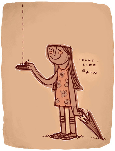
I drew this sketch of a little girl holding out her hand to capture the first raindrop of a storm several months ago. What a coincidence that this week's theme for Illustration Friday is Rain, huh? Nice. I didn't have to think too hard on the concept, however, I did have a dickens of a time trying to find the right color scheme. I went through several iterations, from green, blue, red, etc. At first I had her in mostly blue hues with a greenish background. But I realized that I use green and ochre way too much. I wanted to use colors that I normally wouldn't use. Peach seemed peachy keen to me.
Well, here ya go. What do you think?

Very cool interpretation of the theme!! Love the style and humor in this illo!! :)
ReplyDeleteI like it! The little girl looks so happy! May I ask what media you used?
ReplyDeletehey I just read your comment on my blog.
ReplyDeletethanks!
I like this image a lot.
btw,
I saw the Cocoa Puffs commercial you did-- very nice.
j.
I like her, too. Very cute!
ReplyDeleteThat's great. I love her socks.
ReplyDeletevery cool
ReplyDeleteWell, I think you've chosen the right colour for this. cute!
ReplyDeletethis is a cute one!
ReplyDeletethis is a fun illo and ur peachy keen colors work well too
ReplyDeleteI just can't get over your style--it's so endearing and unique. I love this one...so sweet and simple. Nice work!
ReplyDeleteGreat style, and character. The colors work perfectly.
ReplyDeletewonderful and amazing as always!!
ReplyDeleteVery cool. I love the whole look of this drawing.
ReplyDeletebeauytfull, beauytfull, beauytfull style !!!!
ReplyDeleteI like it !!!!
ReplyDeleteone of your best !
ReplyDeletevery nice. I like her pose and that you chose an un-rainy palette in the end. It makes me think of a few drops of rain in the desert.
ReplyDeleteCOOOOOOOOOOOOL!
ReplyDeleteI love that you didn't use blue. She's great.
ReplyDeletelove the retro stylings you've used here. i dig the rosey cheeks.
ReplyDeleteI love that I was able to recognize your style from the thumbnail on IF before I even saw your name. The color balance is really great in the piece.
ReplyDeleteShe's great! First connection that popped into my brain was the cat from "Put Me in the Zoo". Awesome.
ReplyDeleteI love this. xxoo
ReplyDeletei think it's great
ReplyDelete