
My submission for Illustration Friday this week: run.
I'm going to forego the obvious and not make any Forrest Gump jokes here. Just not worth it.
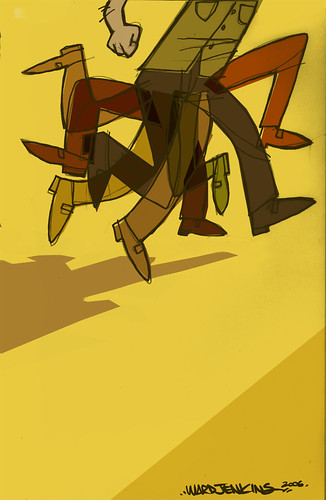
It's kinda funny, because I had this sketch already drawn in my sketchbook last week. So what a nice surprise to see that the theme was "run." Was trying something simple with the colors on top of colors here. I used the "multiply" layer effect on some of the legs, but not all of them.
Love the design!! It's like an animation! :)
ReplyDeletelove it ward! so great!
ReplyDeleteLove the 2 backward legs...took me a sec to realize what gave it that great frenzy feel.
ReplyDeleteI really like this, Its got kind of a hana barbara feel to it and the colors and composition are great.
ReplyDeleteI love the colors. The layer of legs looks really great. Really sets a scene. Very cool!
ReplyDeleteThe composition on this is really nice, and I love the colors and energy. Rock on!
ReplyDeleteMakes me wonder why the hurry. What's he running to tor from? As others have said, great enery and great colors.
ReplyDelete8^)
really like it! great colors :)
ReplyDeleteI love it! I always get a kick out of your work.
ReplyDeleteNice Work. Do More.
ReplyDeleteWoohoo! Fantastic colors and composition... is there a story behind this illustration?
ReplyDeleteGreat colours and I love the chaos in the movement.
ReplyDeletenicely done, I like how you handled to multiple legs!
ReplyDeleteI agree with Matt, the two backwars legs make this image for me.
ReplyDeleteThanks for all the nice comments, guys! Yeah, originally I didn't have any legs going the other way, but then I drew one in there to see what it would look like. It gave it a more frenzied look, which is what I was trying to convey here.
ReplyDeleteJared, no story behind this one. Just a sketch/doodle that ended up as an IF entry. Was trying something different here with the nicer shoes (I usually draw sneakers). I liked the sharper look it gave me.
Thanks again!
Whoa! I love it! Simple and catchy. Attractive but not striking. Good job there! I feel like I was watching something on cartoon network.
ReplyDeletesuch a great sense of motion, love.
ReplyDelete