Hi guys. Thought I'd enlighten your day by sharing with you a sort of step-by-step process of how I created the illustration I did for Guide Magazine, The King of Putdowns (see
previous post). Since I didn't take screengrabs while I was working, I can at least show you some of the layers by themselves, with a chance to view the images closer. I know that everyone has their own way of working, and by all means I'm not suggesting that any of you work exactly like me - this is just a hey, check it out! kind of thing. Hope you enjoy!
Roughs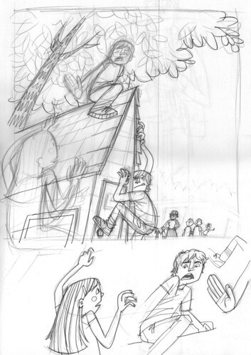
After reading the short story for Guide magazine, it was suggested that maybe we could use a low perspective, looking up at the scene. I went with this and created this first sketch in my larger sketchbook. I did a couple of extra drawings for the main character and his hand, along with the girl climbing up the playhouse. (It's a playhouse situated in the back of a school's playground, abutted up against the woods.)

This is the first rough I sent to Guide after I scanned in all the elements and put them together in Photoshop. I don't normally do the grey painting for the various background items (such as the tree and playhouse here), but I think I like it. It helped me keep an eye on how the tones and colors might work in the final version.
Final Pencils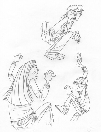
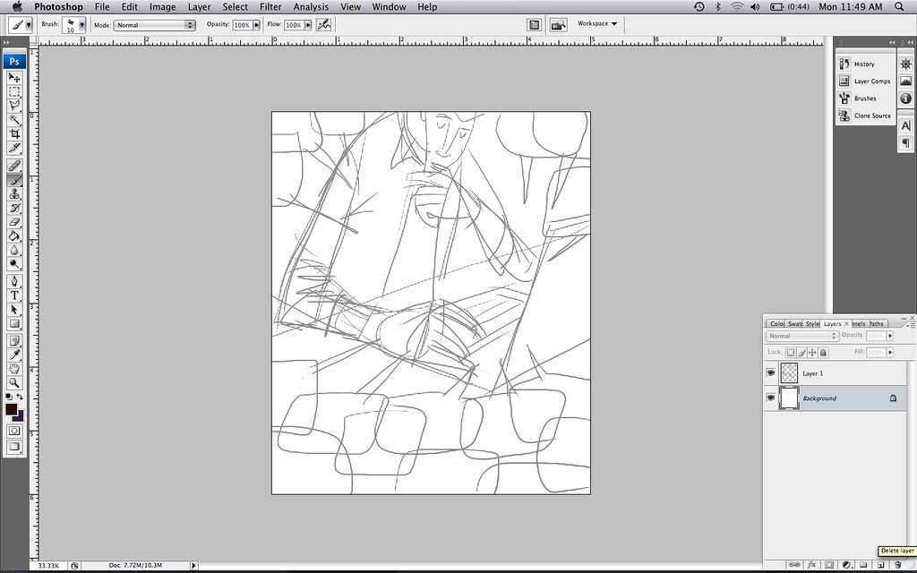
Once I get the okay, I then print out the rough and create tighter pencils of each item by tracing over the rough. At this stage, I may change a couple of things as I'm going along - like the girl's expression, for instance. I also changed the pose of the main character, pushing it further, making him more in opposition of the girl climbing up. I also changed the other boy's pose - he looked strange hugging the playhouse in the rough version.

Here are the final pencil scans of the playhouse, people in the background, and some leaves. I ended up not using any of the leaves over on the left, save those two that are not touching any other leaves. I then used those, along with the others on the right side of this scan, to create the leafy pattern for the final version. Lots of duplicates. Lots. On the bottom there, you'll see the teacher looking disapprovingly at the situation, along with two classmates. There are a few kids in the background as well. All these extras ended up getting nixed in the final version. I felt that it was taking away from all the action going on at the playhouse.
Color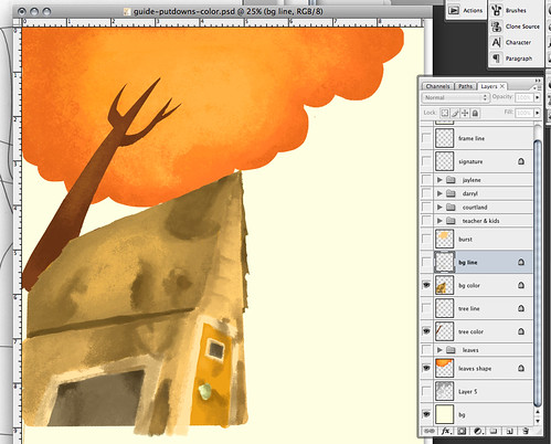 Closer look.
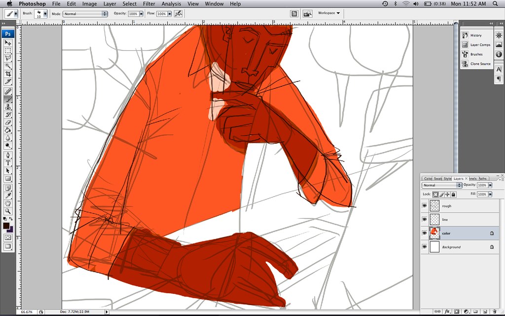
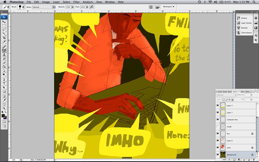
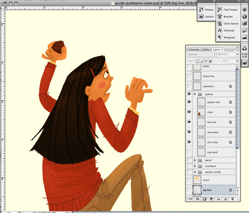
Again, sorry I don't have a step-by-step of my process on this piece, so I have a couple of the layers spotlighted for you. Here, you'll see the background color layer (as well as the tree color layers). As you can see in my layers on the right, I have two main layers for each item:
line and
color. Sometimes (not always) I'll put the pastelly-brushy effect on its own layer, separate from the color layer. That way, I can do alternate versions if necessary. But honestly, that requires time and usually I don't have much of that when I'm working.
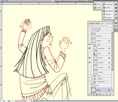
I never merge the line layer with the color layer. Never! Even if the line will be the same color as the color layer underneath. I just never do it. I've learned my lesson throughout all the years I've done this. As you can see, I ended up adding a pine cone in the girl's hand (I drew and scanned this hand with pine cone separately) after re-reading the story and realizing that the girl ended up throwing a pine cone at the main character while she was climbing up the playhouse.
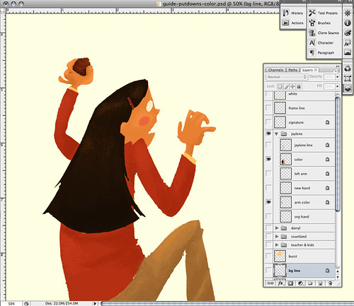
It's rare when I see the layer like this. I always keep the line layer open so I can see the two layers together.
 Closer look.
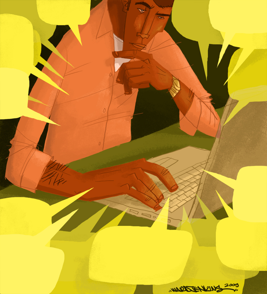
And here are all the layers together. For the girl, since I had a different hand, I ended up separating the throwing arm from the body just in case I needed to shift it for a better composition.
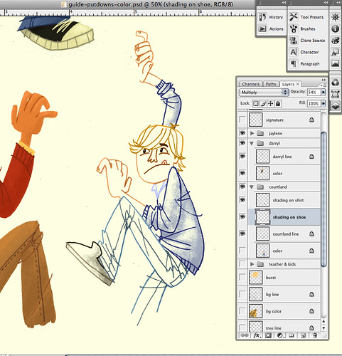
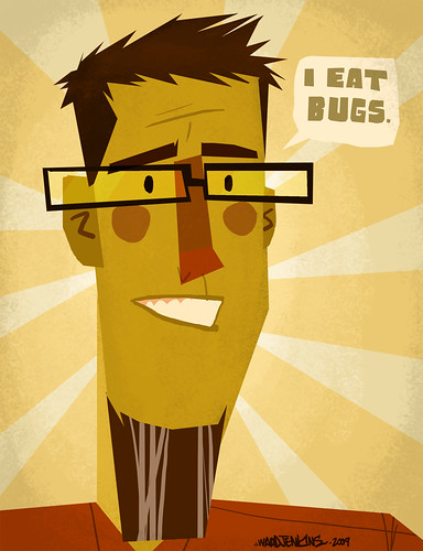
Courtland is this boy's name. His brushwork I did differently because he had a pattern on his shirt and shoes. Instead of trying to work out the brushy look on the color layer (where the patterns were), I did all the brushy shading on a separate layer, usually sandwiched between the line and color layers (here, the shading layers are on top). Well, as you can see, the shoes and shirt each had its own brushy shading layer (in case I needed to alter the opacity for each item, which I did). I do this only when the pattern underneath will be difficult to work with when it comes to the shading. Otherwise, I'd much rather work with the colors themselves instead of relying on a basic color for the shading. FYI: I never work with black or grey for the shading, unless the main color is grey itself. In order for the shadows and shades to be richer, fuller color, always work off of the original color.
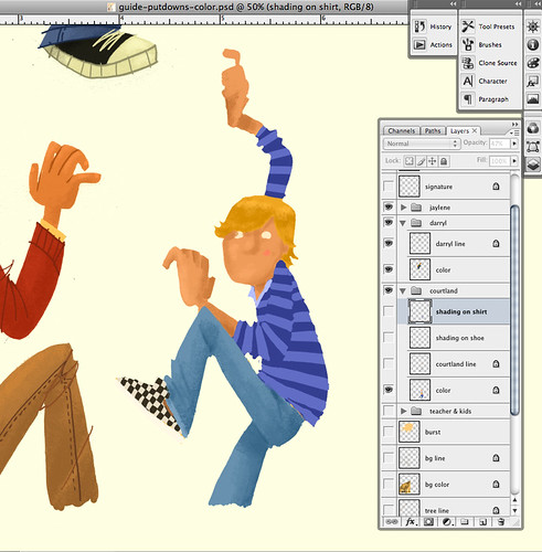
For Courtland's color layer, I did all the brushy shading like I normally do on all the sections without patterns: the hair, skin and jeans.
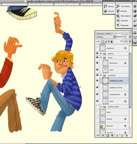 Closer look.
And Voilá!! Courtland all colored and done. Here's the final again:
 Closer look.
This process is a holdover from my days working in animation. I still use my animation disc and even use leftover animation stock paper when I work on the final pencils. Having pegbars and pegbar holes to better register the paper works perfectly for me. My entire children's book
How To Train With a T.Rex and Win 8 Gold Medals was created using this method and it's worked pretty well for me so far. The concept of separating all the elements and then putting them all together like puzzle pieces is pretty much how we do animation, if you think about it. A sure fire way of making sure I don't get caught having to do extra work than necessary.
If you have any thoughts, questions, suggestions about this post, feel free to leave a comment below! I'd love to hear from you.


