
The concept is this: is there too much internet chatter? With all these portals into everyday living and feedback, there seem to be so many conversations going on that it can get a bit overwhelming. Facebook, Twitter, blogs, messageboards & forums, it doesn't let up. How would I convey an illustration that showcases this idea?
Well, a guy sitting down, looking at a computer, of course. But how can I make this interesting to the viewer, while supporting the article? My initial thought was word balloons. The quick & easy symbol of someone (in this case, lots of someones) saying something about something.
Click on each image to view larger:
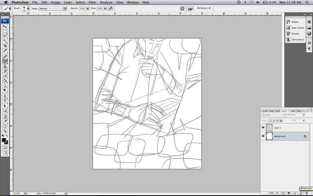
Rough sketch done straight in Photoshop with stylus & Wacom tablet.
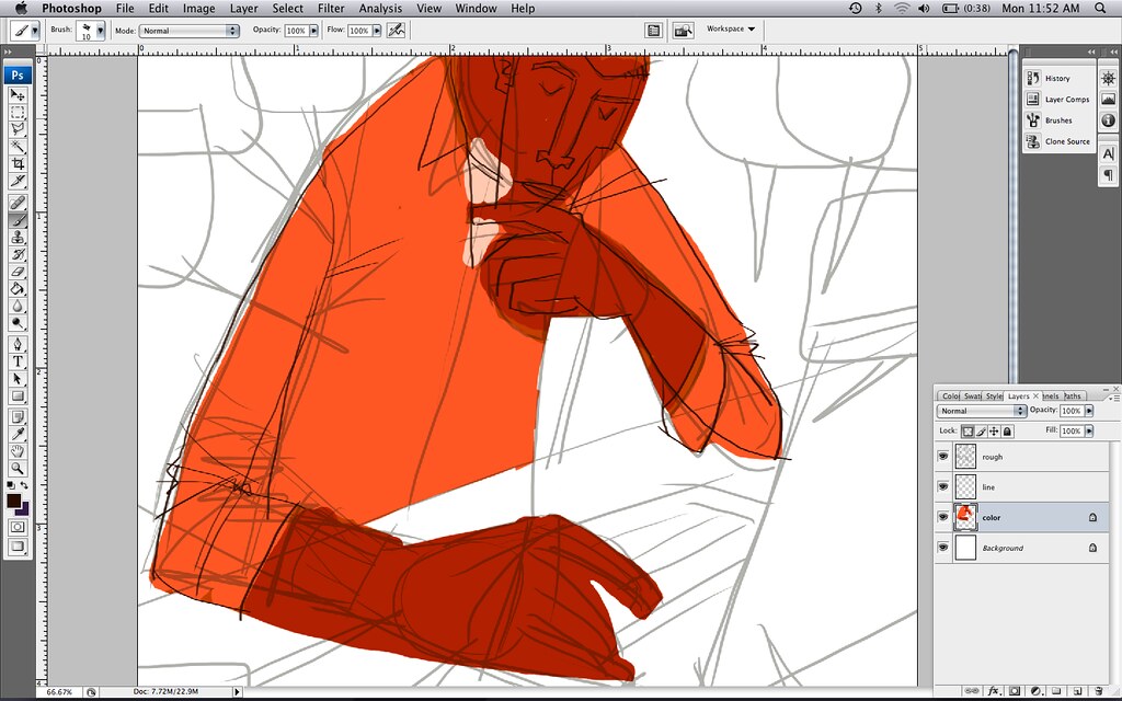
Color layer added as well as more refined line layer. (Rough layer is made slightly transparent so I can use as a guide.)

More color added, along with word balloons. (Rough layer still slightly transparent.) Some tweaks made to character.
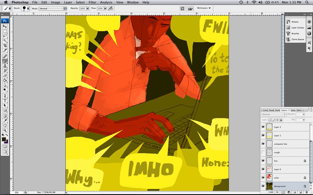
After some brushy/chalky details added to the character, I add letters & characters in the word balloons. These were simply roughed out -- my intent would be to go in and do more refined letters later on, but I wasn't digging the concept with words included at this point.

So I took all the words out of the balloons altogether. It makes more of a statement if you leave it up to the viewer to add their own version of what this guy is checking out on the computer. Here, I then added more details to the color layer and touch-up to the main line layer, as well as colored in the guy's computer.
And now, the final result:
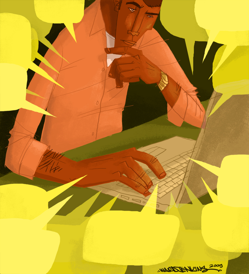
With more details added here & there, and all the i's dotted and t's crossed. I'm pretty happy with it.
Semi-related:
With all this twittering, I've been able to check out some amazing stuff. Case in point, Bob Staake takes a Roll With the Children's Book Dice. Fascinating to see other illustrators' creative process. Check it out!
Great comp and colors! Love the character as well!!
ReplyDeletei guess this means you're not a lefty.
ReplyDeleteGreat concept.
ReplyDeleteThanks for showing your entire process!
ou are awesome. i am coming over there and we'll do a swap. i teach u and andrea everything i know about everything i know, you teach me how to draw photoshop. i'll also throw in babysitting.
ReplyDeleteGreat job! I really think it conveys the message quite well, and eliminating the words in the balloons ended up being more effective. I loved seeing the process!
ReplyDeleteThanks, guys! ha ha..okay, paine, it's a deal! Just need to figure out the whole distance thing, since you're all the way in Australia and all.
ReplyDeleteI like the color on the second-to-last image the best. The more saturated, vibrant palette show more intensity. Either way, it's a great piece!
ReplyDeleteI'm not sure if you've finalized this, but how about... A desktop completely covered with IM messages with and the mouse positioned over a prompt that says "it is now safe to turn your computer off".
ReplyDeleteThat would clearly put across the idea that the average user is a bit overwhelmed by internet chatter and at some point they just want to escape.
If you ever need ideas, I'm usually pretty good at coming up with stuff quick.
ReplyDeleteprammaven@hotmail.com
It's interesting to see the process to go from sketch to final product. The guy looks like he is in deep thought. You are very talented. Will be interested to hear about the children's book announcement.
ReplyDeleteGreat to see your process. I learned a little something from Frank Romero.
ReplyDeletePut your sketch on the top layer and set it to multiply, and then color on layers below. You can still lower the opacity if you want. The works in Illustrator too. Works way better than drawing on top of your sketch.
Awesome job!!!!
ReplyDeletelove your aesthetic and pallette!
ReplyDeleteI just found your blog after doing a search for Miroslav Sasek's book Cape Cav. I am DYING that you found a copy of that--I collect those for my daughter and have been looking for a long time, but to no avail ;(
ReplyDeleteYour artwork and your wives photos are beautiful. Glad to have found you!
when's the news? miss you!
ReplyDeleteThat's great! I love seeing other artist's process.
ReplyDeleteReally really nice work there, Ward. Thanks for sharing it.
ReplyDeleteI can't believe I've never thought to draw, then scan and edit in Ps. Brilliant! I'm inspired to try drawing again!
ReplyDelete(When I was ten I was told, "Wow you draw really well for a 10 year-old!" Sadly, I still only draw really well for a 10 year-old...)
Hi.. just wanted to leave a comment on your stuff.. Here´s it: I love it!.. Your style is absolutely great.. I´m now following you ;) (on twitter for sure)..
ReplyDeletebye ahenjotah
Nice post
ReplyDelete