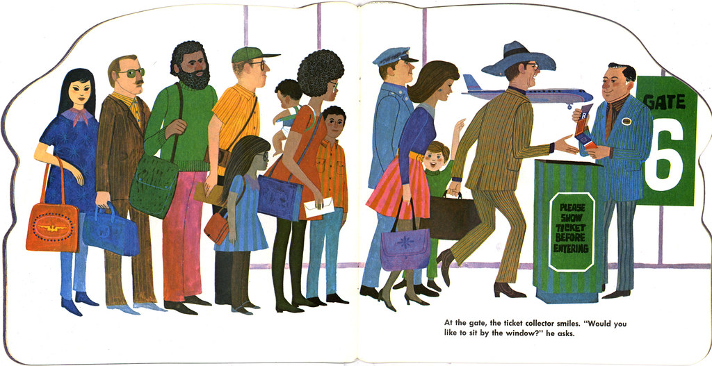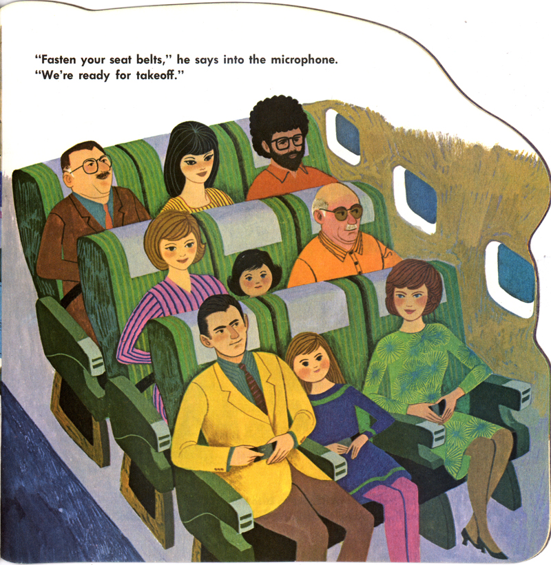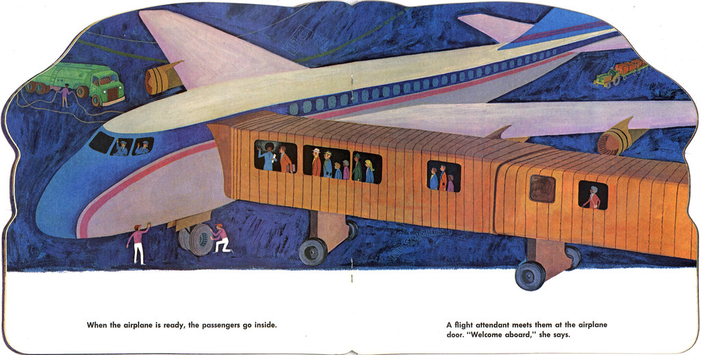
I present to you all one of the most visually arresting books I've come across since I've been collecting. I found The Airplane Book at a thrift store awhile back and when I went up to Andrea to show her what I was buying, she looked at the book and then at me. Obviously puzzled, she asked "Why?" I proceeded to show her the wonderous glory that lay within the book. It wasn't pretty, I tell ya. I had to convince her that this book was worth getting for the bizarre symphony of color alone, but she wasn't buying it. Good thing it was only 40 cents. At least I had THAT going for me.

Illustrated by the well-known and very prolific (he illustrated about 500 books in his lifetime) Art Seiden, the story is a simple follow-us-as-we-show-you-all-the-goings-on-behind-the-scenes-of-an-airline type of book. The character designs are nice, and simple, typical of Seiden's work. His style was similar to Mary Blair, JP Miller, and The Provensens during the 50's, but then by the mid-60's things began to change. The look and style of most children's books took a strange route, far removed from the stylish characters and no-line shapes that were very popular during the 50's. Pen and linework began to be the norm, and thus the effect of the earlier colorful shapes were not as strong. But here, in 1972, Art Seiden looked like he was trying to get back to the stylings of the 50's and implemented color as a stronghold, using linework sparingly.

It works. Up to a point. Unfortunately for Art, the culture and style of the late-60's and early-70's were very strong, and so we have here in this book a gushing of vibrant colors and patterns -- garish and loud, so typical of the time. It's almost hard to imagine puke-browns could live in brilliant harmony with nuclear greens, but somehow Art kinda pulls it off. And thus, you see why this book has become one of my favorite finds of recent. It's not often you'll see a grey-toned child wearing a cobalt blue dress and poo-poo brown leggings. You gotta love the use of ochres and avacodo greens for the interiors of the plane, as well as the pink striped seats for the pilots in the cockpits. Seems like Art was given free reign on everything in this book. I can't imagine him going to any real airplane and checking out the decor for reference, although I do have to say, I've seen some incredibly ugly plane interiors in books and on the internet, so maybe he wasn't too far off.
Anyway, I've got a good majority of the book scanned for your pleasure and on display at my Flickr. You can check out the photoset HERE. Enjoy! That is, if you can stomach it.


Whoa man, these are really cool. Great find! Some real brilliance in illustrating. The control panel with the pilots is a standout. The control tower people as well are equally brilliant. I detect some Sasek influence in his texturing work. The clothes are particularly Sasek like.
ReplyDeleteGreat find and great write up!
Best,
Steve "puke-browns" Mack
diggin it ward.
ReplyDeletej "nuclear greens" morrison
HEy this is awesome!
ReplyDeleteI love Seidens work, [more than Millars I gotta say] and
have a stack of his work.
The colour is a bit more 70's but looks real cool. I wish the Provensons hadn't veered some much away from the 50's style work in the 70's.
A 40 cent, puke filmed jewel!
Heh heh in the fro flight attendant page there are some dudes with ipod earbuds...time travelers! (er I'm new 2 post & I like your blog)
ReplyDeletePoo poo brown leggings are definitely a tough one to pull off. Thanks for sharing.
ReplyDeletehey, you make me sound like a real drag, man. like I have no tolerance or vision for such treasures... like I am a mean old hag that would deny you the pleasure of a sixty-cent thrift store purchase... are you forgetting who got you hooked into collecting thing? remember when I had to bribe you to come with me to the flea market? I totally don't remember the scenario you describe above as such and I imagine we'll bicker about this forever.
ReplyDeleteYou were in a state of agitation not because of what I was showing you, but because of other shoppers, I believe. I caught you at a bad time. You did, indeed, rain on my parade when I showed you this book. I distinctly remember that.
ReplyDeleteAnd I thank you immensely for you introducing me to vintage and oldish items. It's all good, sweetie.
hugs and kisses,
husband-o-matic
QUOTE:
ReplyDelete"The look and style of most
children's books took a strange route..."
Well, your condensed blog mini-history of children's book illustration took a strange route and none of your history made any sense upon arrival.
I don't know how you can generalize about styles and trends in children's books of ANY era.
The creators of children's books have always been on the cutting edge of artistic independence, especially here in the States.
At any given point, there are a trillion different art styles being filtered through kid's books...this is true now and has been true for decades and decades
Anonymous, I completely agree with you about there being a "trillion different styles" in children's books. But in my humble opinion (and after all, this is my "blog," wherein opinions and nothing else really matter, right?) I found that there was a certain style that became very popular in the late 40's into the 50's, taking a drastic turn in the mid-60's. How do I know this? I collect books. Children's books. School textbooks. I have hundreds of 'em. Based on my collecting experience, and being more observant than I probably should, I noticed a big change in what was being produced and printed in these types of publications. Economics and general cultural likes and dislikes can create such changes like this. That was the norm at that time. It was part of the zeitgeist, if you will.
ReplyDeleteI also collect ephemera. I collect all those crazy throwaway pamphlets and booklets and cookbooks that nobody really gave a shynola about, but which illustrators poured their heart and soul into. And the majority of them STILL did not receive any credit. In these publications, this particular style changed around the exact same time. I can't imagine this being a coincidence.
Look, I'm afraid that you've mistaken me for some illustration historian, which I've never purported to be. This was just a fun post about a funky children's book that I found in a simple thrift store. Nothing more. Nothing less. My "mini-history" of children's book illustration was just from my observations from collecting children's books. Flawed -- yes, perhaps. But I never intended to discredit or overlook any particular artist, illustrator or an entire industy for that matter. I appreciate you posting your comment here, but I still stand by my words.
hey anonymous dude, lighten up. I promise you'll feel better and thank me for it.
ReplyDeleteWard! I just love your blog! this book is a super-groovy find and I agree with your general assessment of children's book illustration (and styles in general) that changed in the late 60's early 70's. For example, I LOVE the Provensen's work (A LOT) but their style changed and even got a little grotesque in these later years...tho, there is still much beauty and wonder to find there as well. Just that my preference is for a lot of the older work. Go score some more 40 cent treasures for us!
ReplyDeletePaige "Poo-Poo Brown" Pooler
Well i'm no artist :) But what I love in art is color. And though I would wear none of these things I actually like the color in this book. I would think kids just like things with lots of color period. At least Owen does :)
ReplyDeleteThanks for sharing.
Thanks for stopping by, guys!
ReplyDeleteAnd just to clarify: I actually love the illustrations in this book, including the fun (and odd) use of color. My descriptions on the content in the book were just my feeble attempt at humor.