7.14.2010

Mad Men Party

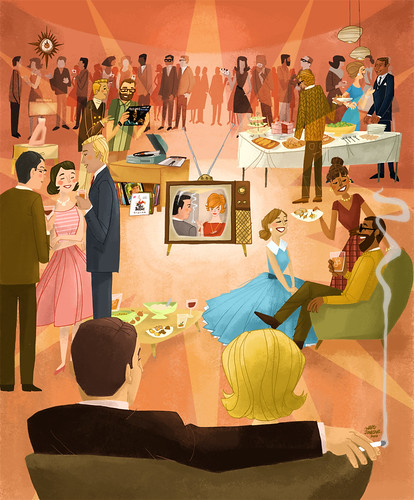
Mad Men Party: G Cover for Boston Globe
What happens when a collector of 50s-60s ephemera, books and various what-not gets a chance to illustrate a Mad Men-themed party? Well, here you go. For The Boston Globe G Magazine. Big thanks to Martin Gee for being such a swell client.

In order to pull this off, I had to endure an all-nighter - which, by the way, gets harder to recover from the older I get. Not like it was when I was in college, that's for sure. But anyway, it was worth it. I'm quite pleased with how this looked after sleeping throughout the next day. I think I was worried that it was looking too busy, with some of the colors looking jumbled and crazy. But I simplified the colors to the partygoers in the far background, near the top, and that seemed to do the trick. I also played around with the starburst in the middle of the composition. I know that it's something I tend to do a lot, but here, it worked out pretty well since we are focused on the TV in the middle. Plus, the starburst motif is mirrored by the starburst clock in the upper right corner.

I'll do a step-by-step progress post on this illustration once all the dust settles.

Boston-ites, this will be for tomorrow's Boston Globe: Thursday, July 15th. Look for it! Here's a sneaky-peek before it goes to press, thanks to Martin:

7.07.2010

Summer in Full Effect

It's here. It's definitely here and we can feel it. Summer has arrived in Portland—they say that the summer usually doesn't "officially" arrive here until around July 4th, and by golly, they're right. We're expecting temps in the 90s this week—I know that's no biggie to most of you on the eastern seaboard, but over here in the great northwest, it's kind of a big deal.

To kick it off, here's some summery vintage scans for you:

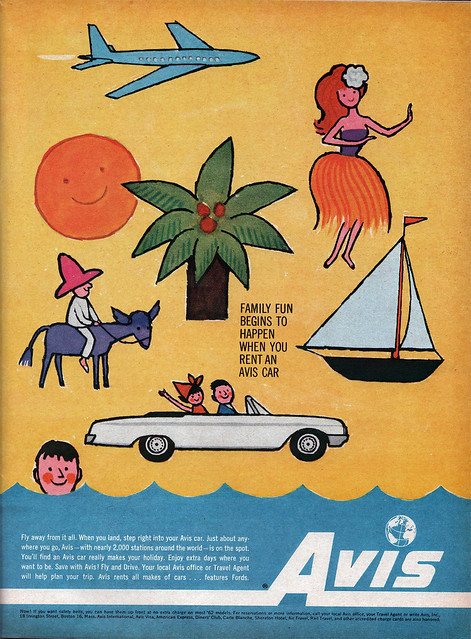
Avis ad from 1962
Fun Avis ad from Sunset magazine, January 1962.

At bottom:
"Now! If you want safety belts, you can have them up front at no extra charge on most '62 models."

Umm...gee, thanks, Avis!

Seattle Welcome Guide
Nice little pamphlet from the Seattle Convention and Tourist Bureau. 1959. No illustrator credit.

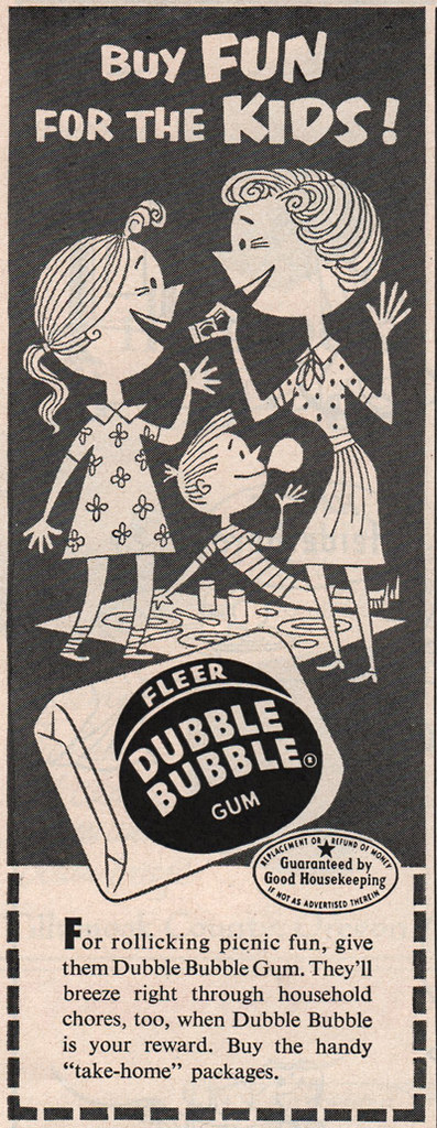
Buy FUN for the KIDS!
Dubble Bubble ad in Family Circle magazine, August 1953.

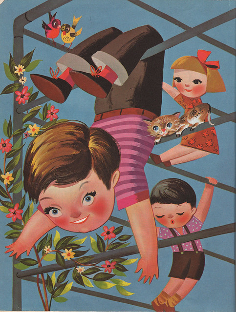
The Jungle Gym
From Music 'Round The Clock, Follett Publishing Company, 1955. Illustrator is Val Samuelson.

Summer is the time for jungle gyms and freaky kids, apparently.

Ooo! Some leftover fireworks from 4th of July:

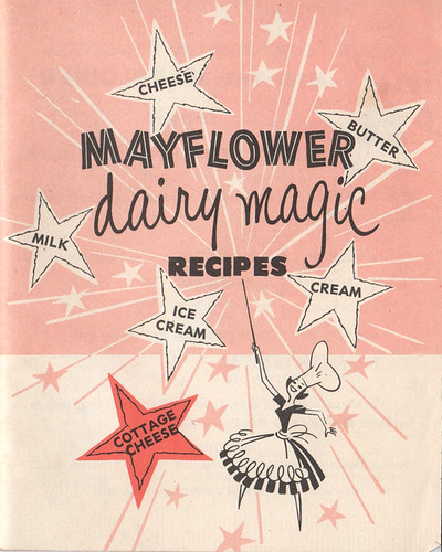
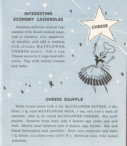
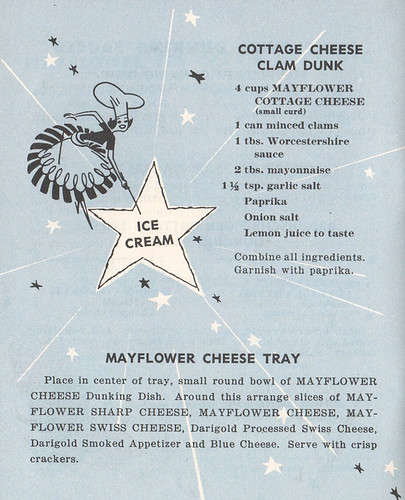
Mayflower Dairy Magic

Fun little booklet for Mayflower dairy products. No date, no illustrator credit. Thinking it's probably early 50s, based on the look and style of the photographs they have on the back cover (not shown in my Flickr or here). The little cook there is so fun. Yay! Cooking!

Mayflower Dairy Magic: cheese!
Anytime you've got a little cook with a wand pointing to a big star with the word CHEESE in the middle, I'm going to scan it, people.

Mayflower Dairy Magic: cottage cheese!


Mayflower Dairy Magic: ice cream!

Yay! Cottage cheese! Ice cream! Yay!

Summer is here.


7.04.2010

Happy 4th!

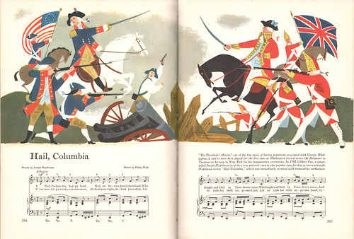
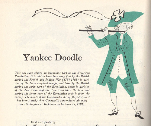
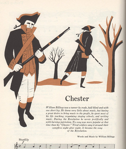
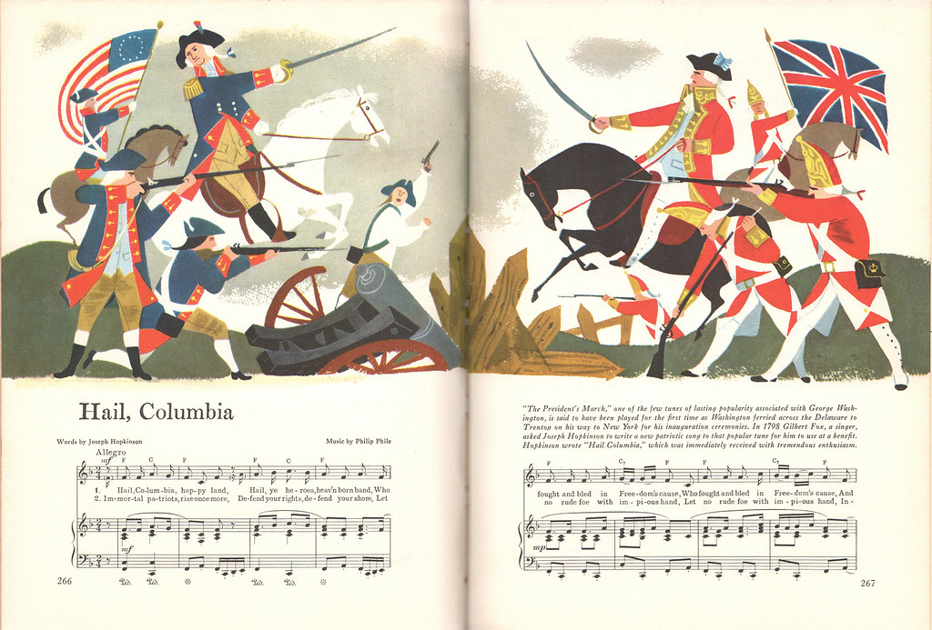
Happy 4th of July to my fellow Americans. To celebrate, here are some independence-related scans from a couple of wonderful Fireside song books, each filled with amazing illustrations by some incredibly talented people.

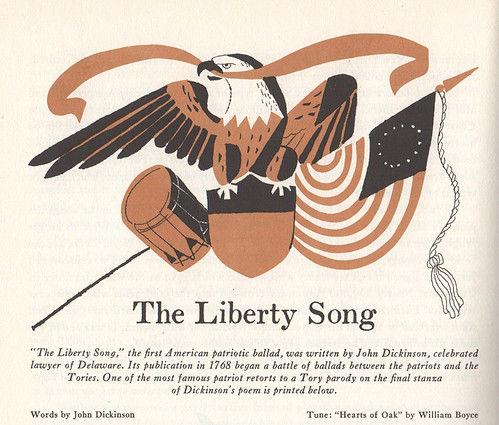
The first selections will be from Fireside Book of Favorite American Songs, selected and edited by Margaret Bradford Boni. Arranged for the piano by Forman Lloyd. Illustrations by Aurelius Battaglia. © Simon and Schuster, 1952:

Hail Columbia
Hail Columbia

View larger.

The Liberty Song
The Liberty Song


Yankee Doodle
Yankee Doodle


Chester
Chester


Next spread is from From Fireside Book of Folk Songs, selected and edited by Margaret Bradford Boni. Arranged for the piano by Norman Lloyd. Illustration by Alice and Martin Provensen. © Simon and Schuster, 1947.

The Star Spangled Banner

View larger.

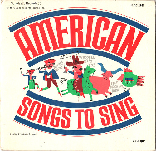
The last is not from a song book, but from the cover to a 45 vinyl record:

American Songs To Sing
American Songs To Sing, complied by Judy Wathen. Illustration & design by Abner Graboff. © Scholastic Records, 1976. As many of you know, I featured Abner's work last year when I was able to interview his son, John. This record belongs to one of our buddies here in Portland—I HAD to borrow it to scan so I could share it with you guys.

Okay, that's it! Hope you enjoyed this little bit of liberty-minded inspiration for this 4th of July! Have a great holiday!

Aurelius Battaglia featured in my Flickr.
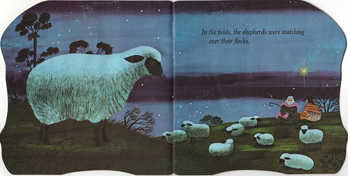
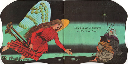
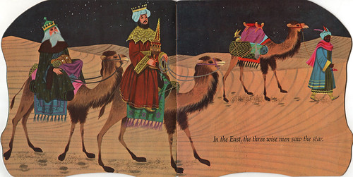
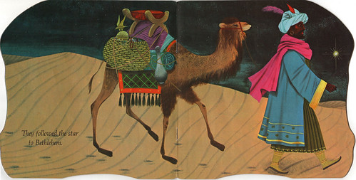
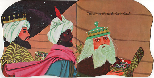
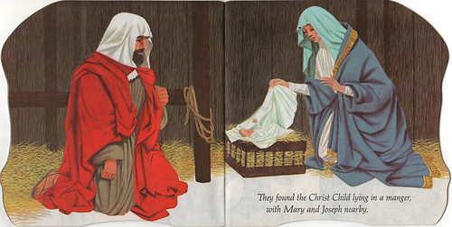
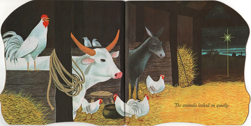
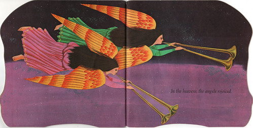
The First Noel by Alice and Martin Provensen.
Abner Graboff featured in my Flickr.

6.28.2010

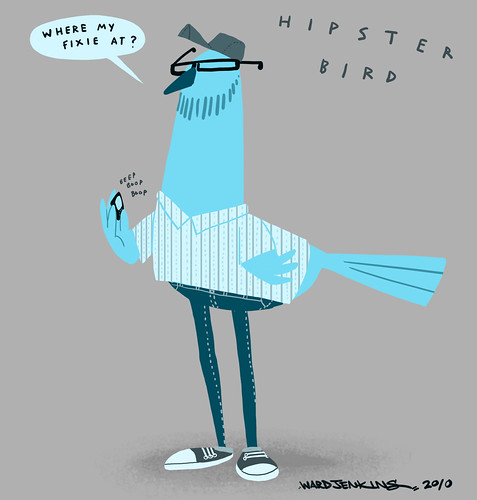
Hipster Bird

Hey look! It's a new post! And with a drawing? Even better!

Hipster Bird

This is in response to Jared's bird.

5.20.2010

Big Site Update

Ward Jenkins 2.0

I finally redesigned the website and it's now up and running! New section I'm happy to unveil: Books! Take a look around, click on all the fun clickables, see if everything is working correctly...

This intro page has only a few things different than the first version, but the redesign is all about the rest of the site found within. For instance, since I was brand new to iWeb for the first version of the site, I had no idea about centering the entire layout for each page, resulting in some wonky pages. Another thing I fixed: I didn't like having to scroll down a bit for each image in my Illustration portfolio. By shrinking the main header of "Ward Jenkins" and all the categories in the navigation bar at the top, I was able to keep it simple, allowing more space below. Now, practically all my portfolio images are viewable without having to scroll down.

Besides the new Books section, I've also split up my Illustration section into two categories: Personal and Published. Took down some old stuff, put up a whole lot of newer stuff.

Yes, an entire section devoted to my first children's book: How To Train With a T.Rex. You can check out some pages (as well as the sketches), lots of sketches on how I drew Michael Phelps, and, of course, the easter eggs found in the book. Since most who visit the Books section could possibly be kids, I'm thinking of creating an entire Kids section. Still need to mull it over, though, figure out the possibilities, how it would fit within the rest of the site.

Enjoy the new look!

5.07.2010

Social Networking vs. The Faceless Entity

Social Networking vs. The Faceless Entity

Ever see a cool commercial and wonder who made it? I do all the time, but that's because I've directed a few and have worked in the industry for some time. And after seeing said cool commercial, do you ever try to find out who made it by searching for the thing online? I do, but of course, that's just me. And when I do, I hit a brick wall almost every single time. Why is it so hard to find out who made a commercial these days? Especially during this day and age of social networking, of Google, YouTube, blogging, Facebook, Twitter, et al? Are production companies scared of these networks? Of sharing? Of getting their work out there?

It's not the same for all of these companies, I'm sure. I see some ads (and entire ad campaigns) that are promoted to the hilt online. If it's done right, it gives a face to who makes them. A persona, if you will, and makes me more than curious to see what else they'll do. If it's done wrong, this self-promotion can come across as being gaudy and superficial. A thin line to cross, apparently.

But I'm perplexed by the double standard of how production companies promote themselves. There's plenty of boasting about who they are and what they do on their websites, touting all the latest awards and recognition they've received, and how long they've been receiving these awards. Most will update their sites solely for the purpose of letting us know what they've done lately. If they're smart, they'll mention each of their directors with a list of all the ads these directors have done for the company. But all of this is for....who? Me? No, of course not. Potential clients, right?

Problem with this type of promotion however is that it's blandly informative, not at all personable.

The last two companies I worked for, I constantly talked with certain people about starting a company blog - one that would be regulated by the principles of the company, by someone who would know what to say and how to say it, to promote the company as an entity that had a face. A voice. A vision. But nothing ever came of it.

I'm happy to say that since then, one of my former employers has started to embrace social networking through both Facebook and Twitter. No blog, but still, they've started to create a presence online, outside the usual incestuous circles that most commercial production companies usually confide themselves in. They mention the latest project they've recently completed and will occasionally post an interesting link or video. I like that.

The other company is still faceless online. In fact, their website hasn't changed since its inception. That was 2005. Five years in the online world is like an eternity. No blog. No Facebook. No Twitter. What are they afraid of?

The biggest fear is probably the aspect of sharing too much information. They think social networking would expose "company secrets" which is TOTAL BUNK. I don't buy that. Not if these blogs or Facebook or Twitter accounts are monitored by a PR person who would know what would be too much to share if anything gets too "sensitive." The nature of the industry is wrapped in secrecy, though - with nondisclosure agreements a staple for anyone working on a each and every project, of which I completely understand and respect. But there are plenty of ways to work around any questionable content and generate buzz or interest solely on the fact that they're working on something awesome. Take a lesson from some ad agencies. It can be done. (Side note: Clients themselves must break free from this cloak of secrecy, however. Some big-name companies are too slow and so far behind the times that they don't realize just how backwards this way of thinking is. Wake up, people.)

These companies who eschew any sort of connecting online are missing the boat and make it extremely difficult for someone like me to be positive about what they're doing, even if what little they show is "cool."

What are you working on, companies? What are you doing to get us, the AUDIENCE, to know about what you're doing? Do you realize that if you talk about your work outside of your industry and trade magazines and design award shows that maybe, just maybe, your current clients will like you even more? And, if you're a buzz generator, do you realize that more people (read: potential clients) might be interested in what you do?

Just a thought.


5.03.2010

FLIP Interview


Thought I'd let you know that I'm this month's featured artist for the excellent online magazine, FLIP. Editor Steve Moore interviewed me about my style, how I approached my style, and my graffiti background. Hopefully I didn't ramble. Well, hopefully I didn't ramble too long. I'm very honored to be included in such a fine online publication! Many thanks, Steve!

4.21.2010

The Question of Versatility

GHK: Appetizer Book 4

Several years ago I wrote about Lou Peters and his propensity to be diverse in various illustrative styles. (Still no new information on exactly what this mystery person was all about. Anyone?) While it's obvious I'm in awe of such talent - to be able to go from style to style without making it look difficult is quite a feat for any artist - this had me thinking, "Is it worth it to be a versatile artist? Was it beneficial for Lou Peters? Would it be beneficial for me?"

I've often wondered about this throughout my career as both an illustrator and animator. While in animation (especially of the hand-drawn variety) it usually works to one's advantage if they were an artistic chameleon, aping the look and style of every character and show that they've been assigned to work on. Throughout my time as director in broadcast animation, I often told my assistants this: Forget your own style; you have to be a chameleon. Sounds harsh, but it's a harsh reality in this industry. If they didn't completely conform to how a particular show was being drawn, they would be politely assigned to another project (which wasn't too often, I'm happy to say). Time is money,right? If an artist wasn't drawing the characters correctly, it was a waste a time - therefore, a waste of money.

This constant aping of various cartoon styles served to be both a blessing and a curse for me. I throughly enjoyed being assigned a new project, diving into all the research that went into it, watching shows frame-by-frame to see exactly how the characters moved and acted, grabbing screengrab after screengrab of faces, walkcycles, and characters. With my thirst for knowledge, the pre-production stage of each project was my favorite part. However, there were issues with how much time I devoted to research on the onset - did I really need 40 frames of Astro licking George Jetson's face? (In hindsight -yes, but that's just between you and me.) Could it be that too much information is, well, too much?

I digress. Back to the issue at hand. For an illustrator, the question of being diverse is different. It might look on the onset that being a versatile artist would be beneficial to an independent illustrator as well - to be able to address a look and style that fits each job offer that comes their way should work to their advantage, right? If a client is looking for illustrations that imitate Soviet propaganda posters, or mirror Roy Lichtenstein's pop art characters (which, in of itself is ripped from comic books, of course), or perhaps copy the pen and ink feel of Maurice Sendak's Where The Wild Things Are, then who's to say it would be wrong for an artist to not turn these projects down? Especially during this day and age of an unsure economy? But would the artist be compromising his own vision? Most freelance illustrators are in the business because they have a "voice", with their own unique look and style and use it to their advantage. In order to stand out, you have to be unequivocally forging ahead with your own distinctive style.

Or do you?

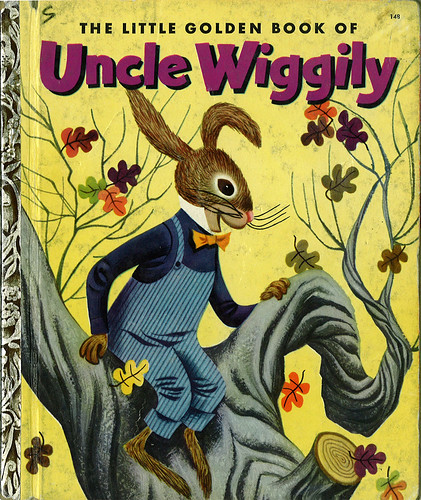
Let's take a look at the fantastic work of Mel Crawford. He's done plenty of children's books during the 50's, 60's, all the way through the 70's and 80's. (He's still alive and painting, by the way!) I've mentioned Mel before. Here's the cover to his take on Uncle Wiggily from 1953:
Uncle Wiggily 01

Uncle Wiggily 11

Bright, lively work, Mel captures the fun and energy of the story and brings this vitality through on each spread of this book. The colors are bold and the characters are posed wonderfully. Plus, I love the textures that he shows for the surroundings, such as the trees, grass, the house. All around, a brilliant book.

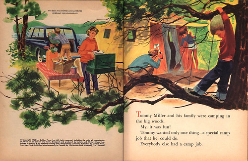
Now, let's look at another Little Golden Book he illustrated, Tommy's Camping Adventure, from 1962:

Tommy's Camping Adventure 1
I had this book when I was a kid. When I saw it in the fleamarket, I bought it right away. A wave of nostalgia washed over me while turning the pages of this book. I remember it fondly.
Tommy's Camping Adventure 2
Notice how Mel framed Tommy with the use of the tree and branches, and silhouettes the boy by the much lighter yellows and light greens behind him.
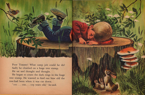
Tommy's Camping Adventure 3
I remember looking so intently at this spread when I was a kid - the details, oh! the details! I could almost feel the ridges of the rings on the tree stump here. So wonderful. Take a closer look.


Tommy's Camping Adventure 4
With the use of an extreme diagonal, Mel allows our eyes to go from the family down to Tommy, and finally, to what he's looking at: a little wood rat.

Tommy's Camping Adventure 5

Tommy's Camping Adventure 6
Again, the diagonal. Love that huge tree on the left there. Also, notice how Mel uses the tree on the extreme right to help guide our eyes to Tommy, so we don't go off the page.

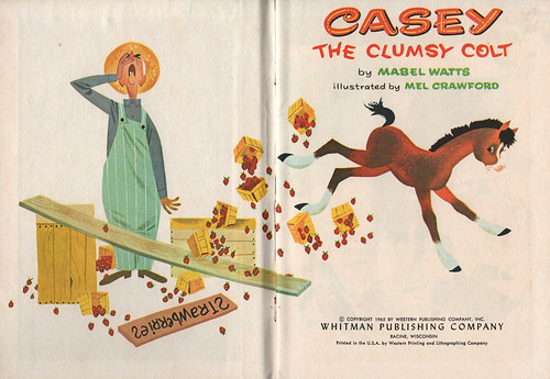
Now, let's take a look at Casey The Clumsy Colt, also illustrated by Mel Crawford (from 1965):

Casey The Clumsy Colt 1

Casey The Clumsy Colt 2
What's interesting to me is the fact that Mel uses white in almost every single spread of this little book from Whitman Publishing. Whitman made small, easy-to-afford books for children, similar to Little Golden Books. They weren't known for their quality, however. Most Whitman books I own are in terrible shape because of weak binding and eager little fingers wanting to tear them apart throughout the decades.
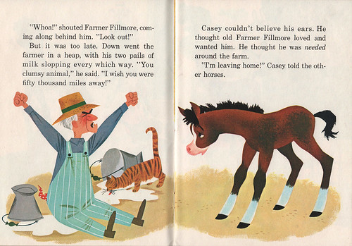
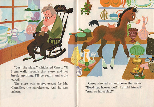
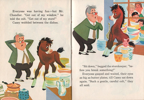
Casey The Clumsy Colt 3

Casey The Clumsy Colt 4
Even on a busy spread, the details that Mel put in are simplified here - there's not too much to take away from the story, or the overall aesthetic.
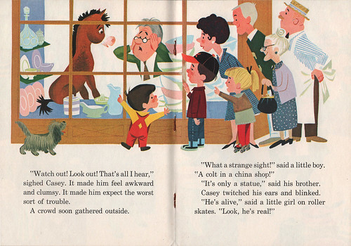
Casey The Clumsy Colt 5

Casey The Clumsy Colt 6

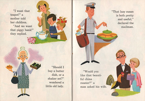
Casey The Clumsy Colt 7
Mel's characters are perfectly designed - simple, yet give off enough personality in each pose.
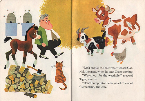
Casey The Clumsy Colt 8

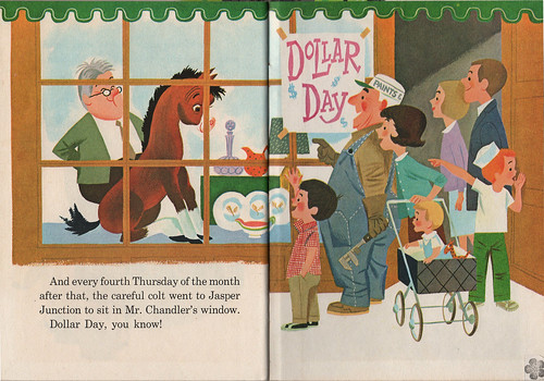
Casey The Clumsy Colt 9
Even when there's more information painted in the background, white is evident.

The man definitely has a grasp on details and knowing how to pare back on what's necessary to show in order to get the story across. I've been looking at Tommy's Camping Adventure and Casey side-by-side and it's so fascinating to observe what Mel shows, and more importantly, doesn't show. What's clearly evident in all three books I've shown here is the fact that Mel Crawford is simply a great artist. He's able to take on any form of illustration technique and apply his talent and skills to the story at hand. Each book has its own "voice", which is very important for the reader. When I open each of these books, I'm transported to their respective worlds, and am able to be fully immersed in the story, without any doubts.

(Oh, by the way, check out some more Mel Crawford in my Mel Crawford Flickrset.)


With this in mind, I was curious about what others thought about being versatile in this industry. I put this question out to my Twitter followers, to see what they thought:

Do you think it helps or hinder your career to be diverse in styles as an artist?

I received some interesting answers:

@eimhin The canned answer is "Hurts", as we're always told to pare down to an identifiable style. ADs can't decide if we fit, otherwise...However, I think it ought to be seen as an asset. You just need to market each style differently, and not to same people. (from Even Jensen)

@matt_gavenda from my experience. you'll be asked at some point in your working years to do multiple things. only can help, i think. (from Matt Gavenda)

@hipphop If you are diverse in style, no, diverse within your style, yes. I have learned it gets looked at as inconsistent. (from Ryan Hipp)

@mary_longshore It is my opinion that it helps to have as many styles as possible. Versatility is important for success as an artist. (from Mary Longshore)

@AJB_Design A distinct style identifies an artist, but maybe limits their jobs. A generalist might be more versatile, but less memorable. (from Andrew Brozyna)

@arthurmount I'm for diversifying. While it may dilute the impact of having one style, it broadens your reach and creates new audiences. (from Arthur Mount)

@curtisdickie I believe it is good 2 be internally diverse-but u need to create an outward focused style 2 create your brand as an artist. (from Curtis Dickie)

@ohmgee personally, i have several styles. to hire, i want consistency. know what to expect. but sick of 1-trick pony graf artists. (from Martin Gee)

@suceda you should be able to work in different styles that are right for you, I wouldn't want to limit myself to just one media. I don't think I have ONE consistent style, I think & draw a certain way, but the actual execution of piece depends on subject. (from Santiago Uceda)

Illustrator Zack Rock then asked: "How do people with multiple styles represent themselves professionally? Different promos, sure. But different sites?" I replied: "I would think that artists w/different styles showcase them on their sites: as separate sections." At least, that's what I would probably do. I've seen others do this—if they have two or more distinct styles, they'll have different portfolios on their site, showcasing them separately.


Finally, I get this tweet from designer and typographer Mark Simonson:

@marksimonson 25 years ago, Mary Grandpré asked me that. I thought she should diversify. She didn't follow my advice.

If you didn't already know, Mary Grandpré is most known for the illustrations for the covers of the entire Harry Potter series.

What do you think? Does it help or hinder an artist to be versatile? I'm curious as to what you have to say.

-------------

LINKS:

Mel Crawford's official site
Mel Crawford's official blog
My Mel Crawford Flickrset
Mel Crawford featured on The Retro Kid
Mel Crawford on Golden Gems blog


3.19.2010

Photobooth Friday (finally)

Call me Mr. Beardy

It's been a long, long time since my last participation in Photobooth Friday (Wow. Not since April of 2008?), but I'm glad to say that a trip to the Ace Hotel this past Sunday was worth coming back for.
We (Ava, Ezra & I) call guys with big beards here in Portland "Mr. Beardy" - "Look Daddy! There's a Mr. Beardy!" If you want to see a prime example of a Mr. Beardy (besides myself), check out the dude who works behind the counter at Stumptown right next to the Ace. You'll thank me for it.

Currently enjoying:

wednesday: orange • My wife's polaroid collection.
• Hansen's Vanilla Cola: real cane sugar FTW.
• My new(ish) Cintiq 21UX: thank you, Hugh. You're awesome.
• German visitors: Mathias & Jördis (and little Mari), best house guests EVER.
• Almonds: magical nuts that are supposed to change my life.
• Twitter: because Facebook can be annoying. Like real life.
• MY SECOND KID'S BOOK IS DONE.


Not enjoying:

• Third anniversary of my Aunt Bo's passing away because of stupid cancer. I miss her.
• Andrea out of town. Again.
• German visitors having to leave to go back home. Goodbyes suck.
• Waiting to get paid.
• Waiting. Period.

3.12.2010

Daytrippin with Kitsune Noir

daytripping for kitsune noir

Bobby of the excellent Kitsune Noir asked me to do a bicycle-themed illustration for his Desktop Wallpaper Project. You can download the size of your choice here:

The Desktop Wallpaper Project Featuring Ward Jenkins

One thing I like about wallpapers is using the design as a way to organize your folders. Even though the arrows here are part of the composition behind the girl riding her bike, they also offer the user a chance to group certain folders together, for fun or whatever. For instance, all your folders that feature current projects can go on the bright green arrow, the ones that need immediate attention go on the red arrow, etc.

Enjoy!

2.23.2010

My Favorite Quotes

Thought I'd share with you some of my favorite quotes that speak to me on so many levels. I notice a theme here. See if you can pick up on it:

"I have forced myself to contradict myself in order to avoid conforming to my own taste." - Marcel Duchamp

"Rules are what the artist breaks; the memorable never emerged from a formula." - William Bernbach, co-founder of legendary DDB ad agency.

"I never had to compromise myself. It was always me, doing what was comfortable, and relaying the message that I didn't have to be taught to be creative and do good things. I guess what I'm saying is that I'm here and I want to be heard. I come from the streets, I painted on subways, and I feel my work is important. I want people to see it —I want to influence others." -Dondi White (aka DONDI - RIP)

2.16.2010

Limbo

Hi guys, sorry for the inactivity lately. Still working on the book, among other things. Trying to manage my time wisely and well, that's a pretty hard task for me apparently. But I'm almost done, and soon I'll have some stuff to share here. I promise.

Thanks for hanging on. I promise the wait will be worth your while!


1.10.2010

Starting the Year Off Right

New! Improved! 2010!


I think 2010 is going to be a great year for me. Heck, 2009 wasn't anything to sneeze at, I have to admit. It was pretty much a great year, if you ask me. 2010, now, I think will be another winner.

It's certainly starting off well: I'm currently working on my second children's book. To be published by Simon & Schuster in the Spring of 2011. I know, a whole year off, but I'm sure you can manage.

Deadline is looming, so I best be on my way.


12.26.2009

Christmas Angel Book

Merry Christmas, everyone.

With love,
The Ward-O-Matic


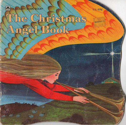
The Christmas Angel Book

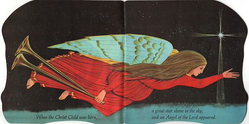
The Christmas Angel Book 2

The Christmas Angel Book 3

The Christmas Angel Book 4

The Christmas Angel Book 5

The Christmas Angel Book 6

The Christmas Angel Book 7

The Christmas Angel Book 8

The Christmas Angel Book 9

The Christmas Angel Book 10

The Christmas Angel Book 11

The Christmas Angel Book by William Dugan. ©1965 Golden Press, Western Publishing Company, Inc.

William (or Bill) Dugan is one of my favorite illustrators, creating some of the more interesting and colorful books for children during the midcentury era. There were certain details that Bill focused on for some of his pieces, like the hair and fabic, that stood out from the usual stuff.

We read this each year for Christmas.