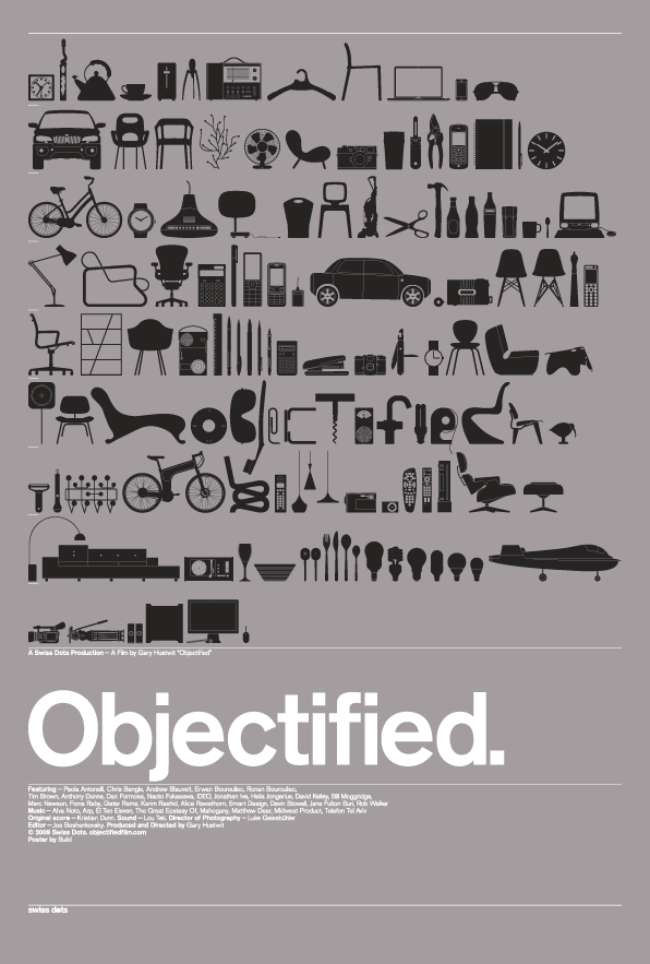
When I first saw this incredibly cool poster for the new documentary Objectified recently, I couldn't help but think that I'd seen this concept before: objects in black, with minimal detail silhouetted up against a basic solid background. And the type, too. So, where had I seen it before? I thought to myself. Maybe it was done by the same people? Maybe Build, the company who designed the poster, is known for this sort of thing? Maybe it's a common enough concept that it's not worth finding out? Nevertheless, I began the search in my extensive archives.
Ah, yes. here it is:

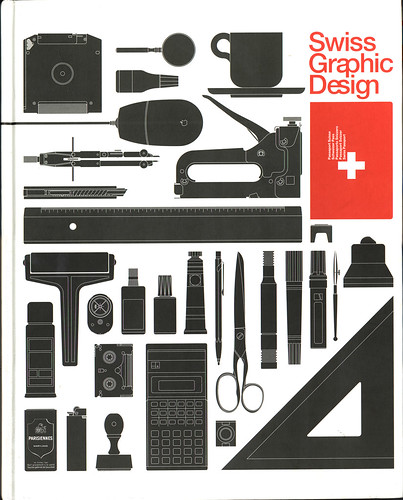
The cover to Swiss Graphic Design, edited by Robert Klanten, Hendrik Hellige, and Michael Mischler, published in 2000. I don't own this book. I scanned the cover back in 2004 when I was working at Primal Screen. One of the designers there had the book on his desk and I was immediately intrigued by it.
I'm not crying foul here. I'm just presenting something that looks very similar to something else. I find it interesting that the objects themselves are rendered almost the exact same way: black with thin line details.
Here's a post on the film's blog about the logo that's shown in the middle of the poster:
Objectified logo explained.
It's there where you can get a closer look at the objects:

Click on image to view larger.
Coincidence? Or not?
I found this while writing this post: Chinese publication The Outlook Magazine rips Objectified logo. What goes around comes around, I guess.

Yeah I think it is more of a riff on old eames catalog graphics
ReplyDeletehttp://www.modernism101.com/images/herman_miller_pricelist_1961.jpg
I am with Dan on this. The Eames pricelist came to my mind, but I am no expert in graphic design... Love the concept and can see why it is appealing to reuse. I noticed prints on Etsy that twist the concept as well.
ReplyDeletefyi, There's a site devoted to art swipes such as this:
ReplyDeletehttp://youthoughtwewouldntnotice.com/blog3/
Robert, I mention that site at the top of my post. Thanks for the mention, though.
ReplyDeleteDoes anyone know who did the illustration for the front cover of the Swiss graphic design book? or where I can find similar for sale.
ReplyDeleteYou know, when I first saw the Objectified poster, it initially reminded me of Official Classic's vector set work.
ReplyDelete