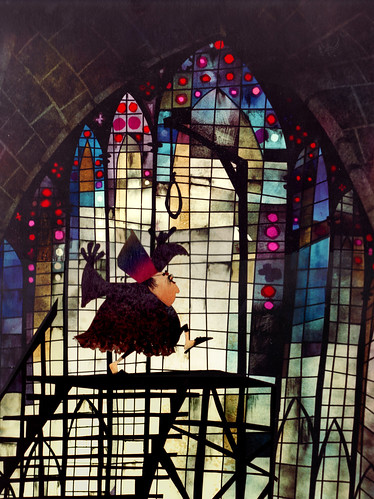
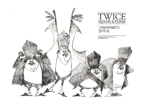
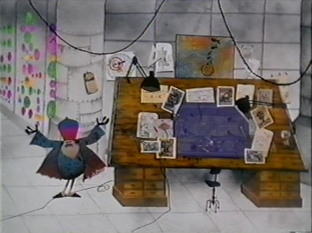
Synonamess Botch on the gallows. Image courtesy of Harley Jessup.
When you watch TWICE UPON A TIME, the very first name that appears in the opening credits is: Art Director: Harley Jessup. Just who is Harley Jessup and how did he get the job of art directing one of the most ambitious animated films in recent years? And why was there a huge model of a train trestle in his living room at one point during production? Curious minds needed to know. To find out, I decided to get in touch with Harley and to ask him a couple of questions about a silly little film that he worked on over 20 years ago. The thing is, Harley's a busy man. He's currently a production designer at, oh, some little upstart company you might've heard of called... Pixar. He's been there since 1996, having joined the incredibly talented crew in Emeryville, CA, to work on MONSTER'S, INC. He just recently wrapped up work on Pixar's latest feature, RATATOUILLE.
Harley's bio is very impressive:
Harley grew up in California’s San Joaquin Valley and the Bay Area. He earned a BFA in graphic design from Oregon State University in 1976 and an MFA in design from Stanford in 1978.
Harley began his career at Korty Films, designing The Adventures of Thelma Thumb for Sesame Street, which served as a training platform for his work as production designer on TWICE UPON A TIME (more on how he got this job later). Afterwards, he went on to Lucasfilm to work as art director on several live action projects before joining Industrial light and Magic in 1986. As a visual effects art director at ILM, Harley earned an Academy Award for his work on INNERSPACE and an Academy Award nomination for HOOK. Harley’s other projects at ILM include THE HUNT FOR RED OCTOBER, GHOSTBUSTERS II and FIRE IN THE SKY. From 1990 to 1994 he served as creative director of the ILM art department. In 1994, Harley left ILM to serve as production designer for Disney’s animated feature JAMES AND THE GIANT PEACH.
Besides his work in film design, Harley has written and illustrated three children’s books, What’s Alice Up To? (1997) and Grandma Summer (2000), both published by Viking Children’s Books and Welcome to Monstropolis (2001) based on Pixar’s Monsters, Inc. For Viking, he also illustrated the books, Just Enough (1999) and Flower Girl (2002).
Harley currently lives in Marin County, California, with his wife and three children.
After going through his bio, I found myself stunned by just how much he's done in the entertainment industry. I mean, c'mon -- he's won an Oscar! So, I was a little hesitant in conducting an interview with Oscar-winner Harley Jessup. Just a little nervous and a bit worried in taking up too much of his time. But honestly, I found Harley to be very gracious, open and extremely courteous. He was more than willing to take the time to answer my questions about his work on TWICE UPON A TIME. Even more so, he sent me some photos of him during production of the film, along with some model sheets and a storyboard frame that he did for TWICE! I was ecstatic.
I am extremely pleased to present to you my interview with HARLEY JESSUP:
Ward: So, I'd like to know your thoughts and feelings about making TWICE UPON A TIME. What was it like to work on this small, obscure animated film during the early 80's?
Harley: It was my first job and it's the reason I'm working in animation. I'd just finished up at Stanford and John Korty was looking for designers that he could train to work in his cut-out animation technique. I love John's approach to design and I really felt like I was in the perfect place. The TWICE UPON A TIME crew was young and the atmosphere was really fun. We were putting in very long hours, but it felt like we were working on something really special and new. John had a great feeling for hiring wonderful animators and artists and I feel lucky to have been a part of that group.
I'm curious, how did you find out about Korty Films? Or did Korty find you?
I met John at the Stanford Design Conference in 1978. He did an amazing presentation of his cut-out films that just dazzled me. Later that day I got to show my work as part of a showcase for the design graduate students. John's former wife Buelah was there and she introduced me to John the next day. That was in July and I fretted for a month before I had the nerve to call and ask for an interview.
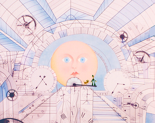
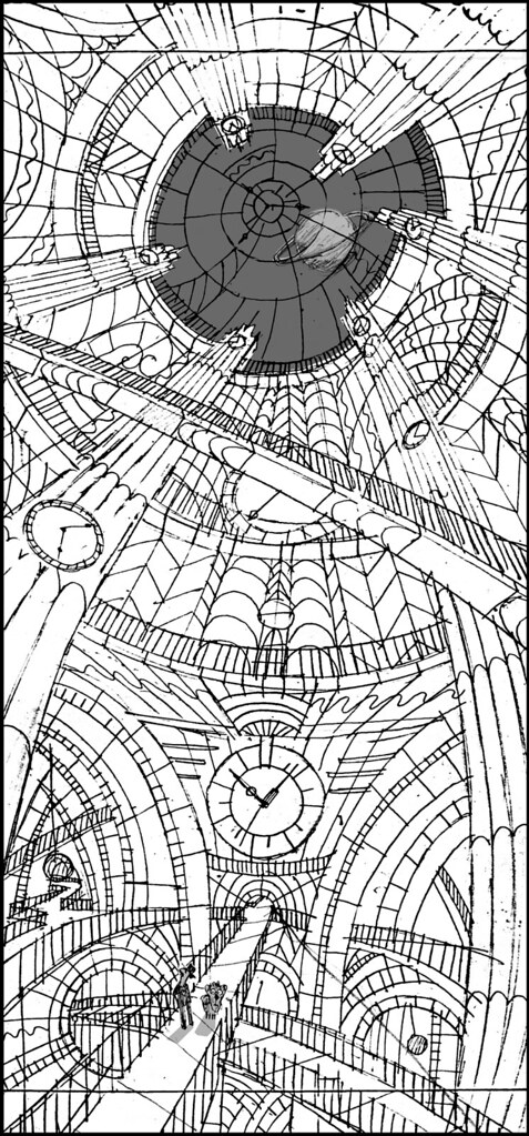
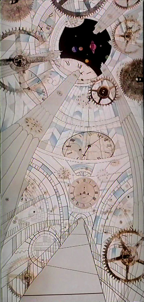
The Cosmic Clock. Image courtesy of Harley Jessup.
I understand that if someone wanted the job at Korty Films that they had to do a test before they were hired. What was that like for you?
The day I came into Korty Films to interview, I showed my portfolio and a short animated film I had done as part of my project at school. John then took me up to the art room on the second floor. That room was so appealing to me, it had once been a child's nursery and the fireplace was surrounded by these great nursery rhyme tiles. Next to the fireplace, there was a rack of shelves with boxes that overflowed with bright colored yarn and scraps of the watercolor-dyed fabric that John used to make his animated films. In the next room he showed me how to work a Lyon Lamb video recorder that was rigged up to a camera stand. This was the first video playback machine I'd ever seen and I think John pioneered that idea for animation. It seems simple now, but it was amazing then to be able to do a test and not have to send it to the lab.
Anyway, John asked me to cut-out a couple characters and a small set of heads, arms and legs and test them with the video recorder. He left me up there at noon and when it was closing time at 6:00, I was still up there. I hadn't expected to stay beyond the morning interview and it was one of the coolest and most intense days of my life! John seemed to like the tests and he asked me to come back and do more the next day. At the end of the second day producer, Bill Couturie asked me if I wanted to help with visual development on an animated feature John was writing and maybe do some Sesame Street animated spots. He offered me $250 a week and I said, "Yes, of course! I still feel amazed at my luck.
How long were you on the production? Were you in on it at the beginning?
I started in 1978, so I guess I worked on the film for 3 1/2 years. John had already begun developing the feature idea with Gary Guitterez. Zenji Funabashi and I helped by doing character and background concept art while we were working on Sesame Street animated spots. In 1979 we did a three minute trailer for TWICE UPON A TIME that John showed to George Lucas at the Korty Films Christmas party. On the basis of that trailer, we got the go-ahead to do the film. We started full production in 1980, I think.
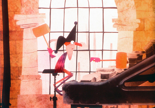
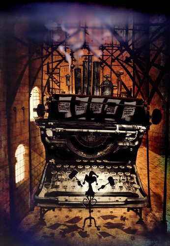
Scuzz at his typewriter. Image courtesy of Harley Jessup.
Did you have to change your artistic vision throughout the production of the film? Or was it pretty much in place at the onset? Did you work with any of the animators about character designs, layouts, sets, etc? With Korty himself?
We tried to stay true to the original style that John Korty had developed in his wonderful short films. I worked closely with John as he was developing the characters. I would make prototype cut-outs and model sheets from his design concepts. Brian Narelle did the concepts for the armadillo character named Ratatooie. Carl Willat and I worked a lot together on Botch and Skuzzbopper, but the original concept for the characters came from John. Carl added touches like the Nixon/Agnew tattoo on Botch's stomach.
For the sequences that I was designing myself -- the cosmic clock and most of the Murk sequences for example -- I would do the layouts on small storyboard panels, then the background artists would blow the designs up onto big 28"X 40" sheets of vellum using an old Lucigraph machine. We'd create the cut-out backgrounds on large light tables in the attic art room at Korty's. With the animators, we'd set up those backgrounds on the big glass-layered camera stands. Some backgrounds were over 7 feet long!
That's amazing. Seven feet long and there were, what, usually about 60 people in Korty's house at the time? How hard was it to work in an environment like that? Working with a crew in an old house in Mill Valley, away from LA, in a completely original animation technique either gave everyone a great sense of pride and collaboration, or you were all at each others' throats!
It was really fun actually. I liked and respected all the artists and animators - John had put together this amazingly talented, young crew, it's hard to describe exactly, but the overall feeling was great. During the main part of production we were working in hilariously tight quarters. Pat Maloney's desk was built over the old bathtub in what had been the second floor bathroom, eventually they turned even that bathroom into another camera room. The main art room was now in the attic space and we talked as we worked over our light tables. John Korty had a little sound recording booth up there with a great stereo and we played records all day long. I played the soundtrack to OKLAHOMA at least four times a day and I offer this late apology to everybody that must have hated that! There was a place under the fabric racks in the attic where someone was usually sleeping.
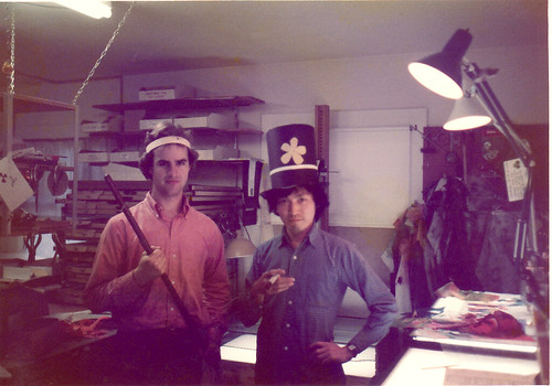
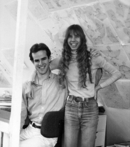
Harley: "Zenji Funabashi and me in the second floor art room while we were working on the early trailer for TWICE UPON A TIME." Image courtesy of Harley Jessup.
Describe to me the typical day for Harley Jessup, art director, during production of TWICE UPON A TIME. What specifics did your job entail?
Arriving at the studio at 9:00 I'd spend the morning working on layouts, setting up a background in one of the camera rooms or cutting out special character parts that an animator might need. At 10:30 or so we'd watch 35mm film dailies projected in the living room/office downstairs. The shots would usually be approved on the first take, but sometimes there would be a problem with a light going out or some part of the background popping off and we would need to reshoot.
Later co-director Chuck Swenson might informally pitch his latest storyboards and we would immediately get started on the design of the sequence. Sequence directors Henry Selick and Carl Willat would usually do the boards for their sequences as well as the animation. There was a tight schedule for the camera rooms and set-ups were constantly changing. At some point during the day I'd check in with background artists, Heather Selick, Heidi Holman and Cheryl Kapach.
During production, I'd often come back after dinner and keep going, finally leaving the animators to work through the night. When I was waiting to change a camera set-up at night, I'd work on the design layouts for the next day. Then we'd start all over again in the morning.
Scuzzbopper, writer of nightmares, at his typewriter. Image courtesy of Harley Jessup.
How do feel about the Lumage process? Was it difficult to work with? If so, would you have done anything different to make it easier for you and the animators?
I love the Lumage process. The cut-outs look so beautiful when they are strongly backlit. It was always a challenge to create light areas as a background for the action. When the backgrounds became too dark, the front light would make the cut-outs look coarse and the edges would start to show. The pure, stained glass quality of backlit cut-outs is wonderful and I'd get worried when the action called for filling in the background behind the characters. Many of the early Sesame Street spots were done against a completely white background and it's a beautiful look.
I had a chance to find some of them and you're right, they're beautiful! (See previous post.)
Korty films had already produced one year of Thelma Thumb episodes by the time I arrived. Dave Hilberman designed the first year of Thelma Thumb (I think I'm getting this right) and I remember being bowled over by the gorgeously designed layouts he'd done. I had no idea that he'd been one of the founders of UPA!
My favorite in the collection you show on your website is the photographer spot that John Korty animated himself for Sesame Street. All of John's animation has a strongly designed quality that I was always trying to emulate. Heather Selick designed the great spot called "What's Inside the Street?" Brian Narelle wrote and directed the episode of Thelma Thumb about the car race. The "Pride Day" spot is one of three shorts that John let me write, design and animate myself. It was done after TWICE UPON A TIME when the studio was scaling down.
Would it be safe to say that you guys were cutting your teeth with the Lumage process through those Sesame Street shorts?
Yes, Sesame Street was great training for TWICE UPON A TIME. There's a lot I still admire about the Sesame Street work, especially the design and animation that John did himself.
Did you learn anything new about yourself as an artist and/or animator during the making of the film?
Yes, I learned that I could be an art director and that I love working in a studio with other artists. In school I 'd assumed, I'd be a graphic designer or children's book illustrator working by myself. I also learned a lot about color just working at a light table with backlit colored papers and theatrical lighting gels all day long.

The Trestle Shot. Click on image to view larger.
I understand that you helped out with this is incredible shot of a train trestle in the beginning of TWICE. (I think it's one of the best in the movie, if you ask me.) Did you have a hand in the design of the trestle itself?
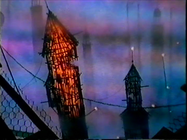
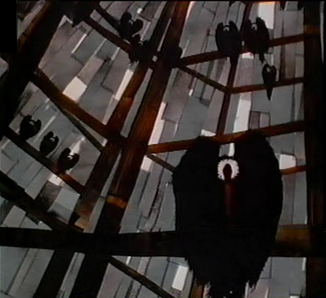
That shot, introducing Botch and the Murkworks, was my first experience with miniatures and motion control. Carl Willat came up with the idea to fly the camera under a 3D train trestle model like a bird moving toward the vultures' roost. We cut the trestle scaffolding out of corrugated cardboard and painted it black along with a cut-out style train engine and coal car mounted on a model train track. I think it blends pretty well with the 2D multiplane background in the same style. There was no room at the studio to build the 15 foot long trestle model, so I volunteered my apartment. After 5 weeks with this huge black train trestle in my living room I began to regret this a little, but the shot turned out beautifully and I think it is one of the coolest images in the film. David Fincher was only 19 and he operated the motion control camera that we rented at an effects studio in Richmond. Carl was the first to point out that we should listen to this brilliant kid and David wound up being the effects supervisor for the film.
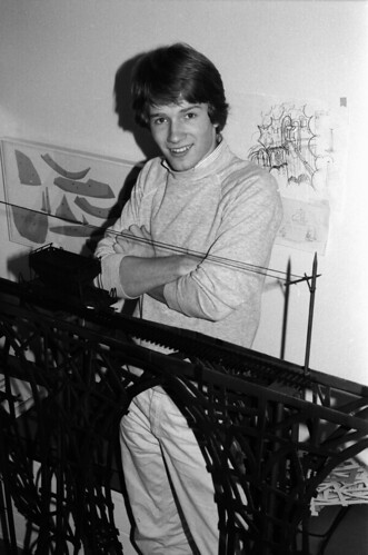
A young David Fincher with the train model. Image courtesy of Harley Jessup.
When creating the world of TWICE, especially Botch's Murkworks, what were your sources for inspiration? Were there any artists or illustrators (or films) that Korty had you look up to help you get started?
John screened a whole series of films that he thought might be great inspiration. We watched many of John Hubley's films and I especially loved WINDY DAY. We looked at several Caroline Leaf films including THE STREET and other Canadian Film Board movies. Finally, John showed a 35 mm print of YELLOW SUBMARINE and I'd never seen anything so boldly great in its design. All the films had in common a very loose improvisational style that John loved.
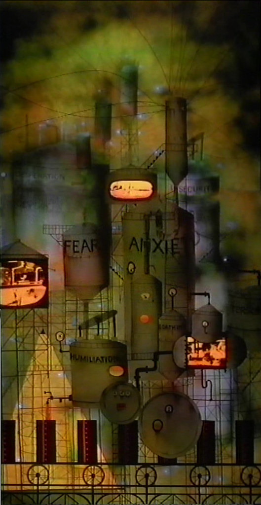
For the Murkworks I looked at books about old European factories and train stations. John Korty gave me a great book of Victorian engravings of gears and all kinds of mechanical parts and we used these as background elements. John Baker photographed wonderful cycles of pistons and train engine mechanisms that we put the in the backgrounds too. Piranesi engravings were a big inspiration for the castle designs.
Pan shot of Murkworks. Photoshopped from several screengrabs.
I'm a big fan of art direction and design. What was it about animation design that made you decide to do that instead of being a graphic designer or children's book illustrator?
Actually I steered away from animation after TWICE UPON A TIME. Even though it's the reason I'm working in animation now, when it was finished, I vowed to never work on another animated feature. It was just way too hard and I didn't want to risk so much time on another project that might not see the light of day. You've got to remember that 1982 was a real low point for animation, no one wanted to go see it and I don't blame them, the few animated features released at that time were pretty weak. But I love the endless possibilities of animation design, the opportunity to work in a studio environment with other artists on films that kids like. Eventually I came back to it after working on live action films at Lucasfilm and Industrial Light and Magic.
You mention earlier that you and the crew felt like you all were working on something "really special and new." I can't imagine how everyone felt when it didn't do so well in the theaters. There were test screenings of the film in Portland, Oregon, that you attended with Heidi Holman and Carl Willat. What was the overall reaction from audiences there?
Well it didn't get shown in very many theaters. As a test, I think, It was distributed in the Pacific Northwest. Carl Willat, Heidi Holman, Ann Zimmerman (my future wife) and I drove up to Oregon and we went to six screenings at different theaters in Portland, Salem and Corvallis. The audience reaction was very good, but the theaters were only half-filled. Korty Films sponsored our trip and we took notes and brought back pictures of the theaters, newspaper articles and marketing stuff. We were, of course, disappointed when it didn't get a wide release, but at the same time I understand. It's such a quirky film and audiences were not very interested in animation at that time.
Okay, I've got to ask you this. Whenever TWICE is brought up in conversation or online, there's always an issue regarding two different (some say three) versions of the film that were released: the uncut theatrical and HBO version, and the more family-friendly laserdisc version released in 1991. I understand that Korty was extremely unhappy with the uncut PG version that was released, citing that families wouldn't sit in a theatre with cartoon characters cussing. Which is the official version? Some say that the uncut version was the "official" version, but after reading about the making of the film in Taylor's article in Animation Blast, it seems like the addition of foul language was mostly a side thought, with producer Bill Couturie letting it slide in, without Korty's knowledge. Do you know what really happened?
The version with profanity is not John Korty's style at all and I think John and Bill Couturie strongly disagreed about this. In fact, John was so upset by the swearing in the first reel, he had that reel reprinted and sent directly to the theaters in the northwest. Many theaters didn't bother to switch to the new (but original) clean reel and we saw a few offended families walk out. I prefer the version without swearing and farting, just because those jokes seem too easy, but I've heard that lot's of people love the "uncensored" version and I'm just happy that they like the film in any form.
Do you still keep and in contact with any of the crew?
Yes! I see John Korty every once in a while. Carl Willat, Henry & Heather Selick are still close friends. (I got the chance to work with Henry again on JAMES AND THE GIANT PEACH.) I exchange letters with Zenji Funabashi who lives in Japan and I keep in touch with George Evelyn, Brian Narelle and Ninfa Ortiz who all still live in the bay area.
Harley with Cheryl Kapach. If anyone has any information on her, please let us know. Image courtesy of Harley Jessup.
Is there anyone you haven't seen in awhile but would love to find?
I'd love to find out about my friend Cheryl Kapach. She had a serious illness that she would never talk about. Toward the end of production on TWICE UPON A TIME Cheryl could barely walk, but she hid that problem by climbing the steps to the third floor art room before anyone had arrived in the morning and leaving after most people had gone in the evening. She would often ask the production assistants to get her a sandwich at lunch and to do other favors for her. She had a princess-like quality that was funny and charming and she made you feel flattered that she was asking you to fetch something. Anyway, the day she completed her last background, Cheryl left and never came back. When the film was finished she called me to say she couldn't come to the crew screening and asked if I would bring her a video tape to watch. I took it to her house, but she didn't come to the door and I just left it there. Anyway I haven't heard from her since. I've heard speculation that she died, but I don't think anyone from the crew knows for sure. Maybe we can find out through your article! I half expect to run into her at a fancy screening on the arm of some billionaire.
I also want to say hi to Peggy Okeya Yamamoto, she's a really talented animator and great friend from Korty Films days.
Do you think that the Lumage process would be worth the effort if someone tried to do it today? Could it be done somehow in computers? Or would that defeat the purpose of using actual light?
Obviously I'm a huge fan of CG animation and I do think a similar look could be created without some of the difficult aspects of the Lumage process. There's a slightly tragic quality to all straight-ahead animation techniques like cut-outs or stop motion where you have to start over when a light blows or a camera jams. Days or weeks of a carefully created animation performance can be lost and that tension is terrible.
It's interesting to look at the TV series, South Park; it's closely related to Korty's cut-out style, but without the backlit glow. In fact there is an episode of The Adventures of Thelma Thumb that we did for Sesame Street that looks like it might have even influenced the look of South Park, maybe I'm imagining things, but the the cut-out style kids in little knit caps look so similar. Comparing the two, you can kind of see how the backlit quality of the cut-outs could get lost when the layers are composited in the computer.
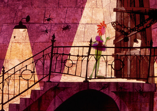
Flora Fauna at the Dungeon door. Image courtesy of Harley Jessup.
I think that the Lumage glow could be somehow replicated in After Effects, given the right amount of effort and time. I hope that maybe through these interviews that we've inspired some ambitious animators out there to experiment in a style similar to the Lumage technique. It's a wonderful look -- warm and inviting. Any last thoughts?
After TWICE UPON A TIME failed to get a wide release in theaters, I was really discouraged. Animation was at a low ebb then and after a few more Sesame Street spots, John Korty decided to shut down the little studio in Mill Valley. I think of TWICE UPON A TIME as a noble experiment. Parts of it make me cringe, but there are other parts that make me feel incredibly proud and lucky to have been a part of that film
You should absolutely feel proud of that film! I don't know if you've noticed, but there's been quite a response in the comments to my first post on TWICE, as well as the mentions on Drawn! and Cartoon Brew. People are wanting to see this film again, after having great memories of it as a kid. I'm hoping that all this new garnered attention will give Warner Bros a chance to see that yes, there is an audience for TWICE UPON A TIME. And you know -- the kids who saw it in the early 80's now have kids themselves, creating a whole new generation just waiting to enjoy this film. I sat watching TWICE with my kids recently and they love it.
One last question: I see that you've illustrated a couple of children's books. (I'm a sucker for 'em.) My daughter loves "Flower Girl." How hard is it to find the time to work on side projects like illustrating books when you're working in the animation industry? Do you find that having an animation background helps or hinders your book projects?
Thank you! It's always difficult to find the time, but my children's book projects are a good contrast to the major collaboration involved in designing an animated feature. When I'm working on a children's book the collaboration is on a much smaller scale. There's just me, the editor and the art director.
In my children's books, I'm always drawing on my experiences in animation design. On "Flower Girl" I was trying my version of the 101 DALMATIONS technique of loosely painted color behind black Xerox lines on a clear cel overlay.
You know, I was actually thinking that when I first picked up the book and thumbed through it. I would guess that it's a fun style to work in. Okay, last question -- I promise! RATATOUILLE has finally been released. What's next for you?
RATATOUILLE has been a great experience for me and now I'm working on the design of a short film here at Pixar. I wish I could say more!
I wish you could too! But I understand that you can't. Whatever it is, I'm sure it'll look fantastic. Thanks so much for taking the time to answer my questions, Harley. Hopefully, one day, TWICE UPON A TIME will be released on DVD for a whole new audience to enjoy.
Thanks Ward, it's been really nice just to think about TWICE UPON A TIME again. Thanks especially for your great questions and for being interested in such a nutty movie the first place!
Harley was kind enough to pass along some images that he did for the production of the film. First image is a character pose sheet for the villian, Synonamess Botch:
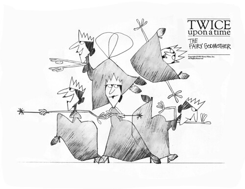
Next is the Fairy Godmother, or FGM, for short. She's probably my favorite character in the film:
Next, is a storyboard pan shot of the Cosmic Clock interior, also drawn by Harley:
I was able to reconstruct this pan by Photoshopping several screengrabs from the film:
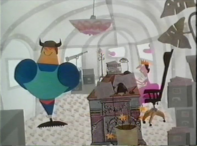
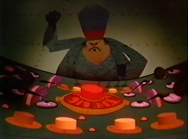
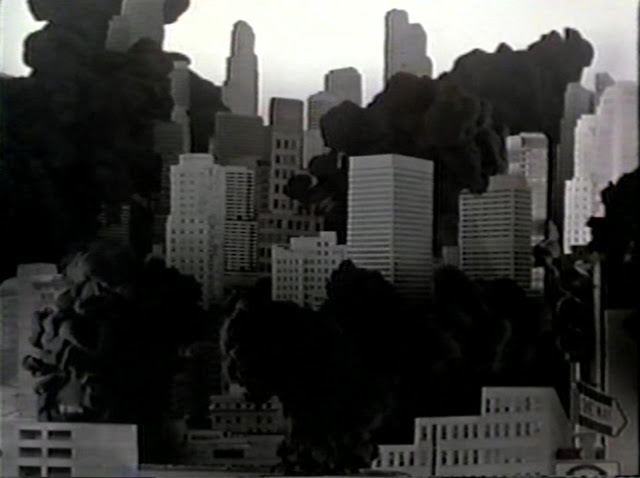
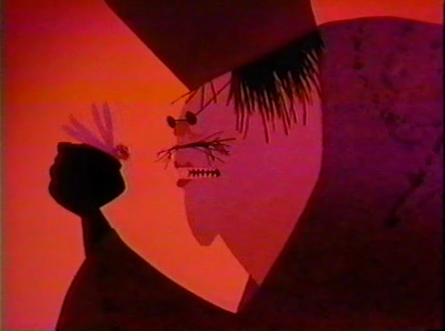
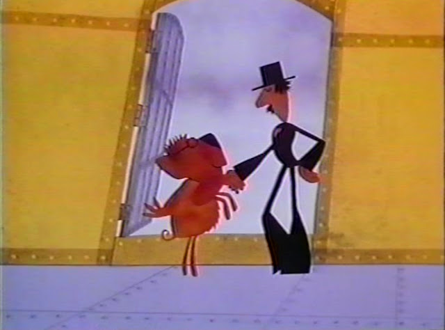
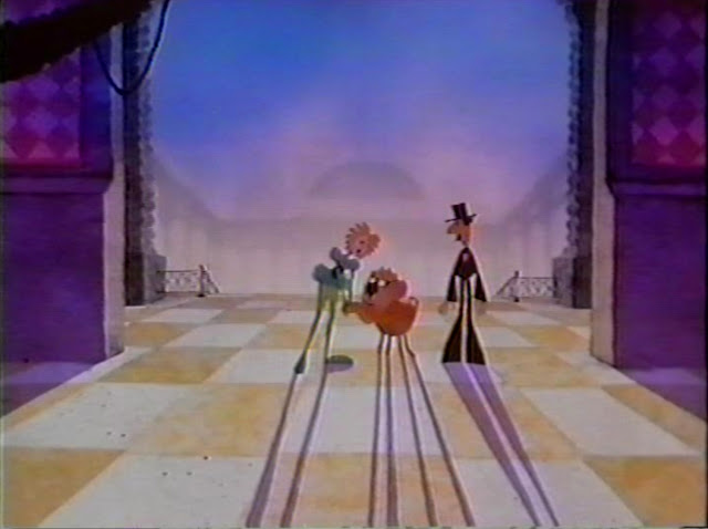
Here are more screengrabs from the film:


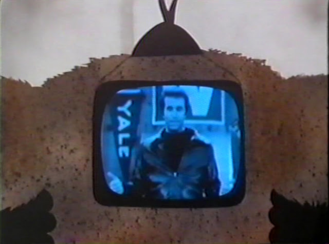
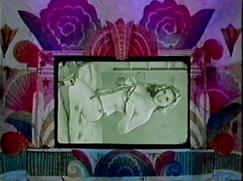
Hey! How'd that get in? Botch accidentally slips in a 50's cheesecake image while talking with Mum and Ralph.
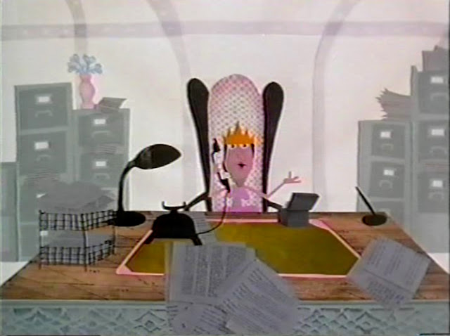
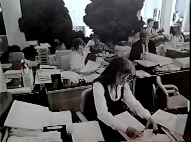
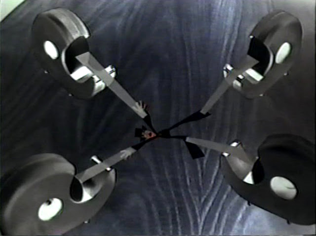

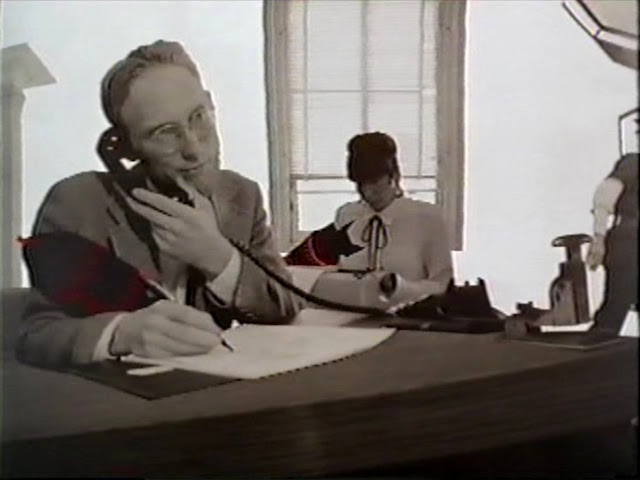
Hey look, that's Henry Selick as one of the Rushers of Din.
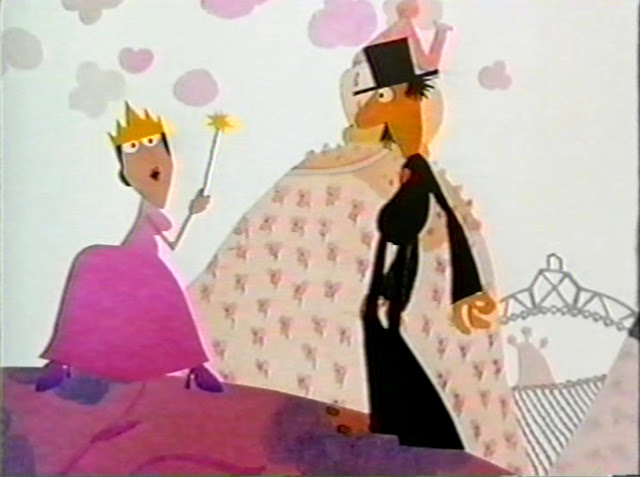
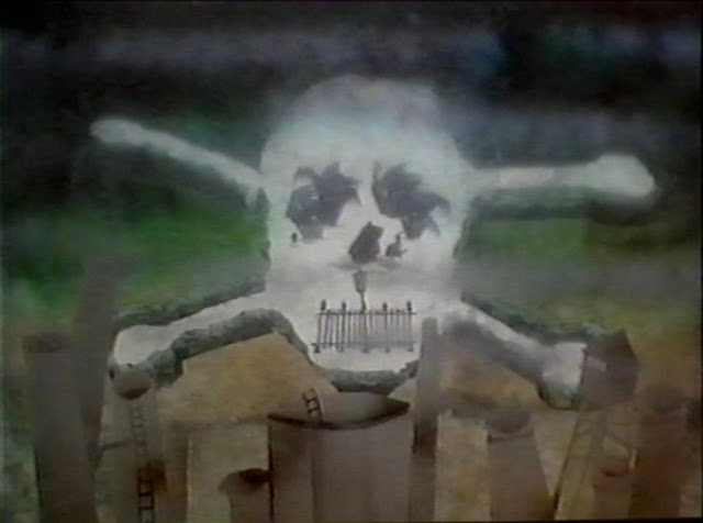


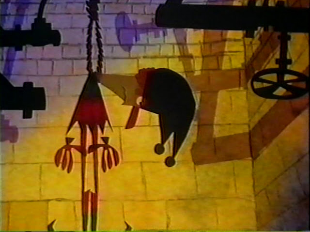


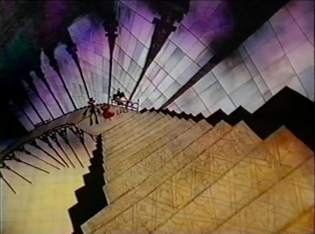


I want to give out big BIG thank yous to Taylor Jessen and Harley Jessup for taking the time to answer all my questions about TWICE UPON A TIME. Let's hope that these posts will put this small but innovative film on the proverbial map, enticing Warner Bros to release it on DVD some day. It truly deserves it. Thanks again, Taylor and Harley!
To view the images that Harley submitted for this interview in a nice Flickr photoset, click HERE.

