▼
3.31.2005
Illustration Friday: Crowded
The theme is "crowded" for this week's Illustration Friday. This was probably the quickest I've ever done one. I had this idea of heads all squished together, did a quick search through other IF entries (I have this thing where if I find out if someone else did a similar concept or idea, I'll scrap it immediately and try to come up with something else), sketched it quickly on a piece of paper, scanned it, and painted it in Photoshop -- all within about 30 to 40 minutes. I'm having fun with this pastel brush they've got in Photoshop. I usually tweak some of the qualities to the brush, but I think it does a pretty good job getting that pastel look -- complete without all the chalk getting all over your hands and clothes. Can't beat that.
Ava Thursday: Easter Bunny
Easter was a big success this year, as it was Ezra's first, and Ava having a grand ol' time with family and, more importantly, Easter eggs and candy. We try not to give her too much chocolate and jelly beans, but sometimes we can't help it. Plus, she's good at not eating it all at once. She likes to put some of the candy accumulated in assorted set-ups, sometimes with the occasional posing Polly Pocket.
So yes, the following day, Ava picks up her pencil and starts to draw and out comes this wonderful drawing of Ava with the Easter Bunny! She added the color on the next day. She said that the Easter Bunny has an Easter basket with ONLY EGGS. There are eggs all around the scene, with one or two decorated. Also there's a crayon right underneath the big basket in the middle. (And see that little sign with a bunny head and a slash right through it? Ava said that sign says "No bunnies allowed." Apparently, the Easter Bunny is completely disregarding it as he's hopping all up in this scene. Maybe that's why he has a worried look on his face.)
Interestingly, in the lower right-hand corner, she drew this odd shaped object and an egg right next to it. It looked like a pencil to me, but wasn't sure. Of course, me being the curious Dad, just had to ask what that was. "That's my pencil drawing an egg."
3.28.2005
A Ward-O-Matic Primer
With The Ward-O-Matic still listed as one of the "Blogs of Note" on the Blogger Dashboard page, I still get a good amount of curious visitors checking out this odd blog of mine. Sometimes I forget that there are many who do not know who I am and who this "Ava" is, as well as what in the heck this blog's all about. (Of course, I'm still trying to figure that out too, so be patient with me....) I decided to take a cue from Andrea Scher at Superhero Designs, who has, on her great blog, listed a "best of" in-case-you-missed-it posts from her recent past.
Here are a some posts from The Ward-O-Matic that might help you get a good idea of who I am and what I'm doing:
The Basics:
This is The Ward-O-Matic - this is the first post, laying down the foundation for this blog.
Just who is this Ward guy, anyway? - Pretty much sums it up there, doesn't it? About me and how I got into the animation biz in Atlanta.
A "Blog of Note" - How this blog got noticed.
What's in a name? - Where I came up with the name "Ward-O-Matic."
Popular Posts:
The Polar Express: A Virtual Train Wreck (conclusion) - This is the post that raised the interest of many, including Boing Boing and Blogger, thus placing me on the "Blogs of Note."
The Polar Express: A Virtual Train Wreck - First part to my commentary and review of the film.
Sometimes a dot is just a dot - This was the first drawing of Ava's that I scanned and posted here on The Ward-O-Matic. This, coupled with the idea behind Illustration Friday, gave me the idea to do Ava Thursdays. (To see the rest of Ava's work, check out the pull-down menu on the right column there.)
The Subconscious Art of Graffiti Removal - A recent review about this interesting short film I saw a while back.
Why is it... - People, please.
My Artwork:
Jump - Ava's first time on trampoline.
Ward 2.0 - Silly drawings of me by me.
Some thanks, etc. - Post sending thanks out to people, with a drawing of me animating.
Hey, I love to paint, too. - I do. I really do.
Sketches - Some sketches that I finally got around to scanning and posting. Some day I'll post up some more. Some day.
Illustration Friday: Sorrow
Illustration Friday: Jazz
Illustration Friday: Ancient
Boys Night Out - Recent post with drawrings.
The Future:
What to expect on The Ward-O-Matic? Well, I plan on posting more of my sketches and artwork soon. I also have seen ROBOTS and plan on posting my thoughts on that film, as well as THE INCREDIBLES DVD, which I've seen countless times by now. (Not to mention, the third installment to my continuing commentary on THE POLAR EXPRESS, of which I've seen the IMAX 3D version, and want to talk about that.) I also plan on conducting some interviews with various professionals in the world of art and animation, just as soon as I find the time. And, of course expect more of my rants, raves and ramblings, as well as more Ava Thursdays. Fun for the whole family, yes?
So there ya go. Hopefully this will give you enough to chew on, and perhaps keep you coming back for more.
Hope you all had a great Easter. We had a blast.
3.24.2005
Ava Thursday: Ava with Balloons
What? I almost forgot Ava Thursday! Big thanks to my own mother for reminding me! I sat down to go through a nice big batch of new scans of Ava's artwork last night, but then got immediately side-tracked (in typical Ward-fashion, of course) when I stumbled upon Banksy's shenanigans and just had to write about it.
So, without further ado, I present to you another edition of Ava Thursday. And since past entries have been mostly devoid of color (just check them out over in the right column there, where you'll find a convenient and nifty pull-down menu), I found one where Ava used these funky special markers that only mark on special paper, made by Crayola. This is Ava with a sister (originally, she said it was a friend, but then changed it) and they are in a park surrounded by colorful balloons. She did this one in February of 2004, while we were watching the Oscars over at Andrea's brother's house. (We do this on a yearly basis, as we get a big kick out of getting together to make fun of all the Hollywood-types.) If you'll notice the arms to the "sister," you'll see that they are stretching out further than they should be and touching Ava, as if she's embracing her. Ava drew this several times in other drawings and I love the significance in that. Very powerful imagery.
Sun! Fun! At the park! And with balloons! What more fun can you possibly have???
3.23.2005
Banksy does NYC
You gotta give the guy some credit. Never one for being tame or timid about his work, Banksy, world-renowned stencil artist and street-art extraordinaire did something that many artists have only wished that they could do. In fact, he didn't do it just once, but FOUR times. He went up to four of New York's most well-known art museums and quietly placed a piece of his own artwork up on the walls and abruptly left.
The Wooster Collective, a great site for graffiti and street art, has pics of Banksy, in disguise, doing the rare deeds, along with close-ups of the artwork that he put up. You can check it all out HERE.
His work was taken down at The Metropolitan Museum of Art early Sunday morning, and lasted for three days at The Museum of Modern Art before being noticed and taken down. As for his pieces of art at The Brooklyn Museum and The Museum of Natural History, well... they are still up.
I love this. For one thing, his work is very good. If he, indeed, painted these pieces in the style of the classics, then I am certainly impressed. (Actually, after looking at them closely, I think the "older" pieces are collages.) Another thing, I love it when artists shake up the art-world machine. With Banksy's stunt, there's this sort of energy and originality that is largely missing in the contemporary scene right now. This one lone guy is definitely trying to make a statement, and this statement is louder than what many artists out there can lay claim to. This is guts and balls all rolled up into one and I really dig it.
What is his statement? Well, on Wooster, he says:
"This historic occasion has less to do with finally being embraced by the fine art establishment and is more about the judicious use of a fake beard and some high strength glue." Banksy continues -"They're good enough to be in there, so I don't see why I should wait."
That's enough for me.
Boys Night Out
Funny thing this internet business. As you all know, I'm a part of the newest web-darling-of-the-moment Drawn!, a multi-author blog on art, illustration, comics and various fun. When John "Robot Johnny" Martz was first getting this all started, he sent out an email to all the participants with a link to the site in its, at the time, infantile state. On the contributors page, I noticed that one of the artists was from Atlanta. What the heck? Scott Thigpen (or sThig if you're cool enough) happens to be this amazing professional illustrator living right here in the Atlanta area. I'm always jazzed to find artists and/or animators in the same town, as even though Atlanta may be a good-sized city, it still can have that relatively small town feel to it, especially when it comes to a limited sub-culture like illustration and animation. There's not many of us here in town, basically.
So, being the overly zealous blogger, I emailed Scott and mentioned something to the effect that hey, since we're in the same town we should hook up and do lunch or something. And since the Animation Show started up this past Friday, I thought that maybe that'd be a good first-time meet thing to do. He took the bait.
We met up at Apre Diem, right next door to the Midtown Art Cinemas, and finally were able to put faces to the voices after the several phone calls that lead up to the evening. It was a great dinner, as we talked shop and shared experiences, both funny and sad, about both the illustration and the animation biz. It was a great start to the evening as we both were able to talk about our careers without having to try and explain it all and still get blank stares. It was interesting to see that we both had more in common with each other than previously thought.
Scott and I are riveted by The Animation Show.
As Scott and I were watching the Animation Show, I remembered Scott's crazy hell that he mentioned on his blog. He said that he hadn't had much sleep recently, so all I could think was "I'm probably going to have to nudge him to wake up, I'm sure..." But no, he was a trooper and stayed awake throughout the Show.
Onto the show. The Animation Show was, as I had heard before, not as good as the first year, but I wasn't going to let others ruin it for me. Unfortunately, they were right. To a certain degree. Don't get me wrong, as I really did enjoy the show as a whole, it's just that the first Show had more going for it and the shorts had more "umph" to them, or something. I hate to say that the big letdown for the evening (and being at the end of everything, made you feel the same for the entire show) was Don Hertzfeldt's THE MEANING OF LIFE, to which, I'd have to say: Eh? Thanks, Don, for making the effort, but it fell far short of his previous endeavors. I felt like Don, himself, was one of his meandering babbling humans that were featured in this short, drawn in Hertzfeldt-ian stick-figure fashion: trying to say so much but not really saying anything worthy at all. I think that he was more proud of himself for shooting the entire film in real film, with nary a computer to help him. Why do I think this? He actually says so at the end of the credits. He says that all effects and shots were done entirely in-camera, with no computers or programs. Well, that's just fine and dandy, but so what? Whuddya want, a cookie? If you don't capture the audience with a decent story and characters, then it doesn't matter if you shot the entire thing with sticks and leaves. The initial concept and storyline was not entirely clear, and that's a major flaw. At the end, after the credits, everyone in the audience kinda just meandered out, deflated.
Unfortunately, Don has pigeon-holed himself because of his brilliant career before this one. Fans and others who know what to expect in his work will be confused with such a heavy-handed venture. I applaud Hertzfeldt for making the extra effort to go outside his own box, but the effort was short-sighted, and not thought out properly, if you ask me. Personally, I love his style of timing and pacing. His simple characters are executed with just the right amount of drawings and details. His humor can be a bit on the morbid side, but all in all I do like his body of work. LILY AND JIM, to me, is his best film. Excellent timing and animation with great story and funny characters. I thought BILLY'S BALLOON and REJECTED were a bit drawn out and went longer than they should, (running a particular joke into the ground) but good films overall. But if some people out there try to tell me that "Oh, you're missing the point with what he's trying to say here in MEANING OF LIFE. It's about the trivial existence of Man and how we are all just going about not connecting with each other, blah, blah, blah..." No. I'm not buying it. The film did not connect with me and, thus, was a disappointment.
I liked GUARD DOG, Bill Plympton's newest film, which was nominated for an Oscar. I'd been a bit disappointed with his recent fare, but this one had a very funny concept and I enjoyed his limited use of animation here.
I still enjoyed WARD 13 just as much the second time, as I'd seen this Aussie short in Ottawa. There's some crudeness to the construction of the puppets, but you overlook that as the story plays out. There's some great action sequences that would put some regular live-action action movies to shame. Nice job.
There were a couple of short films that had some interesting ideas and concepts, but get a bit long in the tooth as the show progresses. I liked the look and colors of F.E.D.S., by Jen Drummond, who worked with Bob Sabiston in Austin on WAKING LIFE, and has since moved to just outside Athens, GA. ROCKFISH, a CG short by Blur Studio was well designed and animated, but fell short on the story side. Not much there. Care for some morbidity? Then FALLEN ART is right up your alley. One stand out for me was HELLO, directed by Jonathan Nix. I thoroughly enjoyed the concept of these characters with heads comprised of audio players, with the main character a boom box with a cassette player, his love interest a portable CD player, and an old wise sage as a vintage Victrola. Nice line work and character design, and great job on the sound mix for this film. (If you go to Nix's site and you can see a Quicktime of the film.)
Overall, as I stated earlier, the Animation Show was not as strong as last year's edition, but it's still a great opportunity to see some original animation, whether it be in stop-motion, traditional 2D, or CG formats. A very diverse lot, which is always a cool thing.
Scott is deeply moved by my work.
Afterwards, Scott and I hung out in the lobby and chatted more about work, animation, illustration and children's books. We then thumbed through each other's sketchbooks as that's always an interesting trip into the mindset of an artist. Rather embarrassing at times, and sometimes downright scary, I always enjoy seeing the doodles and visual ramblings of others. Very fascinating.
So there ya go. We had a good time and it was especially nice to meet a fellow artist, with the added bonus that we live in the same town.
UPDATE: Check out sThig's version of the evening HERE.
3.19.2005
Why is it...
That whenever somebody I meet or talk to who has no interest in art or who is art-illiterate, will ALWAYS say to me, when finding out that I am an artist, "Hey you know what you oughta do? Go work at Six Flags or some amusement park and do those funny caricatures! You could get some big bucks working there! Naw, I'm serious! You should!"
No lie. Every. Single. Time. People.
I guess that's the only connection that type of person will ever have in regards to art: those stinkin' big-headed caricatures and those airbrushed t-shirts of the sunset on a beach with you and your sweetie's name in script. That's what we artists are resorted to, guys. That's what the outside world sees of us. We are here to forever draw big heads. And sunsets.
3.18.2005
The Animation Show Opens Today
As mentioned before, The Animation Show is opening up today in Atlanta, at the Midtown Art Cinemas. It will be screening for one week only, from March 18th until the 24th. This is the brainchild of Mike Judge (Beavis & Butthead, Office Space) and Don Hertzfeldt (Billy's Balloon, Rejected), and is currently on its second year. Last year's Show was a great mix of animated goodness, with Ward Kimball's MARS AND BEYOND (from 1957) thrown in for good measure. This year, the lineup looks to be a strong one, with Bill Plympton's Oscar-nominated GUARD DOG, the fantastic WARD 13, and Hertzfeldt's newest film, THE MEANING OF LIFE, among others, to be featured. It may be tough to beat last year's Show, but you'll definitely still find me in line for this year's edition. And can I say how much I love the poster? Tim Biskup's work is worth the second mention. Hope to see you guys there at the Show!
3.17.2005
Ava Thursday: Daddy at Work 2
Click on image for closer look!
Welcome to another edition of Ava Thursday! I've been quite the busy bee lately, what with finishing up that last post on The Subconsious Art of Graffiti Removal for Monday, several posts up on Drawn!, and working on the CD packaging for a hip-hop MC out in Phoenix, AZ. (Once it's released, I'll post it up here soon.) I almost didn't have the time to get the next installment of Ava Thursday ready, but since I know that there are good amount of readers that come and visit only for Ava's artwork, well, I couldn't let you down, now, could I?
If today's drawing looks familiar to you, you're absolutely right -- this is similar to Ava's drawing from February 3rd. Actually, today's drawing was drawn first, on a Friday, while Ava was visiting my work. The next day she drew me again, but not with so much detail.
Because today's drawing is so detailed, I've made it possible for you to click on the image to see a larger version, complete with descriptions about what Ava drew. As she was working on this drawing, I happened to turn around and see her looking up and around her, draw a little bit, look up, draw some more, etc. So when she was done, she did her usual describing of the scenario to me and of course I was pleased as I could be that she chose me as the subject. But I was curious as to what this huge centipede-like object was at the top of the paper. I asked her what that was. She said, "That," and pointed up towards the ceiling of my workplace. Since the building that Primal Screen occupies was once an old printing company warehouse, we have high ceilings. And being a high-tech animation and design company, we have lots of wires running through the place. To corral all this technological circuitry, there are these metal catwalks placed high above our cubicles, with spider-like arms on each side to keep the wires from getting outta hand. So, Ava, upon seeing these catwalk thingys high above my office, decided to depict one in her little masterpiece here.
Now, even I don't notice details like that.
UPDATE: You can now see a photo of these catwalks HERE!
3.14.2005
The Subconscious Art of Graffiti Removal
Subconscious Art: a product of artistic merit that was created without conscious artistic intentions.
Some time ago I came across the Best of ResFest DVD series. On Vol. 3 there was this 15-minute long documentary with the most unusual title: The Subconscious Art of Graffiti Removal. Being a graffiti writer myself, I was immediately intrigued.
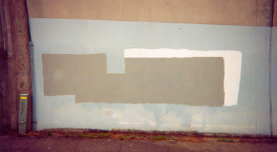
Written and directed by Matt McCormick, a filmmaker from Portland, Oregon, this ethereal short film from 2001 documents the seemingly mundane job of graffiti removal (or, as we graff writers call "buffing," or "getting buffed"). While we follow a couple of regular-joe-type city workers as they cruise the streets looking for graffiti tags and other various aerosol activity from the previous night, the filmmakers intercut with very very long artsy shots of various factory walls covered with sporadically painted shapes, complete with heady art-school voice-over ruminations about this potential "art movement."
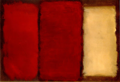
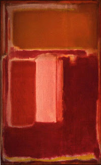
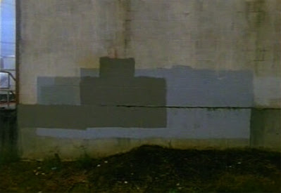
Yes, you read that right. There is a sort of tongue-in-cheek humor that permeates throughout the film, as the female voice-over describes this activity as being "one of the more intriguing and important art movements of the early 21st century." And just as art movements have roots for their state-of-being, she even goes so far as to say that this art movement's roots stem from abstract expressionism, minimalism, and Russian constructivism. We hear the names of Rothko, Rauschenberg, and Malevich mentioned as their work exhibits stylizations that the "graffiti removal artists" are perhaps referencing. And I can definitely see why. The following two paintings are by Rothko, and you can see how the use of abstract but organized shapes evoke the same sense of this deliberate painting-over that the subconscious artists do in the third image:
Untitled (unknown date)
Untitled (Plum, Orange, Yellow), 1947
Somewhere in Portland, c. 2001
This is not to say that these subconscious artists are on the same level as Rothko. It's all about the intent.
Continuing on this academic bent, McCormick takes it a step further and designates three separate methods utilized by graffiti removal artists:
1. Symmetrical: producing identifiable shapes in a series of squares and rectangles.
2. Ghosting: painting over the tag by basically following the lines, whereby the original artwork can still be seen.
3. Radical: where the "artist" uses neither geometry nor the original tag as guidelines.
Now, at this point, I just had to laugh. I mean, it really is kinda funny to suggest that there could be art scholars out there that take the time to analyze, deconstruct and critique work done by city workers, most of whom are completely unaware that what they're doing is being considered "art." It sounds a bit absurd, doesn't it?
I sure did dig it, though. For me, it was the notion that this film dared to be taken very seriously, outlining strong points and showcasing excellent photography, all the while giving you that subtle wink that seems to say, "yeah, we know this sounds loopy, but we're having fun with it." I would even go so far as to say that Matt McCormick & Co. were poking fun at the navel-gazing art community as a whole. And I love that.
By the end of the film, they had me really thinking about all this. The idea that this "subconscious art" could be actually taken seriously raises some interesting questions:
Is it really art if the creator is not aware of it?
To these "removal artists," what they were doing was WORK. They were not thinking in creative terms. They just picked out the paint, the rollers, and did their thing. In fact, in the film, the filmmakers mention that there had to be some creative process going on, as the workers had to pick and choose which gallon of paint to use, and how to paint over the graffiti. But the big difference is that these workers were not making these choices with the knowledge of having an end result (aside from the fact of getting the job done). Is it necessary for the artist to knowingly benefit from the process?
Who really designates what "art" is, anyway? Artist or viewer?
The artist, [Marcel] Duchamp said, is a "mediumistic being" who does not really know what he is doing or why he is doing it. It is the spectator who, through a kind of "inner osmosis," deciphers and interprets the work's inner qualifications, relates them to the external world, and thus completes the creative cycle. The spectator's contribution is consequently equal in importance to the artist's, and perhaps in the long run even greater, for, as Duchamp remarked in another context, "it is posterity that makes the masterpiece."
When it comes to the presentation of art there is a symbiotic relationship that forges itself between artist and viewer. Some artists feel that they don't need an audience in order to create. And to some degree, I feel the same way. Sometimes I like to draw and paint for myself. But someone will eventually take a look at my work, possibly offering their opinion about what they've seen. This relationship between artist and viewer is important for both as it enables the artist to keep in touch with his audience, remaining grounded, so to speak, and enables the viewer to keep in touch with his/her cultural side. Both benefit from this relationship.
This is really a discussion for another day, but for the sake of this post, once that paint was placed over those tags on those particular walls, it was officially up for judgment by the public. And from this public, a one Matt McCormick decided that the act of painting over artwork has merits as being artwork in and of itself. It is a cyclical thing, too, as the canvas changes constantly - each night or each week more and more tags have to be painted over, with the covering paint being different each time, creating a unique pattern on various walls around town. This is all subjective, as all art is, of course, because most will not agree that this activity would even be considered art. I brought this subject up with an intern at Primal Screen and he, in turn, mentioned it to his art-school classmates. They all agreed that there's no way that anything covering over artwork should be considered "art." But I believe that they missed the point. Of course it sucks to have art covered up, even if it is the bastard child of the art world, graffiti -- but what is interesting to me, as a viewer, is the way said covering up looks like in the end.
Photographers do this for a living, every single day -- they point their lenses toward every single corner of our world and somehow make the mundane mesmerizing through their artistic eye. It's all a matter of being aware of your surroundings and realizing that there are some really amazing and interesting things to look at, even if it may just be something so simple as a wall being covered up by paint.
Interesting film. If you get the chance, I definitely recommend you check it out.
UPDATE: I've taken some shots of this "subconscious art movement," myself. Check out this post as well as my Flickr photoset street gallery.
3.11.2005
My Drawn! posts
Thought I'd share with you all my contributions to Drawn!, the multi-author blog that I've been graciously asked to be a part of by Robot Johnny. Drawn! focuses on inspirations in art, illustration, comics and the like. It's a fun site. You should go there....NOW! Here are my three posts thus far:
I've been spending too much time at the website to Los Angeles' Buck. Buck was started up by Jeff Ellermeyer and Ryan Honey about little over a year ago and is heavy on the cutting-edge broadcast design that is oh-so-hip nowadays. Be sure to check out their ID's for "Puma vs. Fuse" and "Wintergreen vs. Fuse," as well as their demo reel. Good stuff.
I've been checking out the work of Doze Green for some time now, as he's been featured in Straight No Chaser, XLR8R, and Juxtapoz magazines. Displaced and dismembered bodies floating admist icons of typeography and arrows, his work evokes a nightmarish world of the futuristic graff writer. Where some graffiti writers run into that proverbial brick wall while trying to crossover successfully into the art-world, Doze has done it with ease. Plus, he's done so without compromising his unique vision. Originally a b-boy from back in the day (he's featured briefly in the STYLE WARS documentary, so we're talking about 1982, y'all), he's not frontin'. He's the real deal.
There is a small gallery still up of work by THE IRON GIANT's production designer Mark Whiting. Who? Truly one of the most passionate artists on that production, Mark seemingly vanished soon afterwards. Or did he? If you check out Mark on IMDB you see that he was the art director for the DUCK DODGERS TV series. and he also worked on some conceptual environmental designs for FINDING NEMO. (You can find a couple of his pieces in the "Art of..." book, if you're curious.) It looks like he's started his own production company, Tranquility Pictures, but the site looks to be a couple of years old.
To see some of his character designs for the Giant, go HERE and then click on the "next" button. His work is so rich and moody, I'd long to see more of it. If anybody knows what he's up to lately, I'd be curious to know.
Be sure to visit Drawn! on a daily basis as there are eight(!) of us posting lots of visual goodness for all to enjoy.
I've been spending too much time at the website to Los Angeles' Buck. Buck was started up by Jeff Ellermeyer and Ryan Honey about little over a year ago and is heavy on the cutting-edge broadcast design that is oh-so-hip nowadays. Be sure to check out their ID's for "Puma vs. Fuse" and "Wintergreen vs. Fuse," as well as their demo reel. Good stuff.
I've been checking out the work of Doze Green for some time now, as he's been featured in Straight No Chaser, XLR8R, and Juxtapoz magazines. Displaced and dismembered bodies floating admist icons of typeography and arrows, his work evokes a nightmarish world of the futuristic graff writer. Where some graffiti writers run into that proverbial brick wall while trying to crossover successfully into the art-world, Doze has done it with ease. Plus, he's done so without compromising his unique vision. Originally a b-boy from back in the day (he's featured briefly in the STYLE WARS documentary, so we're talking about 1982, y'all), he's not frontin'. He's the real deal.
There is a small gallery still up of work by THE IRON GIANT's production designer Mark Whiting. Who? Truly one of the most passionate artists on that production, Mark seemingly vanished soon afterwards. Or did he? If you check out Mark on IMDB you see that he was the art director for the DUCK DODGERS TV series. and he also worked on some conceptual environmental designs for FINDING NEMO. (You can find a couple of his pieces in the "Art of..." book, if you're curious.) It looks like he's started his own production company, Tranquility Pictures, but the site looks to be a couple of years old.
To see some of his character designs for the Giant, go HERE and then click on the "next" button. His work is so rich and moody, I'd long to see more of it. If anybody knows what he's up to lately, I'd be curious to know.
Be sure to visit Drawn! on a daily basis as there are eight(!) of us posting lots of visual goodness for all to enjoy.
3.10.2005
Illustration Friday: Ancient
I have to admit that I cheated on the illustration for Illustration Friday this go around. The theme this week was "ancient," and I really did not feel up to it. It was not my week to be all creative I guess, because, as mentioned before, when you're dealing with two sick kids, it's kinda hard to find inspiration. So I wasn't going to participate; I was going to post about something completely different today.
But I changed my mind when I had this one scan of a painting I did in my sketchbook last year of a 1956 DeSoto ad up on my computer screen. I was going to post it for another day, but when Andrea saw it she asked me if I was going to post this for Illustration Friday. She thought that it would fit the theme considering that some people would think that a car about 50 years old would be considered ancient. I felt that that might be stretching it a bit, but after some thought, I agreed with her. To some, a DeSoto from 1956 is ancient, but to me, those cars from that era are marvelous, beautiful works of art.
So, here's my entry. I didn't work on it this week, but it does fit the theme. Something a little different, but I hope you like it.
---------------------------------------------------------------------------------
Oh, and isn't this an animation blog? Hmm. I guess it is. Sorry about that. It seems that I've neglected in posting about things animation-related.
So uh, yeah. Expect some more animated posts soon. I promise!
Ava Thursday: Ava with Flower
Sorry this was late in posting, but Ava is sick and whenever there's sickyness going on in a household, it throws everything off. Anyway, this drawing was done in mid-October of last year. We had given her a sketchbook for her to doodle and draw in and she filled that thing up with all these wonderful and fantastic characters -- some elaborate, some simple. I like this one, as she says that this is Ava with a flower, and the flower seems to be its own character, with eyes and a cute little smile. The scene is never complete without the ever-present sun, of course.
3.09.2005
Drawn! Out
Special news, folks! Drawn! is a brand-spankin' new multi-author blog "devoted to illustration, art, cartooning and drawing. Its purpose is to inspire creativity by sharing links and resources," as stated by John Martz, aka Robot Johnny, the creator of this endeavor. He was able to round up a nice creative bunch including myself, Jared Chapman, Claire Robertson (Loobylu), Scott Thigpen, Jay Stephens, Patricia Storms and Matt Forsythe. For more info on these guys, go HERE.
I plan to post items on Drawn! that I feel would not fit into some catagory here on The Ward-O-Matic. I stumble upon many sites, links and what-not that eventually sit in my bookmark column without a real place to go. This gives me the perfect opportunity to dump my found oddball links to an unsuspecting audience.
Drawn! has already hit the ground running, with great links for resource and interest. It's bound to be a bookmarked site for many. Check it out.
3.04.2005
Illustration Friday: Jazz
I can't tell you how excited I was to do this week's Illustration Friday theme. Jazz holds a very special place in my heart as Andrea and I both started listening to it during our first year dating. Lady Day, Ella, Louie, Bird and Monk became our new friends that rookie year, and as I took a Jazz History class in college, it further solidified my love for the artform.
Jazz is honest and pure. There's so much more I could write about it, but that would take a small eternity, and I wouldn't want to bore the socks off my entire audience. That is, if I haven't already.
3.02.2005
Ava Thursday: Sparkly Shoes
Another fun drawing by Ava, my 4 1/2 year-old daughter, drawn last June. This is her with "sparkly shoes." Now, who doesn't enjoy a moment with some nice, red, sparkly shoes?
It's interesting to see how much she's progressed artistically since then. In fact, it's even more interesting to see her development from June to October of last year (see last week's drawing). Going from stick arms to arms with volume was probably a big transition.
I'm thinking about doing an Ava Thursday where we see her progression from her earliest drawings on up to very recent. That'll be pretty interesting, don't you think?
3.01.2005
What's In a Name?
So far, nobody's really asked me where'd I get the name "Ward-O-Matic," but I've had some people say that they were intrigued by it. And that was why I chose it. At first, I thought it was too cheesy, but the more I thought about it, it seemed like the perfect fit as the title to a blog written by an artist named Ward. Plus, I thought that it would catch your eye.
Originally, I used the name "The Ward-O-Matic" as the name of my iTunes ID at work. Since we're all pretty much Mac users at Primal, we all listen to our iTunes on a constant basis. And I love the fact that you can listen to your fellow co-workers' library of mp3's via sharing. I chose the name Ward-O-Matic as it was a bit retro, plus it was similar to the idea of the Automat, a place where they dispensed food mechanically through a series of windows when you put your coin in the appropriate slot. There is a Looney Tune cartoon that uses this for gag purposes. So with The Ward-O-Matic on iTunes, my feelings were that you can listen to a nice, large selection of interesting tunes at your convenience. For free.
And now, with the blog, the name "Ward-O-Matic" just made sense to me. I think of it as a place that dispenses links, interesting artwork, illustrations, commentaries and the usual hot-air rants at your convenience. For free.
Continuing on the Automat vein, Clark Whittington. an accquaintance of Doug Grimmett (co-founder and Creative Director of Primal Screen), started up a pretty interesting venture, called The Art*o*mat. He takes retired cigarette vending machines and converts them to vend art. Huh? Yes, art. For five bucks, you can become a bona fide art collector by purchasing an original cigarette pack-sized work of art from local or not-so local artists. It's a fun concept and very original. If you want to find an Art*o*mat machine in your area, just find one HERE.