There are three very good sources for Symphony In Slang layouts:
1. Tex Avery, by Patrick Brion. This is the most extensive resource not to mention the most expensive. Luckily, I was able to borrow a copy from my good friend Dave, aka. Dr. Strangetoons. (Thanks, Dave!) What's remarkable about this book is that all of the layouts are actual size and are all printed on nice toothy, thick paper and not the thinner, glossier kind the rest of the book is printed up on. Makes it look like they grabbed the original layout drawings and bound it just for you in this book. Probably why it's been out of print for over 20 years. That and it's entirely in French. Strictly for hardcore animation book completists (you know who you are).
2. Tex Avery: The MGM Years, 1942-1955, by John Canemaker. This came out in the mid-90's and features some great artwork, ranging from original animation sketches & layouts to original production cels. One interesting thing is that this book also features some "recreated" cels -- paintings that look and feel like the real thing but have been recreated from original production drawings. There were a couple of decent Slang layouts I scanned from this book.
3. Tex Avery: Les Dessins, by Patrick Brion. Not as hard to come by (and certainly not as expensive) as Brion's other book, "Les Dessins" is a soft cover book that features animation drawings and layouts only. No color, save for a second color of red for whenever there were some director notes scribbled in red. Again, everything printed in this book looks to be life-sized and not reduced. There's even a couple of multiple fold-outs of background pan layouts that are very impressive when you unfold them. Most of the Slang material in this book were of, surprisingly enough, scenes cut from the final film. (More on that later.)
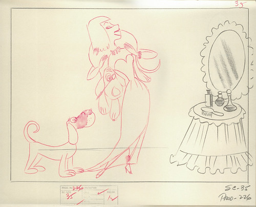
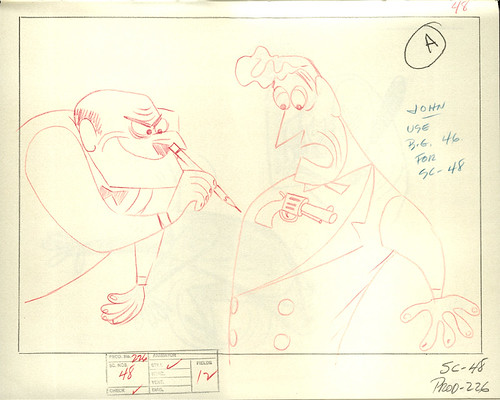
A note about these layouts: What's exciting for me when I scroll through these images is the fact that the rough layouts were most likely drawn by Tom Oreb himself. You can just tell in the quirky way that the characters were drawn and how Oreb utilized the pencil to create shading and blending effects. There's a certain looseness, yet direct quality in his designs here -- very simple and effective. When I study these layouts, I'm noticing how each character is staged, and how the action is going to play out. For this cartoon, camera movement was pretty much kept to a minimum, allowing us, the viewer, to take in each gag as it's presented. Again, simple and effective.
You'll notice that there'll be other layouts that are cleaned up, with red pencil used to signify character movements. No telling who did these drawings. An assistant, most likely, but there's a slight chance it could've been Oreb, tracing over his own rough layout drawings. Slight changes are sometimes made from the rough to the clean version, based off of any director's notes. Not sure just how much could've been changed for this cartoon, but at least it looks to me that a good amount of the scenes featured here were identical to the final version.
Onto the LAYOUTS:
From "Tex Avery", by Patrick Brion:
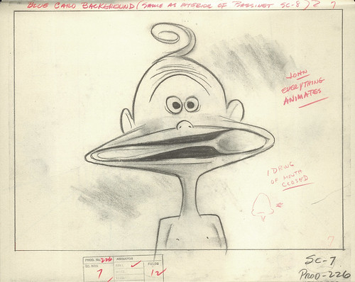
The "John" mentioned here on some of the scribbled notes was probably background painter John D. Johnson, who worked with Tex Avery during his MGM years. You can see some more of his work here. He did the "Red Hot Riding Hood" backgrounds in the first part of the post.
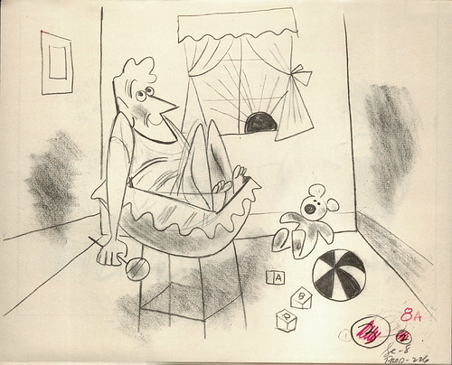
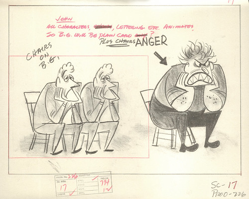
This is my favorite gag in the film.
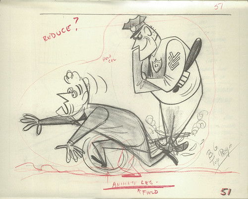
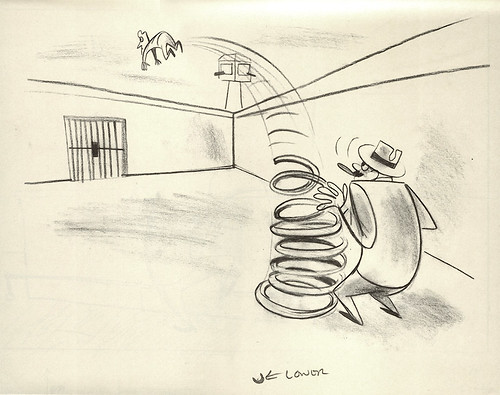
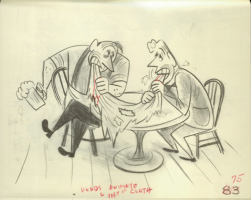
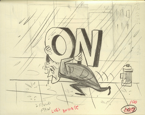
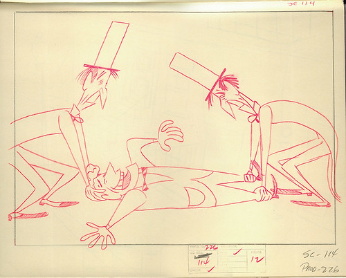
From "Tex Avery: The MGM Years", by John Canemaker:
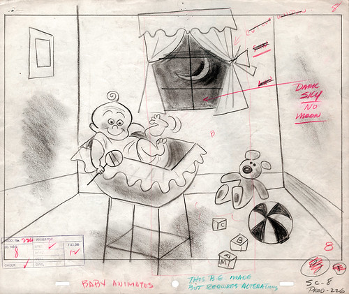
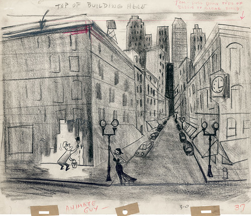
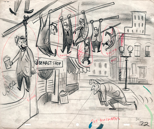
There were many more slang terms that were not used in the final film. Whether it was because of timing or just not good enough gags, there's no way of telling. Either way, it's fascinating to see just how many of the layouts for these cut scenes survived.
Take this scene, for instance:
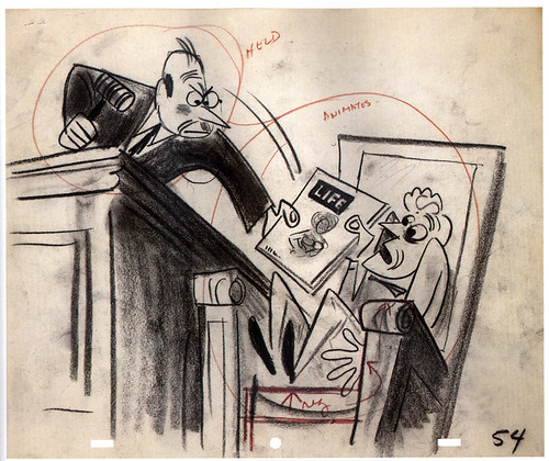
I'm thinking that the line would've been "The judge gave me life!" Compare this rough layout to the cleaned-up version below:
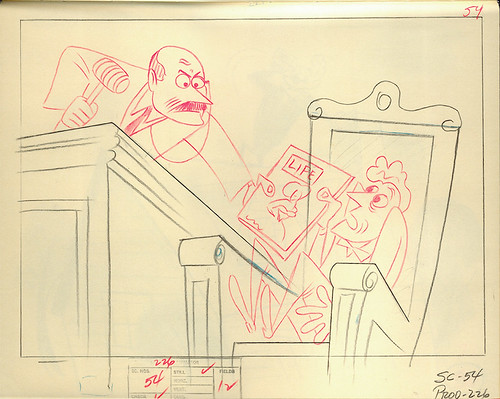
You can see changes made to the judge, probably to get the best possible pose in this shot. That's my guess, at least.
Here's some more cut gags/scenes:
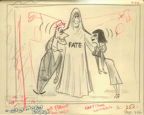
"Fate brought us together..." I can see why this wasn't used. Everyone has their own interpretation of "fate" (isn't it usually depicted as a female?), so maybe this was cut because of it not working out. Maybe. Anyway, I like "...and then our eyes met," much better.
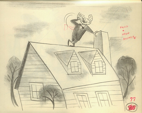
"Drinks were on the house!" Item worth noting: this gag was used in another Tex Avery cartoon: "The Shooting of Dan McGoo." Checkit at 3:30 into the cartoon.
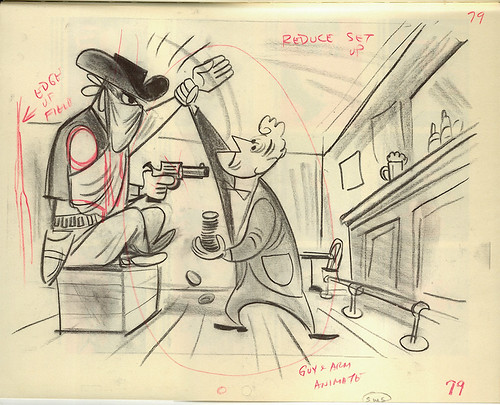
"Played with the One Arm Bandit," I'm assuming. Corny gag.
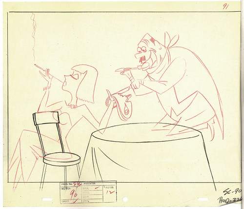
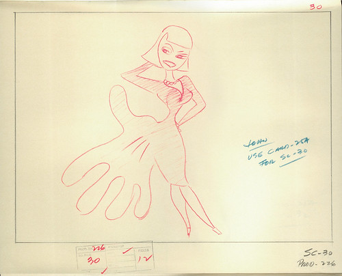
"She had him eating out of her hand." It probably worked better story-wise for the guy to have the upper hand, don't you think? This gag gives Mary control, and not the other way around.
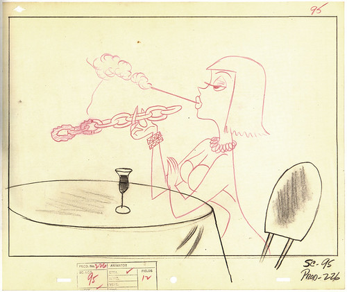
"She was a chain-smoker." Ha -- I like this one. Too bad it was cut. These last two were from "Les Dessins", by Patrick Brion.
There are plenty more layouts (along with many other images) from this wonderful cartoon on my Symphony In Slang Flickrset. Hope you enjoy.
Oh, and in case you're wondering, this is all part of research I'm collecting for a super secret side project I'm currently working on, paying homage to the great cartoons of the past. A short film that's being concocted down in the basement right now.
Up next: Backgrounds!

wow! great finds!
ReplyDeleteMan, love the concept sketches - great post! And is this 'secret' project personal or work related?
ReplyDeleteWOW.. i love this short! The play on words is so great! The fact that you found these layouts and concepts sketches is even more fantastic! Thanks for sharing!
ReplyDelete