UPDATE: Several readers and myself have come to the conclusion that the unknown illustrator here is none other than the late great J.P. Miller! Many thanks to those with sharp eyes and a keen sense of illustration history.

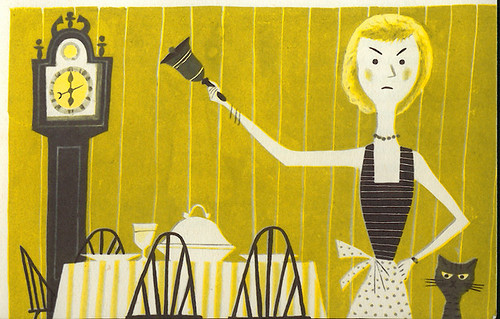
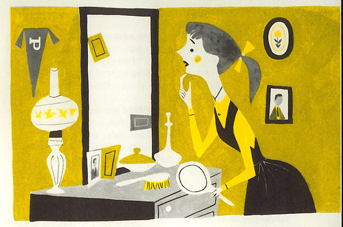
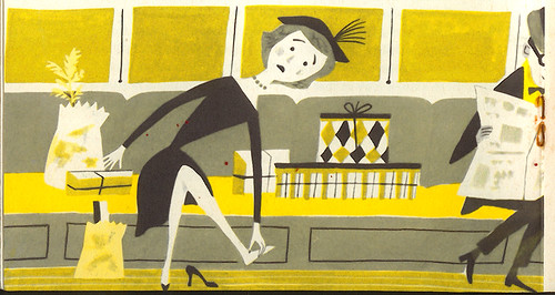
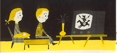
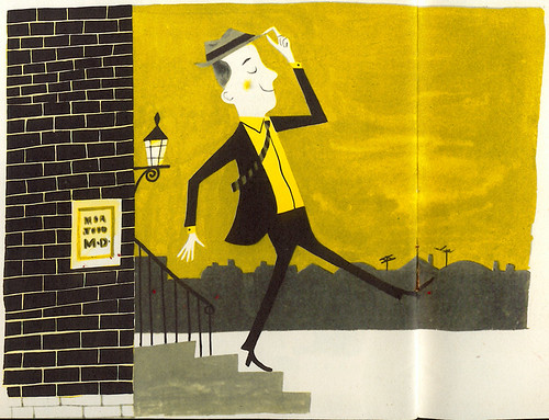
There's more to this booklet as well as tons of other fun vintage illustrations in my Fun Ephemera Flickr set. Be sure to view it as a slideshow. Fun!
Other diversions:
Amid has some great Tom Oreb drawings over at Cartoon Modern. Be sure to read his thoughts on "flat" design here. You know I just had to give my two cents in the comments.
I have a BIG blog crush on Jen's wonderful Blackwing Diaries. Jen has been a big supporter of The Ward-O-Matic from way back when and I cannot give her enough praise and support myself in what she's doing on her blog. Insightful posts about Disney, storywriting, story pitching, the animation biz in general, as well as posting some fantastic vintage photos and knicknacks from back in the day. She's doing what every good blogger should do and that's create an inspiring account of your world, your interests, your passions -- with great writing. Excellent job, Jenny. Keep it up!
Flickr-hopping:
Vintage Disneyland: Grickily's great collection of vintage photographs of Disneyland from 1955 to the 1970's.
Signs and Entropy: Neato signage from Lord Jim. They don't make signs like they used to.
Jet Set Ruins: Never has old airplane wreckage and ruins looked so GOOD. 85 photos by Telstar Logistics. Is Oceanic Airlines Flight 815 in here anywhere?
The Sam Remo Groove: I'm diggin' ChicagoEye's set of 70's magazine ads. Right on.
That is all for now. This weekend I'll be working on the previously mentioned posts. I promise!
Have a great weekend and, oh, yeah -- It's Photobooth Friday!

That Metropolitan Life pamphlet is the coolest! Coincidentally, I just picked up another old Metropolitan Life item at a used booksale recently -- a 1957 cook book. Lotsa nice cartoons of anthromorphized food items in there that I'll have on flickr soon, I hope.
ReplyDeleteCarry on, blog twin!
very well written and interesting your blog. i'll definitely come back for a breath of intelligence!
ReplyDeleteThat reminds me... I have a book for you. It's an old book from the 50's that my mom was throwing out. It looks like it would be right up your alley.
ReplyDeleteNice find. I love the palette: black, greys, and ochre. It's amazing how the artist was able to get so much out of such a limited palatte. It's interesting that the palatte subtlely alludes to the black and yellow police hazard tape found at the scene of an accident. Was that connection with life insurance intentional or subconscious for the artist? Hmmm...
ReplyDeleteI was also very inspired by the talk about "flat" drawings. I'm so glad it's being addressed. Some people just don't seem to get it. What makes that style so interesting is the "Cubism-lite" approach that is required by the artist to create it. Not only must the artist have a great understanding of rendering traditional perspective and depth, but they must also have a grasp of design theory. That's what I love about it. It's so cool to hear about these things being verbalized. It takes much more than just putting sharp angles on everything...it's creating forms that exist as "ideas" of what they represent. Creating mass with a quirky geometry. Do you see it similarly?
I like your writing about such things, because you really break things down. I've always admired your ability in seeing the design side of drawing...integrating typography, unusual angles and planes, and design motifs. Many people who can simply "draw" don't work on these levels, don't you agree?
Yikes...I hope this comment doesn't come off as stodgy.
I completely agree with Justin.
ReplyDeleteDrafstmanship has to be about more than just rendering. I know that I struggle with this aspect of drawing. I spend so much time learning to "draw" that I let the design aspect of what I do suffer... It's a much more wholistic way of looking at drawing.
I hope this makes some kind of sense...
Hi Wardomatic,
ReplyDeleteI think your kind of illustrations would be great to use for a video-clip to my song "Space Machine". It's available on my website www.renevis.mysites.nl on the page of CD Space Machine. Please listen to it and let me know at renefifi@zonnet.nl