6.30.2005

Ava Thursday: Spaceships and Mommy


Click on image for a closer look at the alien onslaught!

And now, another edition of Ava Thursday, wherein I showcase a drawing by my 4 1/2 year-old daugher, Ava, every Thursday. She's a talented little girl, and I'm a very proud father.

This week's drawing is from November of last year, when Ava's cousins, Naomi and Matt, came into town to visit for the holidays. Up until the visit, Ava's drawings were getting a bit more elaborate with the attention to detail increasing slightly. But when she and Matt sat down one day with some paper and crayons, the creativity in her drawings afterwards increased ten-fold. Ava's always been an observant one, often mimicking various shapes and character details from my drawings into her own. So here, she watched Matt draw these fantastical scenes of buildings being attacked by UFOs and aliens in spaceships, which was quite a change from Ava's own usual scenarios of girls in dresses, flowers, and sparkly shoes. I can only imagine what was going on in that bright little head of hers upon seeing the barrage of action and landscapes that cousin Matthew presented to her on that day.

Afterwards, Ava created some of her own spaceship scenes, with this particular one featuring mommy, obviously distraught over these unwanted, flying visitors destroying our house with their laser beams. That's a car to the left of the house, by the way.

6.28.2005

Abundant Linkage 3

Figured I'd pass on some more links I've unearthed throughout my cyber-travels of recent. Bonus points for those who might've noticed a couple of new changes along with some new links over on the right column there. I've been meaning to clean up some of the links, with easier catagories to sort through, but in the meantime, I decided to add a new catagory that is a bit close to my heart: All about me. Since this is my own blog, I realized I did not have a particular area for those who are unfamiliar with who I am and what I do. So, you can now check out a couple of links that showcase my work, my photos, my wife's blog, and my workplace. Nothing like a good ol' fashioned big, fat ego, eh?

Onto the new links:

In Animationblogs, there are a couple of blogs that I check out from time-to-time, as some of these guys have some good things to say about the industry. Keith Lango is an animator from Dallas, Texas, who updates his blog very regularly. He even offers some tutorials on a subscriber basis, and better yet, some of the tutorials are available in several different languages. Great job, Keith!

Notorious Newsquirt is the moniker of Jason Newkirk, a 3D animator from Seattle, Washington. He's been in the gaming industry for 8 years. Give him a pound, y'all.

And now, with the advent of blogs, it was only a matter of time before the people behind the production of animation for TV would pick up on the phenomenon and start their own production blogs, or "plogs." The first, of course, is Lili and Eddie's Fwak! Blog, which pretty much was there from the beginning, before everybody got on the bloggity-blogging bandwagon (including me). Now, we have The Wubblog, and The Teenage Roblog. All are fascinating in checking out the inspirations, the progress, the people involved in the making of a particular show.

In the Artblogs section, be sure to check out Snyde Remarks, the blog to artist/illustrator Csnyde (not sure how to list that name). Also, how can I not mention my good internet-pal, Steve Mack? Steve has a great blog, showcasing his latest work (most notably, his Illustration Friday submissions) at Spot Illustration. Go there, NOW.

I just recently posted on Drawn!, a fantastic artist who's the artistic director and background designer for such shows as Samurai Jack and Foster's Home for Imaginary Friends: Dan Krall. Wonderful paintings with great style and flair. I especially love his drawings and caricatures, as he definitely has a Ronald Searle feel to them. And I love Searle with his scathingly funny drawings. (Another site about Searle HERE.) Krall's caricatures of celebrities are stretched and pulled, with no holds barred: the way any good caricaturist should be with their subjects. No holding back. Al Hirschfeld, considered one of the best caricaturists that ever lived, didn't hold back and he did his thing for about 80 years.

I've added a new link catagory: Art Minded -- of, or having to do with sites that are anything art-related, such as artists, illustrators, and animators who do the art-thing on the side. I've had the great luxury of interacting with some of these wonderful artists, such as Jen Lerew, Steve Mack, Nathan Mazur (Scared of Bees), and Paige Pooler, through my blog. Some wonderfully gifted people with fabulous personalities. I'm honored to know them. (You gotta love the internet.) Anyway, I know that there's a lot of leeway here in trying to figure out where do I draw the line between artist and animator, but like I said, I might have to do some more organizing in this matter. In the meantime, please check out some great work by these fantastic artists I've featured here. I'll definitely be updating this section periodically, so be sure to check back often.

Hey --where are the dance blogs? Anybody? If you're into dance, be sure to check out my wife's blog, hula seventy, as she has a couple of links to dance companies and dancers who've inspired her and who deserve more exposure than they're probably getting. We're talking modern dance and the power of movement here. I've seen some of the dancers she's linked in motion, and they are indeed impressive. Give them some love.

Gotta run.

6.24.2005

A How-to on Black & White

As promised, I thought I'd show you guys a little "how-to" on the thought processes for my recent Illustration Friday piece, Black & White. You can add this to your Special Edition Ward-O-Matic files, I guess. Since I did not record my progress when I initially worked on this piece, I tried to replicate the steps here the best I could.

First, the concept. I immediately thought of a film noir scene when I first read of the week's theme, black & white, and so, being that I had recently wrote about Frank Miller's Sin City, I wanted to get real dark and gritty. I wanted to go to both extremes with the tone, from bright whites to jet blacks, from bright lights to sunken shadows. So, what a better setting to convey this type of scene, than in a bar? I sketched this guy out with my red Col-Erase pencil on animation paper on the second try, and then scanned him in at 150 dpi (300 dpi is normal for print and such, but since I knew this would be on the web, I figured there's no need for him to take up too much space in my computer), and tweaked levels to darken the subtle lines. I need as much of the pencil lines as possible before my next stage. (Most of these images are clickable for larger views.)


Next, I want to get rid of all the whites, so I can have freedom in painting and coloring. Where I work, Primal Screen, we have all these Photoshop actions for various cel-oriented jobs, and one of them is a "delete whites" action. I went in and tweaked the action so it would better suit my needs and came up with this: before I do anything, I make a copy of the background layer (the layer your current image is on), and then select the top layer and go under Select=Load Selection... If all goes well, I usually can just click "OK" and all the white is selected in that top layer. I then press "delete," and hopefully all the white in that layer is gone, including half-tone whites. See, getting rid of the half-tone whites is very important as that ugly halo effect will not be present if I just selected the white areas with the wand tool.

UPDATE: I found out that in order for the Select=Load Selection to work properly, the image must still be in "Greyscale" mode. Once you delete the whites, you can then convert the image to RGB or CMYK mode, whichever you prefer.


After deleting the bottom background layer, I add a new layer and place it under my image. I then click on the transparency lock for the top layer, which I now call my line layer. This will allow me to color only the line itself, and nothing else. Nice. Okay, so originally, my idea was to have a big diagonal black shadow run across the entire image, with only half of our friendless barfly visable. But as I am working on it, I realize that I'll lose some of the impact of the light coming in from the door. Anyway, I select my bottom layer and go ahead and fill in the area on the right in black, and fill in the rest with white. This bottom layer is now my color layer.


Next, I select the top line layer and then grab my trusty pastel brush over in the brush tool menu. It's about two-thirds down. I use the eyedropper to select the white for my brush and then start to color in the line that's now in the black area, to white. After this, I start to have some fun. Back on my bottom color layer, I go back and forth between black and white and start to work with the pastel brush to get a good idea of shading and lighting. How much am I willing to go with the shadows? Should I make the entire room black? Should I have a harsh light emit from the one window in the door? How harsh should this light be? All these questions go through my mind, plus more.


As I was working on this piece, I started to realize that the more lines I hid, the stronger the image got. If you'll notice in the final image, the guy's head in shadow has only a few highlights of lines to denote his hair and ear. I figured that the audience will know that his head continues back there, so why should I have to show all the lines? To do this, I did NOT erase the linework, but instead colored it black. That way, if I changed my mind later on, I still had the artwork intact. And by the way, I did not use the airbrush brush at all, only the pastel brush to do all my coloring -- background color and line color. I try my best to stay away from the default airbrush they give you in Photoshop as it tends to look too "computer-y" (except in a few situations where it's called for). It's too perfect. Here, I wanted a human element involved, to make it look like someone got their fingers all smeared with charcoal or pastels.


As I work, I start to get a feel for the setting, the overall ambience of the place, and try to get that feeling across through my brushstrokes. At first, I want to show all the smoke in pure white, but once I darken part of it on the right side, it somehow feels better to me. It looks "right," somehow, and I leave it be. Sometimes initial ideas don't always work out the way you imagined it in your head. (Remember that big idea I had earllier, with that diagonal shadow splitting the image in half?)

So, alas, we have here the final image, after much tweaking and noodling. Of course, the more I look at this, the more things I want to change. Why is that always the case?

6.23.2005

Ava Thursday: Runny noses


As for our sweet little artist and her doodle for the day, this was a drawing she did some time ago, maybe when she was 2 1/2. She was on this head kick, where she would draw heads all the time. The way she drew them was always the same: circle for the head first, then the circles for the eyes and nose. Line for the mouth next, and then she'd scribble in the hair and color in the features. Occasionally, she'd add some details at this stage, and here, she drew lines coming from the noses of two of her subjects, denoting runny noses. From left to right, this is Nani (my mom), Naomi and Ava (with runny noses), and Matt. Naomi and Matt are Ava's much-adored cousins who live in Indiana.

6.21.2005

Illustration Friday: Black & White


Click on image for a closer look!

Black & white is the theme for this week's Illustration Friday, and so I just had to do it. I eeked out minutes here and there, spanning a couple of days, to work on it. Just a simple scene of some dude at a bar. That's all. Kinda dark bar, but that's the way those places usually seem to me, anyway. That is, if I ever find myself in one. Not much of a drinker, so this kind of environment is so foreign to me. Plus, I wanted to evoke the look of film noir a bit, with the harsh darks and spot lighting. I had fun with this IF entry.

UPDATE: See how I did this piece with a How-to!

6.20.2005

Out of the mouth of babes...

There's been about three or four times in the past two months where Michael Jackson is shown on TV, in full bizarro regalia, umbrella and all, and Ava turns to us and sweetly asks, "What's her name?"

To which, one of us replies, "Well, ummm..." and diverts her attention with either a Polly Pocket, princess Barbie, or some pretty pink coloring book, as the other quickly changes the channel.

6.19.2005

Oh to be a father

Can I just say how lucky I am to have the best kids known to mankind? And the best wife ever? Yeah, yeah, what great sentimental overdramatic pap I'm pumping out right now, but I'm on a post-Father's day high and there's no stoppin' me now.

It's quite something to add a new label to your persona. When I became an uncle that was such a big emotional deal for me. The term "uncle" sounded so old and official. I was 25 at the time and the last I checked 25 wasn't at all old, nor was it official-sounding. You aren't just given a new label in life; It becomes you and forms you. Maybe I'm not that typical uncle that gives unnecessary advice, smokes Swisher Sweets, or somehow always needs a place to stay, borrowing money from your old pop time to time, but I did become that uncle that liked to act silly, make stupid faces, speak like Scooby-Doo on the phone for birthdays, become instant human monkey-bars, and draw funny pictures if poked and proded long enough. Throughout the years I've realized that once you're labelled something, it doesn't always have to be what the rest of the world expects from you. I know that my niece and nephew will look at me as the only Uncle Ward that they'll ever know, and that they'll love me for who I am.

Becoming a father was like that, but on a much larger scale. It literally took the wind out of my lungs once I saw Ava emerge from her mother and was held up in front of me to witness the beginning of a new, wonderful life. A new life!

A new baby is born! And thus: A new father is born! A new mother is born!

It was so overwhelming and so BIG at first. To have this little thing that you've helped create with someone you love so dearly, in your arms while she's sleeping for the first time in her entire life, well, that's just so HUGE. It's beyond comprehension. To hear the slight whistling of the air going through her tiny nose on her first night on earth: HUGE. To watch her eat for the first time: HUGE. To witness her eyes focusing on objects in front of her, to have her cling onto your index finger, which must seem like a treetrunk to her -- all of it monumental and larger than life itself.

Memories are fleeting, but there are a few moments in my burgeoning career as a father that stand out like tent-poles for me, and I will never forget them. Here are a few:

As I was holding Ava in my arms sometime during her first year, she began to study my face and slowly reached up and ran her pudgy little hands down my rough cheeks, both sides. She did this several times and I just melted right there on the spot. It was as if she was very intent on knowing who this strange person was who was holding her all the time, tickling her just to get her to laugh, making the crazyiest faces she's ever seen. The next day, I was beaming very loudly to everyone at work that they all must experience being a parent, as it's the best thing that's ever happened to me, period. I wanted every guy there to experience what I just experienced the day before. They all looked at me like I was nuts.

To hear Ava laugh is priceless. I made her laugh uncontrollably one night, while mom was out, teaching. It was just after Easter and Ava was almost 2 years-old. I placed one of those plastic eggs that you put candy in, in my mouth and spit it out in front of her. She laughed so much, it sounded like she couldn't breathe, as she would gasp in air with such gusto. It sounded like she was hyperventilating. It was so funny, I taped it so Andrea would see it when she got home.

To witness my two beautiful infants be born right in front of me was simply amazing. (Of course, the pain that Andrea had to endure was definitely not amazing, and she'll have to tell you the birthstories when she's good and ready.) Nothing can describe it. I still think about both wonderful events to this day.

I love hearing Ezra say his first word, "ball." It sounds right on some days, but sometimes it comes out sounding like, "ba, ba, bah." He'll reach out and try to grab the object that looks most like a ball or balloon, but is almost always beyond his reach. Sorry, kiddo. You can't havies.

---------------

My Father's Day was great. Got some wonderful artwork done by Ava, as well as a piece done by both Ava and her mommy, Andrea. I love these new drawings, but am conflicted about posting them, as I can't always share every single Ava drawing that's out there. There are some drawings that are meant for family, and family only, and I plan on respecting that. These drawings are precious, and I love them dearly.

Oh! -- I got some great presents, too. Thank you, Andrea, for making my Father's Day the best I've ever had. And thank you, Ava and Ezra, for making me so proud to be called father. I am truly blessed.

6.16.2005

Ava Thursday: Baking Cookies


I love this drawing by Ava. The colors, the composition in the way she drew herself at an angle, almost as if she's in motion, the shapes, the objects on the ground -- all of it works for me. Ava took extra time in coloring all the stripes on the dress, and the effort shows. I wasn't able to get the story here from our little artist until I returned home from work, so that's why I was a little late in posting this. Ava tells me that this is her baking cookies, with a spoon in her right hand. Over on the far right, we see her red apron, with one of her brown shoes immediately to the left of it. Apparently Ava got so carried away with her baking, that she didn't even notice that she was half-barefooted. In front of her, on the ground are (from left to right): a cookie, sugar, and a bowl. I know, I know, the middle item looks more like a bowl, but I wasn't going to argue.

This is a slight departure from the way Ava's been drawing lately, but it's a welcome departure. The analogous colors are bolder and more aggressive, correlating with each other very nicely. Again, I love this picture.

6.15.2005

Paper Arts & Crafts

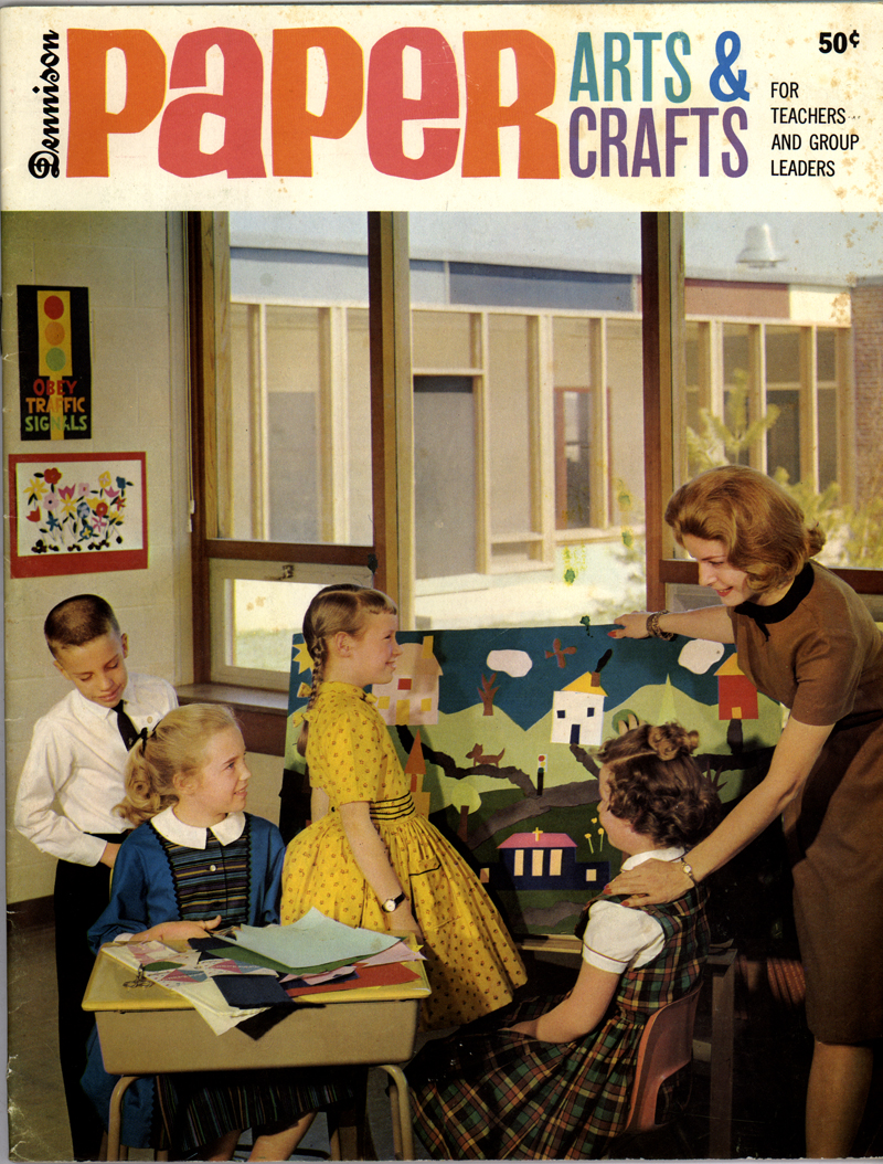
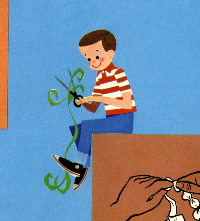
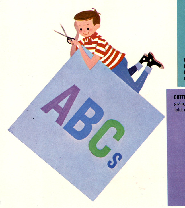
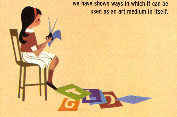
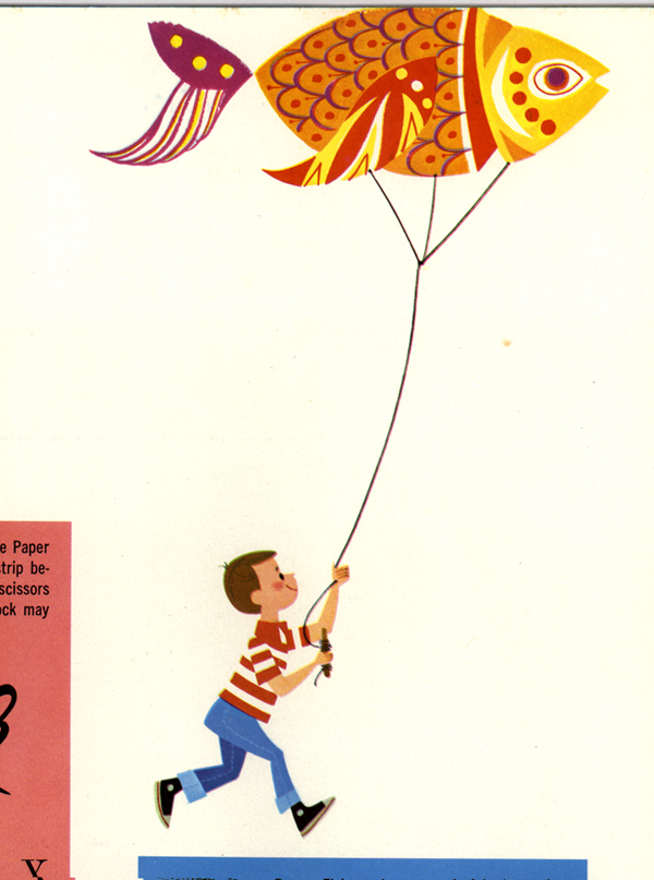
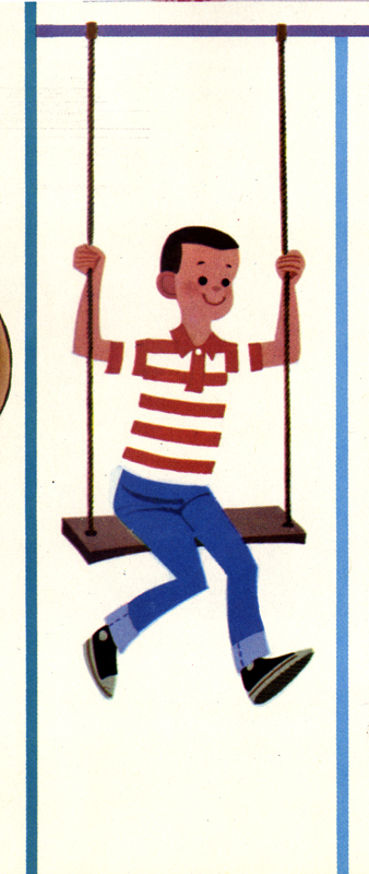
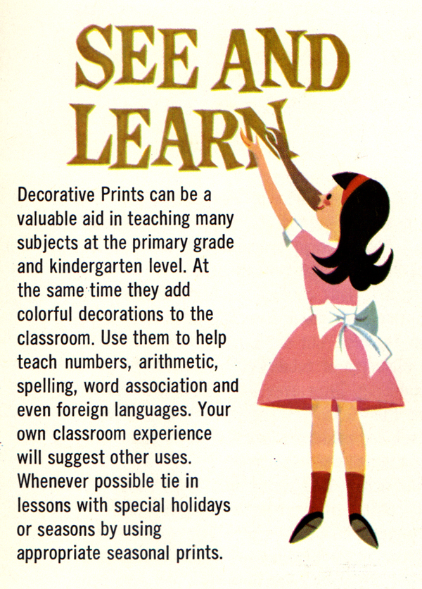
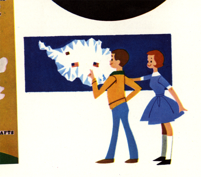
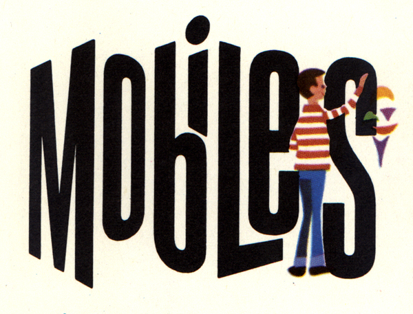
Paper Arts & Crafts coverWhat a great gem of a find. The title of this booklet caught my eye, while sifting through some dusty ephemera at this antiques market in Illinois. The bright reds and oranges were calling me, I guess. I wasn't expecting much, but when I picked it up and thumbed through it, I was pleasantly surprised to see all these wonderful spot illustrations spread throughout. And, again, there is no mention of who did the artwork, but I've seen the artist's work before. I'm guessing that this is late 50's, possibly '57 or '58.

If you'd like to see these images in a slideshow, check out my Flickr Fun Ephemera photoset, and click on the "View as slideshow" link in the upper-right. This photoset will be an on-going thing, with me updating it periodically, adding images from my vast collection of fun, quirky and interesting ephemera, when I get the chance. I'll upload the Busy Office, Busy People images into this set later on, as well as others I've posted here on The Ward-O-Matic. I'd like to have all my scanned wonders together in one place for everybody to check out. Hopefully, it'll be a source of inspiration for all of you who like this sort of thing.

Onto the images:
Paper Arts & Crafts: cutting
Paper Arts & Crafts: ABCs
Paper Arts & Crafts: sitting
Paper Arts & Crafts: fish kite
Paper Arts & Crafts: swing
Paper Arts & Crafts: see and learn
Paper Arts & Crafts: weather
Paper Arts & Crafts: mobiles

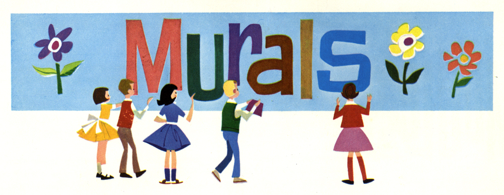
Because the two following images are horizontal, you don't really get a chance to fully appreciate the artwork. So click on them to view much larger versions:

Paper Arts & Crafts: murals
Paper Arts & Crafts: posters

Now, go and cut some paper!

6.14.2005

Birthday Bash

The event was a success and the boy had a great time rubbing cake all over himself. If you're curious reading about all the sordid details, my dear wife has a nice write up at her blog. Andrea does tend to go a little overboard for birthdays and holidays, with all the decorations and gifts -- and she'll be the first to admit it, too --but I must say that to her credit, she's making these special moments quite memorable for our little ones. She's the keeper of traditions in her family, and without her, birthdays would be dull, boring affairs.

Andrea has an incredible creative spirit and a great knack for fun. Even though she's worn out by the end of the day from all the preparations, invitations, decorations, cake and presents, she never fails to achieve what she originally set out to do: make this day extra special for the one having a birthday. I love to see what she comes up with for each birthday, and with Ava's coming up in July, Lord only knows what amazing things will transpire that magical day.

And you just know that Andrea's love of birthdays and parties is rubbing off onto Ava....

6.11.2005

Illustration Friday: Summer

Summer is the theme for this week at Illustration Friday and I first thought, "Gee, that's so...broad." I mean, c'mon! Let's come up with something a little more intriguing!

But then I thought, hey -- my little boy, Ezra is turning ONE today, and that's sorta in the summer, right? A birthday under the sun -- how appropriate. In fact, whenever I think of summer, I will always think of birthdays as Ava's birthday is also during this season.

Yes, Ezra is one year old. I cannot believe how fast this one is growing. Time is passing by me so quickly, I'm afraid I'm missing all the details. I can stop and notice the most minute of details on a series of drawings, or on a commerical being made, but can I do the same for my kids as they are growing up on a daily basis? Am I missing out? I do not want to miss anything. But it's so hard for me not to think this when I'm gone half the day at work. Oh sure, this sort of thing is nothing new. Old hat. Generation upon generation of fathers have gone through this. But this is me and I want to think that I'm different. So all I can do is just get the most out of my lunches with my family and then when I'm home after work. I try my best to go full-tilt with Ava and Ezra every single possible minute.

And thus, I want to get as much as I possibly can out of Ezra's first birthday today. Take it all in. Enjoy the moment.

Happy birthday, little buddy.

Click on image for a closer look.

6.10.2005

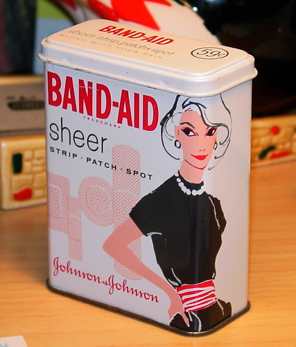
Swank Band-Aid tin


This has got to be the coolest Band-Aid tin EVER. Makes having a boo-boo fashionable, huh? Andrea found this at a booth at the infamous Lakewood Antiques Flea Market here in Atlanta. We were kinda on a budget at the time, but after taking one look at this thing, there was no question in buying it. It was just too cool to pass up. There's no date shown, but I'm guessing '60 or '61.

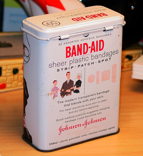
Just look at how the image of the woman wraps around the corner there. I love the fact that the designer(s) used only 3 colors and that they decided to not color her hair. And check out the font used for "sheer." I love it. In fact, that same font is used on the back:


Check out the cool hip family there. Mom knows what's going on. She got style when it comes to covering up boo-boos.

This tin currently resides on my desk at work. I look at it practically every day.

Click on images for a closer look.

6.08.2005

Ava Thursday: Big hand


Before we took off for Florida several weeks ago, Ava got on a big kick drawing with these new markers that Andrea bought for her that were erasable. They have very bold colors and the ink is somewhat thick like paint -- especially when it dries on paper. Ava loved them. She would draw on several pages at a time and get really into it, forgetting about the upcoming vacation to the beach that she was very very excited about.

Now, kids love to do the ol' tracing of the hand bit, with Ava no different. She likes the way it tickles when the marker or crayon goes around the fingers and under the wrist. I find it fun too. For this sort of action, a parent is usually called to help out, but after Mommy helped Ava out on one hand-tracing with the new erasable markers, Ava decided to do it on her own. She very carefully traced her hand and then lifted it to draw the rest of her arm. I did not witness the creation of this piece until after it was finished, so I was unfamiliar with the shape at the bottom there, about the attention given to it, etc. Ava told me that it was her head. I blinked.

"Really? Where?" To me, it looked like a yellow bridge with two creatures underneath. Trolls? Spiders? I was baffled.

"Right there!"

And then suddenly, I saw it. See, when you're used to a certain way that your child draws, to see something completely different takes a while for the gears to shift. Here, she drew the top part of her head, cropped.

Cropped? Omigosh. Ava is thinking about composition here. See, to know why I'm so jazzed about this bit of creative development, you have to understand that kids usually draw everything they know of a subject -- if it's a person, they'll draw the entire kit-in-kaboodle: the body, head, arms, legs, eyes, EVERYTHING. Here, Ava decided that she didn't need to draw the rest of the face, or the head for that matter, and just left it like this, with the eyes peeking just slightly over the edge of the paper there. She made the conscientious decision that we'd understand that there's more to this drawing past this particular point. She cropped the head knowing that it would be crowded and wouldn't look right to her. Quite an important discovery for a child her age!

She ended up drawing about five more like this, with each girl having different features. I'll post the rest up later, as they're pretty fun.

(Oh, and in case you're wondering, she drew one of the new special markers over there on the left. And the thing that looks like an eye on her hand is actually a colorful band-aid. She likes to draw band-aids for some reason.)

Sorry for beaming like the proud father that I am. It's really exciting for me to witness this girl grow and learn on her own.

6.06.2005

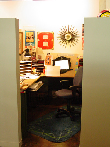
My workspace

Behold! If you dare, my workspace at Primal Screen! Do you dare enter the small, harrowing enclosure that I inhabit daily? Who knows what evil lurks deep within the confines of--

Ah, enough of that. Aren't you curious? I know you are. Here's an open invitation for you all to check out my workspace at Primal Screen in Atlanta, GA. Since I've finally started a Flickr account (there goes the rest of my spare time), you can check out the photoset of my workspace HERE. There're a few details I mention on most of the photos, but you're welcome to add questions or comments. You can even make notes on the photos themselves, highlighting a certain area that you like and writing about it. (Oh, and if you remember, Ava drew a wonderful rendition of my workspace a couple of months ago. Now, you'll be able to see what exactly she was looking at when she drew THIS.)

Flickr rocks. It's so interesting to check out other people's photos and to see where they live, what they do, where they go to visit, (and where they work) etc. It's a great communal site that brings people together in unique ways, all through photography. It's wonderful. And highly addictive. What gets me sometimes are the contacts. If you see someone who has some cool photos that you dig, or they're someone you know, you can add them as a contact. What gets intriguing is seeing who's on who's contact list. Sometimes it's almost like a popularity gauger, but I try not to think of it as that. I just like to check out other people's photos, and see who's on their list. I also like to use Flickr as a great resource, through the use of "tags." If you're looking for a particular item, say, something that's retro, just type in "retro" in the tags search and all photos that've been tagged with that same term will come up. Fun!

You can also post illustrations and artwork, which I plan on doing soon. (I have some of my graffiti up right now.) I just need to get the Pro account, so I'll be able to have 2 GB of storage to work with. I've already used up my storage FOR THE MONTH, with my regular, free account. No lie. Once I get the Pro account, I'll be uploading pics like crazy. I promise.

Anyway, now you all can catch a glimpse of what I get inspired by on my desk, on my walls, in my shelves, etc. I really enjoy my little home away from home at Primal. It's a fun place. And I encourage you all, if you have a blog or site, to post photos of your workspaces as well, whether they are at home or office. It's never a dull moment to see what others are inspired by. And if you have a Flickr account, please feel free to add me as a contact. I have the desperate need to be popular.

I blame Andrea for getting me turned onto Flickr. Darn you, woman!

6.05.2005

Music Baton

This thing has been passed around a million blogs, and so of course it's been passed to me. Here ya go:

Total volume of music files on my computer(s):
21.53 GB at work
8.92 GB in my iPod
5.96 GB in my Powerbook G4

The last CD I bought was:
Heart Like a River by Ida

Song playing right now:
"If It Ain't Been In A Pawn Shop, Then It Can't Play The Blues" by Qwel

Five songs I listen to a lot, or that mean a lot to me:
"Mutual Slump" by DJ Shadow
"When You Were Mine" by Prince
"In The Waiting Line" by Zero 7
"Such Great Heights" by Iron And Wine
"Don't Be Afraid, You Have Just Got Your Eyes Closed" by Múm

Passing baton to:
Andrea of hula seventy
Jon of smart brother
Jared of his Crockpot of News and Thoughts
James of artsmear
sThig of his Artsy Fartsy Weblog

Received baton via:
Jason of deeply shallow

Take that, suckas!

(Oh, and you all can check out what I listen to by visiting my Audioscrobbler page. It's somewhat representational of what I listen to. Sometimes I forget to turn it on. So sue me.)

6.02.2005

Ava Thursday: I am beautiful


Crazy! It's been touch and go since we've been back from vacation and I'm so worn out from it all. Not only have I had to finish up a mad crazy scene this week at work (working all night again last night), we had to prepare for Ava's graduation from preschool today, which was a big fun event. To top it all off, it's been raining every. single. day. since our return and Andrea and I are not happy about it. We want our vacation back. Why can't we have a two, or maybe three -- no, make that a FOUR week vacation? A month-long vacation twice a year, hmm? Sounds good to me. It'll make us all happier people, I tell ya.

So, for this week's Ava Thursday: better late than never, right? I again apologize for the delay in posting. Today has been one wild ride. I was going to post an earlier drawing by Ava from a couple of years ago, but when I found out that she wanted to draw something specifically for me to scan and "put on the computer," well, you know me, I just had to wait.

Ava said that this is Mommy and she has her purse and a red dress with a heart on it. You can see that there's a talk balloon in the upper right-hand corner, and Ava tells me that she's saying, "I am beautiful." Not that Andrea walks around the house saying this all day (unless she does when I'm not around), but I think that this is what Ava really thinks of her mother. She is, indeed, beautiful. And a fantastic mother, too.