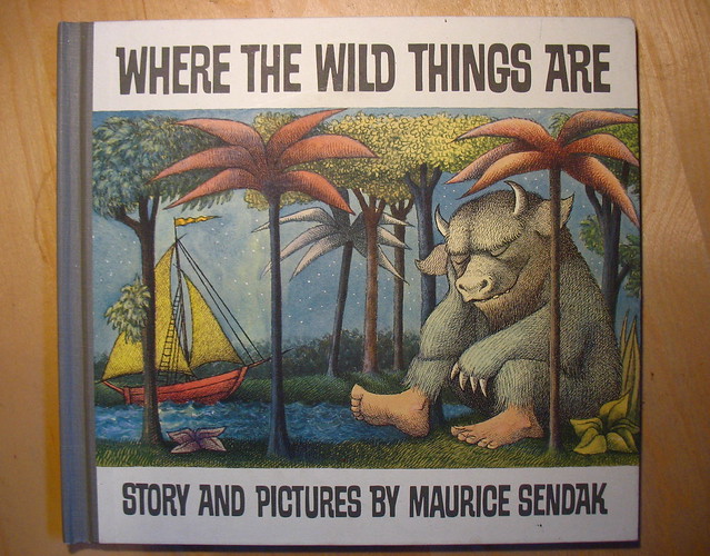
 Where The Wild Things Are, by Maurice Sendak. All images here © 1963, HarperCollins Publishers.
With all the talk about the film, I thought I'd share with you some observations about the iconic children's book by Maurice Sendak from 1963.
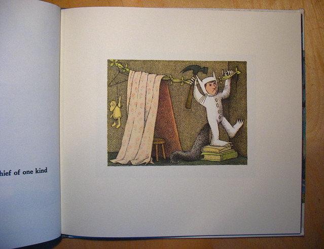
Have you ever noticed the way Sendak constructed the story for Where The Wild Things Are visually? There's a lot more going on. Notice how small the first image of Max is here. He's completely surrounded by white space - a victim of being boxed in. A reason for his mischief? Who knows. It's possible.
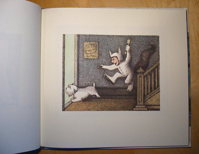
You turn the page and now the actual image has grown ever so slightly.
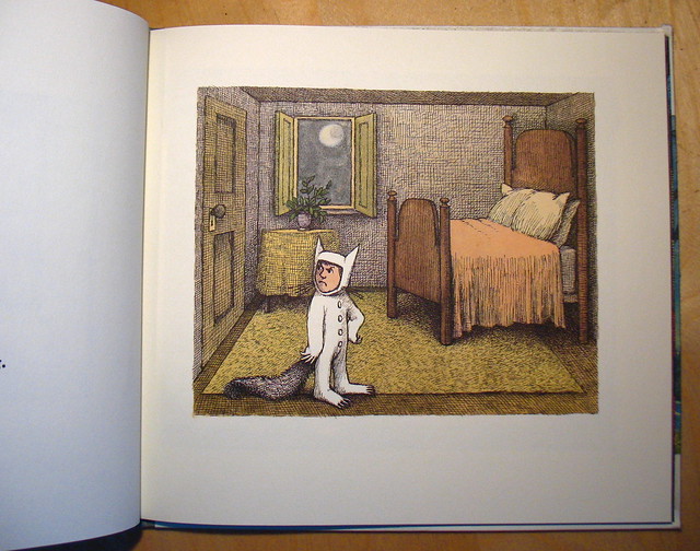
As Max is sent to his room, the image grows a bit more, allowing him now to build upon his own imagination.
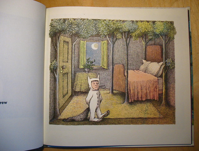
Now, as we slip out of reality and into fantasy, the image grows even more, just as his forest grows. Notice how even the trees break free from the stiff borders, adding to the fantasy element.
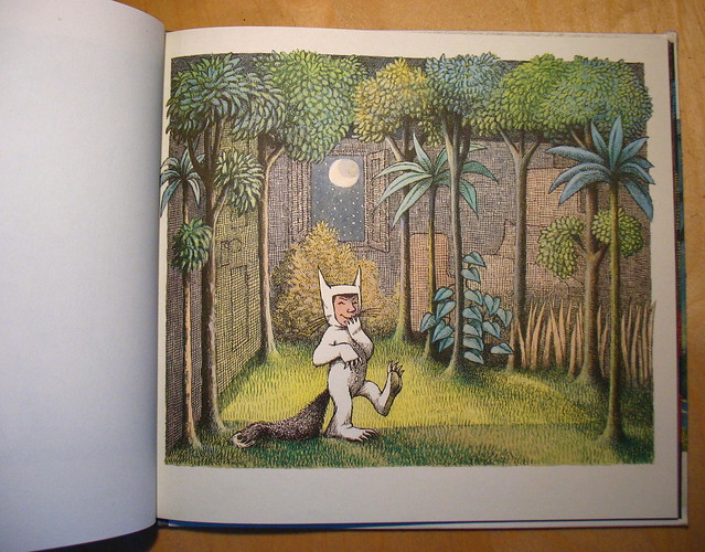
Max is happier now that his own version of reality (or alternate reality) continues to grow.
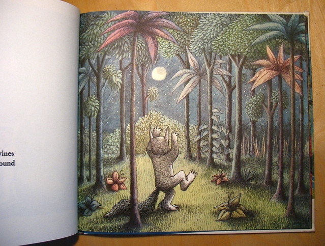
It is here where the image completely covers the page. There is no more white surrounding Max and his world.
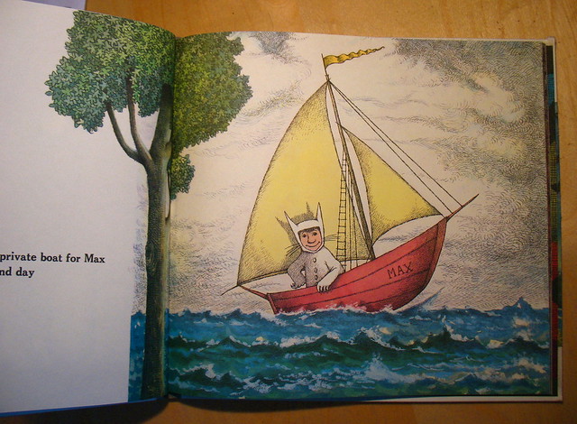
But wait! It's not over. Turning the page, we notice that the image continues to grow even more. If you think about it, this makes sense as Max starts out on his journey.
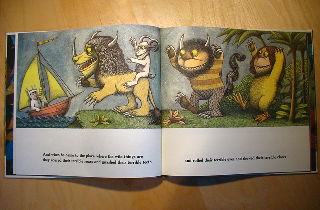
Several pages over and Max has come to the place where the wild things are. At this point, the overall image now stretches from left to right, with white still shown below.
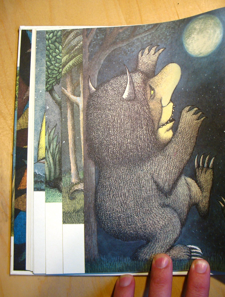
While Max is now at the place where the wild things are, notice how the image still continues to grow. It's such a subtle thing, but subconsciously, I think the reader knows it's happening. Roughly at about the two/thirds mark in the book, the wild rumpus starts and as we turn the page....
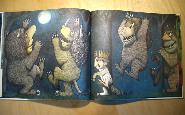
...the image now completely covers the entire spread. There is no more white space, no more words. Max is deep within his world here, and we are completely engrossed by this visual cue.

After about three spreads of pure images (the wild rumpus), the story takes a turn back to reality. Max stops the rumpus and now, white space reappears on the page and the image starts to shrink for a few pages.
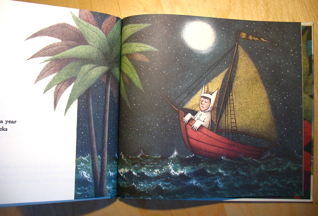
Max's journey back home is similar to when he left - completely filling one page and then spilling out onto the other.
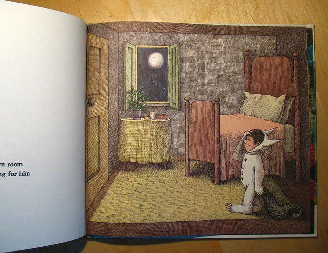
And now, for the last image of the book, Max is back home, room back to normal, now filling the entire page. No more white space surrounds him (I'm not counting the other page), suggesting that maybe Max worked out his issues. Perhaps? It's possible. All is right in the world, as he can now eat his supper. Still hot.
As I child, I remember a few things about this book. I don't think we owned it, but probably checked it out of the library. Sendak's style and the way he drew the wild things definitely left a strong impression on me. They were unlike anything I'd seen before. What hits me the most is when the tone of the book changes. It's when the wild things want Max to stay. When they yell out that they'll eat him up! This evoked a strong sense of fear and danger in me when I was young. Wow - a kid's book where the bad guys want to actually eat up the kid! I thought. It was dangerous. And compelling.
I haven't seen the movie yet, but I want to. I plan to see it soon.

I hadn't noticed that. Thank you!
ReplyDeleteFor what it's worth, the movie has a LOT to do with what you just mentioned here though it does so in a different way.
ReplyDeleteGreat post Ward, and excellent observations. I never had the book as a kid but remember it almost constantly checked out of the library. And it's still so engaging now reading it to my own kids.
ReplyDeleteExcellent observations.
ReplyDeleteThe movie elaborates even more on that. It's all about his anger and hurt, and feeling of being trapped and misunderstood.
ReplyDeleteI thought it was excellent. Don't be put off by the personalities of the Wild Things. At first, they're not what you expect and I wasn't sure what to think... but then they grow on you, if you let them. And it's fantastic.
And very heart breaking at the same time. No one take children to see it.
Even seen/been to the old World of Maurice Sendak attraction that used to be at San Francisco's Metreon? WTWTA rider, Midnight Kitchen Restaurant, and tons of merchandise... was cool while it lasted.
ReplyDeleteWhat a great post synthesizing some of the brilliance of WTWTA! I'm going to link to it on Twitter tomorrow.
ReplyDeleteFantastic, I did a little presentation to my group on my illustration degree course 7 years ago, on the very same thing! I love how the page design draws you deeper into the story but in such a subtle way...Sendak is a genius.
ReplyDeleteThank you for this post. You inspired me to put into words on my own blog what I have been thinking about for a long time. "Where the Wild Things Are" holds a wealth of deeper meanings. I am not sure if Maurice Sendak intended all of this scrutiny, nevertheless, under the least little examination a lot can be taken from his few words and detailed drawings.
ReplyDeleteGreat observation! Thanks for posting it.
ReplyDeleteI believe that Where the Wild Things Are was one of the first books that used claws and pointed teeth. Before that publishers shyed away from monsters and creatures having those, as they might frighten children. This book was definitely a pioneer.
ReplyDeleteThe movie is great.
I had noticed that when I decided to re-read the book a few days ago! And the way you say it, man, it makes Sendak look like the greatest genius ever. *sigh* It will always be one of the greatest picture books ever.
ReplyDeleteGenius. How did I fail to notice that before? Thanks so much for a great post!
ReplyDeleteFor such a simple story there is a lot going on! Thanks for the astute observations, Ward.
ReplyDeleteHeaded over from Betsy Bird's #1 post... I LOVE this breakdown. So subtle, so expertly cued, so Sendak. Thanks for this!
ReplyDeleteYou're welcome, Carter! Thanks for coming over and commenting. I love sharing stuff like this with others.
Delete