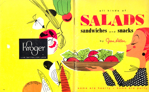
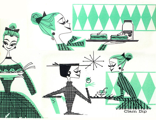
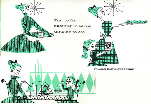
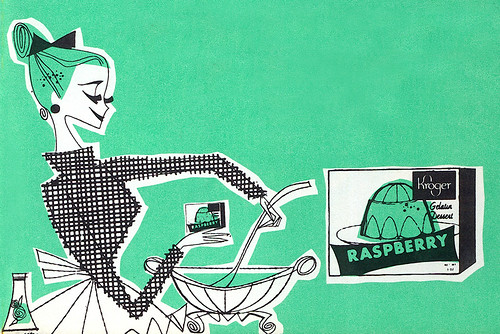
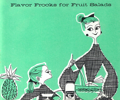
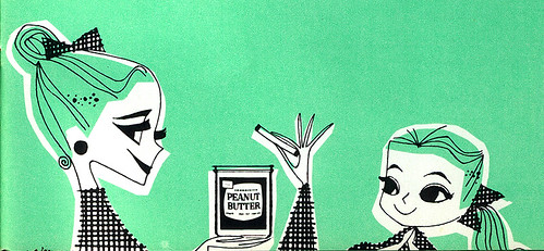
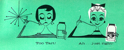
Man, that's some serious mascara going on there. I like the way the little girl is depicted. Very cute design. And gotta love that lettering. Very suave and sophisticated.
In a comment from one of these Flickr images, theappraiserlady quotes architect Charles Moore: "A good case can be made on evidence collected from all over that the future came and went in about 1957."
If you like more of this type of stuff, check out Vintage Cookbooks.

You know how I feel about these: I LOVE THEM. Your retro recipe collection just keeps getting better and better.
ReplyDeleteMan, I love all this vintage design you keep postin up. Where do you keep finding it? Is it you're walking along eating a sandwich and boom...it's in your wallet or something...i don't know, why I'm asking.
ReplyDeleteIt's really neat.
Wow! These are gorgeous.
ReplyDeletethose are georgeous...simply beautimus. sigh...i needs to draw more.
ReplyDeleteThese women sure are lovely. Lookit those fresh-scrubed faces, sparkling eyes, and perfectly placed hair! But watchout - I bet they'd turn on you in an instant if you arrived with a slightly cold casserole dish or a single wrinkle in your wardrobe. Your family's name would be tied to a stake and burnt like a witch!
ReplyDeleteGreat stuff! All the inspiration for Tadahiro Uesugi and Charles S. Anderson in one post! Thanks for sharing.
ReplyDelete