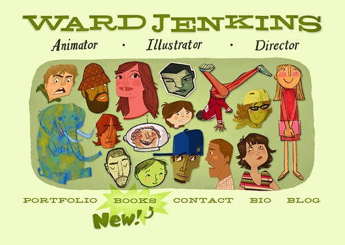
I finally redesigned the website and it's now up and running! New section I'm happy to unveil: Books! Take a look around, click on all the fun clickables, see if everything is working correctly...
This intro page has only a few things different than the first version, but the redesign is all about the rest of the site found within. For instance, since I was brand new to iWeb for the first version of the site, I had no idea about centering the entire layout for each page, resulting in some wonky pages. Another thing I fixed: I didn't like having to scroll down a bit for each image in my Illustration portfolio. By shrinking the main header of "Ward Jenkins" and all the categories in the navigation bar at the top, I was able to keep it simple, allowing more space below. Now, practically all my portfolio images are viewable without having to scroll down.
Besides the new Books section, I've also split up my Illustration section into two categories: Personal and Published. Took down some old stuff, put up a whole lot of newer stuff.
Yes, an entire section devoted to my first children's book: How To Train With a T.Rex. You can check out some pages (as well as the sketches), lots of sketches on how I drew Michael Phelps, and, of course, the easter eggs found in the book. Since most who visit the Books section could possibly be kids, I'm thinking of creating an entire Kids section. Still need to mull it over, though, figure out the possibilities, how it would fit within the rest of the site.
Enjoy the new look!

Your website is terrific! I just love the Trix yogurt commercial- thanks for showing all the cool behind-the-scenes sketches! Your work is way cool, Ward!
ReplyDelete