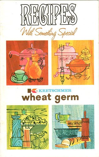
More inspiration for you guys, this time from Kretschmer Wheat Germ, circa 1971. Even though it's dated a little later from what I normally post, the illustrations found in this little cookbooklet (yes, I made that word up) are fun, colorful and lively. It's an interesting group of illustrations here because they almost serve as a bridge from the cheerful & simplistic 50's cookbook illos to the more decorative and graphic, pen & ink style of spot illustrations seen in the late-60's and 1970's. I'm no expert on this, just a simple observation.
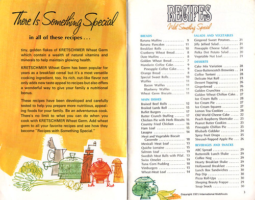
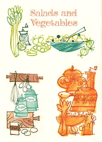

Mmmmmmm...I'm gettin' huuuuun-gry
ReplyDeleteWhat I find interesting from these is how important the choice of font is in really dating an image.
ReplyDeleteAny of these illos could be easily replicated in Photoshop, but how many people would think to use that font type to really push it over the edge?
I really like looking at these old illustrations. The illustrations are so simple and make them so completely captivating. I can study these things for hours.
ReplyDeleteThanks!
These are so beautiful!
ReplyDeleteSo many recipe books from the 60s are loaded with cool illustrations; these are no exception. Cocktail books from this era are golmines, too. Great stuff.
ReplyDeleteSimplicity reigns supreme! Jeez, these are great.
ReplyDeleteI love these illustrations. I was learning to cook for my grad school husband about this time. Just had a scare today about Kretschmer Wheat Germ in fact; we were told that our supermarket couldn't get it any more. Since I've been eating it since the fifties, that would be unfortunate. Thanks for putting this up!
ReplyDelete