Click to view larger.
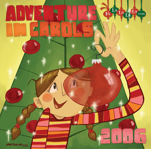
Here ya go! This is the cover to this year's ADVENTure in Carols, drawn and illustrated by me. I had a lot of fun working on it. ADVENTure in Carols is a music compliation offered by "King of Jingaling" on his fun and whimsical website, Falalalala.com, a site devoted to the art of collecting forgotten vinyl of Christmas past. The compliation is free and can be downloaded HERE, including artwork and song details.
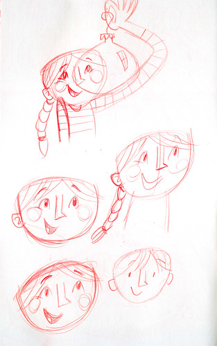
Do I even have to tell you that that's my daughter, Ava, on the cover, gazing through a magnificent red ornament? There's something about Christmas that brings out the kid in me and I wanted to convey that magical time somehow. I went through several ideas and concepts -- my first one had a hipster Santa hanging out in front of the fireplace after his Big Night, with Rudolph curled up by his feet like a dog. I couldn't get the staging down right so I trashed that idea. I then thought up of a Christmas tree family, but that didn't pan out either. But then, I scribbled down a little doodle at the bottom of a page in my sketchbook and that was all it took:
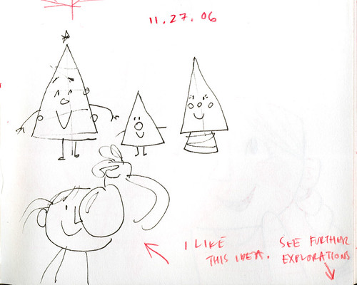
I liked the simplicity of the idea and that this sort of thing everyone would surely "get" -- as I'm sure we've all experienced the magic of looking at all the sparkly and glittery lights and garlands and tinsel and knick knacks found on the family Christmas tree. I was hoping that my viewers will identify with the girl on the cover here and share with her sense of wonder through a simple, yet RED! glass ornament.
Here are more sketches (again, click on each to view larger):
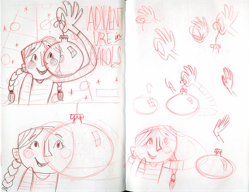
As you can see, I had the initial concept already down by the time I drew it out in the upper left-hand corner there (click on above image to view larger). I might've strayed a bit here and there, working out different poses of the girl's hand and shoulders, as well as different positions of the ornament in front of her face, but the basic look and composition remained intact for the most part.
Below, you can see that I was trying out different poses for the ornament, even making the ornament the same size as Ava's head, eclipsing it perfectly. I quickly abandoned that idea:
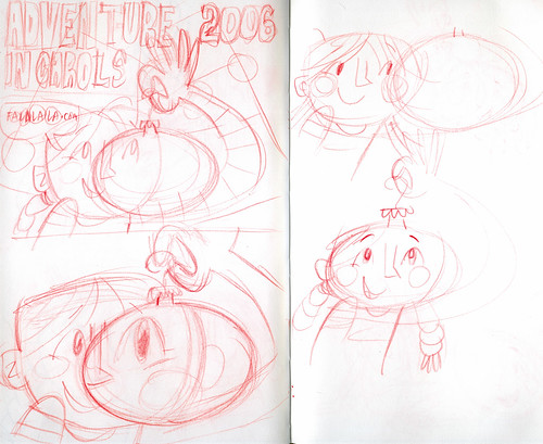
One last set of sketches, this time considering possibly making the kid a boy on the cover. Nope. I liked that it was a girl. You can have more fun with the hair and shirt:
Speaking of shirt, the colorful striped pattern you see for the final design was based off a cool striped pair of pants that Ava had in her drawers. I loved the use of pinks, oranges, magentas and yellows found on that pair of pants -- I just had to use it somehow in this piece. I think it worked out pretty well. I'm happy. Ava loves it. And that's the most important thing.

Wow! I'm glad to now get to see the man behind the curtain, so to speak.
ReplyDeleteI never saw any of this process. It gives me even greater appreciation for the end product.
I'm also glad that it meets with Ava's approval....
I love the colours and warmth of what you came up with - damn, I wish I could draw!
ReplyDeleteHey, this turned out nice and colorful. There's such a nice quality to the transparency of that red ornament, and seeing Ava's face through it. Cool shirt pattern...and boy, you went to town with the sparkles! It's inspiring to see your conception process. I like the fact that you try different things. I'm trying to force myself, more and more, to create options to choose from, before settling with the first idea that hits.
ReplyDeleteSwell cover Ward! I was so excited to see your version of this project. I hope each year King gets a new illustrator to work on this project. It was neat for me to see what the next illustrator would do! You sir, knocked it outta the park!
ReplyDeleteBest,
Steve
I figured the girl was based on Ava. I really like this one, as usual. Thanks for the nice work for Brad, Ward.
ReplyDeleteGreat picture! Love the colors. I always enjoy stopping at your site. It is art candy!
ReplyDeleteDo you have a tutorial somewhere with tips on how to take a scanned drawing and "color it in"?
I would love to know how to turn my drawings into magnific works of art like yours.
Hey there Mr. Ward, great illustration. Just saw your cartoon Adventure Time and thought it was amazing, can't wait to see what you do next.
ReplyDelete-Fred
ooops...sorry...Wrong Ward...cool illustration none the less.. keep up the great work!
ReplyDelete-Fred
I absolutely love the colors for your cover illustration! The picture reminds me of those old Christmas stop-motion animations. The ones that have Rudolph, Santa, and Frosty star in their own feature film. Nostalgia!
ReplyDeleteLove the the behind the scenes! Congrats, it look great!
ReplyDeleteHey Ward-o;
ReplyDeleteloved the behind-the-scenes stuff; very nice. Not to be a critic or nothin', but I have one constructive comment; if you had it to do all over again, would you still have that little red ornament touching the top of Ava's head? It just constantly leads my eye there; and it looks too much like a Mouseketeer ear to ignore. I dig the overall piece a lot, but that one design choice continues to garner all my attentions.
National De-Lurking week...
ReplyDeleteIn the spirit of NDLW, I'm dropping you a note.
I had been visiting Falalalala even before getting to know your site. Its always reassuring for some reason when random things/interests are interconnected that way.
Love the posting of art and process.
Thanks for a good blog.