By now, you should know that I'm a big fan of 50's illustration and animation design. Not only do I love children's book illustrations from that decade, but also love the artwork done in ads and commercials, especially the animated ones. A couple of years ago I was assigned to direct a spot for the Boomerang network, where we were recreating the look and feel of old commercials but with Hanna-Barbera characters put into them. We even were allowed to redesign the classic HB characters to fit the style, which is practically unheard of when it comes to network icons. I chose the 1950's, of course (with Quick Draw McGraw), and I went on a mad hunt for any and all animated commercials from that era. We had a tape at Primal with a great collection of vintage kids-related commercials, and for resource I sat down and grabbed as many frame grabs as I could from the tape. I couldn't stop, I tell ya. I got so into it, I literally had to pry myself away from the monitor at the end of the day.
Out of my extensive research, there were a couple of spots I really enjoyed that had a fun look and great styling to them. I've put some of my favorite frame grabs from these spots into a new Flickr set titled, Fun Vintage Commercials. Here are a few highlights:
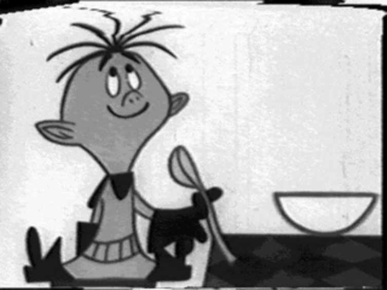
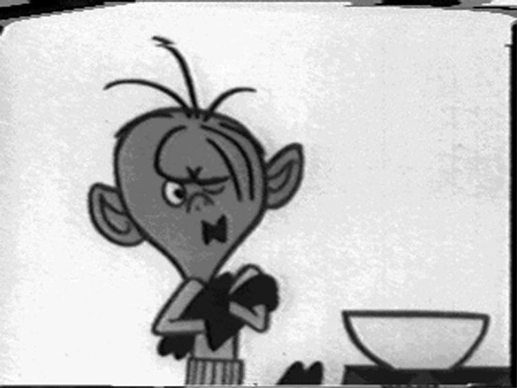
 I Want My Maypo became one of the most popular commercials of that time, all thanks to the infamous tagline belted out by the "Maypo kid," shown here. It aired in 1956, with John & Faith Hubley doing the production, and Emery Hawkins, a former Warner Bros. animator, doing the animation (you can read more about Emery HERE). I love the design of the kid -- you can see why I chose him to be the icon for The Retro Kid, the Flickr group I started. Another bit of trivia, this spot is briefly seen in Brad Bird's THE IRON GIANT, when the Giant's hand is watching TV.
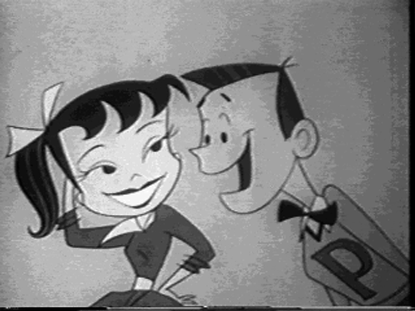
 Pepsodent's The Yellow Went was one of the earliest TV spots that was aimed at marketing to a growing teenage market. The zippy animation and editing help this 60 second spot seem like it is only half that long. And guess what? The animation production was done by Tex Avery. Oh, and the jingle was pretty much a big deal too, with the "You'll wonder where the 'yellow' went, When you brush your teeth with Pepsodent!" running around in the heads of many in 1956, when it first aired. I have to say that Suzi, the girl in the spot, has one of the swingingest walks ever recorded on film. Check out the other frames I grabbed from the spot, and you'll see that teenage boys will do anything to get the attention of a cute girl.
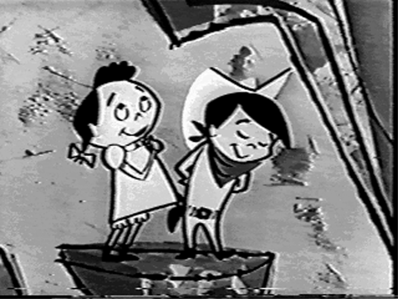
  I don't know the title to this spot, but The Cheerios Kid was introduced in 1953, along with his female pal, Sue, to promote the energetic possibilites of eating a bunch of little o's. This particular spot aired in 1955, with the character and background design done by TOOT designer, Tom Oreb. I love the way the mountains and how the waterfall were depicted, with everything very stylized and very angular. Fun animation, too.
Check out the set to see more images from these wonderful TV commercials. (And by the way, I plan on updating this set periodically, so be sure to check back often.)

Great post.
ReplyDeleteI don't know much about art or illsutration, but looking at these nicely stylized pictures makes me miss the days of pen-and-paper. A lot of the new cartoons are heavily stylized, too, but they don't seem to have the soul of older stuff.
NB: I bet the "yellow" teeth commercial worked so well in black-and-white because yellow would have to be dark gray. And if there's one thing worse than yellow teeth, it's off-black teeth!
This first Marky Maypo commercial is nothing short of genius. Hawkins comes up with so many appealing and incredibly creative head shapes. His poses and animation are sublime. One more bit of trivia related to Maypo: the kid in the first Log commercial on the original REN & STIMPY is a tribute to Marky Maypo. They copy many of the poses from this Marky Maypo commercial, and even the spot's set-up is a tribute, where the Log kid yells "No!" to the other toys.
ReplyDeleteThe Pepsodent commercial was supposedly designed by Gene Hazelton. It's never been officially confirmed, but based on the style, it's pretty plausible. On the Cheerios ad, Vic Haboush co-designed that with Oreb. Vic had saved some of his layouts from that spot, and it's clear that he played a role in designing the bgs of that spot.
Anyway terrific post Ward! TV commercials are such a lost (and woefully underdocumented) aspect of animation history.
Fantastic post. always enjoy your blog Ward.
ReplyDeleteWow, these are fantastic! These commercials would be a terrific resource for a project I'm working on. Do you happen to know if they are available to the general public anywhere?
ReplyDeleteWow....just gorgeous images!! The 50s are such a pinnacle for art. It just oozed out of every facet of that era..movies, books, tv...even labels on food. Photograpy killed it all!
ReplyDeleteOn a positive note, have you ever looked into this dvd on ebay,Ward?
It's even got the Tom Oreb disney commercials on there. Not a great copy of them, but at least it's there.
Commericals?
ReplyDeleteAnyway, I used one of your images in a piece I did this weekend for church with all 50's images.
Thanks for being such a resource of joy.
You rock, Ward.
Thanks, Amid for adding your two cents here. I knew that you'd have a couple of nuggets of wisdom to bestow upon us regarding 50's animation and design. (And I'm still dying to check out your book on this subject when it comes out next Spring!)
ReplyDeleteCedric, I think Steve Lambe answered your question, but there are other outlets to find vintage commercials, and I believe that the tape I was watching was from Something Weird Video. Worth checking out.
Slim, that's what I'm here for. Thanks.
I do want to add more to this lot, people, so please come back for more!