7.29.2005

I'm back in it

It's been about two years since I last painted one of my characters on a wall. Two years in graffiti-time is like two lifetimes. I've been missing it. Why such a long sabbatical? Life. Life just moves on, as some things become more important to me than others. I don't mind that, actually. I'll be the first to admit to other graffiti writers that graffiti is not my lifestyle, and I've received nothing but love from them for being honest. Graffiti takes time away from the family, and I value my family more than anything. I'm not trying to be something that I'm not, and other writers pick up on that, and give me respect.

So, it's been two years since I've been out there and imagine my surprise when a get an email out of the blue from a graffiti writer here in town asking me if I'm free to paint the following Sunday. He got permission to paint an entire wall that's on the side of this automotive place in Marietta. Not only was the size of the wall impressive, but the roll-call of writers that were expected to show up and paint was equally amazing. Some old school cats along with some mad talented newer faces -- I immediately said yes. I was back in!

In my usual over-the-top fashion, I drew up a sketch, scanned it, and did some color schemes in Photoshop. Most guys just do a sketch in pencil or pen, and then bring that lowly drawing, or their blackbook, to the site and bring along the paint that they have with them. I wanted to make sure that I had the right colors, as sometimes I never like the way the final colors come out. I misjudge the hues and tones and I usually can never be satisfied with the end result. (You can click on these drawings for a closer look.)

My style of characters are not the typical 'hip-hop' style of characters that you usually find on graffiti productions. No b-boys in a buffalo stance, no big eyes, no big shoes, no baggy pants, no bling and the like. I felt why do something that everyone else has seen countless times? I was getting rather sick of all that. The lines became something that I could manipulate to my advantage, and now has become my signature look. Occasionally I'll do something different, but this chunky, blocky style with the thick, straight lines is what people expect from CANON. As you can see in my initial drawings, the lines are thinner and less strict. More free-flowing. Actually, I wish that I could paint my lines like this, to tell you the truth, but I know that that would require more can control than what I possess right now. Plus, I would need a much larger space.

I've had some graff writers tell me that they didn't like my characters at first, but once they saw more, they eventually warmed up to them. And now, they love them. It's all part of that notion of getting stretched and pulled out of your conventional box -- your comfort zone, if you will. These are not your typical graffiti characters, and if that's what you're used to seeing all the time, of course you may exhibit some trepidation at first.

So, I had my brother-in-law, Nate, come along with me to Marietta to take some photos for me. It's a rarity for me to have some actual shots of me painting, plus I thought it'd be a cool thing to post on The Ward-O-Matic. I know that most people view this activity as criminal, but since this is a permission wall, wherein the owner of the building gave us permission for us to do our thang on the wall, then this is completely legal. For the record, I've never done any illegal graffiti. All my characters that you see in my gallery and in my Flickr were all done on legal or permission walls. I've got too much at stake to be screwing around with any illegal activity. If that shoots my street credibility to nil, then so be it. I don't care. I don't want Ava to ask "Where's dada, mommy?" And Andrea answers, "Well, honey, he's in jail for painting on somebody's wall." Not for me, thankyouverymuch.

Onto to the pics. Hope you enjoy them:
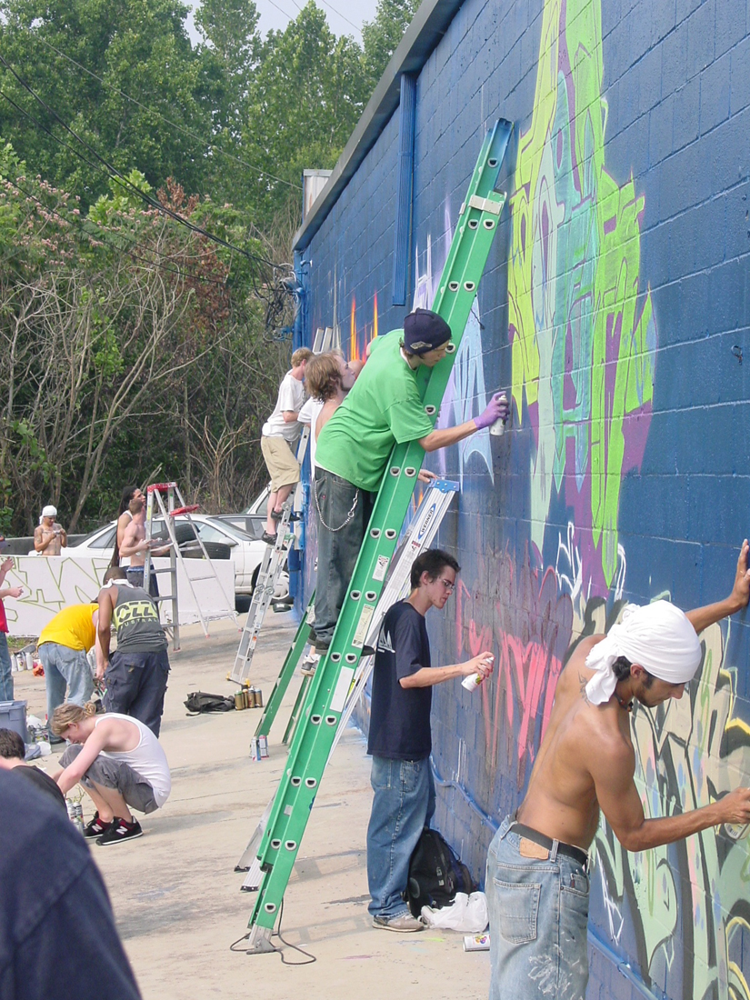

Like I mentioned earlier, we had a great turn out. The wall was so big that ladders were needed in order to fill up as much of the space as possible. There was not much space to walk around in, as there was this steep ravine right behind us, filled with kudzu. Welcome to the south.
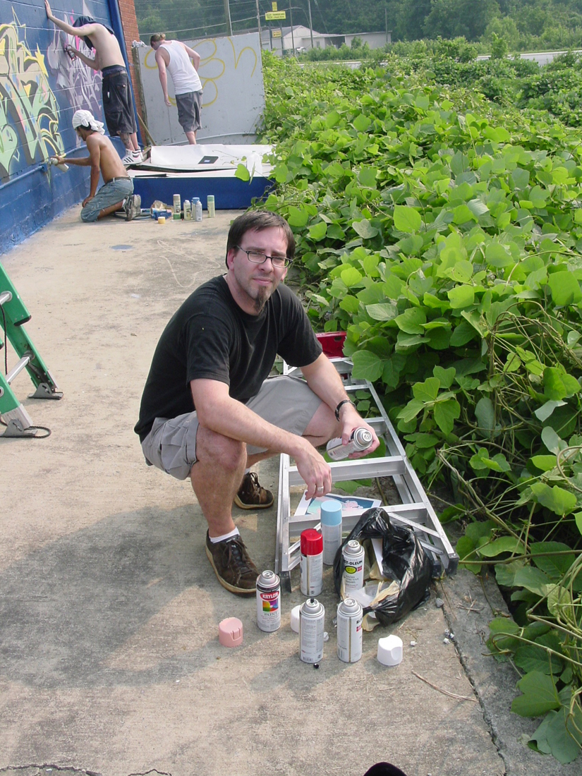

Checking the paint situation. Nate said that I should be saying here, "Here I am, a 36 year-old grown man... and I'm painting graffiti." Lookit, I'm already sweating.
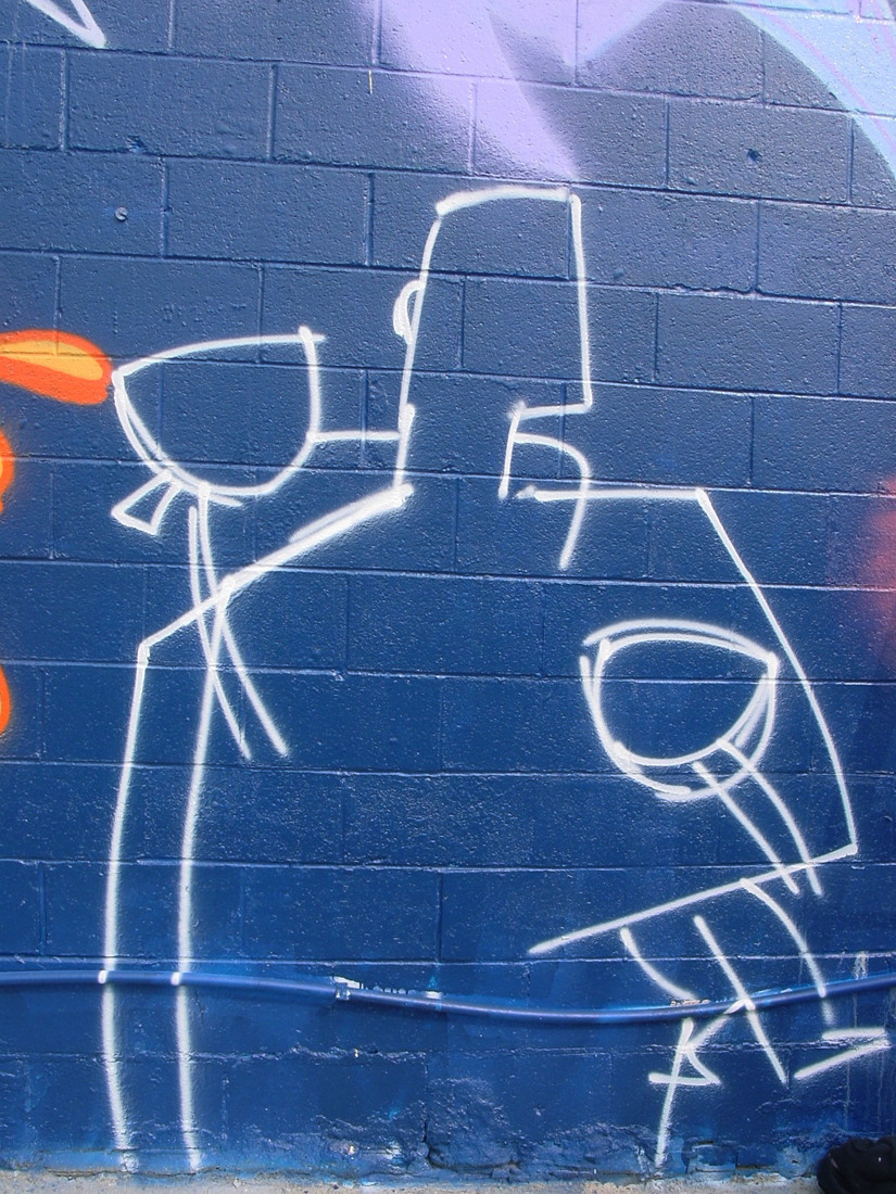

I start with a sketch of the piece, to make sure I've got the composition and proportions correct.
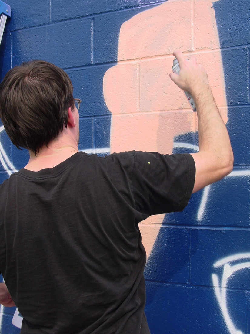

I then begin on the inside fills. Not all that fun, but necessary.
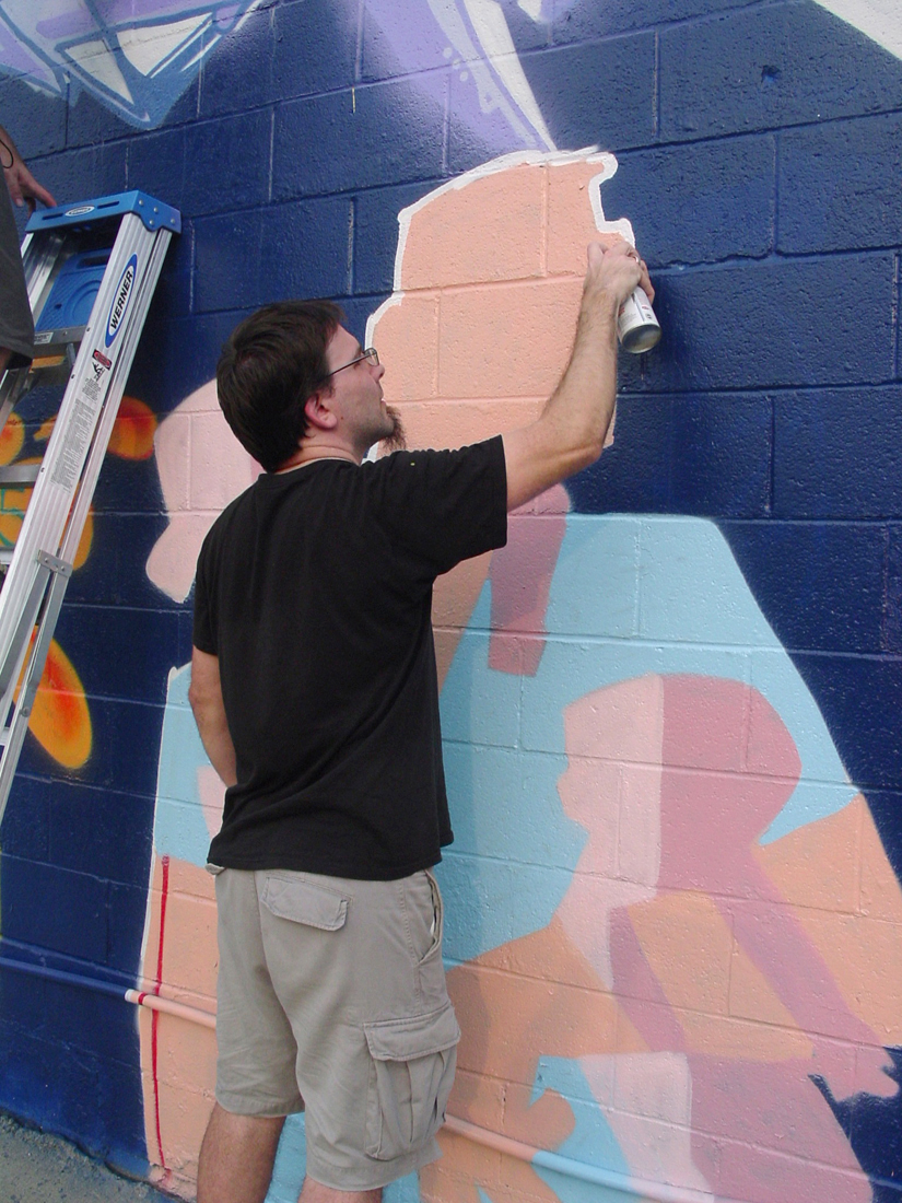

After I get all the inside fill colors, I then paint a white outline around everything. I have to be careful not to get too sloppy with the line, as I don't have any of that dark blue paint to go back and fix any mess-ups.
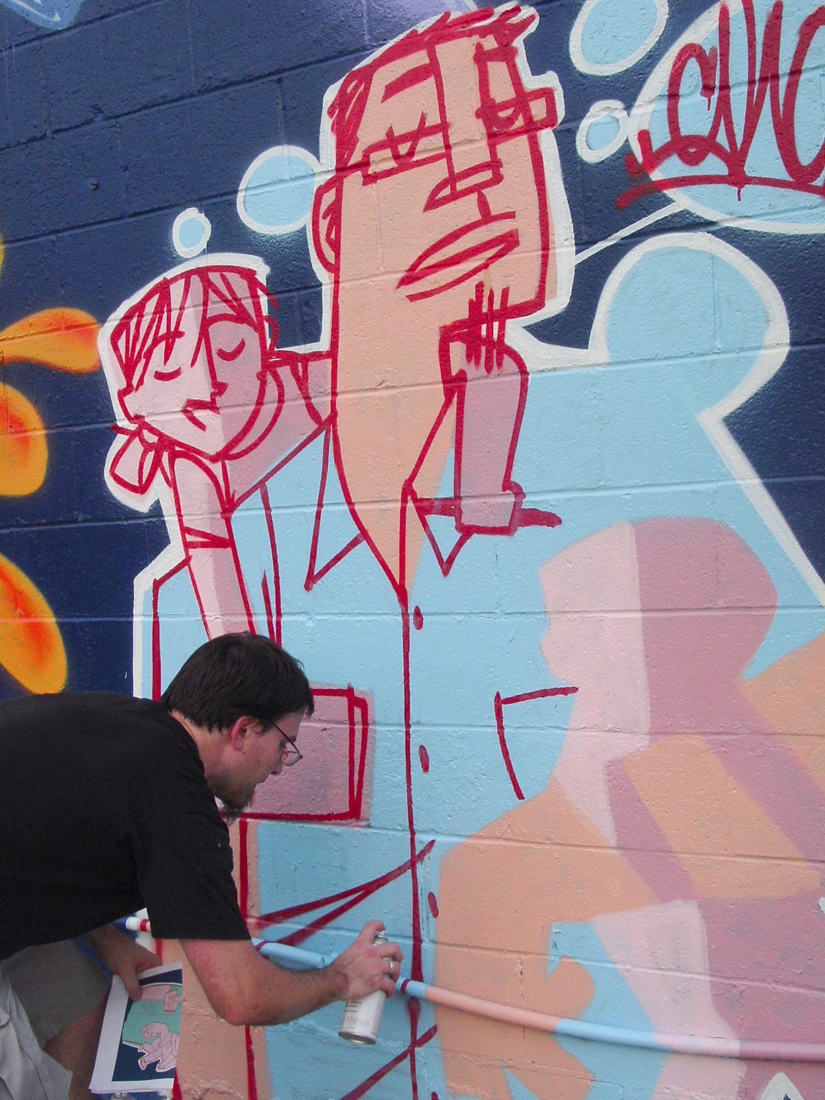

Next, I do the red lines. In order to control the lines, to shape them just the way I like them, I do what we call "cutting the lines." I have a can of the fill color and I "cut" into the red line, to thin, or shape it how I want. Mostly I trim the ends, to make them flat. Looks nice. I like it.
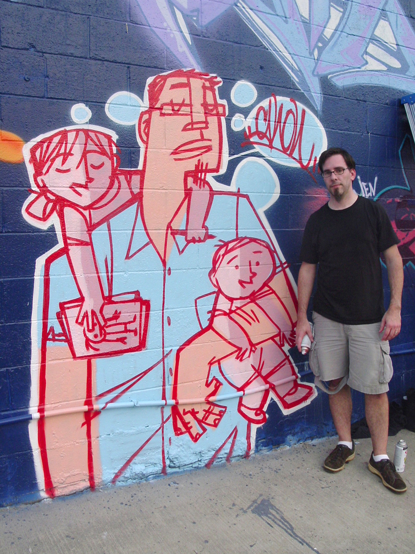

Finally done. I am one worn out old dude.


Here it is. Me and the kids. I'm happy with the end result. Even though the lines are thicker and not the same as in my original sketch, I have to understand the process and know that it's not going to be perfect each time. Under the circumstances, I'm happy with the piece -- especially since I've been absent from the graff scene for two years.

Hope you all enjoyed seeing an old dude getting back out there. It was a great experience for me. Finally got it out of my system. Hopefully, it won't be another two years until I get out there again. Be sure to click HERE, to check out the entire photoset on my Flickr. There are more photos, if you're curious. Enjoy!

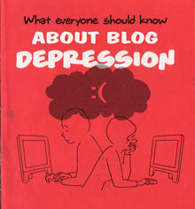
Blog Depression

This is just too funny. I found this the other day and now I must share it with you all. The Nonist is a great blog on art, pop culture, and the usual oddity, headed up by a 'JMorrison.' If you are ever in the need for an interesting read, then The Nonist is the place to be. Anyway, just the other day was posted A Nonist Public Service Pamplet, or, "What Everyone Should Know About Blog Depression." (Some naughty words, so read at your own discretion.) Done up like a 60's-70's public service pamphlet, or 'tract,' it is a very hilarious take on blogging and the woes that it may entail. Very hilarious, yet might hit very close to home for some of you bloggers out there.
Too close for me, I'm afraid. In fact, I'll have to end this post now, so I can go and voraciously eat a box of Nilla Wafers....

7.28.2005

Ava Thursday: 5th Birthday Party


Sorry this is late, but I could not find this drawing for the life of me. We looked everywhere, but Andrea finally found it between the wall and easel. It's been a crazy hectic day for me, so I'm sorry this'll be brief.

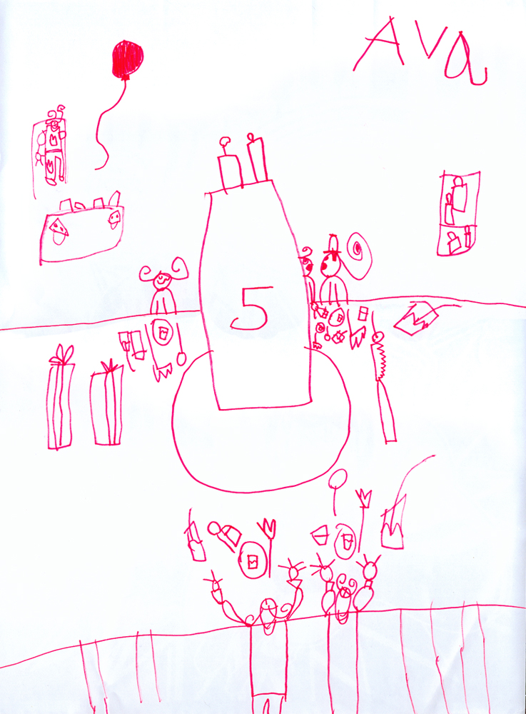
Ava drew this soon after her birthday party this past weekend. That's Ava with her best friend, Stella, at the foot of the table, along with other guests, all ready to dive into the cake. Well, eat some cake, not really dive into it, but you get the gist. As you know, the theme of the party was 'pink and red,' and it was a fantastic sight to behold. You should've seen the place. That's Andrea's cousin Kristy in the kitchen up there, in the left-hand corner. She was a big big help with the presents, party favors, games, and food. There's a table for the ice cream just below Kristy. Presents are found over on the right, as well as a few on the table -- along with favors, utensils and drinks for each guest.

Ava likes all the little details, haven't you noticed?

7.27.2005

Remembering Lou on AWN

Animation World Network is working on a tribute to Lou Hertz, and is asking for messages and remembrances from his friends, colleagues, and students. If you'd like to add your story or doodle of Lou, please send it to editor@awn.com. More information can be found here.

Try to send them in by August 3rd, by the way.

7.26.2005

Happy 5th, Ava


I know you're not old enough to read this, my dear Ava, but some day you will. And I hope that I don't embarrass you too much when I say that I am the proudest father on the face of this earth. I've been constantly at awe by everything that you do. You amaze me daily. You've persuaded me to look at this wonderful world around me with new eyes, and made me realize that I don't have to over-analyze every little thing I work on; I should just enjoy it. Your wisdom rocks me to the core sometimes, Ava. "It's just a dot," is not just a cute, little thing you said to me about one of your drawings one day, but something that I keep close to my heart always, as I later on discovered that there were many layers to that simple, yet beautiful statement. Some things are not meant for reason, they are meant just to be. Enjoy the moment. Enjoy.

With your Ava-speak, I've learned to admire the love of nonsensical words, which, when spoken by you, actually mean something, somehow. I truly do not know how you do it. Your silly songs brighten the darkest of days in our house, and I'm kicking myself for not getting them on tape soon enough. Not only would they be ideal for me to listen to while at work, they'd be perfect for bribing you into embarrassment when you bring home your first boyfriend. (I don't even want to think about the concept of 'dating' yet, anyway.)

Five years. Five whole years? Where has the time gone? Not to dive into clichés here, but I do remember the time when I first held you and brought you over to your mommy so she could take a look at you. You did quite a number on her, making her go through hours of labor, as you wouldn't budge. The c-section was not what we had planned, but you know, Ava, you've never done anything as planned. You've always set your own pace, which definitely makes you my daughter. When it may look like to others that you are slow or distracted, I know that what you are really doing is being engaged with your surroundings, taking it all in. You are such the observant little child, noticing the smallest of details in a room, on a doll, in a drawing, or a movie. I know that you mustn't be rushed, that you will get there soon enough. Patience is, indeed, a virtue.

You are such a bright girl, Ava, and you make me laugh and cry at the same time. You are brilliant and you will shine forever, little star. I love you, Ava. Happy Birthday.

----------
To see some of our favorite photos of Ava, taken during her fifth year, click here.

7.25.2005

Weekend fun

Crazy weekend we had, but it was fun! Ava had her Big Birthday Party, with everything pink and red. Those colors are now seared into my skull. My eyes ache. But oh! what fun we all had! Andrea and her cousin, Kristy, went all out. You should've seen it. Well, you will, most likely. With two parents blogging about things around them, you know Ava's party will be documented somewhere on the web. Poor girl. So much for privacy.

Another thing about this weekend, I was able to get back out and do some graffiti on a permission wall. And yes, I will post about this glorious event as well. All in due time.

Here's some links for you all:

Retro Randy has some very hilarious scans of various past pop culture oddities. Some more strange, loveable retro goodness can be found at The Swank Pad. We all must have a sense of humor about our past, don't you think? Yes.

Ed Bell is an amazing animator and director who's worked on fantastic projects and jobs for Wild Brain in San Fran. Love his work.

Everything you've ever wanted to know about stop-motion animation can be found at StopMotionAnimation.com. Be sure to check out some of the great photos that are posted in some of the threads there. Great stuff. (And I do hope you all go check out Charlie and The Chocolate Factory to see the trailer to Corpse Bride. Or, you can just check out the link I just gave you there. Either way, it's a wonderful trailer. Can't wait to see the film!)

S'more blogging madness:
All my wisdom is stuck in the back of my tooth (Wins the best blog title for the month.): animator mentioned on Drawn!
Patch of Orange: art and sketches
Billy Blog: fun art blog found through Illustration Friday
UPDATE: Bill's got a site too! Check it out HERE.

And a special congrats to Paige Pooler for the ultra-big mention on Boing Boing! Way to go, Paige! Don't forget us little people who knew you when, now that you're a big shot blog star....

7.22.2005

Von


My wife Andrea has two incredibly talented brothers, Nate and Von. Nate is a DJ for an underground hip-hop group here in Atlanta, Mars ILL. I've done some work for Mars ILL from time to time, including the painting you see currently on the site (which is not fully up-and-running yet) -- but more about Nate some other time. I want to talk about Von today.

Von is a graphic designer living in the thriving metropolis of New York City. He's been living there for several years now, with most of the time working on his site: conceptualizing, designing and creating the thing from scratch, learning action-scripts on his own. Methodical and precise, Von knows what looks good and won't let go of something until it looks just right to him. I admire that immensely. I've known him since he was in middle-school, and it's been wild for me to see him grow and struggle and learn -- just as any artist does. Our experiences are what make us unique as artists, and Von's no exception. He and I have had long discussions about art, cinema, design, the theories and the criticisms behind each of these arenas, and much more. It's never a dull conversation with Von. And I admire that about him, as well.

Anyway, he's got his website up and running now. He's got quite the eye for things. Check it out HERE.

(Andrea wrote about her brother a while back on hulaseventy, if you're curious. She writes gooder than me.)

7.20.2005

Ava Thursday: Reading books


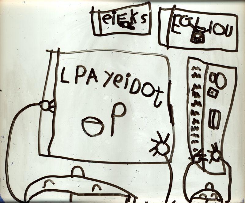
Ava drew this the other day on her dry erase board (there's a chalkboard on the other side) and once I saw it, I knew that I had to scan it somehow. What an amazing drawing! It's just so interesting to see how much she picks up from what she sees around her, as well as how she does something completely different from the norm.

Originally, Ava said that this was her and mommy, but then later changed it to be her best friend, Stella, and Stella's mommy reading books. Notice that Stella's mommy (on the left) is reading a book about food. That's a bowl of soup with a spoon on the cover there. Those are other books up above, with a TV on the cover of the right one.

Two things I love about this fantastic drawing:

1) Her astute attention to letterforms on the books. The way she did this, was she'd look at one of her own books, study it, turn around and draw a letter, then turn back around to study the book again, turn again to the drawing and draw another letter, and so on. And her penmanship is remarkable.

2) The way we are looking down at the subjects as they are reading. Again, this (to me) is simply wonderful to see how she is coming up with different ways of looking, developing a unique sense of compostion. I NEVER did anything like this until I was well into my.... well, just last year, to be honest.

This girl of mine is freaking me out. In a good way, of course.

UPDATE: Ava just informed me that the book the mommy is reading is called "How To Eat Your Food Good," and that Stella's book is "of things to make a party."

Blogger search

Hey all -- if you're ever curious about finding an old post of mine, but couldn't remember exactly where it was, but know what I talk about, you can use that Blogger search window up in the upper left-hand corner of the screen there. It actually searches within just this blog, for your convenience. And, of course, it's a Google search, so you know you're going to find exactly what you're looking for.

So, go ahead and do that search for "booty," as I know you're curious. (13 matches, by the way.)

7.19.2005

Moongirl sneaky-peek


I just posted this up over at Drawn!, the fun multi-author blog I contribute to from time to time:

What's this? A work-in-progress clip of Henry Selick's newest short film Moongirl? Well sure, I'll take a gander. Hey, wait a sec -- that's not stop-motion, that's CG! Yes, it's true, Selick's upcoming short is, indeed, animated by computer, not by hand with puppets. But I don't have any fear, as Selick is one of the best animation directors out there, so I'm sure the project is in good hands. The look and style of this clip is pretty nifty, but I'm not completely digging the shape of the boy's head when he turns. However, I'm forgiving, with it being a work-in-progress. Based on this clip, the animation looks very nice, and the story is bound to be interesting.

And if you're wondering just what the heck is Laika, that's Vinton Studios' new name.

By the way, Jared sent this link to me, suggesting that it needed "the Ward touch," but I know better. He got distracted by something shiny. Again.


Thanks for the heads-up, Jared! Now get back to work!

This is weird

What a stange world this is -- the early morning. It's so quiet and relaxing here at work right now. Nobody around to bother me. No assistants to interrupt my flow by asking me to check out a penciltest. No producers. No calls. Nothing. Just me and my animation disc.

I'm not a morning person. I'm supposed to be at work by 9, but I usually get in around 9:30 or later. So, you can imagine my horror to learn that Ava had a doctor's appointment today at 7am. That's A.M. In the MORNING. If you know Atlanta traffic, you know that you can't get anywhere without it taking 45 minutes or so to get there. That meant for us, as a family (the Jenkins clan are not morning people -- Ava's been known to sleep until 9:30), that we had to leave the house by 6:15 this morning! Egads. That meant that we had to get up around 5:15. Good gracious. This could only end in tears.

This is the second go at this, by the way. The first time, I slept right through that early alarm. Never heard it. Andrea was livid when she woke up at 9 to find me still zonked out in bed.

So, this time, I called in the Big Gun: my mom. She gets in at work by 6 or 6:30 (sicko!), so I knew that I could rely on her to give us a wake-up call this morning. And it worked! She called me at 5:30 and set the whole waking machine in motion. Everything went smoothly, without a hitch. I could not believe it. I thought, surely something will keep us from reaching the doctor's office by 7 -- for me to be on time, well that's just crazy talk. It's not part of God's plan for Ward Jenkins to be on time. Especially not for an early morning doctor's appointment. No way.

But we made it to the office by 6:45. We were EARLY! I'm piddling me chair as I write this, I'm so happy.

Afterwards, we had breakfast and then I was able to get into work early. Double takes were made by several co-workers upon my entrance. Yes, it's crazy -- Ward is early. Sorry to throw off the whole time-space continuum, but it was bound to happen, my friends.

And now I've got so much time to myself here at work, I don't know what to do. I'm really digging it, though. I can see why people do this: to get things done. To have moments to yourself before the onslaught of the day. To relax and finally focus on things. To draw. To blog.

This is weird, but I like it.

7.18.2005

Lessons to be learned from Blow Out

I'm a reality-show junkie. And I've been in it from the beginning, as Andrea and I watched with curious glee the goings on of "seven strangers picked to live in a loft," in 1992. Throughout the years, it's been interesting seeing all the new concepts and ideas that networks come up with for reality shows. Most of it is literally crap. Silly, stupid and downright naughty. These are the ones I find more fascinating, of course. Even with the worst ones, I've found that once you sift through all the bad editing (sound and otherwise) and forced storylines, there's bound to be some life lessons to be learned. Believe it or not.

Bravo's Blow Out is one particular show. The debut season was interesting to watch for the noted opening of famed (in his own head, of course) hair stylist, Jonathan's newest salon in Beverly Hills. Will he or won't he open on time? Can he subdue his workers? Can't everyone just get along? A good amount of it was fluff and vapid, but I did enjoy the characters. And that's one of the main reasons I get into shows like this: the characters. Sure, some (most) of them are completely concocted by the show's producers through editing and clip choices, but all-in-all I do enjoy watching these pre-fabricated reality nobodies unleash their pseudo-dramas before us. I guess it's sort of comforting to watch others make bad life choices, and perhaps I like to think that I'll never make these same choices, especially not in front of millions of viewers. You may call it a character flaw, I call it a guilty pleasure.

Anyway, as I watching an earlier episode of Blow Out, I did some sketches of some of the crazy characters on the show:


Jonathan: all drama, no substance.


Kimberly: squarest jaws in the business.


Odd-looking Daniel, a stylist.


I think his name is Jason, another stylist.


Scott: graphic designer with issues.

So, what are the lessons to be learned from this shallow freakfest of a show? Some of my thoughts on how Scott, the graphic designer of Zorbit, became the epitome of all selfish, rude, ego-centric designers out there. If you want to be a designer, then learn what you can by NOT doing what Scott did on the show. A couple of notes:

Made the mistake by talking down to Jonathan and being rude by calling his outfit a "dog and pony show" as well as the slip-up by calling Jonathan a hair-dresser, not a stylist. Oopsie! Do your homework. Learn who your client is, what they do, how they do it, know how they speak. That was very disrespectful.

Bad designer! Bad! Listen to your client. Even if they are a pompous, arrogant egomaniac (much like yourself, right, Scott?), you must bend over backwards for them. You are there to do their bidding. They are paying you, even if you think their ideas or personality are not what you are down with. Even though he may be the worst client EVER, if you can get through the job relatively unscathed, you will have that job as experience that you can learn from, and be able to handle any type of client afterwards. Plus, positive feedback from clients will almost ensure more work your way. Do not make enemies. Do not burn bridges. Connections and who you know are essential in this line of work.

When Jonathan and Scott started to make the other wait for excessive amounts of time before a scheduled meeting, it became the equivalent of a pissing match between the two. Basically each of them were putting up a front, a barrier, while at each other's turfs. Meet at a neutral place. Sit down. Talk to one another. Try to work on being on the same page.

There are more, but I'm afraid I'm coming across as being some big nerd for the show. I'm not, I just think it's interesting. Honest!

Oh, and some more irritating points: the constant plugs of his hard-looking sister's show-girl group the Baby Dolls (?) in Las Vegas. It was similar to last season's plugs of Lenscrafters and Revlon makeup products. Shameless. What's worse is that now we've got his 'Jonathan' product line that he's endlessly promoting on the show. Just one big infomercial. But it is sorta fun seeing him get all blubbery over the slightest mention of how he started his salon from scratch, blah, blah, blah. Aw, the sensitive type.

7.15.2005

More or less?

There's an animation adage I've heard a couple of times -- I'm not sure who said it, or where I heard it -- but it's pretty dead-on:

"A new animator wants to put more drawings in, a seasoned animator wants to take more drawings out."

I'm paraphrasing here, but the saying is so very true. When I first got into animation, I felt that in order to do a great scene, that all I had to do was to draw some great key poses and then in-between the heck out of it. What happened was all the motion and movements looked labored, as if all my characters were moving in molasses. Not only did the action look slow and lumbering, but it also looked so amateurish. I did not take the time to realize that maybe more drawings DID NOT equal better animation.

The more experienced an animator you become you start to realize that not only do you tighten your movements by economizing your drawings, but the most important thing for you to know is where to economize; where to tighten. How to know? Practice. Do extensive penciltests. Over and over. The more tests you do, the more you learn. Eventually, you pick up on your own style of animating, unique to you, and you alone. And once you establish a style, the easier it becomes to get the job done. What once took you 20 drawings to complete, you can now get the same effect done in 10.

The same could be said of practically any job, I guess. Practice. Just keep drawing. Even if you're not an animator. Sharpen those skills. It'll benefit you in the long run.

7.14.2005

Ava and TV


Thought I'd show you guys a sketch I did of Ava while she was watching TV a couple of months ago. Whenever they show the bad guy on the particular show or movie she's watching at the time, she'll stand up and do this strange dance in front of the TV: a sort of karate-style jumping while punching at the TV screen, as if she's fighting the bad dude. It's her way of dealing with something, or in this case, someone, she doesn't like.

When I showed her this sketch of her performing her fighting ballet, she wanted to draw too. I was afraid she'd scribble all over my drawing, assuming that perhaps she'd relive the bad scenario that was on TV moments before, but no -- she drew what's on TV. I love it. (And notice that the character she drew has an 'x' over it -- again, something she does to show she doesn't like it.)

(And oh, I know that I borrowed heavily from Bill Watterson here, with the TV up in the air, but I don't care. It's a great visual.)

Ava Thursday: Going to Mema's house


Click for closer look!

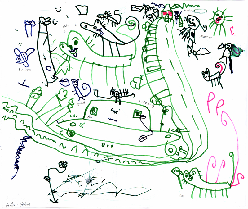
Since Ava got back from visiting her grandparents, I thought I'd post a drawing that she had done back in January of this year, that seems appropriate. It's quite an elaborate piece, and it's actually on the backside of another drawing that I've posted earlier. This was post-cousin Matt visit, so there's certainly some details going on here.

Ava tells me that she and I are going to Mema's house (Andrea's mom) in a car, and that there are cats around and a squirrel, too. There are trees lining the road, all the way up to the house, as Mema and Pawpaw wait for us to arrive. The squirrel is just to the left of the car, with a nut. Looks like he's putting it in the tree there. There's also a bee flying around, as well.

I really love how Ava drew the car, as well as the way she drew the cats. The trees alongside the road are a nice touch, as I'm sure that that's what she remembers when she goes and visits her grandparents. It's what she sees outside her window the entire trip (we drive up to Illinois each time we visit). What is especially cool for me to see here is her use of perspective, as the road seems to go back in space, all the way up the page. The house looks very far away, and Ava drew the road getting smaller, it seems. Not sure what that that bizarre contraption is on top of the car. Antennae, perhaps? Looks cool, though.

7.13.2005

I'm whole again

Yay! The family is back! I'm sane again. I'm whole again. I can now resort back to my neanderthal ways of not cleaning up after myself, not doing the dishes, not ironing the multitudes of shirts I own, watching stupid infomercials 'til 4 am, and not emailing anyone back for weeks. Back to being ME again, huh?

It's great to hear requests again to come play with the Pollies with Ava. How could I NOT turn that down? Life is certainly good if you're Polly Pocket, I tell ya. And there's nothing like hearing the constant whines and grunts that Ezra has now picked up. Enough to make you drive a nail into your skull. Yipee!

Seriously, I'm so happy to have my family back home. It's weird how you feel so alone when you're with someone now. That is, when Andrea and the kids were gone, I felt so much more ALONE than when I was all by myself B.A. (Before Andrea).

7.10.2005

MELODY


Released on May 28, 1953, MELODY was the first cartoon ever filmed in 3D. It was shown at Disneyland in the Fantasyland Theater as part of the 3D Jamboree. As I mentioned earlier with TOOT WHISTLE PLUNK and BOOM, this film was the first in a proposed series of shorts teaching the principles of music, called Adventures in Music. TOOT was the only one made after MELODY. I would've loved to have seen the opening credits in 3D, as the mobile concept for the opening title sequence probably looked great.

All the prinicple artists and creative geniuses who produced MELODY are pretty much the same from TOOT (check out the details here). Ward Kimball, being the director, kept the flow of the piece quick and precise. Again, some great character designs by Tom Oreb, as well as some fantastic background and color designs by Eyvind Earle. The story is similar to TOOT, where we are introduced to a schoolhouse with the Professor Owl presiding over the class. As he talks about the subject of the day, we are presented with some interesting side examples of melody in action. My favorite is the "Steps of Life" segment, demonstrating how melody is evident throughout the life of your average guy. As we go though the stages of this one guy's life, his early life and childhood steps go up. When he marries and has children, that is considered his "prime of life," and is depicted at the apex of the stepbridge of his life. Then, as he gets older, the steps go down. All at the same time, the overall colors shown for each step changes subtlety, as warm ochres, yellows and reds, suggesting growth and vitality, are for his childhood and school years, up until his marriage. When he gets older, the color scheme subtlety changes from reds to purples to blues, depicting maturity and loss of vitality. A nice gag that is barely seen, but for an instant, is when we see him get married, a shotgun slowly flies across the frame, suggesting that perhaps there were more than one reasons why our boy got married!

Another slip of fun that got overlooked somehow, was a shot of the dunce of the class glancing over at the Mae West-wannabe chick, Suzy Sparrow. He's not looking at her eyes, if you know what I mean. You can check that frame out below. And yes -- the frames! I couldn't stop with the frame grabs. I believe there are 46 here. It was very difficult in trying to find out what exactly to grab as every single shot looked fantastic. The colors, the backgrounds, the characters, everything. This short is probably not as fun as TOOT, but it's just as tight. (By the way, MELODY is found in the bonus features of the FANTASIA 2000 DVD, and more recently, is included in the Walt Disney Treasures: Disney Rarities DVD set.) And don't forget -- all images below are clickable to view in a larger, 800 pixel-wide size. Enjoy!

DISCLAIMER: The following images are owned and copyrighted by Disney. I am not making any money off of this presentation, just posting these wonderful images merely for the sake of resource and historical purposes. If you have any questions about all this, please feel free to email me. Thank you.


As I was watching the end of MELODY, I noticed the nice pan that goes from the schoolhouse, up to the end frame, and I thought, you know that'd be pretty cool to see in its entirety. So, I grabbed some of the frames from that shot and put them together via Photoshop. Here's the final result (you can, of course, click on image for a larger size):


You can help me out by ordering MELODY through Amazon directly here: